ASSIGNMENT
3: INITIAL DESIGNS
People
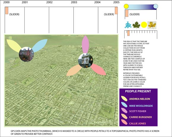
Petals (By Andrea Nelson)
Related
Links:
Overview
This idea intends to feel “organic” and natural, with
soft colors and strong visual references to real environments and
associations with a flower/growth metaphor. The strength of this
interface is that if certain data—co-present others, for example—is
not there, photos will still be displayed and the system will not
“break.” The interface, then, allows the data to evolve
and works with photos that have a varying degree of data.
Click
to view
Time
Emphasis is given to time in the form of a manipulate-able slider.
To show, say, the whole collection, view the timeline on a year
scale. To zoom in on a year, specify that and adjust the slider;
4 icons show the main seasons and tick marks show the months. To
see photos from one day, for example, specify and adjust the slider.
Icons show a sun to a moon gradient.
Place
A topographical map is used. A screen of transparent green is applied
to enhance contrast of photos. The idea is this: this aerial photo
is generated by GPS data (currently supported by MMM2). While the
photo supplies a lot of detail, some might argue it’s too
much or “no one will care.” But here’s the thing—novelty
aside, it’s useful to the degree that the viewer (Darla, Steve,
Jake, Sarah) wants it to be. If Darla knows San Francisco very well,
she’ll see one photo is by the courthouse and Market Street
while one photo is by Fisherman’s Wharf. If Sarah doesn’t
know the city very well, she may not know or care that the location
being displayed is emphasized to that degree of precision, but she
will still appreciate that the photo is put within the frame or
context of an identifiable, reasonably familiar location. In other
words, someone who knows the area well will read all the detail
that’s there. Someone who doesn’t won’t read all
the detail that’s there, but the detail supplied does not
interfere with their user experience.
If
GPS data is not available, system should default and graph all photos
to either cell id, or the billing address of the phone’s owner.
Note:
it is possible that a slider or similar menu might want to be there
to clarify the scale of the map to be gone, thereby accommodating
photos from both Italy and Berkeley at the same time!
People
Introducing “people-petals.” The concept visually displays
a very literal translation of what co-present Bluetooth data is:
the people who were around and part of a central event at the time
of photo capture are represented here as being “around”
the photo, a peripheral part of the event that was taking place.
In this way, people contribute to the notion of event, combining
with place and time to inform the photo. Colors are related to the
people they define in a legend. Note that the interface has pre-set
colors to depict people but those are also customizable. So, if
Steve is often taking pictures when his girlfriend is present and
he knows her favorite color is blue, he can set his preferences
to always show her as a blue petal. This allows the user to learn
what the legend references and minimizes the cognitive load of having
to refer back and forth between the main display and the legend
repeatedly.
Note
that one idea is that you could click on the people listed in the
reference and have a screen come up that shows thumbnails of all
the photos they are co-present to at time of capture, or have those
photos display on the map.
Density
The other idea is that for an area of density on the map, where
multiple photos occur, we could display the multiple “photo-flowers”
transparently. Rolling over them would do a quick transitional animation
and the scale of that particular area on the map would zoom in to
show all of the thumbnails in that area.
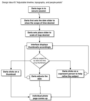
Interaction
Diagram
|