 |
 |
|
Assignment 1 Assignment 2 Assignment 3 Assignment 4 Assignment 5 Assignment 6 Assignment 7 Assignment 8 Assignment 9 Contact Us |
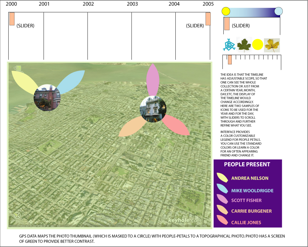
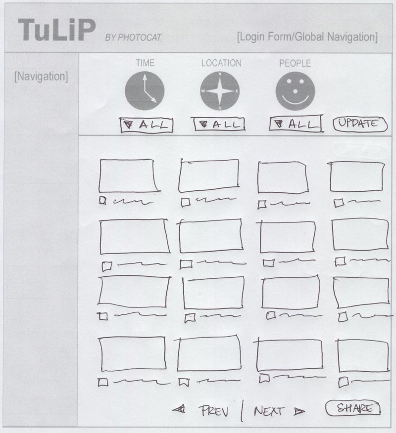
ASSIGNMENT 9: DESIGN EVOLUTION1. Initial Sketches
2. Lo-Fi Prototype
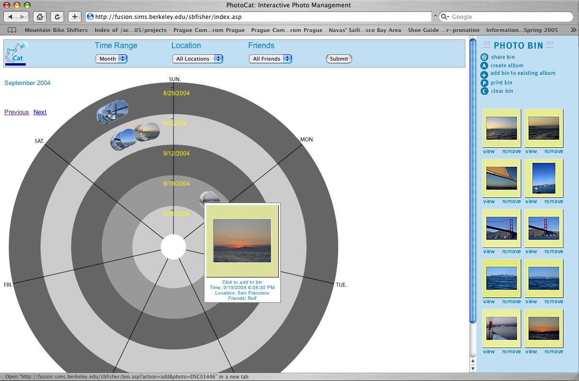
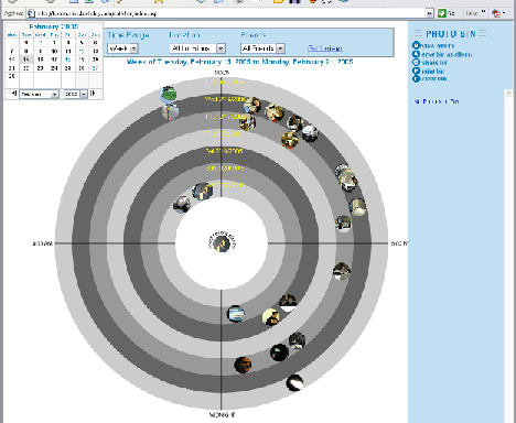
For our paper-based, lo-fi prototype, we chose to pursue the People Petals design with a bull’s eye background. We believed that this design could best communicate the metadata associated with photos. In the bull’s eye, each photo was represented as circular thumbnails surrounded by people petals. To the right of the bull’s eye was a photo bin where users could save photos of interest. Users added to the bin by clicking a circular thumbnail and then clicking a "+" button. Menus on the right side enabled users to filter the photos in the bull’s eye. Users could also use buttons to print, share, or save (as an album) the photos in the photo bin. 3. First Interactive Prototype
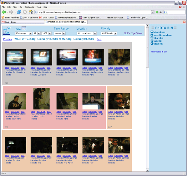
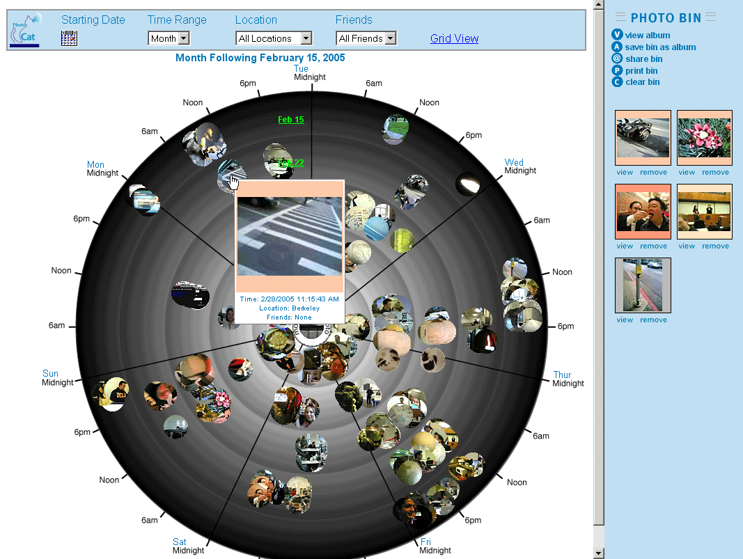
The results of the lo-fi testing showed that users were confused about the relationship between the right-side controls and the bull’s eye. So, in our first interactive prototype, we moved the time, location, and friends controls to a box above the bull’s eye. The photo bin and its controls were moved to the far right. The "+" button was removed. Users wanted to be able to simply click the thumbnails to add photos to the bin. We also added a rollover information area that appeared when the user rolled the mouse over a circular thumbnail. This addressed concerns that the circular thumbnails were too small to see adequately and also allowed more precise display of metadata since exact metadata was difficult for people to determine. The petals were removed from the circular thumbnails, since it was unclear to all the lo-fi testers what the petals represented. 4. Second Interactive Prototype (Post-Heuristic Evaluation)The heuristic evaluation (performed by the Uhle Group) gave us a lot of valuable feedback about our design. One of the Uhle group's recommendations was that we create a more traditional time-ordered view to supplement the bull’s eye. This led us to our building a new "grid view." (Interestingly, this new view was conceptually similar to our initial TuLiP design idea.)
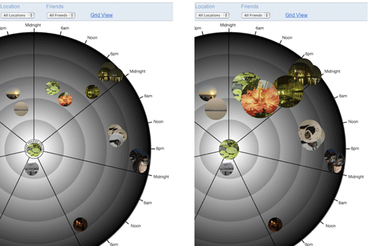
The grid view organizes photos in a reverse chronological order. Location information is indicated by a colored background surrounding the thumbnail. White vertical separators between backgrounds denote changes in dates. The grid view works in tandem with the bull’s eye view. When you switch from one view to the other, the interface remembers your current menu settings. It also retains any photos in the bin. Another key feature added after the heuristic evaluation was the calendar popup for date navigation in the bull's eye. This proved to be a popular feature in the pilot tests. 5. Third Interactive Prototype (Post-Pilot Testing)The pilot tests let us observe "real world" subjects using the PhotoCat prototype. We made several modifications based on the pilot testing results. We added the ability to share directly from the thumbnails in the grid view. Previously, users had to first move the images to the bin before sharing. Subjects found this two-step process to be a waste of time. We removed the static "Click to add to bin" instructions in the bull’s eye rollover, which was misinterpreted to be a clickable hyperlink. We also updated the coloring on the bull's eye so that it ranged from light gray (on the inside) to dark gray (on the outside). Subjects thought the alternating light and dark bands in the previous version held some time-related meaning (which they did not). Two of of the pilot testing subjects tried clicking and dragging from the bull's eye to add to the photo bin. While we were unable to add full drag-and-drop functionality to the final prototype, we did enable users to add photos to the bin by dragging thumbnails anywhere in the bull's eye (not just to the bin). The issues with drag and drop are related to the use of two technologies for the different views and the use of frames. To address the issue of the thumbnails being too crowded on the bull's eye, we created a separate demo in Flash. In the demo, clustered thumbnails dynamically disperse and enlarge when the user rolls the mouse over them. We would want to integrate and test this feature in our prototype if we were to take the project further. (It could potentially replace the mouseover popup feature.)
Most Valuable Evaluation TechniqueWe found heuristic evaluation to be the most valuable evaluation technique for the following reasons:
The second most valuable technique was the lo-fi prototyping. Since this was done in the initial stage of our design, it helped us discover more critical problems than the pilot testing did. The paper prototype was also easier to develop than the interactive prototype, so it had cost-benefit advantages. The pilot testing would've been more valuable if we could have tested more subjects. Three was not enough to yield a convincing data set. Videotaping could have also helped, since it was difficult to observe what the subjects were doing on the laptop screen (compared to with the larger lo-fi prototype). Next: Appendices |

