ASSIGNMENT
4: PROTOTYPE
Overview
Design Development
Prototyping Considerations
Overview
This first stage of interactive paper prototyping
marked a turning point at which we needed to make some critical
design choices. Rounds of sketches had helped to refine our idea
to a certain extent, but it was only at the point when someone other
than ourselves would be using our application that we were able
to make some final decisions about the design of the interface.
For
our prototype development, there were several key points we needed
to consider to produce an effective and usable tool. As lo-fi prototyping
meant to be a very "hands-on" exercise, size was judged
to be the most important consideration. Additionally, we needed
to make the transition between viewing digital pictures on a screen
and viewing printed paper pictures. While the eye can detect more
detail on screen in a smaller space, that did not transfer to a
paper prototype.
TOP
Design
Development
The
opening screen of the interface that appears after user login consists
of several panels: an overview "bullseye" panel that displays
a browsable view of the photo collection; a "Photo Bin"
that displays larger thumbnails that can be shared and organized;
an "Actions" panel that includes commands that act on
the photos in the bin; and a series of drop-down menus that allow
the user to filter the collection in the overview panel.
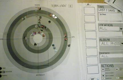
The
Bullseye View
Our preview display has focused on the idea of combining
temporal, spatial, and social metadata using position, opacity,
and color along a chart of concentric circles. This idea takes its
inspiration from medieval astronomical charts and primitive Christian
calendars. At the center of the "bullseye" is the relative
starting point—the initial point in time, space, and social
space. Our default view is the last 7 days. In this view, the bullseye
is the current time at which the user logs in, and the circles represent
each day as a band counting backwards in time as the circles expand
from the center to the outside.
Prior to the prototyping phase, the notion was to align the photos
on top of each ring in the circular chart. However, after some consideration,
we modified the design. Using grayscale gradation, the space between
each ring has been shaded, effectively creating a "band"
instead of a "ring." Now, units of time can be measured
as the space within each band, and photos can be positioned in this
space as opposed to along the rings. The greatest gain is that this
allows for more photos to be displayed for each unit of time, which
is especially helpful for the smaller, inner bands. Building on
this notion, we established the idea of “dynamic bands,”
another device that would help enhance the amount of available screen
space in time-intensive displays such as the 1 year / 12 month view.
Dynamic bands would resize the width of each band on the display
in accordance with the amount of photos from that unit of time:
if one day contained many photos while another day contained very
few, band width would resize algorithmically to account for the
asymmetry, resulting in a less cluttered, more readable display.
The overview also includes a legend that defines what the panel
is showing the viewer; ie, concentric circles = time; opacity =
location; colored petals = friends.
There is also a "+" button in the upper right hand corner.
To add photos to the bin from the overview display, users can either
double click for an automatic transfer to the bin, or click once
and then hit the
"+" button to transfer them
into the bin.
Spatial metadata is represented in the overview window using opacity.
The default view is to display all locations--in which case, all
photos are displayed at 100% opacity. When a user specifies a particular
city, all photos not from that city are set to 50% opacity. When
the user grows the range beyond that city, corresponding photos
within that range revert to 100% opacity.
Social metadata is displayed using our "people petals"
concept: a small, color-coded, half-circle is displayed around the
circular perimeter of each photo. Corresponding Bluetooth co-presents
and user-input others are shown in this way and accessible through
the "Friends" drop-down menu.
Drop-Down
Menus
Drop-down
menus allow the user to specify the range of temporal, spatial,
and social metadata. Menu choices are all preset and system defined,
not user entered. "Set Range" dynamic tabs under the time
and location menus allow advanced users to specify a range within
a particular temporal or spatial view.
Temporal
choices include:
- Last
7 days
- Last
30 days
- Last
4 months
- Last
12 months
- Last
5 years
- Last
10 years
Spatial
menu options are defined at a city, state level. The default view
is set to “All.” The user may choose to view one city
at a time from the drop-down menu. A “Grow Range” dynamic
tab allows advanced options to grow the range within a mile radius
around a particular city.
Social metadata is represented as "Friends." Rather than
have all co-present Bluetooth persons displayed on the default screen,
"Friends" are defined on a separate screen. Only the Bluetooth
co-presents that a user wants to see can then be specified prior
to browsing the photo collection. In addition, colors can be customized
(Mom can be set to red). People who are not Bluetooth users can
be assigned a color manually by the user. Then, when viewing the
details of an individual photo, it is possible for users to specify
that a non-Bluetooth user is in or related to this photo. This information
is then displayed in the overview panel.
The Album drop-down menu represents user input data and provides
a filter to view user-defined groups. The generic term "album"
was chosen to avoid trying to delineate between events, subjects,
and titles—all criteria that our interviewees said they use
to describe their photo collections. When defining an album, he
user is free to choose a term that best fits the photos in question.
Users can act upon photos in the "Photo Bin" using a set
of commands. The commands include:
Remove
selection (removes highlighted photo from bin)
Clear
bin (removes all photos from bin)
Create
album (creates new album using all photos in bin, creates new
pop-up screen)
Add
to album (adds photos in bin to existing album, specified in drop-down
menu)
Share
bin (provides for email sharing of all photos in bin as one "batch")
Print
bin (prints all photos in bin)
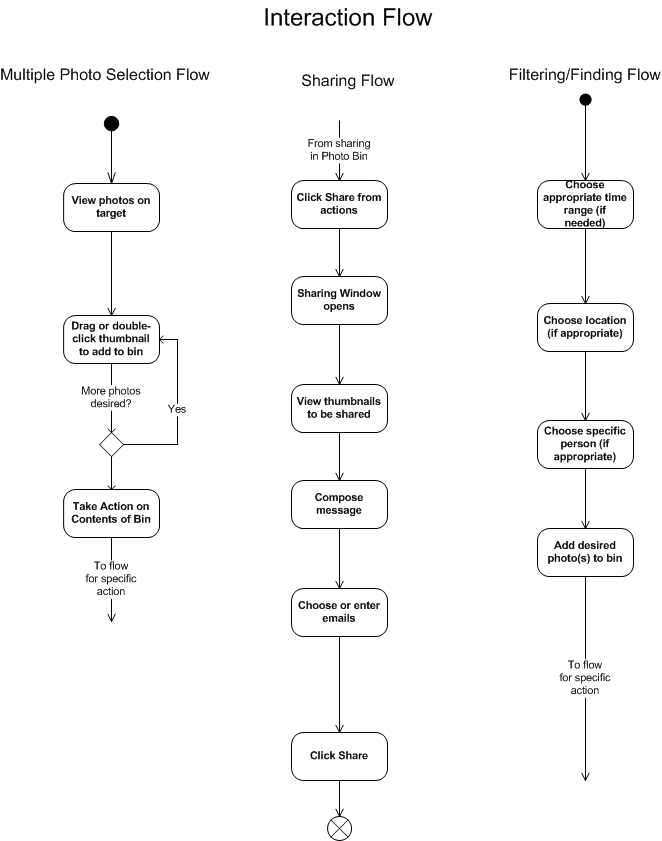
 Task
Flow Task
Flow
The main tasks for the interface included choosing
multiple photos by viewing them on the target, sharing photos with
others, and filtering and finding photos in order ot take some action
on them.
Most of the functionality has been described above in the previous
sections and the overall flow for these tasks seems fairly simple
and straightforward. The photo on the right reveals the general
anticipated task flow for completeing tasks using the target, Photo
Bin and filters.
TOP
Prototyping
Considerations
The
final prototype measured approximately 36" W x 20" H. This size
was arrived at based on the constraints of the circular paper thumbnails.
In our on-screen mockups, our thumbnails measure 35 pixels in diameter.
This size, while viewable on screen, did not transfer well to a
paper print environment. We decided upon a 150% enlargement—50
pixels in diameter—as a readable size for the printed circular
thumbnails.
From
there, we scaled the interface accordingly. We wanted an opportunity
to attempt a display using our "dynamic band" idea which would allow
photos on one band to be stacked two deep, in two rows. Our measurements
to accommodate this display resulted in a "bullseye" that was 20"
W x 20" H. Drop-down menus and the photo bin were then produced
to scale.
TOP
Next:
Methods and Measures |
