 |
 |
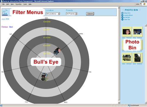
ASSIGNMENT 5: INTERACTIVE PROTOTYPE OVERVIEWView Interactive Prototype (opens in a new window) The implementation of PhotoCat proved to be time consuming and difficult because of its interface choices. We focused on getting the bull’s eye and photo bin functioning correctly since the other options directly depend on them for usage of the application. We concentrated on getting the photos to display correctly on the three most essential bull’s eye views (month, week and day), getting the filters to function correctly, and getting the photo bin to function correctly to ensure that people can aggregate the desired photos for further actions. (The screen shot below shots the layout of the main interface. For more screen shots and information about functionality, see the Screen Shots and Walkthrough section.)
Many of the peripheral action screens (sharing, printing, creating albums) imitate the real functionality. They express the basic functionality without full implementation. They show the flow of use and generally terminate at the end of a process without taking the real action such as emailing friends to notify them of shares. To get a realistic idea of how the interface works, we needed a larger collection of photos than was available on our paper prototype and much more realistic photo distributions and responsive filtering options. The photo collection size was very limited in our paper prototype because we had between 30 and 50 photos—only some of which might appear at a specific time. The small size was necessary because of the time-consuming nature of creating thumbnails and other items by hand. The small size was also necessary for the human computer to operate on the collection. Our interviewees, after some minimal navigation, often just looked and immediately spotted the photos needed to complete a task scenario. The interface couldn’t be tested thoroughly since most interviewees spotted target photos unrealistically quickly because of the small collection size. Creating mock-ups or using simple "Wizard of Oz" techniques for the basic functionality proved difficult because of the large number of possibilities and interactions between all the controls and the need to have a larger and more realistic collection. We needed to create some real interaction since simulating the kind of interaction we were interested in is difficult. We also wanted to use realistic photo metadata. We know that real photos are often taken in a "bursty" way. TECHNOLOGIES USED We had to use a variety of tools to do what we needed. Most of the tools we used were decided based on our needs and by the group members’ knowledge of the tools.
Overall the technologies we used allowed us to complete our main goals. At the same time, using so many different technologies made their integration more difficult than with a smaller number of technologies. CHANGES IMPLEMENTED BASED ON LO-FI PROTOTYPE AND FEEDBACK
1. There needed to be a stronger mapping between the filter menus and the bull's eye view. We moved the menus above the bull's eye and away from the Photo Bin in the interactive prototype. 2. Users did not understand the mapping between the Actions section of the screen and the Photo Bin. There needed to be a stronger mapping between those as well. We put the Actions and Photo Bin in a single box with a blue background to connect them. 3. Participants thought that the petals signified who the picture was shared with. We got rid of the petals around the thumbnails to make our interface less complicated. 4. All of the users expected albums to show up in a separate album view. We've added a popup album view feature (although it isn't fully functional in the interactive prototype). 5. Users assumed that some elements of the bull's eye view were clickable, and that clicking them would allow them to filter the photos in the collection. We've added clickable links within the bull's eye that allow users to change the time range. We've also added an effect that displays a larger popup image (with metadata details) when the user mouses over a circular thumbnail. This improves usability when photos are close together in the bull's eye, or when the content in the circular thumbnail is hard to distinguish.
|

