 |
 |
ASSIGNMENT 8: PILOT USABILITY STUDYIntroduction
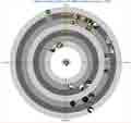
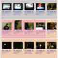
The PhotoCat photo management system aims to leverage the point-of-capture metadata that can be automatically collected by new mobile photo-taking devices. Specifically, PhotoCat focuses on time, location and friend (co-presence) information. The current PhotoCat system has two alternate interfaces for accessing photos and their associated metadata. The bull’s eye view has circular bands that represent units of time. Small thumbnail images appear on the bull’s eye according to the time in which the photos were taken. The circular representation of time is much like that of analog clocks. The bull’s eye interface clusters photos in time ranges together as part of its basic metaphor. The other interface is a grid view in which photos are listed in reverse chronological order in a grid-like layout. The grid view shows the photos in a more conventional way and allows browsing by larger-sized thumbnails since there are fewer space constraints (compared to the bull's eye view). The two interfaces have similarities. Location is represented by different background colors behind the thumbnails (or in the roll-over images) in both. Both interfaces also allow the user to choose a start date and date range, and filter by location or friends (co-presence). A goal of our testing was to find out how the two interfaces compare to each other in usefulness, task response time, and user preference. Toward that end, we made both interfaces available and allowed users to switch freely between both views. A secondary goal was to evaluate how interview subjects used the "bin" and its associated actions. We want to ensure that its photo selection and aggregation properties make sense and are useful. We also wanted to ensure that the actions associated with the bin were useful and made sense. You
can access the current PhotoCat prototype here.
|

