ASSIGNMENT
6: HEURISTIC EVALUATION OF UHLE
PROJECT
 Initial
Impressions Initial
Impressions
UHLE seems like
an extremely valuable search-and-retrieval tool for a field where
efficient access to information is so important. It seems like UHLE
will meet many needs of both trained archaeologists (like those
in your personas) who need an effective way to navigate complex
sets of data and the general public who’d be interested in
browsing information about historical artifacts.
We like the
different methods by which users can access the collection: via
a keyword search, an interactive map, or a hierarchical set of facets.
It seems like different users will come to the system with different
search-and-retrieval criteria, and having multiple pathways for
exploring is convenient.
The map feature
you describe (but have not yet implemented) is intriguing. Being
able to easily view and explore the spatial relationships between
different artifacts seems like a cool tool for archaeologists.
Heuristic
Evaluation
1.
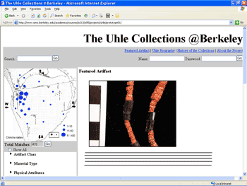
[H1 Visibility] (Severity 2)
I have a laptop running 1024x768, and the choices below “Material
Type” are below the fold. Perhaps you could merge the “Uhle”
title area with the navigation bar to get rid of the space on the
upper left and bring the content up a little more on the page.
2.
[H7 Flexibility] (Severity 2)
In my browser interface, the links on the upper right seemed too
close to the search radio buttons (that are displayed post-search).
You might want to move the links up to the white space with the
title.
3.
[H7 Flexibility] (Severity 3)
The gray background combines three forms with three different “Go”
buttons. Does “Search” go with the map, or is it a more
global tool like the other items up top (site navigation_? You could
answer that by keeping “Search” with the map’s
background or with the nav bar background.
4.
[H10 Documentation] (Severity 2)
The legend in the corner of the map is unclear. 1-10 what? I’m
guessing this means the number of artifacts. A label would be nice.
5.
[H1 Visibility] (Severity 3)
Does “Show All” open up all the hierarchical menus?
Or does it check all of the menus, so that clicking “Go”
will then show all artifacts? Or, is it a fast way to uncheck all
the checkboxes in the facets below? The Show All checkbox presumably
makes the interface ignore any selection that has taken place in
the faceted metadata area. The checkbox isn’t the most appropriate
control and it does not make the consequences of selecting it very
clear. The Show All button and the faceted metadata node checkboxes
may both be selected at the same time (in seeming conflict). Two
radio buttons may be more appropriate here with two choices: one
to show everything and one to select metadata. When Show All is
selected the metadata area should reflect the state of not being
used by being deactivated.
6.
[H1 Visibility] (Severity 3)
How does “Total Matches” field relate to the map above
it? Does it relate to the map, to the facets below, or both? If
the facets and the map are distinct tools and the “Total Matches”
field pertains to one of them, this should be communicated somehow.
7.
[H6 Recognition] (Severity 2)
When I open the home page, I’m a little unsure of where to
start. It might be nice to give the first-time visitor a clear pointer
as to what to do first (Click on the map? Type a search keyword?).
8.
[H6 Recognition] (Severity 3)
In the featured artifact display, it might be nice to include the
top breadcrumb links so people can explore the areas under which
the featured artifact is classified. Those links would also give
users clues about how the collection is organized and how to explore
the collection.
9. [H1 User Control] (Severity 2)
It would be nice to have a “Close All” button by the
facets that would close all the menus at once to make the interface
uncluttered. Or maybe you could call the button “Reset,”
and it would uncheck everything as well.
10.
[H1 Visibility of system status] (Severity 2)
The interface displays a Name and Password log in area under the
navigation links for the site. Right now the interactive prototype
acts as though people are logged in. It is probably more appropriate
to provide status such as “logged in” or showing the
username of the person logged in such as gMail does. Because of
the form and no log-in status someone using the system might be
uncertain of their log in status.
11.
[H2 Match between system and the real world] (Severity 1)
Most people will understand what the log in is asking for with Name
and Password. It may be more appropriately called Username since
name suggest that someone type their name rather than a username
or login. Most sites I’ve seen ask for a Username instead.
12.
[H10 Help and Documentation] (Severity 4)
There is no help visible for the system anywhere. For the most part,
the system is reasonably straightforward to use, though.
13.
[H4 Consistency and standards] (Severity 3)
The display of matches when selecting the faceted metadata seems
to show things in a strange way. It has Total Matches followed by
what appears to be a disabled text box that shows the number of
matches. Also as part of the problem, the Go button directly follows
the disabled text box. This part of the display seems like a data
entry form with a textbox and a Go button right beside it. As suggested
in the GUI Bloopers book, textboxes should be used to enter data
and not as display devices. Also the Go button probably goes with
the list of faceted metadata in the list below, yet it appears next
to the results. Moving the text box inside of the faceted metadata
selection area would make its relation more obvious if this is what
the Go is referring to.
14.
[H7 Flexibility and efficiency of use or H4 Consistency and standards]
(Severity 3)
The expanding lists of metadata items have different behaviors on
different items. Sometimes the expanding lists expand by clicking
either the side-arrows next to them or the text of the item. Sometimes
they only expand when the text of the item is clicked. Many people
who click these expanding lists will expect the list to expand as
they click the side-arrow icon that indicates a closed portion of
a list. The same goes for folding them back up by clicking the down
arrow icon.
15.
[H4 Consistency and Standards, H5 Error prevention] (Severity 4)
The search options for Within search results and new search do not
operate correctly as radio buttons normally do. Both may be selected
at the same time. It also makes the state unclear and it’s
unclear which type of search is being performed when both are selected
and cannot be deselected. Also, it’s often traditional to
place a Go or Submit button after all the form fields related to
it (such as after these two options).
16.
[H5 Error Prevention and H6 Recognition rather than recall] (Severity
3)
In both the search results and the details screen there is a Remove
link next to either the search or the facets. It was unclear what
this does in the details screen in which it is shown next to the
facets. Does this indicate that any user may remove this object
from this facet? Or does this indicate that the user is no longer
interested in limiting by this item? Or does this indicate that
the facet is being removed? If the use is unclear then it may cause
errors or people will need to remember what the items does because
of the ambiguity. Maybe this is unclear because I don’t know
some tidbit about archeology.
17.
[H1 Visibility of system status and H2 Match between system and
the real world] (Severity 2)
The thumbnails screen shows small thumbnails of each item with its
collection/item number underneath as a caption. Does this small
caption present the most useful information in the available space?
I’m not sure what piece of information your target users will
want to see the most with each thumbnail since there is limited
space. I suspect that a collection number might not be the most
useful. It might be useful, however, since this is a specialized
application and perhaps this number is of great significance to
archeologists. I know in everyday life, most people do not want
to see the item number of an item when they are shopping. They would
rather see its name or description.
18.
[H8 Aesthetic and Minimalist Design](Severity 2)
If
users are required to login before they can view any of the elements
in the collection creating a separate login page might make sense.
Would remove the login from the main screen.
19.
[H1 Visibility of System Status](Severity 2)
Seems like if you are giving “Total Matches” a dynamic
changing value it might be good to show the factors that are changing
the values.
20.
[H7 Flexibility and Efficiency of Use] (Severity 2)
The numbers of “Total Matches” should be updated as
a user moves through the entire hierarchy not just when they click
the check box. Or, if this approach isn’t taken, this aspect
of the system should be re-examined: total matches for each category,
or something like that.
21.
[H3 User Control and Freedom] (Severity 3)
Map should be click-able for those users who want to navigate to
a specific site quickly without having to use the drop downs.
22.
[H7 User Control and Freedom] (Severity 3)
In scenario 3 the user was supposed to print results. But the results
in both text and photos view are broken up six per page. User should
be able to define the number of elements per page. User should be
able to define number of element on a page so printing is a feasible
option.
23.
[H2 Match between system and Real World] (Severity 2)
In the interview data you mention that a user suggested the text
view, perhaps there are more fields that can be displayed? Also
might be useful to sort by terms. This doesn’t really have
much more data than the photo view.
24.
[H7 Recognition Rather than Recall] (Severity 2)
Should be able to see the textual data in the grid view with the
images of the artifact, so the user doesn’t have to remember
the artifact number.
25.
[H7 Flexibility and Efficiency of Use] (Severity 2)
Should highlight the location(s) on the map that have been selected
when viewing searches.
26.
[H8 Aesthetic and Minimalist Design] (Severity 3)
On the search results page there is a bread crumb trail that has
a ‘remove’ at the end seems like clicking one of the
links would move back without needing remove. Now we understand
this function but the remove is very confusing.
27.
[H2 Consistency and Standards] (Severity 3)
If the << and >> arrows are going to be used on the
search result pages (photo, text) there should be << >>
on the single image page to allow a user to move through the images/data
without having to go back to the results.
28.
[H2 Match between system and the real world] (Severity rating 3)
I understand that the map is going to be developed with a pre-existing
map tool, but I think it lacks enough information to really represent
the data. The size of the blue dots is understood, but I don’t
think enough geographic information is offered. I would suggest
rollovers or tool-tips…maybe give longitude/latitude or other
info when a blue dot is touched? I don’t think that cardinal
directions are enough information about the map. I would even suggest
that since the map shows a detailed area, it map as an inset to
a larger map, placing it in context to its relative geographic location.
29.
H7 Flexibility and efficiency of use] (Severity 3)
I desperately want to ‘touch’ the blue dots on the map
and have them bring up some data. Because the map is located directly
over a navigational system, it comes off looking like a “driver,”
or an area that allows you to input and control output. The blue
dots evoke a sense of interactivity to me and I’m disappointed
that I cannot click on them.
30.
H7 Flexibility and efficiency of use] (Severity 3)
There is something I don’t like about the position of the
“views/thumbnails/text only” menu. Being at the far
right of the screen, it’s a very inactivated area of the screen.
The eye doesn’t often go there. Also, how do I know that that
is an option before beginning my search? Why does it only pop up
after search results are produced? I think this fact is more significant
than screen positioning. I would suggest to make this option visible
from the first screen so the user can know what the options are
before starting out. In turn, I would move it in to the upper left
/ left portion of the screen where it will be more active and more
visible.
31.
[H7 Flexibility and efficiency of use] (Severity 2)
W hat are my options for search? I think that the search mechanism
needs to be either more documented/annotated or perhaps enhanced.
Are there options? Is it all the same? Would it help your audience
to have a more refined search, or a short blurb that explains how
searching works? Either add more controls or a label: do I enter
a tribe, an area, a keyword, or what?
32.
[H8 Aesthetic and minimalist design] (Severity 4)
Because it isn’t implemented yet, it’s hard to know
how this will work and look, but I caution against how the “constant”
links at the top will work with the navigation on the left and the
“display” space. I would not want to click “uhle
biography” or “history of the collection” and
still see the map/options on the left, unless they were relevant
in some way—could the map reflect data about the history of
the collection and be interactive? Otherwise, be careful how this
info gets displayed. I’m also not clear as to why these links
need to be constants at the top, seen throughout all search screens,
etc.—are they really that relevant?
TOP
|