|
Assignment #9
Problem Statement
Solution Overview
Personas and Scenarios
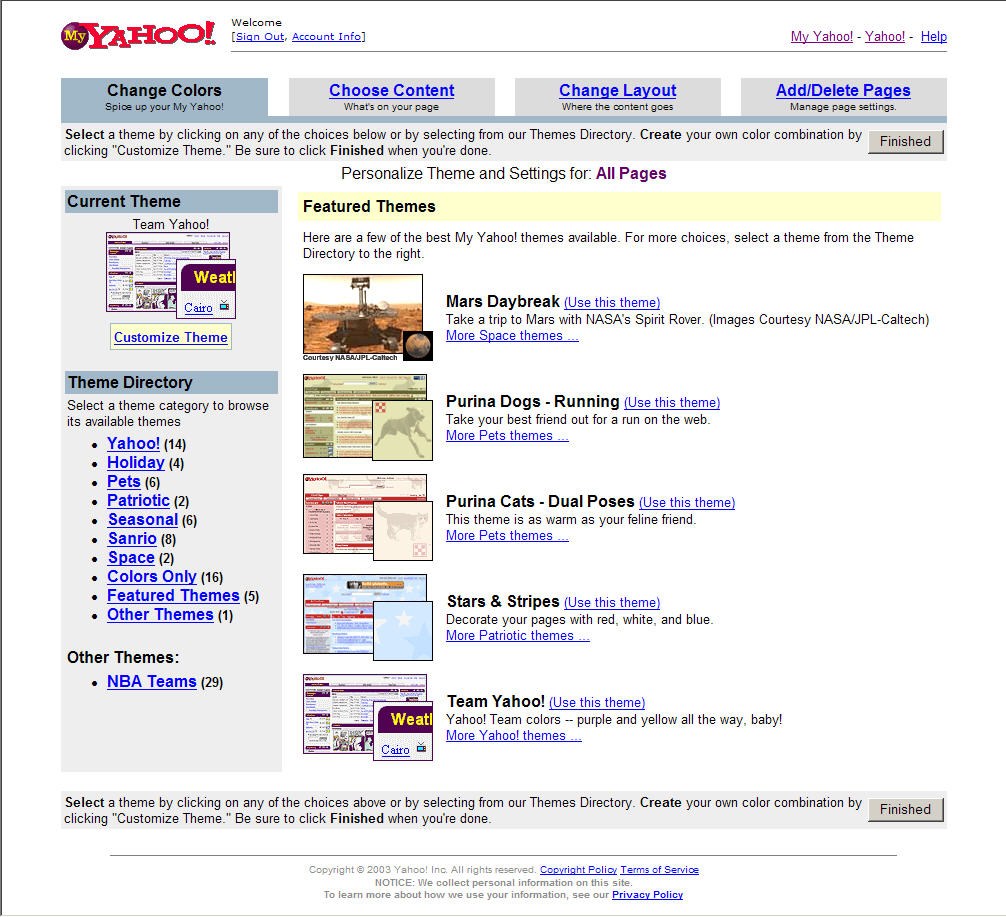
Final Interface Design
Design Evolution
Class Presentation
Problem
Statement
Our team is a developing a tool that will allow students to
customize their access to academic information at SIMS. Currently,
many user communities - students, faculty, prospective students,
potential employers,
and the general public, utilize the public and password protected
web interfaces to access information on the SIMS web site. While
the site contains a wealth
of information, much of the power is lost because individuals
cannot navigate or customize the contents to meet their needs.
In the absence of these capabilities,
people create methods for tracking relevant academic information,
such as course web site locations and graduation requirements,
outside of the SIMS
infrastructure. These personalized methods make it difficult
to assess the resources students utilize during their academic
career. If more standardized
ways of subscribing to information flows existed, students' use
patterns could help establish a dialogue between those who utilize
SIMS' academic
resources and those who provide them. We see utilizing a different
interface model as a starting point for addressing these issues.
Solution
Overview
We have designed a tool, called MySIMS, that will allow students to
customize their access to academic information at SIMS. It follows the
web portal metaphor and would be used instead of the current SIMS or
Cardea site (e.g. students would be presented with the MySIMS portal
instead of the current UIs). The first time a user logs on they would
be presented with a Welcome page. From here the user can decide to
customize their instance or start using MySIMS directly. All users will
be presented with four tabs - Home, Course, UCB, and News. Individuals
who selected interests during the customization process will have a fifth
tab - Interests. Common across all tabs are common navigational links to
MySIMS, Preferences, Help, and Log Out. MySIMS is written in HTML.
Personas
and Scenarios
Personas
At the start of this project, we interviewed five SIMS students
- two first-year and three second-year Masters’ students. All
of our interviewees expressed a need for a centralized place
to manage academic requirements and deadlines. One
of the first-year students was so ardent about all forms of
electronic information that he placed his “whole life
is online”. He did so to allow others to quickly find
and communicate with him. It was due to this interview, as
well as informal conversations with a similar student, that
we developed our persona, Thomas N. Gibson. The insight we
gained from the second first-year and two second-years led
to the development of our second persona, Clara Filo. All of
them were interested in receiving information electronically
but only access sources they can get to quickly
and easily. The
second-years were interested in HCI and focused on the design
and layout of resources. The third second-year student
differed from our other interviewees. She tended to
memorize assignment due dates, would hear about changes
to the schedule either in class or from classmates, and preferred
course readings in printed format. We found it interesting
that her preferences for managing
information were not a reflection of her comfort with technology.
She was adept with a number of online tools to access and classify
information; however she did not see the need to use any electronic
gadget or site to manage her academic pursuits at SIMS or related
interests. Her comments helped us to develop our
third persona, Isaac Einstein.
| Thomas
N. Gibson:
Information Addict |
|
 Thomas' entire
life is can be found online Thomas' entire
life is can be found online
Thomas is 27 years-old.
He grew up in Silicon Valley. His dad, Steve, was one of the
original employees at Apple. He worked there for a number of
years before founding a successful software company. Thomas admires
his dad and hopes to start his own company someday. After earning
a BS in Computer Science from Stanford, Thomas went to work at
Wired Digital.
Thomas was the go-to-guy for anything perl or PHP related and managed
Wired's online communities. In his spare time he supports his gadget
habit by doing as much web work as he can get, uses open source
tools, and spends way too many hours reading news feeds from people
and information providers he trusts. His blog helps him keep-in-touch
with friends. They put pressure on each other to have their sites
current, so he uses scripts to make automatic updates.
He believes it takes an understanding of both business and technical
concepts to run a company. Because he plans to be a CEO by the
time he is 30, Thomas applied to graduate school. He chose SIMS
because his interests change quickly, and SIMS seemed to be one
of the broadest and most forward thinking schools. At the start
of the semester, he used the SIMS web site. to research courses.
After that, he simply added links to cardea, MySims, Telebears,
and the library to his site. Doing so meant he missed out on announcements
posted on the SIMS homepage.
Goals:
 Use open source technologies for as many
parts of his life as possible Use open source technologies for as many
parts of his life as possible
Add new feeds to his reader without having to break the
flow of his current activities
Identify information
by specific people, groups, and publishing organizations he respects
|
| Clara
Filo: Information as an Enhancement |
|
 Clara's interests
are diverse and many. Clara's interests
are diverse and many.
Clara is 29 years old. She grew up in San Mateo and went to UC Berkeley for her undergraduate degree. She majored in Economics but wanted to do something more creative when she graduated. She had some friends in Computer Science and Communications, so she took a few classes in their departments and started to learn HTML before graduating.
Clara worked as a Media Planner in a San Francisco-based ad agency.
On one account, she teamed-up with members of the Creative department.
She was inspired to take another HTML course and a Java class at
UC Berkeley Extension. After losing a few big accounts, Clara's
agency closed its doors. She thought about joining another firm,
but she wanted to find a more stable field. Uncertain what to do
next, Clara researched graduate programs at Berkeley. She wanted
to be near her friends and family and found the diverse aspects
of SIMS appealing. But, she was apprehensive. Clara did not want
to be the only one without a CS undergrad or feel overwhelmed.
She read everything about the school, courses, and jobs people
had beforehand. She emailed a few students. Their responses made
her feel comfortable, and she applied.
After completing her first year of coursework,
Clara had yet to identify a specialty. She found HCI, document
engineering, and
multimedia fascinating. She thought the degree tracks might help
her to focus her interests, but she heard a number of the classes
weren't being offered. She spent some time online researching each
area and realized how important it is to keep up with certain groups
on campus. She has great ideas for using all of the information
she's found at SIMS, if only she had the time to pull all of the
resources together. Then again, Clara lives a hectic life and rarely
has the time to do more than make bookmarks for her class web sites
Goals:
Keep-in-the-know about general topics of interest
Use her SIMS web site. to reflect her individuality
Access course web sites quickly,
frequently, and easily
|
Scenarios
In order to raise questions regarding the design of our user
interface as early in the development process as possible and to
allow for more task-oriented user testing of our prototype, we initially
developed complete task scenarios.
The scenarios followed the guidelines outlined in "User and
Task Analysis for Interface Design" by Hackos & Redish as
well as the descriptive nature Jakob Nielsen prescribes in "Usability
Engineering". The revised
scenarios do not include as much detail and represent vignettes.
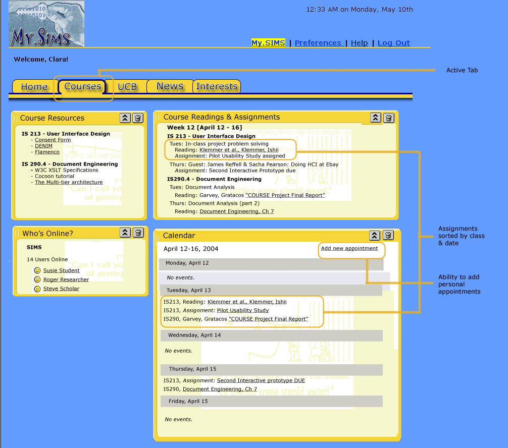
Final
Interface Design
Description of the Functionality
The main aspects of the user interface fall into the following
categories:.
- Setup: We envision our prototype to take the
place of the current SIMS
or Cardea site. Students would be presented with the MySIMS
portal instead of the current UIs. In the upper right-hand
corner, areas for entering User Name and Password details are
provided. Until the user logons, default (not personalized) content
would be presented in each tab.
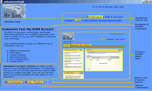
- Welcome Page: The first time users logon to
MySIMS, they will be presented with a Welcome
Page. It explains MySIMS as well as introduces terminology
- such as content channels. To set the context for their interaction
with the portal, the Welcome
Page
also
includes a screen shot of the MySIMS portal. Users
can choose to customize their instance of MySIMS by selecting
the "Customize" button at the bottom of the screen.
Students who want to use the default instance of MySIMS can select
a button labeled "No Thanks". Also security notice
highlights the importance of logging off.
- My Profile Page:
The information provided on the My
Profile page
is used to
personalize
the contents of the Home, Courses, News, and Interests tabs.
The page contains three sections. The Personal Information section
allows
students
to review their name and email
address. These details are pre-populated due to MySIMS integration
with SIMS administrative system. They can also
provide an instant
messenger
ID, phone numbers, and URL. In the Course Details section
students courses are listed. They are populated from SIMS course
registration system. Students can add courses they are interested
in as well. This functionality allows students who are auditing
or simply interested in a course to monitor it on their MySIMS
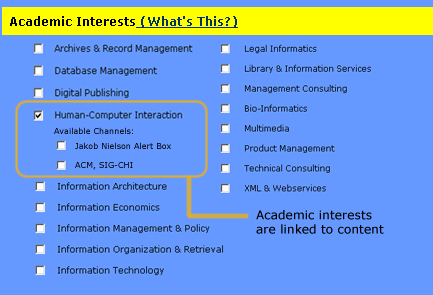
portal. The Academic Interests section gives students the ability
to check off interests and select related content channels. If
students select some channels, an Interests tab will be added
to their instance of MySIMS. Students who do not choose to customize
MySIMS or do not indicate any channels in the Academic Interests
section will not have an Interests tab. Save
and
Cancel
buttons
are
provided
to allow
students
to Save their
entries
or exit the MySIMS set-up process.
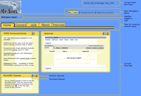
- MySIMS Portal - Tabs, Content Channels, and QuickLinks:
For each student, the initial
MySIMS set-up contains some common navigational elements. They
are the MySIMS logo, login area, four tabs,
and a series of "QuickLinks".
Clicking on the MySIMS logo returns the user to their Home tab.
The login area contains text fields for entering username and
password details. The QuickLinks are hyperlinks which, when clicked,
take the user directly to the following part of MySIMS: Help (goes
to MySIMS help pages), Logout (logs the user out of MySIMS),
and Preferences (presents
options which allow the user to customize their instance
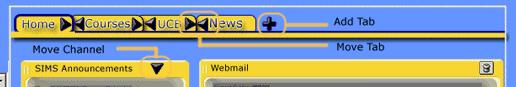
of MySIMS). Initially each student is presented with the Home,
Courses, UCB, and News tabs. Clicking on a tab's label brings
the selected
tab into view.
- Home Tab: Until users add
or remove content, their Home tab contains channels
general interest channels - Portal Tutorial, Weather, Bookmarks,
Search, Directory, SIMS Announcements and Email.
- Courses Tab: The Courses tab
contains a Course Information channel which presents the student's
current
course list. The Readings
& Assignments channel displays work for the week. The
Course Resources channel displays links to supplementary resources.
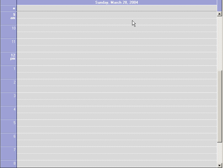
A Calendar
channel
gives students
the ability to view their activities (personal as well as course
related) for a
selected timeframe (day, week, month, and year).
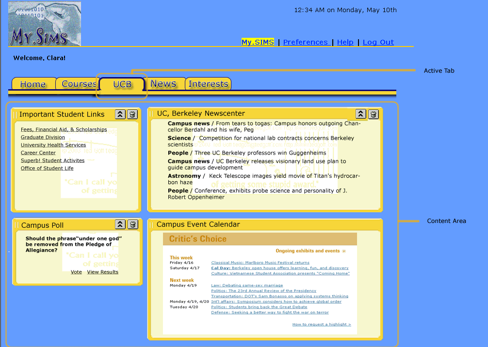
- UCB Tab: Because all students are impacted
by UC-wide mandates, the UCB
Tab includes content channels focusing on campus-wide news,
events, and information. For example content channels focusing
on Important Student Links, Campus Polls, Campus Map, Academics,
Explore Berkeley Web, Campus News, and Upcoming Campus Events
are included on the UCB Tab.
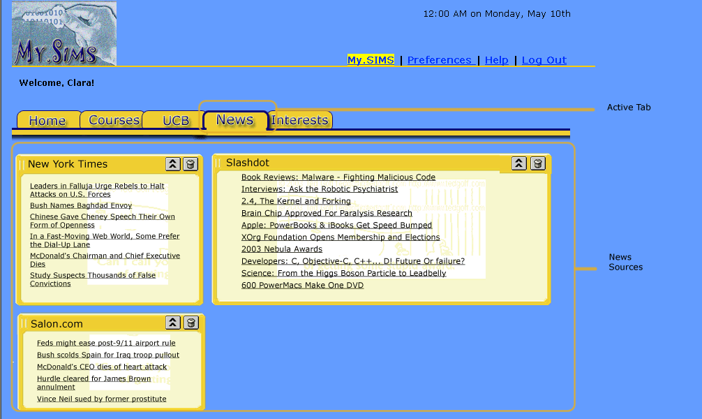
- News Tab: Until they make changes within
the Preferences area, the content channels on the News
Tab are
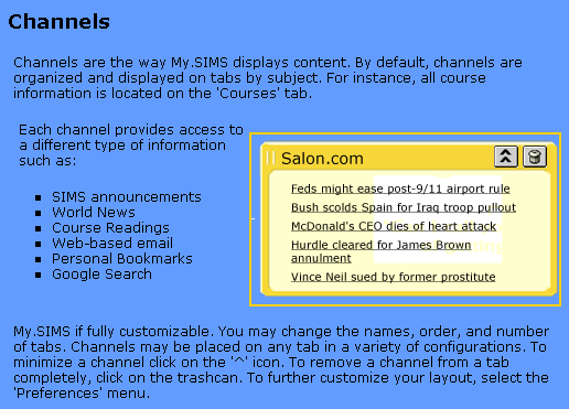
set by default to New York Times, Salon.com, and Slashdot.
After clicking on a story within one of the channels,
students can use the Email Story link to
send the story to a friend or themselves.
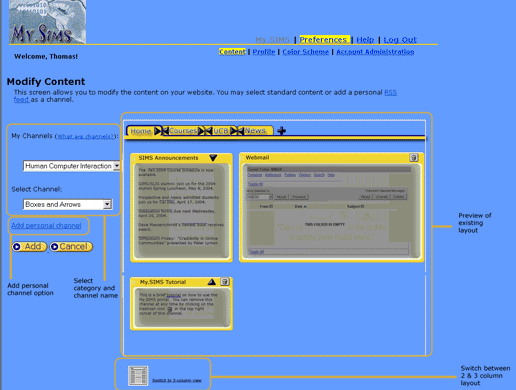
- Preferences: After clicking on the Preferences
QuickLink, the student is presented with the Preferences page.
It includes four secondary navigation links - Content, Color
Scheme, Profile, and Account Administration.
From the Content link students can click on a tab. Doing so,
causes an "interactive" preview
to be presented as well drop down menus labeled Select Category
and Select Channel. The contents in the Select Channel drop down
are based on the item the student chose in the Select Category
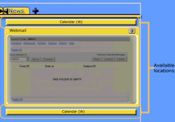
drop down. After selecting a channel, images of the channel's
title bar appear in the available locations. The student
is
directed
to select
their desired
location
on the
preview. After making their selection, the student
can click the Save button or exit out of the
process by clicking
the
Cancel button.
Also an Add Custom Channel link is included. It allows students
to incorporate channels beyond the standard ones provided
within MySIMS.
Interaction Flow
The following scenarios highlight the desired interaction
flow. Since all the tabs include the same functionality, the
scenarios outlined below highlight the most important aspects
- as indicated by our user interviews and usability tests.
Setup
Initial Content
- Description: This is the first time
you are using MySIMS. After logging-in, you are presented with
a welcome screen. You agree to customize your instance of MySIMS.
Ensure your existing demographic details and course information
is correct. You are interested in HCI and Product / Project
Management. Save your customizations.
- Steps:
- Step 1: Login
- Step 2: Choose to Customize
- Step 3: Enter Profile Information
- Step 4: Review Interests Tab
- Step 5: Logout
Print course readings
- Description: You are taking IS213 and
an XML class. You forgot to print this week’s readings
and need to access them from the syllabus.
- Steps:
- Step 1: Login
- Step 2: Choose Not to Customize
- Step 3: Navigate to Courses Tab
- Step 4: Print Usability Assignment & XML Reading
for Tuesday
- Step 5: Logout
Add the Calendar channel
to your Home tab
- Description: You are interested in
tracking your assignments via MySIMS. In order to do so, you
need to add the Calendar channel. For quick viewing,
you decide to add it to your Home tab.
- Steps:
- Step 1: Login
- Step 2: Navigate to Preferences Menu
- Step 3: Select Channel to Add
- Step 4: Select Location for Channel
- Step 5: Confirm Location of Channel
- Step 6: Validate Channel is Added
- Step 7: Logout
What Was Left Unimplemented
The final iteration of our interactive prototype does not
include the following items.
- Tabs: Interactive aspects
of some of the content channels have not been built
out. For example on the Courses
tab the only calendar view being provided on the
Calendar channel is for the week. We envision the
user being able to choose between other options, such as day, month,
and year. Also
on the News Tab, we envision the model we outlined in our Low-Fi
prototype being used to email a story.
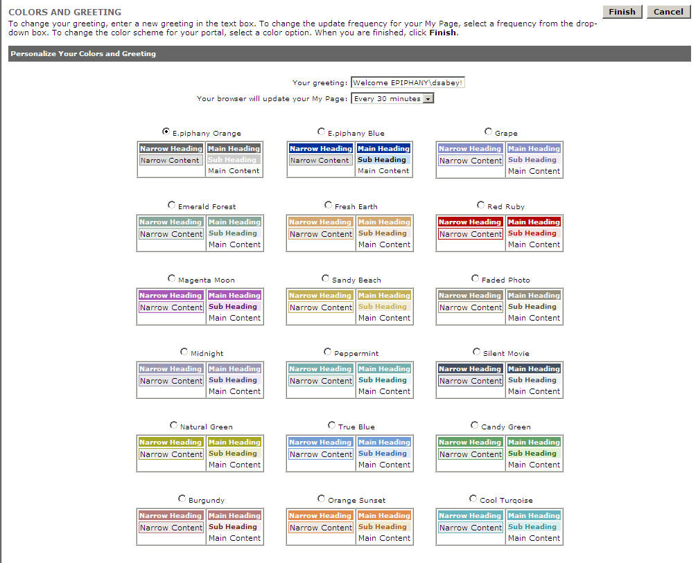
- Preferences: Only the Content and Profile
secondary navigation link have been built. We
envision Color Scheme to follow the structure seen in
the Yahoo or corporate
portals. Account Administration would present details
found in the current version of My.SIMS.
- My Profile: A link to the
UCB Course Catalog or SIMS Course listings could
be included above
the Interested In list box in the My Profile area.
If users have questions on a class, they can click
the link.
The
information
will appear in a pop-up. After finding out information
on the course, they would close the pop-up.
- Pop-Up Messages: Individuals
were unclear what would happen if they clicked the
trash can icon - would the channel
be deleted or simply removed from view. We envisioned
a confirmation message being displayed. It will
ask the user if they want to delete the channel
from
the tab. It will also highlight that the channel
can be added back from within Preferences > Content.
- Offline Calendar / Email: Users
wanted to be able to access their calendar and
email offline. For calendar access, a "Print" function
could be added. It would allow users to print a
copy
of their calendar to their desktop or an actual
printer. Also
web-based calendar applications which support exchanges
between web-based calendars and PCs or PDAs. Along
the same lines, users
wanted to be able to access their email offline. Ideally
the same functionality that SIMS mail has already
would be available; it allows users to
access their email through PC-based Outlook and other
email clients.
Due
to project timelines we determined the
aspects listed above to be secondary to the design. Also,
as referenced above, in a number of cases there are examples
already in common use (i.e. Yahoo!, Palm) which we expect to follow.
Tools Used to Develop System
The first interactive prototype was developed using PowerPoint.
It demonstrated the linkage between content channels and tab layouts,
but some aspects were quite limited. The user was restricted to
interacting with Profile set-up, the tabs, and a few aspects of Preferences.
Information on the Profile page
was shown to personalize the contents of the Home and Courses tab
as well drive the creation of an Interests' tab. By clicking on
each tab, the user was able to view representative content. Within
the Preferences area, the user was able to interact with the Content
area. Also they were able to review the details they had provided
during the setup process by clicking on the Profile link.
The second interactive prototype was designed in HTML. It includes
all the aspects provided in the PowerPoint version. In addition,
it includes changes designed to address the heuristic violations
reported by the Event Calendar team. More specifics can be found
in the Addressing Heuristic Evaluation section. The move to HTML
was made to facilitate the progression towards implementation.
More specifics can be found in the Second Interactive Prototype
section.
As outlined in our final presentation, we felt the feedback gathered
while working with PowerPoint was more useful. Individuals realized
the prototype was not final and focused on desired functionality
and interactions. Whereas with HTML, testers were critical of the
coding and tended to highlight areas that had not been completed
- instead of the desired terminology, functionality, or ease of
use. But, as outlined in Assignment 8, we felt we received very
useful feedback during each usability test.
If
we were performing a "real" experiment, we would have
gone through a few more iterations using PowerPoint before transitioning
to HTML.
Design
Evolution
User Interface Changes
- Academic Interests: In the initial sketches
we envisioned available channels appearing after a user selected
an Academic Interest. Feedback we received during the low-fi
testing and heuristic evaluation implied this strategy would
confuse users. Interestingly enough, during final usability testing
the opposite situation occurred. Users asked to see the available
channels after designating an Academic
Interest. As a result,
we see value in adding the functionality back into the application.
- Channels: Our low-fi prototype used the
term "channel" to designate an area of content. Even
though most users grasped the meaning after interacting with
the
prototype, the majority were initially thrown-off by the word.
They were unsure what it was referring to or how the selection
of a "content channel" during set-up would impact subsequent
screens in the application. The interactive prototype sought
to
address this issue. We added an explanation of channels
to the initial welcome to reinforce the "channel" metaphor.
In addition, separating content from presentation in the Preferences
area helped clarify what a channel was and how it could be used.
- Secure Login: During the initial sketches
we included an area for users to login, but we did not provide
a way for individuals
who had forgotten their password or had not registered to login.
This functionality was identified in the Heuristic Evaluation
and during the final usability testing. While addressing this
feedback, changes were also made to the Home
tab to clearly indicate
which channels were standard and could not be removed (e.g. a
trash can icon is not included). This point tested well during
our final usability test.
- Helpful Help: Our initial sketches and low-fi prototype included
links to Help but content was not provided. Supporting text was
added for the Heuristic Evaluation. Feedback indicated examples
should be added to the Help to put the content into context.
Changes were made, but usability testing highlighted that including
images in Help would be helpful as well.
- Content vs. Presentation - Part 1: A point
of confusion raised while testing our initial sketches stemmed
from
the verbs
we used in the Preferences menu options.
For
example even though users could add or remove channels
from the Edit Channel Layout option, the interpretation was
that
it only allowed for adding channels - not removal. To correct
this issue we incorporated a suggestion made by a tester into
our Low-Fi prototype - removing
the verbs when multiple functions can be performed within
an option. Subsequently, in Preferences,
Edit Channel Layout became Content, Edit Color Scheme
became Color Scheme, Edit User Profile became Profile,
and View MySIMS Settings became Account Administration. The
labels tested well in the final usability test as well.
- Content vs. Presentation - Part 2: In our
initial sketches we envisioned users being able to add channels
within a tab and
in Preferences.
This concept raised some confusion when users walked through
the low-fi prototype. For the heuristic evaluation we simplified
the process and only allowed channels to be added in Preferences.
This concept tested well, but we found some fake text we had
left in confused users during our final usability test. As a
result, the wording was updated and the manner by which the channel's
location is determined in Preferences was refined.
Also confirmation was removed and saving the selection caused
the entire channel to appear - instead of simply a header.
Lastly the process for determining which channel to edit while
in
Preferences was cleaned up for the Heuristic evaluation. Icons
were added that closely followed the style of the 'Add Tab'
icon (+) included in the low-fi prototype. These were well
received in the Heuristic evaluation and tested well in the
final usability test.
Most Valuable Evaluation Technique
Overall we felt the feedback gathered
while testing the Low-Fi prototype was the more useful. Because
it was in PowerPoint, individuals realized
it was very much a work in progress.
Their feedback was more constructive and creative. Also
we were able to quickly iterate on recommendations and make modifications
in time for the next tester. Users also seemed to take 'technical'
difficulties more in stride; their feedback implied they understood
what should have happened and were able to provide more comprehensive
input as a result. If we were performing a "real" experiment,
we would have gone through a few more iterations using PowerPoint
before transitioning
to HTML.
Class Presentation
Presentation given on Thursday, May 6 - MySIMS
(ppt) |