|
Assignment #8
Introduction
Method
Test Measures
Results
Discussion
Formal Experiment Design
Appendix
Introduction
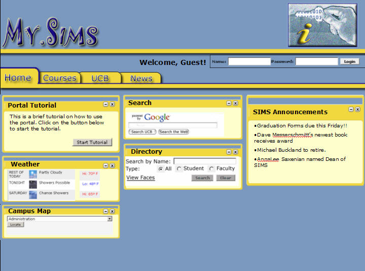
We have designed a tool, called MySIMS, that will
allow students to customize their access to academic information
at SIMS. It follows the web portal metaphor and would be used instead
of the current SIMS or
Cardea site (e.g. students would be presented with the MySIMS
portal instead of the current UIs). The first time
a user logs on they would be presented with a Welcome page. From
here the user can decide to customize their instance
or start using MySIMS directly. All users will be presented with
four
tabs - Home, Course, UCB, and News. Individuals who selected
interests during the customization process will have a fifth
tab - Interests. Common across all tabs are common navigational
links to MySIMS, Preferences, Help, and Log
Out. MySIMS is written in HTML.
To test our latest design, we developed a pilot
usability study of an improved version of our second interactive
prototype. We
asked three users who represented the personas outlined in Assignment
2 to try to accomplish three typical tasks. Based on the outcome
from the tests, we hope to determine if users are consistently
able
to perform the tasks, find the application easy to use as well
as useful, and areas where we can make usability improvements.
Method
Participants
We selected our participants based on our personas. As potential
users of our portal, they are representative of the audience of
individuals we hope will benefit from the availability of MySIMS.
All our participants are SIMS masters students.
Tester |
Gender |
Age |
Background |
1 |
Female |
27 |
1st year Masters student
at SIMS |
2 |
Male |
26 |
2nd year Masters student
at SIMS |
3 |
Female |
29 |
2nd year Masters student
at SIMS |
Apparatus
We tested all three of our participants in the SIMS downstairs
computer lab. Each person used one of SIMS' desktop machines
running Windows.
The prototype was accessed through the version of Internet Explorer
already installed.
Task Scenarios
Task 1: Setup Initial
Content
- Task Description: This is the first time
you are using MySIMS. After logging-in, you are presented with
a welcome screen. You agree to customize your instance of MySIMS.
Ensure your existing demographic details and course information
is correct. You are interested in HCI and Product / Project
Management. Save your customizations.
- Task Purpose: To discover what personal
information the students would feel comfortable sharing as
well as what they expected to happen after selecting specific
interests and channels. We also wanted to test some terminology,
specifically the word "channel".
- Desired Steps:
- Step 1: Login
- Step 2: Choose to Customize
- Step 3: Enter Profile Information
- Step 4: Review Interests Tab
- Step 5: Logout
Task Scenario #2 - Print course readings
- Task Description: You are taking IS213 and
an XML class. You forgot to print this week’s readings
and need to access them from the syllabus.
- Task Purpose: To see if students went to
the Courses tab and understood the layout of the Courses channel.
We also wanted to
identify
other
elements the students expected to be find on the Courses tab
as well as the desired method for viewing course announcements,
readings, and homework due dates.
- Desired Steps:
- Step 1: Login
- Step 2: Choose Not to Customize
- Step 3: Navigate to Courses Tab
- Step 4: Print Usability Assignment & XML Reading
for Tuesday
- Step 5: Logout
Task Scenario #3 - Add the Calendar channel
to your Home tab
- Task Description: You are interested in
tracking your assignments via MySIMS. In order to do so, you
need to add the Calendar channel. For quick viewing,
you decide to add it to your Home tab.
- Task Purpose: To determine how users expected
to add a content channel to a tab. We wanted to see if they
looked within the tab or navigated to the Preferences link.
Also we were curious whether users would view the interactive
preview and notice the content already included on the Home
tab. Lastly were curious whether users would reorganize
the channels after the new one was added.
- Desired Steps:
- Step 1: Login
- Step 2: Navigate to Preferences Menu
- Step 3: Select Channel to Add
- Step 4: Select Location for Channel
- Step 5: Confirm Location of Channel
- Step 6: Validate Channel is Added
- Step 7: Logout
Procedure
To ensure each participant had the same level of knowledge and
introduction, we iterated through the following steps
when conducting our
usability
tests.
- Introduce team members to participant.
- Have participant review and sign consent form.
- Explain purpose of the test.
- Introduce participant to MySIMS and give general directions
on how it is used.
- Have participant attempt tasks.
- Have participant complete post-test evaluation and interview.
Test
Measures
We captured reactions towards our prototype through a combination
of observation techniques and feedback mechanisms, including
"thinking
aloud"
and post-test questions. Of special
interest was task completion navigation and error
rate.
The questions asked at the end of the testing sessions were designed
to be provide insight that participants might not have provided
in a verbal or physical manner.
Observations
During our observations, we focused on the following points.
They were recommended as Testing
Goals on the Usability.gov site.
- Do users complete a task successfully?
- If so, how fast do
they do each task?
- Is that fast enough to satisfy them?
- What paths do they take
in trying?
- Do those paths seem efficient enough to them?
- Where do they
stumble? What problems do they have? Where
do they get confused?
- What words or paths are they looking for
that are not now on the site?
Post-Test Questionnaire
In the post-test questionnaire testers identified their level
of familiarity with the World Wide Web and portal websites. After
these introductory questions, testers were asked to identify
the difficulty of completing tasks as well as comment on the
overall design and navigation. In addition open-ended questions
were included to allow more freeform recommendations for improving
the MySIMS portal.
Results
The following table summarizes the results gathered while observing
users complete the usability testing tasks.
Task No. |
Description - Task Step |
Step Completed |
Observations |
Task
Scenario #1 - Setup Initial Content |
1 |
Step 1: Login |
Y, Y, Y |
Login was in a
location they were familiar with. |
1 |
Step 2: Choose to Customize |
Y, Y, Y |
Users did not read the
text. Instead they followed the task |
1 |
Step 3: Enter Profile Information |
N, Y, Y |
"Interest In" course
option confused users. |
1 |
Step 4: Review Interests Lab |
Y, Y, Y |
Users liked being
automatically brought to the Interests tab. Created a connection
between their selections and how the information was
used. |
1 |
Step 5: Logout |
Y, Y, Y |
Logout was in a familiar
location |
Task Scenario
#2 - Print course readings |
2 |
Step 1: Login |
Y, Y, Y
|
Login was in a location they
were familiar with. |
2 |
Step 2: Choose Not to Customize |
Y, Y, Y
|
Users did not read the
text. Instead they followed the task |
2 |
Step 3: Navigate to Courses Tab |
Y, Y, Y |
Users had an easy
time navigating to the Courses tab |
2 |
Step 4: Print Usability Assignment & XML
Reading for Tuesday |
Y, Y, Y |
Usage of links
was intuitive and what users expected |
2 |
Step 5: Logout |
Y, Y, Y
|
Logout was in a familiar
location |
Task
Scenario #3 - Add the Calendar channel to your Home tab |
3 |
Step 1: Login |
Y, Y, Y |
Login was in a location they
were familiar with. |
3 |
Step 2: Navigate to Preferences Menu |
Y, Y, Y |
The term Preferences
was clear to all the testers |
3 |
Step 3: Select Channel to Add |
Y, Y, Y |
The incorrect label
and options in the drop-down menus caused confusion,
but users understood what needed to be done |
3 |
Step 4: Select Location for Channel |
N, Y, Y |
Users wanted more visual
indication of where the channel could be added - flashing,
brighter color |
3 |
Step 5: Confirm Location of Channel |
N N, N |
Users expected
selecting the channel's location to act as confirmation
as well. So, this step seem unnecessary. |
3 |
Step 6: Validate Channel is Added |
Y, Y, Y |
Users understood the
need to validate the location (e.g. save their changes) |
3 |
Step 7: Logout |
Y, Y, Y |
Logout was in a familiar
location |
Useful information was also gained through the responses to the post-test
questionnaire. The following information identifies the answers
we received as well as free form comments.
- Overall, I found the MySIMS portal easy to use.
- Strongly Disagree
- Disagree
- Undecided
- Agree - 2 testers
- Strongly Agree - 1 tester
- Information was easy to find.
- Strongly Disagree
- Disagree
- Undecided
- Agree - 2 testers
- Strongly Agree - 1 tester
- I would have organized the material differently.
- Strongly Disagree
- Disagree - 2 testers
- Undecided - 1 tester
- Agree
- Strongly Agree
- The explanations and instructions on the screens were worded
clearly.
- Strongly Disagree
- Disagree
- Undecided
- Agree - 3 testers
- Strongly Agree
- I always knew where I was in the portal, and how to get back.
- Strongly Disagree
- Disagree
- Undecided - 1 tester
- Agree - 1 tester
- Strongly Agree - 1 tester
- The colors were helpful when navigating through the application?
- Strongly Disagree
- Disagree
- Undecided
- Agree - 3 testers
- Strongly Agree
- What did you like best about the MySIMS portal? Why?<
- Tester 1: The calendar and incorporating homework / course information.
However, I’d like to be able to access it when offline. The RSS feeds
within a central location & with recommended feeds is convenient, plus
the ability to add my own.
- Tester 2: Aggregation of all my SIMS resources, readings, due
dates, email, calendar in a centralized location.
- Tester 3: Allows high degree of customization,
no forced organization. Easy to change – will change automatically
each semester
- What did you like least about the MySIMS portal? Why?
- Tester 1: Display format of the channels - want it to be more like
newsreader with folders. Would like more identification of
how to add feeds within channels & longer
timeframe view of news
- Tester 2: Want more flexibility when working within a tab
- Tester 3: Can’t change layout while in main application
- If you could change one thing about the MySIMS portal, what would
it be? Why?
- Tester 1: Make channel layout more of a RSS reader. Layout calendar by
class information.
- Tester 2: Not MySIMS necessarily, but want to ensure course
information was standardized and could be accessible from within
MySIMS
- Tester 3: Calendar app would be bigger and have
a full week. I’d like to be able to change views.
- Please add any additional comments that you feel will help
us to improve the effectiveness of the MySIMS portal.
- Additional comments were not provided
Discussion
The Pilot Usability Study gave us quick and constructive feedback
on aspects of our interface which had been added or changed since
the initial review sessions. The findings highlighted aspects which
still need improvement as well as identified areas which are fine
they we they are. We did learn that users expected all aspects of
the prototype to work - specifically because it was designed in HTML.
They seemed to have forgotten it was a prototype, so they tended
to focus their comments on technical errors instead of design, functionality,
and navigation. We did not face this issue when our prototype was
still in PowerPoint. As
a
result,
it might have been more beneficial to do additional interactions
in PowerPoint before moving to HTML.
Subsequent Interface Changes
To address the feedback we received, the following modifications
have been identified
| Issue |
Recommendation |
Calendar channel did not include
Trash can icon (delete) and Minimize icon (double arrows)
|
Add the icons and ensure they are available on all the appropriate
channels |
Users expected entire channel to display after they had selected
a location in the Preferences > Content
|
Change the steps for adding content. Remove the validation
step. Have the channel appear once the user selects the desired
location |
Users were confused by the label of the first
drop down in Preferences > Content. Its relationship to the
second drop
down was unclear
|
Change the label to "Select Channel Category". When this
new name was run by testers, they understood its meaning. It
implied a higher level, grouping of channels. This is correct
and reflects the desired function. |
Users expected to see actual values in the drop down menus
in Preferences > Content
|
Add "real" data to both drop downs. Doing so would also help
to reiterate the purpose of both drop down menus. |
Even though having the ability to select
courses they were
"Interested In", users were unclear on how
would they get more information on the course
|
A link to the UCB Course Catalog or SIMS
Course listings could be included above the Interested
In list box. If users
have questions on a class, they can click the link. The information
will appear
in a pop-up.
After
finding out information on the course, they would close the
pop-up.
|
Individuals were unclear what would happen if they clicked
the trash can icon - would the channel be deleted or simply
removed from view.
|
A confirmation message will be displayed after the user clicks
the trash can icon. It will ask the user if they want to delete
the channel from the tab. It will also highlight that the channel
can be added back from within Preferences > Content
|
| Users wanted to change the calendar view from within the
Calendar Channel. |
We envisioned users being able to change the calendar view
after clicking the Open Calendar link. Instead the functionality
will be moved back to the Calendar Channel. To manage space,
the New Event (Quick Create) will be removed from the Calendar
Channel and accessed from a link.
|
| Users want to be able to access their calendar offline |
A "Print" function will be added. It will allow users to
print a copy of their calendar to their desktop or an actual
printer. We will also evaluate calendar applications which
support exchanges between web-based calendars and PCs or PDAs.
|
| Users want to be able to access their email offline |
Support the same functionality that SIMS mail has already
- it allows users to access their email through PC-based Outlook
and other email clients.
|
| Users wanted to view more than one week of the syllabus |
Allow the Course Readings & Assignments
channel to scroll, so users can view more than one week.
Or, allow
additional
weeks to be viewed after selected a View More link at the
end of the Course Readings & Assignments channel.
|
| Individuals expected course titles in the Course Resources
channel to be links |
Make the course titles in the Course Resources channel links.
Clicking on a course title would bring up the course webpage
in another window
|
Users were not sure how to enter their URL in the Personal
Information section of Preferences > Profile.
|
Add http:// in front of the URL text book. See current My.SIMS
for an example |
| Users wanted to add more than one phone number and IM address |
Add additional phone fields for mobile, home, and other.
Include labels to know which phone number is which. Also allow
students to designate a primary number. This number would be
visible to other students. Similar changes would be made to
the IM field. Allow users to enter up to three IM addresses
and designate a primary address.
|
| Users wanted channels to be able to take up an entire tab |
Provide functionality which "displaces" the channel from
the portal and launches it in its own window.
|
Changes for "Real" Experiment
We felt we received very useful feedback during each usability
test - including the evaluation of our first interactive prototype.
As a result we believe our methods were effective. If
we were performing a "real" experiment, we would continue
testing our interface and iterate the design. We we try out multiple
design
variations in order to address some of the issues raised above.
Also we would build out all of the tabs and functionality. Lastly,
we would
encourage
testers to interact with the application without predefined tasks.
Doing so would help to validate our design and navigation.
Formal
Experiment Design
Hypotheses:
By modeling the customization of MySIMS after MyYahoo!, with the
ability to edit content and color schemes separately, users will
enjoy using MySIMS and find the experience to other web-based
portals they have used.
Factors and Levels
The factor is the way in
which the user chooses to interact with Preferences in MySIMS.
The levels are C (current design - separation content and color
scheme) and I (integrated design - combines content and color
scheme).
The response variables
are the number of errors and satisfaction. Errors were captured
while observing the usability tests. Satisfaction was based on
responses to the questions administered at the end of
the usability testing sessions. We selected these variables because
we hope users will find MySIMS a useful, enjoyable and familiar
design. Combining content and presentation,
instead of making them separate links under Preferences might
be perceived as quicker, but may not lead to
a more confusing - consequently more error prone - experience. Blocking and Repetitions
The experiment will
follow a within groups design. It will include 9 potential
users: 3 students representing Clara's persona, 3 students representing
Thomas' persona, and 3
students representing Isaac's persona.
Each participant will be asked to do 4 exploratory tasks, each
involving
some
interaction
with the factors we want to test. There will be 3 groups
of 3 participants (1 "Clara", 1 "Thomas", and 1 "Isaac"). The
tasks will be varied between the groups to prevent a learning
effect.
Appendix
Test
Script (.doc)
Post
Test Questionnaire (.doc)
Usability
Tester 1 - Observations
(.doc), Questionnaire (.doc)
Usability
Tester 2 - Observations
(.doc), Questionnaire (.doc)
Usability
Tester 3 - Observations
(.doc), Questionnaire (.doc)
|