|
Assignment #4
Introduction
Revised Scenarios
Prototype
Method
Test Measures
Results and Discussion
Appendix
Introduction
Our team is a developing a tool that will allow students to customize
their access to academic information at SIMS. Currently, many user
communities - students, faculty, prospective students, potential
employers, and the general public, utilize the public and password
protected web interfaces to access information on the SIMS web
site. While the site contains a wealth of information, much of
the power is lost because individuals cannot navigate or customize
the contents to meet their needs. If more standardized ways of
subscribing to information flows existed, students' use patterns
could help establish a dialogue between those who utilize SIMS'
academic resources and those who provide them. We see utilizing
a portal interface model as a starting point for addressing these
issues.
In this experiment, we evaluated how potential users react to
our first design. Our design expands on the functionality captured
in the interaction flow diagrams from Assignment
3. We used a paper prototype in order to evaluate and quickly
iterate on the following aspects of our portal before the interactive,
and more intensive, design effort had begun.
- Concepts and Terminology: Do our target users
understand the terms we've chosen?
- Navigation: Do the sequence of steps we envisioned
match what users expect? Do they have to keep flipping back and
forth between screens?
- Content: Does the interface provide the right
information for users to make decisions? Does it have extra information
that they don't need, or that annoys them?
- Page Layout: Are users able to find the information
they need? Is the amount of information overwhelming, not enough,
or about right?
- Functionality: Have we provided all the functionality
our users need? Is any of the functionality perceived to be unnecessary
by our users?
adapted from IBM's Paper
Prototyping
Revised
Scenarios
In order to raise questions regarding the design of
our user interface as early in the development process as possible
and to allow for more task-oriented
user testing of our prototype, we initially developed complete
task scenarios. The scenarios followed the guidelines outlined
in "User
and Task Analysis for Interface Design" by Hackos & Redish
as well as the descriptive
nature Jakob Nielsen prescribes in "Usability Engineering".
The revised scenarios do
not include as much detail and represent vignettes.
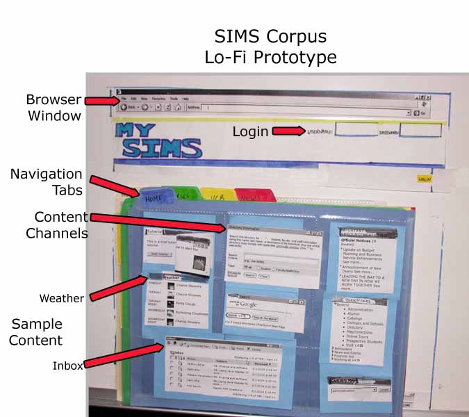
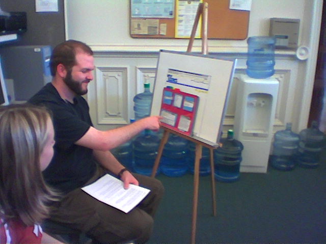
Prototype The prototype was built using colored manila folders (red, blue,
green, yellow, and beige), 8.5 x 11 inch plastic sheets used to
hold nine baseball cards, and lots of Post-It notes. The main components
included the following:
- Login Dialog: A default version of the MySIMS
portal was presented within the context of a web browser. It
contained general topics, similar to those found on the current
SIMS site. In the upper right-hand corner, areas for entering
User Name and Password details were drawn.
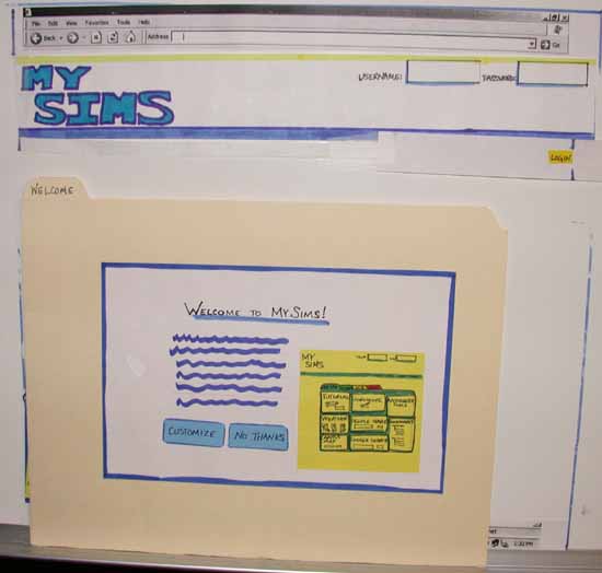
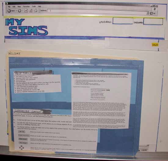
- Welcome Page: The first time users logon to
MySIMS, they will be presented with a Welcome
Page. It explains the benefits of MySIMS. To set the context
for their interaction with the portal, the Welcome Page also
includes a screen shot of the MySIMS portal. At this time, users
can choose to customize their instance of MySIMS by selecting
the "Customize" button at the bottom of the screen.
Students who want to use the default instance of MySIMS can select
a button labeled "No Thanks".
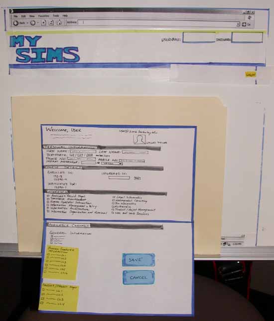
- Student Interests Page: To populate MySIMS
with students' course information and other personalized content
offerings, the Student
Interests Page contains sections for students to provide
an instant messenger ID, check off interests, and select from
available news feeds. Other details, such as home zip code, contact
number, and courses are pre-populated due to MySIMS integration
with SIMS administrative and registration systems. The information
provided on the Student Interest Page is used to personalize
the contents of the Home, Courses, and News tabs. Save and Cancel
buttons are provided to allow students to Save their entries
or exit the MySIMS set-up process.
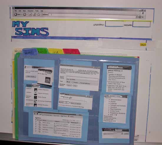
- MySIMS Portal - Tabs, Content Channels, and QuickLinks:
For each student, the initial
MySIMS set-up contains some common navigational elements
as well as four tabs. The common navigational elements are the
MySIMS logo, login area, and a series of "QuickLinks".
Clicking on the MySIMS logo returns the user to their Home tab.
The login area contains text fields for entering username and
password details. The QuickLinks are hyperlinks which, when clicked,
take the user directly to the following part of MySIMS: Help (goes
to MySIMS help pages), Logout (logs the user out of MySIMS),
Mail (launches a web mail application), and Preferences (presents
four options which allow the user to customize their instance
of MySIMS). Initially each student is presented with four tabs.
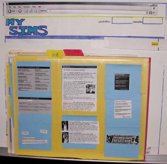
They are labeled Home, Courses, UCB, and News. Clicking on a
tab's label brings the selected tab into view.
- Home Tab: For individuals who decided not
to customize their instance of MySIMS a message is presented
at the top of the Home
tab. It directs the user to click the Preferences link, so
they can make customizations (e.g. QuickLink). Until users add
or remove content, their Home tab contains channels for such
general items as weather, email, Google, student search, and
SIMS announcements.
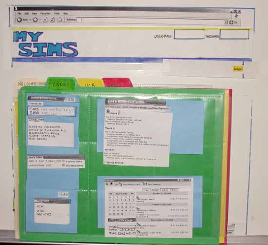
- Courses Tab: The Courses
Tab contains a channel which presents the student's current
course list. Clicking on a course brings channels containing
general information about the course as well as the current
week's topics, readings, due dates, and announcements into
view. A calendar channel gives students the ability to view
their activities (personal as well as course related) for a
selected timeframe (day, week, and month.
- UCB Tab: Because all students are impacted
by UC-wide mandates, the UCB
Tab includes content channels focusing on campus-wide news,
events, and information. For example links to the UCB Course
Catalog, Semester Calendar, and Health Center can be found within
the General Information channel on the UCB Tab.
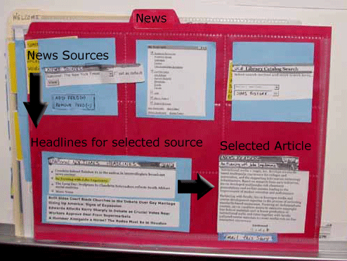
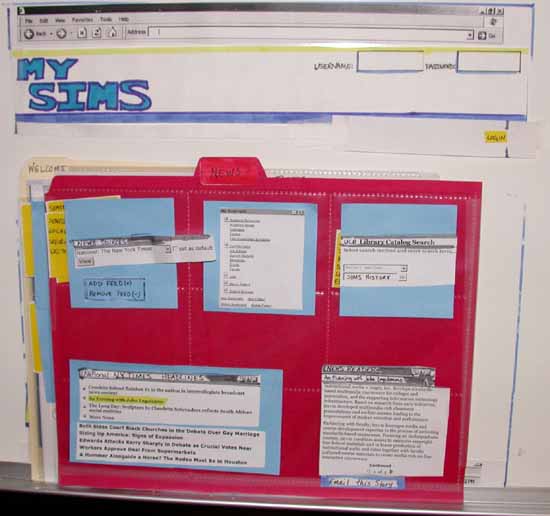
- News Tab: Based on interviews, most students
will customize the News
Tab. Until they make such changes within the Preferences
area, the content channels on the News Tab are determined by
the selections the student made within the Student Interests
Page. For example, based on the options selected in the prototype,
the New York Times was included in the drop down in the News
Stories channel. Selecting a news source from the drop down causes
the corresponding Top Stories channel to come into view. In a
similar manner, clicking on one of the Top Stories causes the
News Feature channel to be presented. It contains the contents
of the story as well as an Email This Story button. Also Add
Feed and Remove Feed buttons on the News Stories channel give
students the ability to customize the News Stories drop down.
Selecting Add Feed causes a pop-up to appear. It includes two
text boxes (Feed Name, Feed URL) and an Add button. Entering
the information and clicking Add causes the feed to be added
to the News Stories drop down.
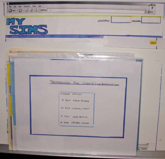
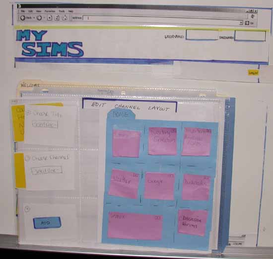
- Preferences: After clicking on the Preferences
QuickLink, the student is presented with a the Preferences
Menu page. It includes four options - Edit Color Scheme,
Edit Channel Layout, Edit User Profile, and View MySIMS Settings.
The prototype included a screen for the Edit
Channel Layout option. From here students could interact
with the Choose Tab drop down menu. Selecting a tab caused an "interactive" preview
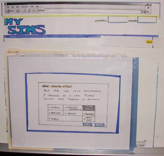
to be presented as well as a drop down labeled Choose Channel.
Choosing a channel and clicking the Add button caused a message to
be presented. It outlined that the tab was already "full" and
contained nine content channels. The student could choose which
channel to remove and save the remaining channels. Doing so returned
the student to an updated version of the "interactive" preview
which now contained the channel they had selected to add. We
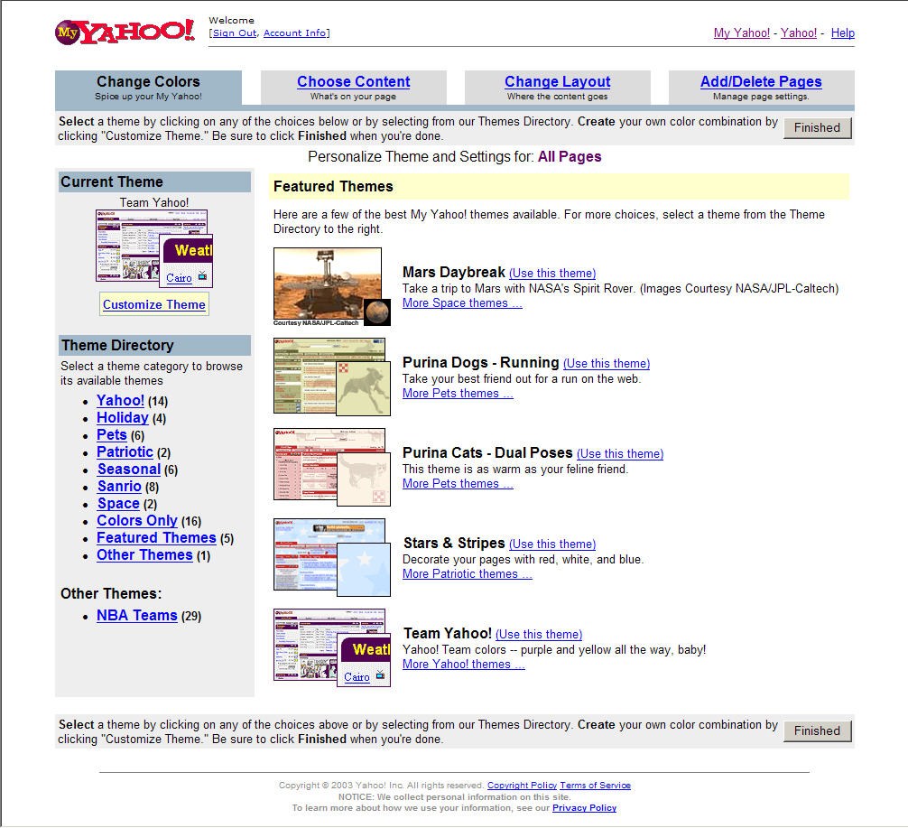
envision the Edit Color Scheme to follow the structure seen in
the Yahoo or corporate
portals. Edit User Profile would return the student to their Student
Interests Page. View MySIMS Settings would present information
found in the current incarnation of My.SIMS.
When operating the prototype, the following conventions applied:
- Computer: Whiteboard with browser Standard
Buttons and Address toolbars taped on the top. Right below the
MySIMS logo was taped on the left. The Login fields were taped
on the right.
- Cursor: Users finger serves as the mouse to point,
tap to select.
- Tabs: Plastic sheets with 9 slots (or sections)
designed to hold one baseball card each. Each sheet is taped
to a different colored manila folder. The tab name is written
on the folder's tab.
- Content Channels: Blue post-it notes stuck
on 1 section of the plastic sheet. Larger content channels were
taped to 2 blue post-it notes and spread across 2 sections on
the plastic sheet.
- Content: Examples of content found on the
Internet. Each items was printed on a white background and glued
to the appropriate number of blue post-it notes.
- Pull-down menus: Represented by options presented on
yellow post-it notes.
- Selected items: The current selection in a pull-down
menu was highlighted in yellow on a new post-it note.
- Update: When the user performs an action that causes
an update to MySIMS, the current view was replaced with new information.
The purpose is to give feedback that something has changed due
to the action taken by the user.
Method
Participants
We selected our participants based on our personas. As potential
users of our portal, they are representative of the audience of
individuals we hope will benefit from the availability of MySIMS.
All our participants are SIMS masters students. The first participant
represented the persona called Isaac
Einstein. The second participants resembled the Thomas
Gibson persona. The third participant has characteristics we
envision match those of Clara Filo.
Task Scenarios
Task 1: State where you would access the MySIMS portal
- Task Description: During orientation you were told SIMS had
a portal you could customize with such items as your interests,
courses, and news choices. The portal is called MySIMS. Go to
where you would logon to MySIMS.
- Task Purpose: To learn where users expected to go to logon
to MySIMS. Capitalizing on behaviors we learned about during
our interviews, we hoped users would envision it being accessible
from the current SIMS
website or accessed through a bookmarked favorite. We also
wanted to see if users expected it to replace the Cardea site.
- Desired Steps:
- Go to sims.berkeley.edu
- Enter username and password
- Click the Login button
Task Scenario #2 - Setup Initial Content
- Task Description: This is the first time you are using MySIMS.
After logging-in, you are presented with a welcome screen. You
agree to customize your instance of MySIMS. Ensure your existing
demographic details and course information is correct. You are
interested in HCI and Product / Project Management. Save your
customizations.
- Task Purpose: To discover what personal information the students
would feel comfortable sharing as well as what they expected
to happen after selecting specific interests and channels. We
also wanted to test some terminology, specifically the word "channel".
- Desired Steps:
- Review your existing demographic details and course information
- Enter interests
- Select desired content
- Save customizations
Task Scenario #3 - View this week’s schedule for
IS213
- Task Description: You are taking IS213. You forgot this week’s
readings and need to review the syllabus.
- Task Purpose: To see if students went to the Courses tab and
understood why IS213 was presented in the Current Courses channel.
We also wanted to identify other content elements the students
expected to be find on the Courses tab as well as the desired
method for viewing course announcements, readings, and homework
due dates.
- Desired Steps:
- Navigate to the Courses tab
- Click on course - 'IS213 User Interface Design'
- View the syllabus for IS213
Task Scenario #4 - View today’s headline news from
the New York Times
- Task Description: You are reading the paper version of the
New York Times and want to email an article titled “An
Evening with John Leguizamo” to a friend. You are already
subscribed to The New York Times news feed.
- Task Purpose: To see if users navigated to the News Tab and
knew why the New York Times was included in the News Sources
drop down. We also wanted to see how users expected to interact
with the content channels, select a specific story to view, and
react to the presentation of the Email channel when preparing
to send the story.
- Desired Steps:
- Navigate to the News tab
- Click on the “An Evening with John Leguizamo” article
- View the article
- Click on the Email This Story link
- Go to the Courses Tab
- Customize the email To: and Subject Line:
- Click on Send
Task Scenario #5 - Add the Discussion Forum channel to your Home
tab
- Task Description: You are interested in tracking certain Discussion
Forums. In order to do so, you need to add the Discussion Forum
channel. For quick viewing, you decide to add it to your Home
tab.
- Task Purpose: To determine how users expected to add a content
channel to a tab. We wanted to see if they looked within the
tab or navigated to the Preferences QuickLink. Also we were curious
whether users would view the interactive preview and notice the
Home tab already had 9 content channels. And, if they did, remove
one before adding the new content channel. For those who went
ahead and tried to add the content channel to a "full" Home
Tab, we wanted to gather feedback on the message and process
for making space for the new channel. Lastly were curious whether
users would reorganize the channels after the new one was added.
- Desired Steps:
- Select the Preferences Button
- Choose ‘Edit Channel Layout’ from Preferences
menu
- Select tab where new channel will be placed
- Select content channel to add
- Save layout changes and additions
Task Scenario #6 - Add a new Feed
- Task Description: A friend told you about a cool news feed
called “The Daily Californian ”. You decide to add
it your MySIMS portal
- Task Purpose: To see where users went to add a new feed and
how they reacted to the steps required to add one.
- Desired Steps:
- Go to the News tab
- Select Add Feed
- Enter in the Feed Title and Feed URL
- Click the Save button
- Choose the new feed from the News Sources drop down
- View the feed’s contents
Test
Measures
At a high level, we measured our users’ ability to complete
the tasks. In order to do so, we noted their steps, mistakes, facial
expressions,
feedback, and
expectations. At a more detailed level,
we evaluated
the following
aspects of the MySIMS portal:
- Concepts and Terminology: We wanted to find
out if users understood the meaning of the word Channel,
grasped the linkage between selecting Interests and personalizing
content, and reacted positively or negatively to using
the Preferences area for updating tab layouts and contents.
- Navigation: Based on users interactions with
other websites and portals, we hoped to discover how
students reacted and adapted to using tabs as a metaphor for
navigation.
- Content: We used the findings from our interviews
and comparative analysis to select content components we thought
the students would value. We wanted to identify which items they
favored and discover if we had left out or included any content
unnecessarily.
- Page Layout: The notion of using a grid to
arrange content across rows and columns is used on other portals.
We wanted to see how students reacted to this metaphor in the
context of MySIMS. Also, with recent browsers supporting drag & drop,
we hoped students would react positively to arranging content
in this manner.
- Functionality: From the comparative
analysis conducted for Assignment 3, we identified functionality
we thought users would expect to find on MySIMS. We hoped to
determine which functionality are users valued and wanted to
retain in the portal.
Results
and Discussion
Overall, we were pleased with our user evaluation results. Testers
readily grasped the purpose of our application and were excited about
some of the functionality it offered. The testing did reveal some
navigation challenges and a few assumptions we had made in our design.
Below, we describe each of the tasks the testers performed and a summary
of the issues we noticed from their experience.
Four of the six tasks were performed with relative ease following
the anticipated or 'expert' path to complete the goal. Two
tasks posed
significant problems for testers (Task 2 and Task 5, see graphs
below). Our application seeks to manage and tailor a lot of
content to the needs
of the user. Organizing the information in a intuitive manner
was challenging, but testers provided good suggestions for
alternate designs.
The paper prototype process was particularly effective at evaluating
how useful an application like ours would be for SIMS students.
Additionally,
user feedback helped us conceptualize the combination of information
and tools information-centric users like SIMS students expect.
Task 1: State where you would access the
MySIMS portal
Evaluators’ Notes:
This task is different
from the others in that it is independent of the prototype and provides
a high level idea of where testers would expect to locate an application
like MySIMS.
Findings:
Two of the three testers expected to find an application like MySIMS
linked from the SIMS homepage. The same two users expressed a desire
to log into SIMS resources once and have access to information on
both the Intranet and MySIMS.
Discussion:
We anticipated using sims.berkeley.edu as the location, therefore
testers' expectations aligned well with our expectations.
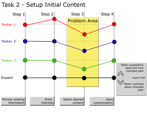
Task 2: Setup Initial Content
Findings:
The purpose of this task is to verify the personal information on file for a
user is correct and to solicit his or her academic interests for the purpose
of suggesting content to be displayed on their customized homepage. Upon entering
an interest, a list of 'available channels' relating to that content is dynamically
generated. As the graph of the steps in task 2 shows, none of the testers recognized
the opportunity to select desired content. We think this occurred as a result
of the testers' difficulty in recognizing the relationship between interests
and the suggested content. They also expressed confusion about what was meant
by the term 'Channel' .
Discussion:
This task revealed two primary changes are necessary: 1) Using the channel
metaphor for content is not obvious and either needs to be changed or have
some level of explanation. Most users recognized the metaphor once they realized
RSS feeds were involved, thus explanation of how content is structured might
be sufficient. Users suggested terms like 'Available Subscriptions' and 'Interest-based
Subscriptions' as more obvious alternatives. More testing will be necessary
in next iteration. 2) On a more fundamental level, the relationship between
interests and the available content needs to be made more explicit. Having
interests and the suggested content on separate parts of the screen contributed
to the confusion, therefore perhaps it would be more obvious if checking
an interest revealed the available subscriptions directly beneath it. We
plan to conduct a card sorting exercise prior to our next prototype to help
us understand how users group SIMS content.
Task 3: View this Week's Schedule for
IS213
Findings:
Providing course information in a concise and timely manner is the most important
functionality of MySIMS, thus we were pleased that this task was accomplished
easily by each of our testers. Testers were able to easily navigate the screen
layout. The only component that caused some problems for testers was the ‘Research’ feature,
intended to consolidate online resources provided by professors. Testers interpreted
it to be the same as the bookmark/favorites functionality provided in other parts
of the application. Even though this screen tested well overall, the testers
provided some helpful feedback on how the content should be structured.
Discussion:
Testers universally liked the calendar feature. They especially liked the idea
of having a single place to refer for an updated list of all of their readings
and assignments. One tester preferred to have an “integrated syllabus” that
would interleave all of her readings and assignments in a task list format.
Another useful suggestion was to add an icon or some other visual notification
that a syllabus or assignment has changed. While we may incorporate some
of these smaller features in a future iteration, we will most likely maintain
the existing format without any major structural changes.
Task 4: View today’s headline news
from the New York Times
Findings:
Our user interviews revealed that SIMS students would probably not use an application
that aggregated only SIMS-related information. Thus, we decided to incorporate
outside news and information in the form of RSS feeds. However, developing
a means for users to organize and view a wide variety of news information was
one of the most difficult undertakings of our design process. We were pleased
that testers found the layout we developed, shown above, effective and intuitive.
Two areas were identified as needing improvement: 1) The tab navigation that
occurs while using the ‘Email this Story’ function. 2) The news
reader window function is too narrow.
Discussion:
While our comparative analysis showed that the best portal applications are
those that provide functionality within the portal window and not by spawning
additional browser windows. Our testers strongly preferred a pop-up window
for emailing a selected article to a friend. Largely, they ascribed this
desire to a need for continuity. By opening the story in another window,
it did not disrupt their train of thought and allowed them to send the email
at their leisure if they were not quite ready to take time out from what
they were doing.
Following that same guideline, we designed the page with a news
reader channel so that users would not have to open another window
to read news stories. One tester thought that this might be limiting
if they wanted to scan headlines and open more than one story at
a time. Another tester thought that the news reader should do more
than just read news stories, instead it should act as a browser
window that could show library catalog and search engine results
as well. Therefore we will give the news reader functionality further
consideration in our next prototype.
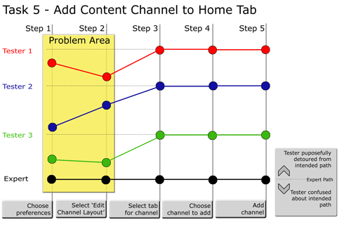
Task 5: Add the Discussion Forum Channel
to Your Home Tab
Findings:
This task showed us customizing layout is clearly the area of our prototype needing
the most improvement. As the graph above shows, none of the testers understood
how to locate the function that would add a channel. Once users realized the
intended path was pressing the preferences button, they had difficulty choosing
the function on the preferences menu that would allow them to add a channel.
Most users expected content and presentation to be in separate places. Since
we had combined the functionality, users became confused about what existed
where. Another unanticipated result of having the wizard customization for
initial setup was that testers were looking for a profile screen or option
similar to the one they had seen initially.
Discussion:
As mentioned above, testers seems to have a mental model of our application
that separates content and presentation. We should respect that and redesign
our preferences menu accordingly. Additionally, we should rename the options
on the preferences menu to eliminate confusion about what functions can be
performed where. One tester suggested removing the verbs if there are multiple
functions that can be done with a menu. For example, rather than having ‘Edit
Channels’ perhaps ‘Channels’ would be descriptive enough
since users already know they have entered a menu that will allow them to
edit. Lastly, we should consider how to incorporate the profile screen that
is used in the initial customization wizard into the preferences menu for
consistency’s sake.
Task 6: Add a new Feed
Findings:
By the time testers reached this task, they were operating much more familiarly
with the application. None of the testers had any trouble finding the ‘Add
a feed’ functionality on the news tab. One tester did express confusion
about how the news sources on the news tab were different or similar to the content
subscriptions completed during the initial customization. Another tester requested
the ability to search for available feeds from the ‘Add a feed’ page
in the event they do not have the exact feed address.
Discussion:
The issues exposed by this task are closely related to the ambiguous line between
content and layout. Our initial user interviewers gave us the impression
that users distinguish between SIMS-related information and externally produced
information. However, the lo-fi evaluation sessions revealed that testers
think of content as a single entity regardless of topic or source. Therefore
there should be a centralized place to see what content is available and
what subscriptions a user has. Resolving these issues will be the central
focus of our iterative redesign.
Appendix
MySIMS Portal: Welcome
Page, Student Interests
Page, Home
Tab, Courses
Tab, UCB Tab, News
Tab, Preferences
Task Scenarios:
User Tasks, User
Tasks - Expert Guide, User
Interview Write-Up
|