|
Assignment #7
Overview of Design Changes
Addressing Heuristic Evaluation
Second Interactive Prototype
Overview
of Design Changes
As a result of discussions during team meetings and while completing
assignments for IS213, we have continued to refine our design.
For the second interactive prototype, we made significant modifications
to some aspects of Preferences. Changes include simplifying the
initial interest identification process, making each channel self-contained,
removing the concept of rows, and improving the navigation. We
also updated the Welcome screen and used bulleted text to clearly
introduce terminology.
The first interactive prototype was developed using PowerPoint.
It demonstrated the linkage between content channels and tab layouts,
but some aspects were quite limited. The user was restricted to
interacting with Profile set-up, the tabs, and a few aspects of Preferences.
Information on the Profile page
was shown to personalize the contents of the Home and Courses tab
as well drive the creation of an Interests' tab. By clicking on
each tab, the user was able to view representative content. Within
the Preferences area, the user was able to interact with the Content
area. Also they were able to review the details they had provided
during the setup process by clicking on the Profile link.
The second interactive prototype was designed in HTML. It includes
all the aspects provided in the PowerPoint version. In addition,
it includes changes designed to address the heuristic violations
reported by the Event Calendar team. More specifics can be found
in the Addressing Heuristic Evaluation section. The move to HTML
was made to facilitate the progression towards implementation.
More specifics can be found in the Second Interactive Prototype
section
Addressing
Heuristic Evaluation
The information
we received from the Event Calendar team provided
us with valuable feedback about the MySIMS portal.
We carefully went through
all
the input. Some of
the points identified major concerns with the application.
We are trying to address these items in the second interactive
prototype. Some of the other violations we did not consider
problems. In these cases, we choose not to act upon the
recommendations. Also there were a few points that had not
emerged in previous user testing but could be potential problems.
We have decided
to conduct further testing and make the changes accordingly. The
following list summarizes recommendations from the Event Calendar
team and our decisions.
- [H6: Clearly marked Exits] (Severity 4)
There is no clear way to exit Preferences to get back to Home or any of
the other tabs (Courses, UCB, News, Interests). This is true on both the customize
page that appears when you first login and also later when you click on preferences
from within your portal. The only button on the page that looks like an exit button
is the Cancel button. However, since this button is inside the context of one of the
tabs (i.e. Interest), it is unclear whether the button applies to just the tab or the
entire page. (2 evaluators)
SIMS Corpus: A MySIMS link was added to the navigation options
when a user is in the Preferences area.
- [H2: Speak the User's Language] (Severity 4)
I do not think that the term "channel" is very clear. Does it
only apply to the content within the Interests tab? Are all content boxes
considered channels? Also, it is unclear what a Custom Channel is and where it
comes from. Although the term content channels is in wide use today in the
area of RSS feeds, we dont think it can be assumed that all incoming students
to SIMS will initially know what that means. It would be helpful if you
defined channel on the Welcome page instead of just listing what the
channels were. It would also be helpful to explain on that screen what the
and more part of academic information and more could be, which would be
another opportunity to talk about what is or is not a channel. Also, you talk
about content channels on the Welcome page and content on the Preferences
page; I believe referring to the same thing. (2 evaluators)
SIMS Corpus: The Welcome page was redesigned. The text was
reorganized into bullets. Each bulleted point introduced a specific aspect
of the MySIMS portal. One bullet introduces a "Channel". Another
bullet defines what can be found in the portal. We decided to continue to use
the word "Channel".
Based on the metaphors associated with the word "channel", we feel
it is the correct term to use. Also, despite the feedback received to date,
we felt
similar concerns would be raised if another
term
was used. For example
the
word
"content"
is
too generic
and
could
bring up too many, disparate mental models. We will continue to gather
feedback during usability testing.
- [H1: Consistency] (Severity 3)
Some content boxes are clearly linked. For example, Course
Readings & Assignments changes according to what course is selected in
the Course Information box. However, this relationship is not clearly
displayed in the UI. These 2 content types are placed in separate boxes that
look alike. There is no consideration of their hierarchy and link. This is
also true on the News page with News Source and News Headings, and is an
inconsistent metaphor with the way the rest of the channels work and how they
are defined. It is also unclear if users can delete one content box and not
the other. Should these be placed in one box? (2 evaluators)
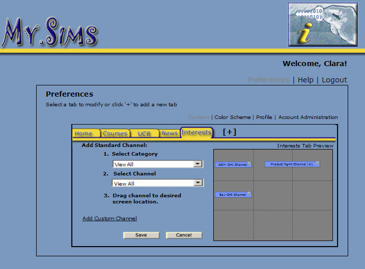
SIMS Corpus: We eliminated this issue by making each channel self-contained.
- [H3: Minimize User Memory Load] (Severity 3)
There is no visual flow to any of the pages. The channels boxes
are all different shapes and sizes but seem to just be placed randomly on the
screen giving the user's eye no place to rest and the placement just seems
arbitrary and confusing rather than useful. It may be difficult for users to
remember the placement of these different content boxes on different pages. (2
evaluators)
SIMS Corpus: Even though we understand the value of creating a
visual layout which is easy to follow, we found Yahoo! and other popular
portals allow their channels (or content) to be of different shapes and sizes.
So, a compromise was reached. Most channels will be of a similar shape and
size, but some will require more space. For example the Announcements channel
may take up more real estate if there are a number of Announcements which need
to be presented.
- [H9: Clearly Marked Exits] (Severity 3)
Each content box has 2 icons on the upper right corner: a bar
for minimize and an x for delete. Does the delete button remove the content
from users settings permanently? Is this the same action as adding and
removing channels from the preferences section? (2 evaluators)
SIMS Corpus: The "x" for delete was replaced by a Trash
Can. A confirmation message was added when the user decided to delete a channel.
Also
the image for minimize and maximize was replaced.
- [H1: Simple and Natural Dialogue] (Severity 3)
In the Preferences section there is an effort to separate
content from presentation by placing content and color scheme on separate
pages. However, isnt layout of content also presentation? If feels awkward to
have to determine the layout of the content when all the user may be
interested in is getting the content on the screen. The fact that different
channels take up a different number of cells is also problematic. It becomes
an exercise for the user to have to find the most efficient way to fit the
maximum amount of content on the page. It is also unclear why there are only 9
cells. Will the page scroll down for more?
SIMS Corpus: Our initial paper-prototype combined content and presentation.
Users were confused and represented breaking out the concepts. We also found
content and presentation was broken out consistently in Yahoo! and other portals
identified for our comparative analysis. We removed the 9 cell limitation and
simplified the layout process by removing the notion of rows. Users can add
as many channels as they want to a tab. See the response for item #4 as well.
- [H4: Consistency] (Severity 3)
The page layouts in the Preferences section are not consistent.
The sub-navigation links are not placed in the same position, the page label
is not consistent, the Welcome message is not in the same location, and
subheadings are displayed differently.
SIMS Corpus: The discontinuity was an oversight. It was corrected
in the Second Interactive prototype.
- [H4: Consistency] (Severity 3)
Preferences: Hard to tell due to the limitations of the
prototype, but it seems like the interaction for initially setting up your
Preferences the first time (the long form with different sections) is very
different from how one changes Preferences later. This seems unnecessary and
potentially very confusing. After studying it a bit, I realize that maybe the
page you get to from the Welcome screen is the Profile part of the Preferences
but it is not obvious that it is part of the same thing that I visited later
when I clicked on the Preferences link.
SIMS Corpus: The title in the Setup area was corrected and made
consistent with Preferences. A comment was added directing the user to the
area within Preferences where they can change their Profile.
- [H9: Prevent Errors] (Severity 3)
Dragging and dropping is much more difficult to coordinate than
simply clicking. Also, they are currently unable to see more than one channel
in order to determine how much room is left on their grid. If they remove one
channel temporarily to make room for another, they must go through the process
of selecting a category and channel from a long drop down menu again.
SIMS Corpus: The method for adding a channel was modified. Instead
of dragging and dropping, the user can click on the preview to indicate where
they want the new channel to be placed. It can be added above, below, or to
the side of any existing channel.
- [H10: Help and Documentation] (Severity 3)
Is there help documentation available to users who have not yet
signed up for the site? You dont show the left-side Preferences | Help |
Logout menu on the Home page of an un-logged in user or on the general Welcome
page. Even a guest should be able to get help and its confusing not to
include the standard menu selections throughout the application. (See Yahoo!
Mail.) If the Help is the same as the Tutorial on the home page, it is
confusing to have two different ways to access it.
SIMS Corpus: Even though Preferences will not be available to users
who have not logged in, the Help and Logout options will remain. Whereas Help
will define various aspects of the MySIMS portal, including terminology,
it will not provide a step-by-step introduction. This is the goal of the Tutorial.
Given the differences, both Help and Tutorial will remain. Other users we discussed
this feedback with were clear on the difference as well.
- [H1: Simple and Natural Dialogue] (Severity 3)
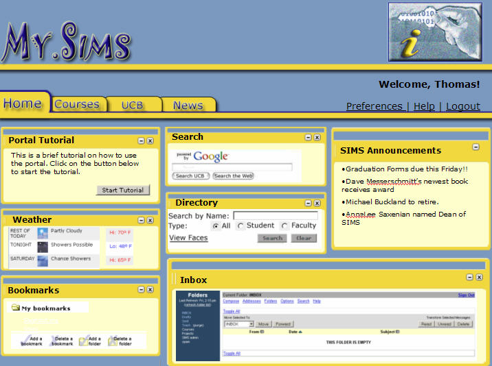
Home Tab: They layout of "channels" on this page don't seem to
make a lot of sense - The portal tutorial and Google search are at the top,
while something like email which people use a lot is at the bottom.
SIMS Corpus: The number of channels on the Home tab was reduced.
Also the most important channels, as identified from user input, were moved
to the top.
- [H1: Simple and Natural Dialogue) (Severity 2)
Preferences- Set-up Course Details: Why are we only interested
in the courses a student is enrolled in as well as those they are Interested
In? What exactly does Interested In mean (e.g. can you only select courses
for the current semester), and if we include that, why arent we including
access to all Courses taken, as the user was definitely interested in them at
one time? It is not clear where this information comes from. Is this populated
from your UCB registration? If so, it seems weird to have a box of courses you
are "interested in" right next to ones that you are officially registered for.
It seems like a there is a bigger mental distinction between this two types of
classes. (2 evaluators)
SIMS Corpus: As
the phrase Interested In was recommended by a user and did well during initial
testing, explanatory text was added. Instead of text box, a drop down menu
was used to facilitate course selection. To differentiate between "enrolled"
and "interested in" courses, separate content channels were created.
- [H2: Speak the Users Language] (Severity 2)
On the Welcome page, users can choose to customize their site by
clicking on the Customize button. This takes them to the Preferences sections
Profile page. It is unclear that customize means preferences.
SIMS Corpus: We did not consider this a heuristic violation. We
found this term to be used consistently throughout our Comparative Analysis.
Also it was a term users understood and referenced correctly during our paper
prototype and other testing sessions.
- [H4: Consistency] (Severity 2)
All pages: Buttons are not consistent in design or in use. In
some cases an action is performed by clicking on a button, and other times by
clicking on a link (e.g. Add Feed on the news page is a link).
SIMS Corpus: This issue was addressed in the second interactive
prototype. Buttons were used to indicate actions. Links
open pop-ups
or new
windows.
- [H10: Help and Documentation] (Severity 2)
Since there are all kinds of content on the site, it would be
helpful to be able to access help at a local level (i.e. at each content box)
instead of a page dedicated to all help questions.
SIMS Corpus: Context sensitive help was added to specific areas
in the prototype. The idea of a "What's This" link was used as well. Clicking
it causes a pop-up to appear with a brief help statement.
- [H6: Clearly Marked Exits] (Severity 2)
It is unclear how a user can delete channels from the
Preferences/Interests page once they add them to the grid. The x is so small
that its not very obvious.
SIMS Corpus: A larger, trash can icon was used instead of the "x"
in the Second Interactive prototype.
- [H2: Speak the Users Language] (Severity 2)
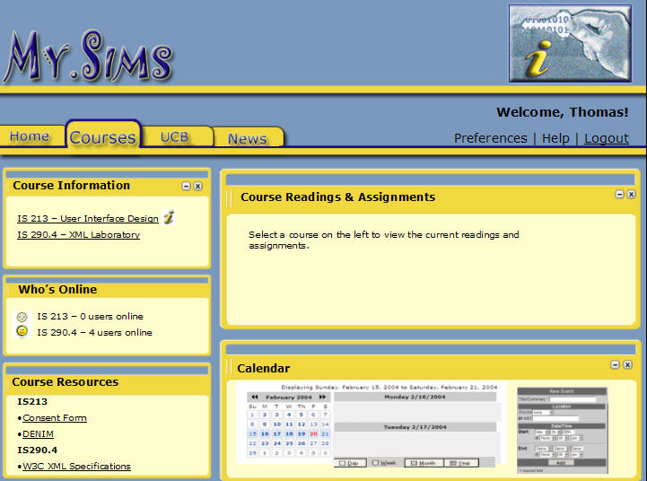
Courses Tab: Its not clear why the calendar is under the
courses tab. Is the calendar only displaying things related to courses? Or can
the user use it to as a planner to enter in any events that they want? If this
is the case then wouldn't it make sense as its own tab?
SIMS Corpus: Users asked for the calendar to be located specifically
on the Courses tab. We had initially placed it on the Home tab. The move allowed
users to view all their course due dates in one central place. This was one
of the most requested features during our paper prototyping phase.
- [H1: Simple and Natural Dialogue] (Severity 2)
Courses Tab: Im not sure why this Whos online section is
part of the courses page and not elsewhere on the site? What value does it add
as part of the courses page? How will you identify someone who is online and
in multiple courses - will they be counted as an online user under each course
they are associated with?
SIMS Corpus: The notion of categorizing who is online by course
was removed. Instead a general listing of who is online will be provided.
- [H8: Prevent Errors] (Severity 2)
Preferences- Set up Course Details: A blank text box for adding
a course that you are interested in doesn't seem very helpful to the user -
what are they supposed to type in there? A keyword? The entire course title?
The department and course number? The CCN? Perhaps some drop down menus or
other aids would be more helpful and prevent the user from making mistakes.
SIMS Corpus: Instead of text box for
adding a course, a drop down menu was used to facilitate selection.
To differentiate between "enrolled" and "interested
in" courses, separate content channels were created.
- [H3: Minimize User Memory Load] (Severity 2)
It is a little difficult to find user name and password on the
initial screen. You might want to move your application icon to the middle and
move the entry fields for user name and password to the top of the screen in
that area.
SIMS Corpus: The
application icon was moved behind the MySIMS logo. The user name and password
were moved up the right-hand corner (where the application icon had been initially
placed).
- [H1: Simple & Natural Dialog] (Severity 2)
You talk about the fact that not logging out could inflict
damage on your user account on the Welcome page. What does that really mean?
SIMS Corpus: The tone of the security message in the Welcome page
was toned down (made calmer).
- [H3: Minimize User Memory Load] (Severity 2)
When the user is in the Preferences > Profile section it is
difficult to tell where they are because you only put Preferences at the top
of this screen and then went straight to the sub-headings for Profile. You
might want to use breadcrumbs (as I did above) to indicate the submenu in
which the user is located. Additionally, Id suggest calling it My Profile
to make it clear that it is personal info about the user.
SIMS Corpus: Retitled the section "My Profile". We decided not
to introduce another navigation model and did not incorporate breadcrumbs.
- [H1: Simple & Natural Dialog] (Severity 2)
In Profile > Academic Interests, it is difficult to tell that
there are sub-menus under each Academic Interest. It is also unclear what will
happen if you select an Academic Interest without selecting a Content Channel
underneath it.
SIMS Corpus: The sub-menus were removed. To introduce the concept,
the items that were previously depicted in the sub-menus will automatically
be added to the Interests tab. Users can remove or add more channels in the
Preferences section.
- [H1: Simple & Natural Dialog] (Severity 2)
In Profile > Personal Information it is unclear what the user
should do if they want to enter two phone numbers (e.g. home and cell).
SIMS Corpus: Another phone number field was added. A drop down
menu before the field was incorporated to allow users to designate the type
of phone number (cell, home, work, etc.)
- [H1: Simple & Natural Dialog] (Severity 2)
In Home > Bookmarks, it is unclear exactly what is contained
in the Bookmarks section. Is it URLs or local folders or both?
SIMS Corpus: The Bookmarks section was redesigned. In the second
interactive prototype, links are used.
- [H2: Speak the Users Language] (Severity 2)
In News > News Sources, what does Add Feed and Remove
Feed mean? It looks like there is already a drop-down there with all the
available choices, so Im not sure what the functionality would be. The term
feed may be confusing for some users, and conflicts with the fact that youve
called these things Content Channels in other areas.
SIMS Corpus: The "Add Feed" and "Remove Feed" options were removed.
- [H5: Feedback] (Severity 2)
In News > News Sources, if Set as Default is checked, how
does the user know that they have successfully set a feed as the default? This
should be a button that returns feedback, not a checkbox (after which normally
a button must be pressed to return feedback).
SIMS Corpus: We removed the "Set as Default" option.
- [H4: Consistency & Standards] (Severity 2)
In Courses > Course information why is the I icon used?
Wouldnt a New icon be better, as it is the more commonly used web
convention and conveys that there is New information, not just
Information?
SIMS Corpus: We decided to keep the "I" icon. Adding "New" or other
words made the text too long. A mouse-over was added to put the "I" into context.
- [H2: Speak the Users Language] (Severity 1)
Home Tab: I t is not clear what community the people directory
is acting upon - is it just SIMS or all of Berkeley? Also, what will happen if
the user presses the View Faces link and a query hasnt been run yet. Should
it be there if a query hasnt been run yet? (2 evaluators)
SIMS Corpus: The word "SIMS" was added, so the title reads "SIMS
Directory". View Faces is a link, so clicking it in the second interactive
prototype will open a new window.
- [H4: Consistency & Standards] (Severity 1)
Grammatically, it is more correct (and more widely used in
applications) to say No, thanks instead of No thanks on the Welcome page.
SIMS Corpus: The requested change was made.
- [H2: Simple & Natural Dialog] (Severity 1)
In the News > News Reader section, an Email Story link
should not be displayed when there is no story. I found that confusing and
initially wondered what it meant.
SIMS Corpus: The "Email Story" link was removed. Following practices
used throughout the web, an email and print
icon will appear in the pop-up containing the story the user clicked on.
- [H2: Speak the Users Language] (Severity 1)
In Preferences > Content, I dont think there is any need to
add the word Channel to the title of a channel (e.g. Jakob Nielsen Alertbox
Channel). It just takes up screen real estate and is redundant since the name
of the drop-down is Channel Also, as mentioned previously, are these
websites or news feeds? Not knowing this makes it difficult for me to tell
what Add Custom Channel could mean.
SIMS Corpus: The word Channel was removed.
Second
Interactive Prototype
In order to progress towards our final application, the
second interactive prototype was built in HTML. It includes the
recommendations identified during the heuristic evaluation as
well as other improvements identified throughout IS213. The overall
structure is still a portal with multiple tabs. The first time
a user logs on they will be presented with a Welcome page. From
here the user can decide to customize their instance or start
using MySIMS directly. All users will be presented with four
tabs - Home, Course, UCB, and News. Individuals who selected
interests during the customization process will have a fifth
tab - Interests. The tab will contain suggested content based
on the interests the user identified. These, as well as other
channels found throughout the portal, can be deleted. The user
can click the trash can icon on the channel or remove it in the
Content portion of Preferences. Within Content, the user can
add channels as well. Also, within Preferences, the user can
revisit the Profile information presented during the initial
setup process. (Note: In the current prototype, we have not had
time to implement the Color Scheme or Account Administration
portions of Preferences.)
Follow these tasks, and supporting steps, to view the
second interactive prototype. Note: It is best viewed
with Internet Explorer version 6.x.
- To Setup Initial Content
- Step 1: Login
- Step 2: Choose to Customize
- Step 3: Enter Profile Information
- Step 4: Review Interests Lab
- Step 5: Logout
- Print
Course Reading
- Step 1: Login
- Step 2: Choose Not to Customize
- Step 3: Navigate to Courses Tab
- Step 4: Print Usability Assignment & XML Reading
for Tuesday
- Step 5: Logout
- Add Calendar Channel to Home Tab
- Step 1: Login
- Step 2: Navigate to Preferences Menu
- Step 3: Select Channel to Add
- Step 4: Select Location for Channel
- Step 5: Confirm Location of Channel
- Step 6: Validate Channel is Added
- Step 7: Logout
Preview of Usability Test
The task scenarios we will be using for usability testing are modeled after
those outlined for low-fi
prototype
testing.
Following the same scenarios will allow us to compare the changes we have made.
Also, as we believe we have cleared up some trouble spots, we envision users
highlighting a few new points of concerns. These items might have been present
previously but could have been overshadowed by other issues. The three task
scenarios participants will perform are as follows:
- Scenario 1: Setup Initial Content
- Scenario 2: View Course Information (Print Course Reading)
- Scenario 3: Customize Content (Add Calendar Channel to Home
Tab)
As the users walk through the scenarios, we expect to evaluate
these five characteristics:
- Effective: Effectiveness is the completeness and accuracy
with which users achieve specified goals. It is determined
by looking at whether the user’s goals were met successfully
and whether all work is correct.
- Efficient: Efficiency can be described as the speed (with
accuracy) in which users can complete the tasks for which they
use the product.
- Engaging: An interface is engaging if it is pleasant and
satisfying to use. The testers' reaction to the style of
the visual presentation, images, colors, and readability
of text will be considered.
- Easy to Learn: An interface which is easy to learn allows
users to build on their knowledge without deliberate effort.
Allow users to build on not only their prior knowledge of computer
systems, but also any interaction patterns they have learned
through use in a predictable way.
adapted from Whitney Quenesbery's What
Does Usability Mean
|
