For our second interactive prototype,
we incorporated feedback from the heuristic evaluation
of our site by PhotoCat (the
complete heuristic evaluation is available here).
The overall layout and navigation functions remained
the same, but we tried to accommodate most suggested
modifications to make the site more useable. Some
of the larger changes are briefly outlined below.
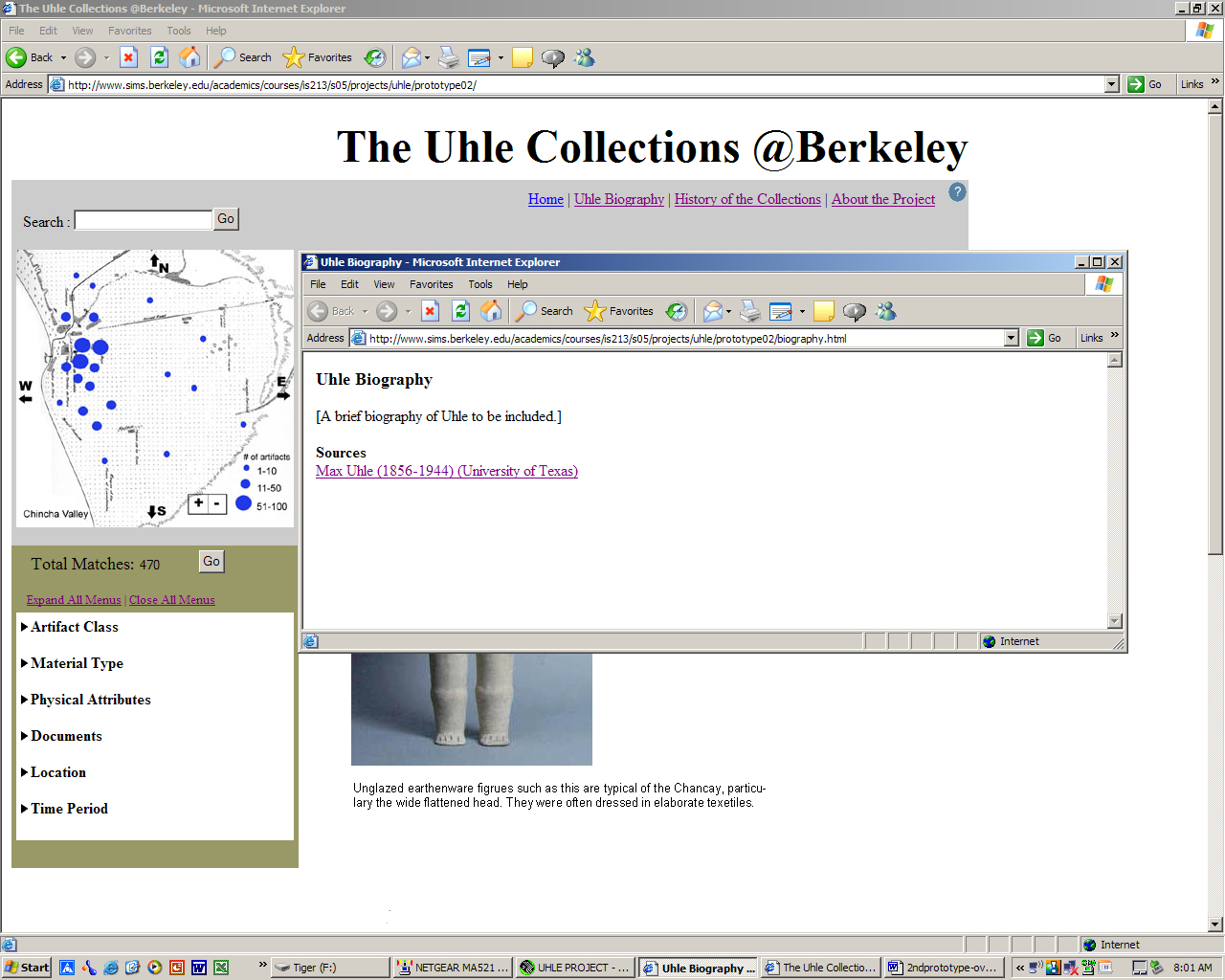
First, the information about the site
and project as a whole, which can be reached from
links at the top of every page, now open in a new
window rather than in the same area in which the results
are displayed. This allows users to refer to these
pages without interrupting her search.

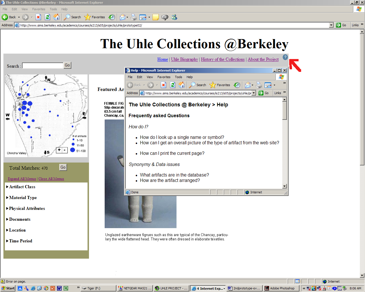
Secondly, we added a help section
to the site. Like the "about the site" links,
the button to access the help section is clearly visible
at the top right corner of each page. To differentiate
it from the other links, the help button appears as
a question mark (similar to help buttons in many other
applications and thus familiar to users).

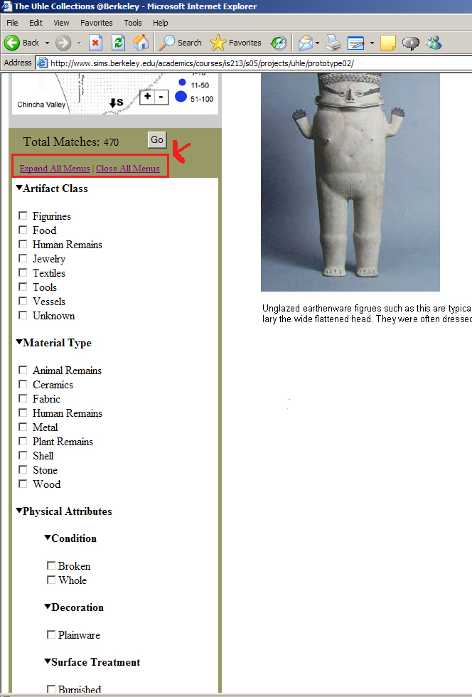
Third, we made the function of the
"Show All" radio button more clear by changing
it to text links reading "Expand All Menus"
and "Close All Menus." This allows users
to quickly open all the hidden categories for browsing-a
feature that our initial users asked for during paper
prototype testing. Implementing this function is an
important improvement over the first interactive prototype.

Finally, we implemented many smaller
changes to improve the look of the site and streamline
navigation. Please see the following table for a more
detailed discussion of the specific changes we made,
including several which we chose not to address at
this point.
Link to
Response to Heuristic Evaluation
Link
to Second Interactive Prototype
[Top]