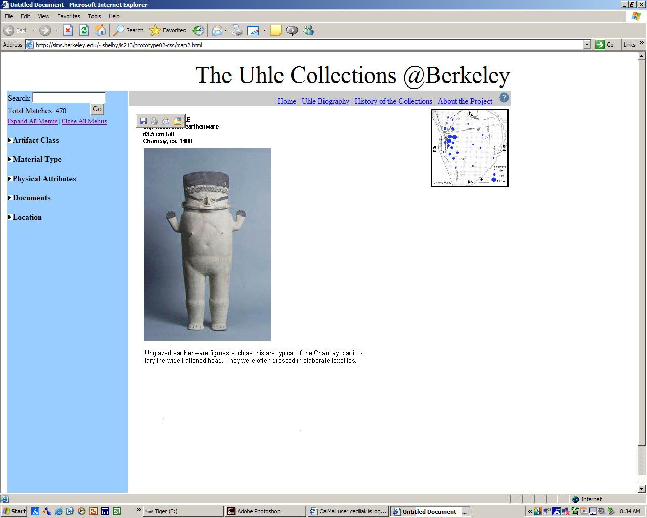
This system, the Uhle Collections
@ Berkeley, provides web-based access to the collection
of artifacts that is located at the Hearst Museum
of Anthropology at UC Berkeley. The purpose of this
study was to determine if the features as implemented
make sense and are useable. Furthermore we wanted
to see if our users would be able to notice the changes
as they added more selections to their search. The
major changes that occur are: the number of Total
Matches and the amount of artifacts represented on
the map. We also asked if our users preferred the
current map location or an alternative. To test our
updated help icon we asked where the users would go
for help with the system.
2. Method
Participants
We selected our participants from
a pool of people with an interest in archaeology.
We expect that our system will be most utilized by
researchers and students of archaeology.
Participant 1 is a male professor
of Architecture at UC Berkeley whose area of interest
is the Architecture of ancient civilizations. He has
been studying Peru since about 1979.
Participant 2 is a female undergraduate
of Anthropology at UC Berkeley. She has been interested
in archaeology since her childhood.
Participant 3 is a male PhD student
at UC Berkeley. He has worked in archaeology for about
7 years.
Apparatus
We tested one or our participants
in his office using an Apple PowerBook computer. The
other participants were tested in the South Hall Computer
Lab, 2nd floor. All participants used Internet Explorer.
Tasks
See
other tasks from assignment 5.
Procedure
We provided a brief explanation of
our system before starting the testing session. We
also explained to our users that some of the items
they select may not be implemented yet, but that this
should not keep them from selecting those things.
We emphasized that if this happens then it is the
fault of our implementation, not their choice. All
of the participants received the same set of tasks
to complete. These instructions were read to them.
As each participant performed the task they were asked
to talk out loud about the choices they were making.
After they finished each task we asked our users to
comment on what they had just done.
[Top]
3. Test
Measures
Our goals for the pilot usability
study were to find out whether the second interactive
prototype of the system supports the various users
who have different knowledge and skills both with
computers and with the subject of this collection
in particular. Through observation and a post-testing
questionnaire, we designed the study to collect the
following data:
- Amount of the time to complete
each task
- Number of navigation errors per
task
- User preference on search method
- Level of ease of use
[Top]
4. Results
We started out wanting to test the
time it took for our users to complete each task.
We found, however, that our users tended to be very
exploratory and that our prototype was limited enough
that tasks tended to run together (that is, users
often managed to fulfill more than one task at a time).
We also wanted to test the number
of errors our users made. However, we found that users
rarely made "errors"-if they attempted to
use a method that was unsupported in our current implementation,
this usually was just a limitation of the prototype.
That is, users never tried methods that would not
work in a true implementation of the system.
As a consequence, we focused on qualitative
rather than quantitative data for this round of testing.
We asked users to continually give us verbal feedback
on the methods they were using to complete the tasks.
Two of our users had gone through the paper prototype
and thus could comment on the changes between the
two versions.
Overall, fulfilling the tasks took
very few steps and users never found themselves "lost"
while carrying out the scenarios. On the contrary,
users wanted to explore the collection to a greater
extent than the tasks required.
[Top]
5. Discussion
Our first user was concerned about
the fact that the checkboxes for browsing were located
far down on his laptop's screen. In response to this
comment, we created a mock-up of a different layout,
in which the map was moved to the right side of the
screen and the checkboxes shifted up.
This also eliminated the second "Go"
button (both buttons will do the same thing). In our
subsequent user testing sessions, we asked the users
to briefly compare the two layouts and pick one (the
task scenarios were carried out using our original
layout, however, as we did not have time to recreate
them in the new layout). However, we discovered that
users preferred the original because the second layout
disassociated the map from the browsing and searching
functions. It was not clear to the user what the relationship
between the map and the other access points was.
For this reason, we decided to keep
our original map position. Of course, this choice
is somewhat arbitrary, as we did not have time to
test different layouts more thoroughly. Perhaps users
preferred the original because they were more used
to seeing it (we went through the task scenarios before
asking the users about the new layout). Also, the
size of the user's screen almost certainly played
a significant role-the first user was on a laptop
with a lower screen resolution. Further testing of
the map layout may become necessary if many users
are accessing the database through lower-resolution
monitors.
We as designers were also concerned
about the two "Go" buttons. We wondered
whether having two buttons would be confusing to the
users. However, users reported that they had no problems
with the presence of two buttons. Further testing
with a working database, however, will more concretely
address this question.
One item that must be improved is
the access to the help section. Having only a "?"
graphic was not enough to alert users to the presence
of a help section.
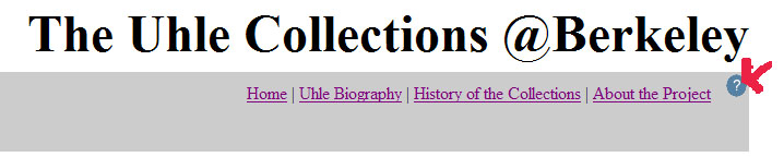
We plan to add the word "Help"
to the top navigation, along with the graphic, to
draw the user's eye to this function.
To carry out the experiment as outlined
in the "Formal Experiment Design" section
below, we would need a working back end to our interface.
The questions we are left with concern how the different
access points interact with each other. While we have
been attempting to address these questions throughout
the life of the project, we are finding that our current
mock-up is in some ways insufficient to fully test
its usability.
Furthermore, the map especially needs
to be in a more complete form-all of our users reported
that having a map would be "cool," but we
have so far been unable to test how this would actually
play out in a scenario. Would they actually use the
map to explore the spatial relationships between sites
and get a better overview of the collections as a
whole? Or would they be more likely to rely primarily
on the text-based browsing and search methods? Focusing
on the map, and on implementing the actual database,
should be the next step in this project.
[Top]
6. Formal
Experiment Design
Hypothesis
Our hypothesis is that different methods for accessing
the information in the database will accommodate a
variety of users that have different backgrounds in
terms of computer skills and general knowledge of
the system's subject matter. Therefore, these different
methods will allow users to explore the site in ways
that are easy and efficient regardless of their previous
knowledge.
Factors and Levels
Factors
Factors are the methods of the navigation. The three
levels are:
B - A browsing method that allows the users to explore
the collections through six top-level categories:
Artifact Class, Material, Physical Attributes, Documents,
Location, and Time Period.
S - A simple keyword search method.
M - A visual navigation method to explore the collections
by emphasizing location prominently.
The response variables for this experiment
are:
Amount of the time needed to complete each task
Number of navigation errors made while completing
each task
Frequency of method(s) used for navigation while completing
task
Blocking
The experiment will be conducted with 36 participants.
These 36 participants will be broken into four groups
of 9 participants. Each group of nine will contain
3 subgroups of 3 users from the following categories:
minimal archaeological knowledge, medium archaeological
knowledge and expert archaeological knowledge. These
subgroups will be determined by a survey that assesses
archaeology knowledge. Group 1 will operate on a control
interface which has all three search types (B, S,
M). Group 2 will use an interface that offers only
the Browse (B) method. Group 3 will use an interface
with only the Search method (S) and Group 4 will use
only the Map method (M). Each group will be given
the same set of tasks that instruct them to find certain
items in a collection. During the experiment the task
completion time would be recorded as well as the number
of errors.
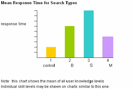
Example of Results
[Top]
7. Appendices
Consent
Form
Post
Paper Prototype Questionnaire
Response Data: Participant
1, Participant
2, Participant
3
[Top]
|