The Uhle Collections @Berkeley will
provide web-based access to the artifacts excavated
by Max Uhle in Peru in the late 19th century and housed
in the Phoebe A. Hearst Museum of Anthropology. Currently,
the only way to obtain information on these artifacts
is by physically visiting the collections themselves-a
process which can be arduous, requiring a certain
degree of administrative overhead and travel, if the
researcher is not located in Berkeley. The interface
will solve some of these problems by allowing researchers
to examine many aspects of the collection remotely,
through a familiar web browser. Furthermore, the interface
will give researchers the ability to easily compare
data on the artifacts in one screen. This will both
help with high-level analysis and serve as a basis
for further research with the artifacts themselves.
The purpose of the prototyping experiment
was to determine whether our initial design ideas
were natural and easy for our prospective users to
use without prior training. Did the interaction make
sense to them, as users of web browsers and as archaeologists?
Was it helpful for the kinds of research they want
to accomplish? We based part of our model on Flamenco's
tightly integrated search-and-browse functions, but
geared conceptually toward artifacts rather than images.
The map feature was another addition whose usefulness
we wanted to test. Finally, we wanted to discover
what additional features our users would like to see
in our system.
[Top]
2. Prototypes
Prototype
Description
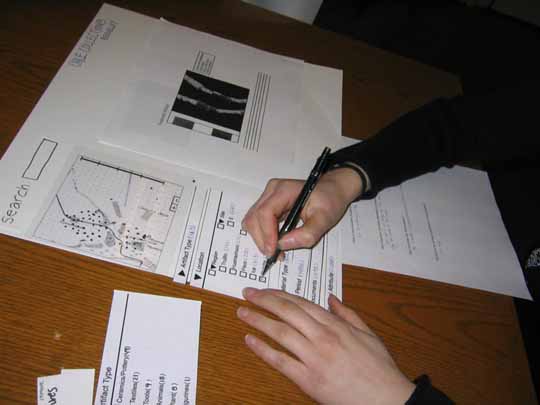
Materials:
Our prototype was primarily paper based, with some
features using transparencies, printouts and Post-Its.
The basic layout of our prototype involved three main
sections: title, navigation and display.
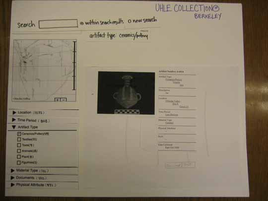
Phase 1
|
Title - Displays
the project name across the top portion of the
"screen" and does not perform any function.
Navigation - The left
hand side is composed of 3 ways to search the
collection.
- Keyword Search - A
search box where the user can write in a keyword
search. As results of a search are displayed
there is an option to perform a new search
or refine the search within the search results.
- Interactive Map -
Each artifact is represented by a point on
the map which marks its location within the
region. The user may click on a given artifact
or zoom in on the map to explore a site or
grave. This map correlates with the other
search features, that is when a user limits
a search query the number of points on the
map limits to represent that search. To implement
this in paper form we used an image of a map
at different levels of zoom. The artifact
points were drawn on transparencies (each
with a different quantity of points) and placed
on top of these maps.
- Browsing Top Level Categories
- Initially, these categories appear minimized
with an arrow to the left to indicate they
may be opened. A user is then able to make
selections using a check box next to a subcategory.
These category menus provide a number to the
right of the text that serve to inform the
user of how many items in the collection are
a member of that category. The number changes
as the user refines the search. To implement
this in our paper prototype we created three
versions of the same menu with the numbers
decreasing to illustrate the function.
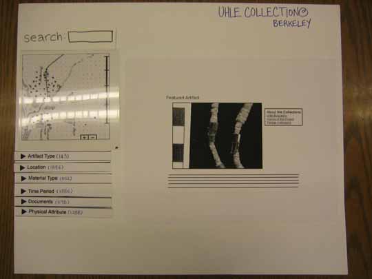
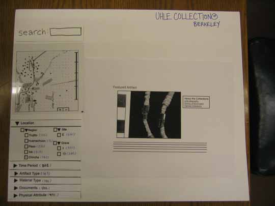
Display
- Opening screen - shows
an artifact and some text about the collection.
There are links to the Uhle Biography, History
of the Project and Partner Institutions.
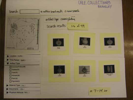
- Search results - thumbnails
- This display shows thumbnails and the number
of search results. Above the thumbnails the
users' keyword search or category choices
are displayed as text that can be removed
from the search results.
- Selected artifact or document
- From the thumbnail image a user may click
on it to open a larger image of this item.
Next to this larger image are the categories
that the item belongs to.
|
Phase 2
|
After performing two usability
studies we decided to modify our prototype before
the third participant based on previous reactions
and suggestions. The basic layout of our prototype
remained the same however the following revisions
were made:
Title
We chose to move the links to Uhle Biography,
History of the Project and Partner Institutions
to the title section so that they are always
accessible.
Navigation
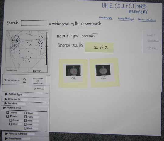
- Browsing Top Level Categories
- In this version we are experimenting with
the numerical data offered in the category
menus. Instead of every subcategory displaying
a number we created a Total Matches: above
these menu options. The number will still
change as a result of user choices, however,
by showing it in one location we aim to clear
up confusion. There is also a Go button that
changes the results when the user has indicated
that she is ready. We also added a "show
all" button that allows the user to open
all the menus at once.
Display
- Search results - thumbnails
- We added the option to see search results
in a text only display to resemble a spreadsheet.
|
System
Flow Diagram
[Top]
3. Method
Participants
Participant 1
is a female fourth year Anthropology student at UC
Berkeley who will be graduating in May this year.
Ever since she was young, she has been interested
in archaeology, but she has only been studying the
"real" thing since she got into college.
She has some experience with surveying and excavation
at a site in Molorea, French Polynesia for two months.
She hopes that she can extend her archeological interest
further even after graduation.
Participant 2 is a male third
year Ph.D. student in the Anthropology Department
at UC Berkeley. Previously, he received a Masters
degree in Anthropology and has worked in the field
of archaeology for about seven years. His current
research includes ethnoarchaeology, ceramic analysis,
public/community archaeology, and the politics of
representation.
Participant 3 is a female professor
in the Anthropology Department at UC Berkeley. She
has been working in archaeology for the past 30 years,
and she has been especially involved in anthropological
research concerned with long-term human-plant relationships.
She participates in various archaeological societies
and has been directing several projects that relate
to South American archaeology. Currently she is interested
in studying the ways ancient people used plants and
refining paleoethnobotany methodology.
Task
Scenario
Task Scenarios #1 - Find jars
with fish on them.
- Task Description: You are interested
in finding some information about jars with fish
patterns on them.
- Task Purpose: To learn where users
expected to go to find the artifact that we had
assigned. We hoped to see whether users would search
through keyword or by using the browse menu. Also
we wanted to test some of the terminology that we
had included in the prototype.
- Anticipated Steps: One of following
steps
1. Keyword search: jars with
fish; fish; jars
2. Use Browse menu: material Type > Ceramic;
Artifact Type> Ceramics/Pottery;
Physical Attribute>Decorations
Task Scenario #2 - Find documents
related to your search written by Uhle.
- Task Description: Find any documents
written by Uhle that mentions the jars that you
found from the first task.
- Task Purpose: To see how users
retrieved documents in the interface. We also wanted
to identify other content elements that users expected
to interact with.
- Anticipated Steps: One of following
steps
1. Keyword search: Documents
by Uhle
2. Browse: Document Type > Manuscript, Letter,
Books, Field Notes, Articles
Task Scenario #3 - Find the
area with the highest density of artifacts.
- Task Description: Now, go back
to the homepage and find the area that has highest
density of artifacts.
- Task Purpose: To see if users used
the the map as a main step in retrieving results.
Also we wanted to find out what other content elements
users would have liked to see for this task.
- Anticipated Steps: One of following
steps
1. Search map: Click on the
area with the most dots
2. Browse Location facet for highest number
Precedure
There were three roles in our group:
one person acted as the facilitator, one took notes,
and the other person acted as the computer. In the
beginning of the test, we gave the participants a
brief description and introduction to our project,
and asked them to read and sign the informed consent
forms we provided. Then the facilitator and computer
person briefly explained the interface with a short
demo. The facilitator then stepped the participants
through each task and observer recorded participants’
questions and responses. After completion of the tasks,
we asked the participants for any comments or thoughts
about the interface that they had just experienced,
and what changes or additions they would like to see.
Finally, we requested that the participants fill out
a short questionnaire
to gather background information.
[Top]
4. Test
Measures
Our primary goal for this usability
test was to get feedback from our primary users. We
incorporated input from previous interviews with users
into our current design, drawing on their past experiences
with other interfaces and their expectations for the
interface we are proposing. In this evaluation, we
explored the following aspects:
- How users navigated through the
interface
- How users responded to the mapping
features
- Whether users understood the terminology
we included in the interface
- What users expected to see from
the navigation process and what were surprise elements
- How users refined and expanded
their findings through hierarchical faceted metadata
categories
- Any further features that users
looked for in the interface
[Top]
5. Results
Navigation
Generally, users tended to select
items in the boxes of metadata when beginning their
search. Keyword searching was usually secondary, if
used at all. Users liked browsing through the pages
of thumbnails to get an overview of the collection.
They had no problem figuring out how to explore the
metadata checkboxes or how to navigate within search
results to locate more detailed information. Users
were inclined toward browsing through surrounding
artifacts and information, even when given fairly
directed tasks, and appreciated the ability to navigate
to related facets without having to back out of the
search.
Map
Surprisingly, users did not often
interact with the map directly. Instead, they were
more likely to go directly to the checkboxes with
metadata text, even when faced with a task meant to
encourage use of the map. On the other hand, they
liked that entering an artifact's detail page caused
the map to display only that artifact's location.
One user in particular did express an interest in
learning more about an artifact's surroundings, and
all users agreed that this kind of information was
critical in archaeological work.
Terminology
There was some confusion about terminology
that must be worked out in more detail. Archaeologists
are very concerned with the terms that they use to
describe an artifact and one of our users warned us
to stay away from using terminology that was too specific
as it may imply a bias which we do not intend. Terminology
is also more complicated among the three areas "Material
Type," "Artifact Type" (renamed "Artifact
Class"), and "Physical Attribute."
There is some overlap conceptually between these three
areas and many questions about proper classification
(for example, what "artifact class" includes
a handful of peanuts?) were raised throughout the
tests.
Expectations
On the whole, the interface acted
in a way that was understandable to the users. Each
had no trouble figuring out how to select metadata
for browsing. When reaching the artifact detail page,
every user understood that clicking on the grave name
would result in calling up all artifacts from that
grave. Total confusion was rare.
Refining and Expanding
Users both checked additional metadata
boxes and used the search function (within results)
to narrow their searches. They did not need to go
far to accomplish the tasks we set them, and most
found that they could meet the task after only one
refinement. However, users often independently continued
beyond the specified task to explore related materials,
such as other artifacts found in proximity to the
selected artifacts, and related documents. They easily
expanded their search results from a single artifact
by clicking on the metadata or related documents links
on the artifact detail page.
[Top]
6. Discussion
What we learned
All users liked the checkboxes that
displayed all the available metadata they could use
for browsing. They had no trouble understanding the
categories and would usually choose a category first
before narrowing the focus through a keyword search.
However, users were unsure if checking a box would
automatically perform the search or if they should
click a button to initiate the search. Some users
suggested an option to view all the top-level categories
at once.
One user said they felt lost in their
search at one point. They were uncertain where they
had been. Some users may like to have the option to
see the data displayed much like an Excel spreadsheet
to easily compare and contrast the items.
Although generally users had few problems
understanding how to move through the system, one
participant experienced confusion when navigating
from a specific artifact item to a broad level category.
The user thought that they were navigating to more
specific information about that artifact's location
when they were really navigating to other items within
that location.
Despite our efforts to anticipate
a user's actions we learned that we did not account
forall of their actual moves. For example, some of
the participants would use location as a tool to find
specific artifacts or documents instead of the expected
top-level category or keyword search. Also, users
went to the location facet to answer the density question
instead of relying on the map representation. Participants
tended to navigate to additional documents via the
link provided in the artifact screen rather than look
in the top-level category labeled Documents.
What will we change
We made some changes in our prototype
based on the first two participants and tested them
on the last user.
These are the items we did change
and test:
- We created a "show all"
button above the top-level categories to open all
the categories at once.
- We included the ability to view
search results in a table format.
- We moved links about the collection
to the title area. Users were not given any tasks
related to this.
- We changed the number of items
in the search to be in one location above all the
top-level facets instead of next to each. We also
included a "Go" button to indicate that
a user could select several checkboxes, see the
number change and then click "Go" to perform
the search. The user we tested this on was able
to decipher what this meant.
These are items
we will change for future iterations
- We would like to include a way
to display a search history.
- We need to add some text to describe
what to do in areas such as the categories to make
it clear that a user may check on multiple selections,
perform a search and then add more selections.
- We need to refine the terminology
used in our categories by utilizing only the terminology
found on the Hearst Museum's catalog cards (making
sure to note this decision in supporting documentation).
To determine a suitable vocabulary grouping, we
intend to carry out card-sorting exercises, and
we will be consulting experts and literature on
Andean archaeology.
What the evaluation could not tell
you
The dramatization of the paper prototype
could not tell us if more subtle features would be
noticed in an actual implementation. For instance,
in our paper prototype the very act of changing the
transparency draws the users attention to the map.
In actual implementation this may go unnoticed until
there were drastic differences in search results or
until the user clicked on the map. Similarly, the
act of switching out menus with existing menus draws
the users attention to look what might have changed.
[Top]
7. Appendix
Additional Prototype Images: Image
1, Image
2, Image
3, Image
4, Image
5
Consent
Form
Task
Script
Post
Paper Prototype Questionnaire
Background
Information Questionnaire
Response Data: Participant
1, Participant
2, Participant
3
[Top]
|