| |
|
| |
Assignment
2
Personas, Goals
& Tasks Analysis
|
| |
Assignment
3 (Revised)
Scenarios, Comparative
Analysis & Initial
Design
|
| |
Assignment
4
Low-fi Prototype
& Usability Testing
|
| |
Assignment
5
First Interactive
Prototype
& Presentation
|
| |
|
| |
Assignment
7
Second Interactive
Prototype & Heuristic Evaluation Intergration
|
| |
Assignment
8
Pilot Usability
Study &
Formal Usability
Test Design
|
| |
Assignment
9
Third Interactive
Prototype
Write
up
(Final Presentation)
|
| |
|
|
| |
Assignment
5: First Interactive Prototype& Presentation
1. Overview of UI
2. Differences from low-fi
3. Scenarios
4. Storyboard
5.
Prototype Overview
6.
Link to Project Presentation
7.
Link to First Interactive Prototype
8.
Work Distribution Table
1. Overview of UI
The user interface we implemented
uses an "L-shaped" layout where the title
is along the top and the navigation items are located
on the left side of the screen. The center portion
of the screen displays the search results. The navigation
section provides three options of searching through
the collection: keyword search, map-based browsing
and category searching. With the exception of the
keyword search, these search options provide information
beyond a hyperlink. The map describes a spatial relationship
among a quantity of artifacts. The category search
allows a way to choose artifacts based on the metadata
of those artifacts. It is also a textual peek at what
is offered in the collection.
The display area shows search results as either thumbnails,
text representation or as a detail.

[Top]
2. Differences
from low-fi
The basic layout of our prototype
remained the same from the low-fi prototype to the
interactive prototype. However, based on user testing
of the scenarios using the
low-fi prototype we chose to change the following
items:
Title Links - Our low-fi prototype
provided links to general collection on the home page.
These links provide information about Featured Artifact,
Uhle Biography, History of the Collection, About the
Project. We decided to move under the title so that
they are always available regardless of the user's
position in a search.

Text Only View - One of our
low-fi prototype testers suggested offering a text
only view of artifact search results in addition to
the thumbnail view. This view is similar to an excel
spreadsheet of the artifacts and allows a user to
easily compare the metadata between artifacts.

Remaining Artifacts Indicators
- In the low-fi prototype we provided a number next
to each facet in the category menus. Inspired by Flamenco,
these numbers represented the number of items remaining
in the collection with respect to that facet. The
users we tested were confused by the number of numbers
so we chose to simplify this as one single number
at the top of the category menus. We also included
a "Go" button so the user has more control
of the timing of displayed results.

[Top]
3. Scenarios
Welcome to Uhle Collections @ Berkeley.
Please follow our task scenarios closely as not all
of the functionality suggested by the UI is available.
For instance, map based or keyword browsing is only
available with pre-scripted html pages for the current
prototype. Start each scenario from the index page
and navigate through the interface while completing
each task.
Scenarios #1 - Find jars
with sooting on them. (Storyboard #1)
|
You are an archaeologist
with a focus on pottery. As part of your research,
you are interested in examining South American
jars which have been burnt (in archaeological
terms, the artifacts display "sooting").
Look up jars with sooting in the Uhle database.
1. Type "sooting"
in the keyword search, and click "Go."
(Do not press enter-this will not work in
the prototype, although it will in the final
version.)
2. Click on the image of the
jar.
|
Scenarios #2 - Find out
how many artifacts there are in Chincha Site
E, grave 13. (Storyboard #2)
|
There are two ways to accomplish
this scenario.
Method A
1. From the artifact detail page that you
reached in the first scenario, click on the
facet "Grave 13" under the artifact's
metadata to the right of the photograph.
2. All items from Grave 13
are returned-the number of items returned
is the number of items from Grave 13.
Method B
1. From the index page, go to the Location
facet, and under Chincha Valley, Site E, select
Grave 13.
2. The number after Total
Matches is the number of artifacts in Grave
13. (You may also click the Go button at this
point to search for all items from Grave 13.)
|
Scenarios #3 - Print a
list of ceramic vessels without thumbnail
view. (Storyboard #3)
|
You are an undergraduate student
from the Anthropology department. This semester,
you are taking Archeology 152, Introduction
to South America, and you have to write a
research paper comparing different types of
ceramic vessels that have been found in Chincha
Valley, Peru. Professor Susan Marks kindly
tells you to visit the Uhle Collections @
Berkeley for your research.
1. Under the Artifact Class
facet, click Vessels.
2. Under the Material Types
facet, click Ceramics.
3. Click the Go button after
the Total Matches number to perform the search.
4. Since, you want to see
general information from the search results
in relation to one another, click "Text
Only" under the Views.
5. Print this page using the
browser's Print command to save it for further
research
|
[Top]
4. Storyboard
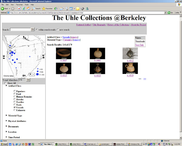
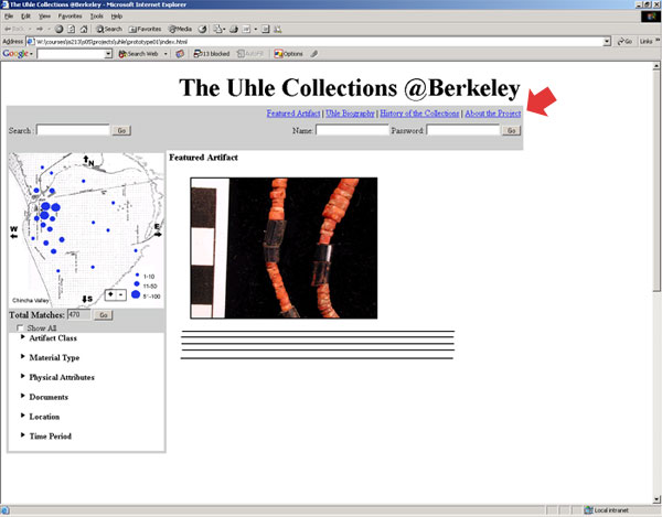
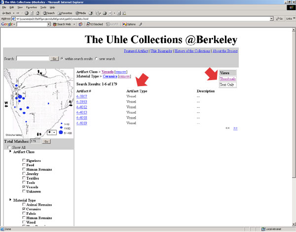
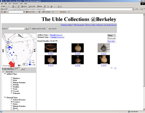
Storyboard
for Scenario #1
Storyboard
for Scenario #2
Storyboard
for Scenario #3
[Top]
5.
Prototype Overview
Prototype Tools
This prototype was built in HTML and JavaScript, using
Dreamweaver, TextPad, and TextWrangler (a text editor
for the Mac). A pre-made script from http://www.dynamicdrive.com
was used for the menus, albeit modified extensively
for our use. In later iterations, we expect to be
using Perl layers to talk to the backend database,
but this functionality is not yet available. We also
plan to use CSS for the graphic design of the site-we
have implemented the most bare-bones design for the
current prototype, as it will be supplanted by the
CSS in the next version.
HTML and JavaScript were chosen because
they would most realistically show how the system
is meant to work, and because the team already had
a fair amount of experience using these tools. Furthermore,
since the final version of the site will most likely
use a combination of HTML, JavaScript, and other scripting
languages, we hope to reduce future coding by building
on the base we have already written.
Wizard-of-Oz Effects
The backend database for this collection is currently
undergoing extensive reworking. For this reason, any
places where the user interface would call the database
are necessarily mock-ups. Where a similar effect is
repeated multiple times (such as with the checkboxes
in the expandable menus), we only implemented some
instances to avoid having to recode every section
to interact with the database when it is available.
Buttons are actually static links
to pages with example search results, and only one
artifact detail page is provided. The map function
received less attention than the browsing facets because
we are planning to implement the map using a pre-existing
map tool.
Furthermore, the "Total Matches"
number is not reflective of the actual content of
the collections. Again, we included the feature so
that our evaluators may get a sense of how it is meant
to work, but coding a more realistic mock-up was not
feasible given our timeframe and the fact that all
this code will be scrapped in further iterations anyway.
What we chose to leave out
Our interactive prototype includes
a user log in option. This is a feature that will
be implemented at some point in the life of the project
but not during this stage of user interface development.
[Top]
|
|
|