Scenario
#1: Rachel's Fieldwork Opportunity
|
Rachel knows
that she needs to gain some experience in archaeological
fieldwork if she is going to pursue a career
in archaeology. While looking up possible sites,
she discovers an opportunity to volunteer on
a dig this summer near Chincha Valley in Peru.
She remembers from her Andean Archaeology class
that parts of the Uhle collection came from
Chincha Valley, so she checks out www.uhlecollection.edu,
a website her Professor recommended as a great
information source with amazing images of the
collection. She browses through the online collection
looking at photographs of artifacts. She is
not searching for anything in particular, but
she is fascinated by the images and daydreams
of excavating similar artifacts herself. Maybe
this summer experience will inspire her to choose
a specialty for graduate school.
|
Scenario
#2: Christopher's Grant Proposal
|
After a meeting
with his advisor, Christopher is excited about
the grant proposal that he is going to write.
He has been wanting to visit Peru for his current
research and his advisor, David Rector, has
just told him in their meeting that the National
Science Foundation may have funding for the
trip. Professor Rector advised Christopher to
gather some background information about Uhle
and his work, as Uhle was an important figure
in Peruvian archaeology. Accordingly, Christopher
logs onto his computer and heads directly to
the Uhle Collections @ Berkeley website that
his advisor mentioned. He browses the site to
find out what kinds of materials Uhle discovered
and to learn about the history of the area.
He is especially interested in reading materials
Uhle wrote himself as well as critiques of Uhle's
work so that he can get a better idea of what
kind of research has already been done in the
area. As he discovers relevant sources, he adds
them to his saved list. Some full-text sources
are available online, so he downloads these
to read later. When he thinks he has enough
materials, he heads to the library with his
laptop to do some reading and get started the
grant proposal.
|
Scenario
#3: Susan's Pottery Analysis
|
Susan is in
the midst of an ongoing research project into
Incan pottery-specifically, she has been working
on a chemical analysis of ceramics to see whether
they were used for cooking, storage, or as decorative
objects. In the course of her research, she
has discovered that Berkeley houses many Incan
artifacts, including ceramics, excavated by
Max Uhle. She has used the Uhle Collections
@ Berkeley website in the past to do some preliminary
research, and is now at the stage when she needs
to analyze the artifacts in person. At her office
computer, she brings up the website for the
Uhle collections. After logging into the website,
she retrieves the searches she has saved in
previous visits. One of these searches focuses
on ceramics that appear to be burnt-possibly
in a cooking fire. Susan browses this saved
search and selects several artifacts that she
thinks would be ideal for the first steps of
her analysis. She prints a list of the selected
artifacts with the appropriate museum number
so that she can locate them in the physical
collection, as there are no computers in the
basement which houses the artifacts. Finally,
she calls the collection curator to arrange
a time when she can visit the collection.
|
[Top]
2. Revised
Personas and Task Analysis
Revised Personas
|

|
Persona #1
Christopher Lee
|
Christopher
Lee is a 29-year-old graduate student
who is known as a "computer junkie"
among his friends and colleagues. He often
jokingly refers to his laptop computer
as a "second wife," but his
actual wife, Grace, does not mind. Christopher
received his Masters degree in Anthropology
at Princeton University; however, his
expertise with computers (dating back
to his first love, the Macintosh) led
him to work in technology companies for
several years after graduation. Recently,
however, he has rediscovered a passion
for the study of ancient cultures. Therefore,
he has returned to University of California
at Berkeley as a Ph.D. student to study
South American archaeology, with a particular
focus on Peru. He uses online sources
frequently for his background research
and he is especially interested in finding
topographical mappings of the regions
that he studies. In addition to his archaeological
work, he faithfully attends the annual
MacWorld Conference and Expo in San Francisco,
and enjoys participating in other computer
conferences two or three times a year.
Christopher
has traveled extensively, and he always
finds the time to visit different places
in the world. He and his wife went on
a month-long backpacking trip for their
honeymoon in Asia about a year ago, and
they are planning to take a trip to South
America next summer. Christopher also
likes to rock climb and go horseback riding
whenever he can get away from his busy
graduate school life and his computer.
Christopher's
Goals:
- To stay
on the cutting edge of technology
- To travel
around the world in 60 days
- To develop
programs beneficial to the field of archaeology
|
Revised Tasks Analysis
| Task |
Christopher
|
Rachel |
Susan |
|
Search
|
by keyword
|
High
Importance |
Medium
Importance |
High
Importance |
by location
|
High
Importance |
Medium
Importance |
Medium
Importance |
by time period
|
High
Importance |
Medium
Importance |
High
Importance |
by material
|
Medium
Importance |
Medium
Importance |
High
Importance |
by artifact type
|
High
Importance |
Medium
Importance |
Medium
Importance |
save results
|
High
Importance |
Low
Importance |
High
Importance |
retrieve saved results
|
High
Importance |
Low
Importance |
High
Importance |
sort results
|
Medium
Importance |
Low
Importance |
Medium
Importance |
download results
|
High
Importance |
Low
Importance |
High
Importance |
| Browse |
by location
|
Medium
Importance |
High
Importance |
High
Importance |
by time period
|
Medium
Importance |
High
Importance |
Medium
Importance |
by material
|
Medium
Importance |
High
Importance |
High
Importance |
by artifact type
|
Medium
Importance |
High
Importance |
Medium
Importance |
save results
|
Medium
Importance |
Low
Importance |
High
Importance |
retrieve saved results
|
Medium
Importance |
Low
Importance |
High
Importance |
sort results
|
Medium
Importance |
Low
Importance |
Medium
Importance |
download results
|
High
Importance |
Low
Importance |
High
Importance |
| Account |
log in/out
|
High
Importance |
Low
Importance |
Low
Importance |
create
|
High
Importance |
Low
Importance |
Low
Importance |
delete
|
Low
Importance |
Low
Importance |
Low
Importance |
edit
|
High
Importance |
Low
Importance |
Low
Importance |
|
[Top]
3. Comparative
Analysis
Einstein
Archive Online
|
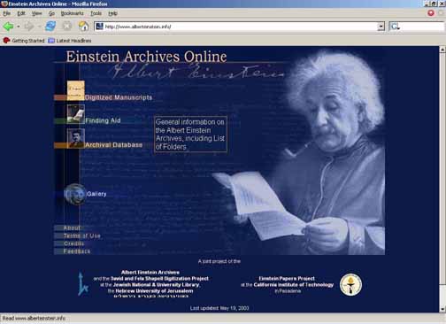
We chose this site for
comparative analysis because it is an
example of an online archive database.
|
|
Description:
This site is an online archival
collection of the work of Albert Einstein.
It is a web interface for a collection in
a database.
Audience:
The general public.
Contents and Features:
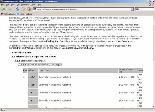
- Digitized manuscripts
of Einstein's scientific and non-scientific
writings and travel diaries. These are
arranged in a hierarchical folder structure.
- Archival Database of
writings, professional and personal correspondence
from and about Einstein. This section
provides a keyword search through the
collection by Author, Receiver, Title,
First Line, Content, and Place.
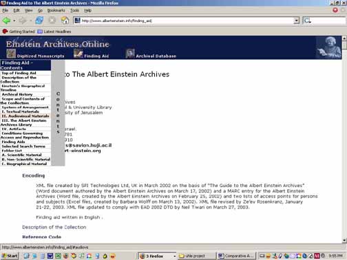
- Finding aid that describes
the categorization of items in the collection.
Offers reference of time and context.
Intended to guide search. Also contains
a list of folders in the database. Has
a menu that follows as screen scrolls.
- Gallery that allows
you to explore highlights of the digitized
manuscripts. Arranged by icons of actual
manuscripts.
Positive:
The keyword search feature
works very well and there is an advanced
search section.
Negative:
- This site is lacking
consistency in its organization of materials.
Each section has a different approach
to how a user should search. The Archival
Database section provides a keyword search
on all documents including those in the
Digitized manuscripts section. However,
the Digitized manuscripts has its own
link from the homepage which leads the
user to a hierarchical folder structure.
The Finding Aid provides useful information
about how to perform a search which seems
like it should be integrated with the
search section itself. The Finding Aid
also includes a hierarchical folder structure
of the entire contents (both the Archival
Database and the manuscripts section).
The Gallery section uses icons (yet another
organization scheme) to navigate through
this sample set of Digitized manuscripts.
- Once a search query
has been made, and the search results
are shown there is no way for a user to
tell what type of search he is in if that
is indeed a distinction that is trying
to be made. Generally, it is difficult
to keep track of what page or section
of the site you are in.
- The Finding Aid includes
a menu that scrolls along for the length
of the page. This menu hops along as you
scroll and is generally distracting. In
other sections of the website, such as
About the menu is at the top as links
to different sections of the page. Once
again this is inconsistent use of navigation
tools.
|
|
|
|
|
|
Africa.
Art and Culture - Museum of Ethnology Berlin
|
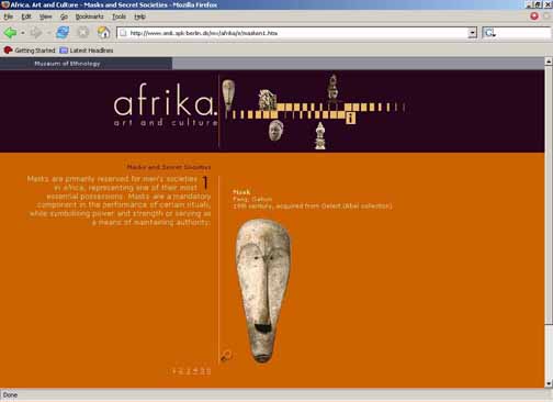
We chose this site for
comparative analysis because it shows
images of artifacts and is an example
of a museum collection.
|
|
Description:
This website shows selections
from the African Collection held at the
Museum of Ethnology in Berlin.
Audience:
General public with an
interest in the museum, potential patrons.
Both German and English speakers.
|
Contents and Features:
This site is broken
into the following categories: Masks
and Secret Societies, Kings in Africa,
African art, Connections between Africa
and Europe, and Witchcraft and Magic
Medicine. A toolbar facilitates the
user's navigation to each of these categories.
Images of artifacts representative of
this category are displayed as the user
clicks through a series of pages. The
images have a zoom tool.
Positive:
- The navigation toolbar
is consistent throughout the navigation
experience so that the user may easily
choose another category to look at.
- Navigation through
the pages of each category is smooth
and directed by hyperlinked page numbers.
The categories are consistent in layout.
Each section puts the images on the
right and the images on the left.
Negative:
- The zoom feature breaks
the consistency with image layout, possibly
to differentiate. However, this makes
the page navigation links at the bottom
a little confusing. Does it still correspond
to the original scheme or will it now
page through the artifacts with the
zoom feature?
- There is no indication
that the user is in the zoom feature.
|
|
PLANTS
National Database (USDA)
|
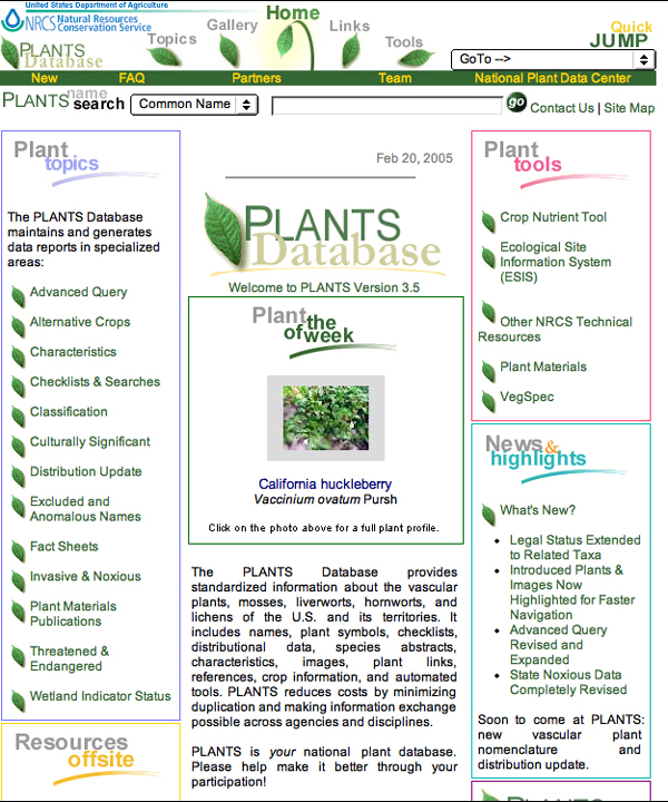
We chose this site for
comparative analysis because it is an
example of an extensive database used
for research purposes.
|
|
Description :
The PLANTS National Database
from the US Department of Agriculture is
a collection of data on plants native to
the United States. It is intended as a resource
for standardization so that agencies and
individuals can more easily share plant
information.
Audience:
This website appears to
target somewhat advanced researchers, but
also contains information for novices.
Contents & Features:
- A page on PLANT project
news.
- A search interface into
the database.
- Reports drawn from analysis
of the database as a whole.
- Articles on materials
related to the database.
- Tools for research with
the database.
Positives:
- The search box on the
top of the front page is clearly labeled
as a search of the plant database (i.e.
not the website), and has options for
three different fields to search on.
- Clean layout with few
large pictures, allowing for quick loading
time.
- Different options available
to users (i.e. "Plant tools,"
"News and highlights," and "Plants
Download") are divided into separate
boxes on the front page.
- Contains a separate page
stating that they are committed to providing
accessibility, and invites users with
accessibility issues to contact them via
phone or email.
- Each page contains the
search box for the plant database, as
well as a link to the site map.
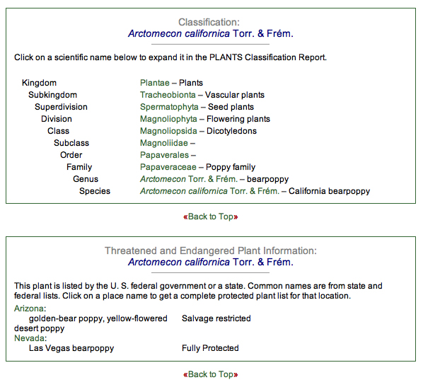
- More detailed information
on each plant is separated into boxes
such as "Taxonomy" and "Threatened
and Endangered Plant Information,"
so that users may easily focus on the
information they are looking for.
|
|
Negatives:
- An off-site link is placed
on the header, confusing the user into
thinking that the link is internal (as
all the other header links are).
- The header with links
to sub-areas changes depending on what
area the user is in and they are not always
replicated anywhere else on the page-these
links are therefore easy to overlook.
|
|
|
- Grouping and titling of areas
is not necessarily logical-for example, the
"Topics" heading covers the "Advanced
Search" option of the plant database, as
well as reports and articles that collate broader
information from the database, detailed discussion
of certain plants, information on "invasive
and noxious" plants, etc.
- Quick Jump" navigation
is in the form of a drop-down menu that does
not correspond exactly to the layout of the
site (ex. it is missing some links, such as
"Site Map" and "USDA Privacy
Policy," and appears to contain separate
links for "Intellectual Property"
and "PLANTS Citation," although these
are combined into one on the main page and,
in fact, point to the same page).
- FAQ answers are sometimes out-of-date.
For example: "We expect to provide multiple
common names as part of the next version of
PLANTS. If we are adequately funded we plan
to provide multiple common names by geographic
area and language group in the year 2000."
(http://plants.usda.gov/faq.html#onecommon,
accessed 2/20/05)
|
IDP
- International Dunhung Project
|
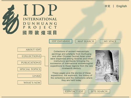
We chose this site for
comparative analysis because it is an
example of an extensive archive database
used for both research and general purposes.
|
|
Description:
This website includes the
information about religion, trade, culture,
and social life on the Silk Road in the
first millennium AD.
Audience:
This website intends to
target somewhat advanced researchers, but
also contains information for general public.
Both Chinese and English speakers.
Contents & Features:
- Interactive digital map
search.
- Information about the
project publications and latest project
news.
- Tools for research with
the database (manuscript, catalogue, artifact,
painting, photograph, map).
- Links to other relevant
websites
Positives:
- Clean layout throughout
the site.
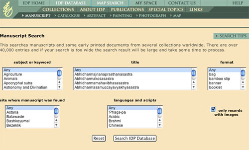
- Different options available
to users: 1) a general keyword search
through Google, or 2) a specific keyword
search from the menus, or 3) search through
images.
- Search results are saved
for later use that easy to navigate thru
the site.
- Has a friendly search
tips box, if you get lost.
Negatives:
- It is not easy to navigate
the map in general. It has options for
moving the map to direction that you would
like to see, but it is not sure how useful
it would be. Also, the map does not link
to other data that might be relevant to
the sites on the map.
|
|
|
Flamenco
|
We chose this site for
comparative analysis because it is an
example of how to handle a large collection
of data, also because it was referred
to us.
|
Fine Arts: http://orange.sims.berkeley.edu/cgi-bin/flamenco/arts/Flamenco
Architecture: http://bailando.sims.berkeley.edu/flamenco-interface.html
Description:
Flamenco (FLexible information
Access using MEtadata in Novel COmbinations)
allows a means for users to navigate through
large collections. There are two collections
that are using Flamenco for this purpose:
The Museum of Fine Arts of San Francisco,
Legion of Honor and de Young Museums,
http://www.thinker.org
(Fine Arts Images)
The UC Berkeley Architectural
Image Search (Architecture)
Audience:
Fine Arts Images - This
site is for the general public or for
people with an interest in the fine arts
collections at any of these institutions.
Architecture - This site is for use in
the UC Berkeley Architecture department
by faculty, staff and students.
Contents & Features:
- Hierarchical faceted
metadata categories to refine and expand
query
- Ability to search multiple
categories
- Free text search
- Each subcategory shows
a dynamically generated number that describes
the number of images remaining with that
subcategory type as an attribute.
Positives:
- There are tool tips that
indicate what is in each subcategory so
that the user can preview a category without
actually selecting it. Another nice feature
is the ability to turn tool tips off if
the user chooses to do so.
- The ability to close
each "currently classified"
category to remove categories from the
search results. These category boxes also
act to display which search results are
showing.
- The hierarchical nature
of the facets provides a way to go deeper
within a category. If there are more subcategories
it provides those as the new subcategory
menu. For instance, if you chose Location
> Asia then the menu would change to
show locations within Asia, such as Japan.
At the same time you are provided information
that you are in Location > Asia >
Japan.
- Architecture: Once a
set of images is displayed the user has
the ability to sort the results by architect,
location and building name. Similarly,
the Fine Arts collection can be sorted
by object title, date or artist.
Negatives:
- The "currently classified"
categories appear in alphabetical order
which follows the logic of layout for
all the top level facets. While this consistency
may be useful it may be more useful to
display these in order that they were
selected so that when a user selects several
categories they are more able to retrace
the steps they took in refining their
search.
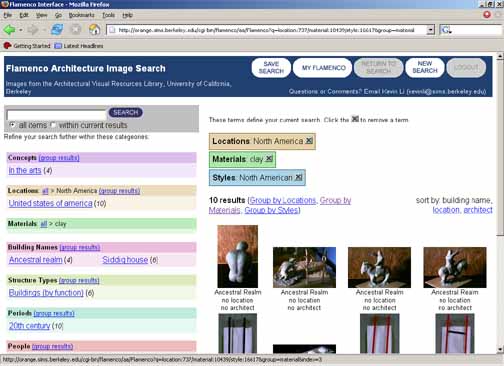
- The "sort by"
feature does not appear all the time.
When it does not appear a group feature
is displayed instead. It seems that "sort
by" appears once a user has chosen
a category that has no other subcategories
until then the "group feature"
appears. Although it is possible to switch
between each this relationship is not
intuitive to the user. For example if
your search items are grouped, you may
ungroup them which then allows you to
sort them. However, ungrouping does not
automatically imply sort.
|
|
Manis
|
We choose this site for
analysis because it is an example of an
interface that allows access into a collection
of items drawn from several different
places primarily for research purposes.
|
Description
& Purpose:
MaNIS is the user interface
to a collection of mammal specimens.
Audience:
Biologists or other researchers
interested in studying mammal remains.
Some expertise is expected.
Contents & Features:
The interface allows users
to access the collection through taxon,
location, date of collection, or institution
housing the item. An advanced search is
also available.
Positives:
- When you search on
a taxon and the result set is zero,
the system will offer suggestions of
other taxa.
- When searching on a
taxon, an expanded taxonomy is displayed
in the left with the additional terms
hyperlinked, and with a count of how
many results will be returned by clicking
on those links.
- A "New Search"
link at the top easily allows user to
start over.
- The results screen
display can be altered by the user in
two ways: by sorting on different columns,
or by changing which columns are displayed.
- Provides a way to export
the search results or to print them.
Negatives:
- Aside from the "New
Search" link, there are few ways
to back out of a search. (Terms may be
removed by clicking an "X" button,
but this is not immediately obvious.)
- The only way to get into
the collection without typing in a keyword
is through "Institution"-this
exacerbates the problem that there is
no way to get an overall view of the collection
(perhaps this is unimportant for the intended
audience, but it will be necessary for
the Uhle Collections).
- "Show/Hide Columns"
function opens in the same pane as the
various access points to the collection
("Taxon," "Location,"
etc.). This creates some confusion and
appears to "hide" the access
points.
- The link to an access
point and its actual pane are only associated
through color and name-i.e. not spatially-thus
it is not obvious which access point is
selected.
- A related problem is
that the first page by default has the
Taxon access point selected (which is
good), but it is difficult to recognize
at first that it is only searching taxa.
(A search box by itself-even with the
title "Taxon"-is still assumed
to search an entire collection if it is
placed on the front page and not associated
with a tab.)
|
|
[Top]
4. Initial
Designs
General Notes
In these initial designs, we have focused on three different
methods for accessing the information in the Uhle Collections
database: Browse, Search, and Map-based Browse. We anticipate
that elements of all three designs may be incorporated
into our first prototype. However, we began by isolating
the designs to better explore the strengths and weaknesses
of each method.
In addition, we are experimenting with
a function (code-named "MyUhle" in the diagrams)
that allows users to save the results of a search or
browse for later research. The creation of individual
user accounts is already necessary to control access
to high-quality images, so the introduction of this
additional feature may be both a useful research tool
and an added incentive to use the system for users who
might be initially reluctant to go through the account-creation
process.
Initial
Design #1: Browse
|
The first design focuses
on a browsing method for accessing the
database-similar to a directory such as
Yahoo. A user may begin browsing by selecting
one of four top-level categories: Location,
Time Period, Material, or Artifact Type.
In this example, the Location
category was selected. The system then
displays possible locations which correspond
to materials in the Uhle collections.
Items from this list may be selected and
saved to a user's personal records so
that the user can come back for further
research without browsing through the
top levels a second time.
The user may also click
on a specific item to view detailed information,
such as an artifact's size, material composition,
and age. From this page, items may also
be saved to a user's personal records.
The browsing-centered
design allows the user to explore the
collection along one of four axes without
knowing any details about the artifacts.
The four axes were chosen based on preliminary
interviews in which this type of information
was identified as salient by potential
users. Browsing in this method is meant
to simulate "browsing" shelves
in a bookstore or library, in which an
individual may have a general idea of
her topic or interests, but may not have
a particular resource (i.e. book or artifact)
in mind. Movement through the collection
is therefore exploratory rather than narrowly
focused.
|
|
|
|
Initial
Design #2: Search
|
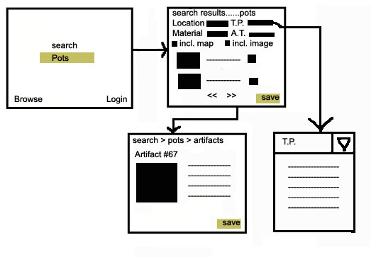
This design follows a
"Google-like" approach. It allows
the user to enter a keyword in the main
page and immediately bring up a list of
results relevant to the keyword.
For example, a user may
search for the keyword "pots."
The system returns a list of search results
ranked by their relevance to the keyword.
From this page, the user may refine the
search by Location, Time Period, Material,
Artifact Type (which are chosen from drop-down
menus), and whether the item is associated
with a map or includes images. These search
results may also be saved for later use.
As in Initial Design #1,
the user can then call up a detail page
for the items returned in the search results
list.
Searching in this manner
requires more advanced knowledge of the
collection. A user must know what kinds
of keywords to use to retrieve the information
she is seeking. This calls for a more
technical knowledge of archaeological
terminology-specifically South American
archaeological terminology-than the browsing
method does. On the other hand, it also
allows the user to more quickly access
relevant data, as she no longer has to
click through top-level categories.
|
|
|
|
Initial
Design #3: Map-based browse
|
In the preliminary user
interviews, our respondents all indicated
an interest in mapping and emphasized
the importance of location to archaeological
research. A map-based technique for accessing
the Uhle Collection data may therefore
be especially useful for archaeologists
and researchers in related fields.
The first page features
a map of the general area in which Uhle
worked, with the particular regions noted
so that the user can see their relationship
to each other and the surrounding area.
From here, a user can click on one region
and zoom in to see the sites contained
within the region. Within a site, the
map is further divided by grave. The Uhle
Collection is especially important to
archaeologists because it has been "provenanced"-that
is, there are records for the particular
locations at which each artifact was discovered.
Therefore, when a user selects a certain
grave, she will be able to retrieve a
list of artifacts excavated there. Furthermore,
at each level, other documents and photographs
relating to the area are displayed so
that the user can easily discover other
relevant material.
As in Initial Designs
#1 and #2, whenever the user encounters
a list of artifacts or other materials,
the results may be saved for later use.
Through this method, the
user has an excellent visual representation
of where artifacts were discovered in
relation to each other and their surroundings.
While slower than direct search, it adds
the important element of introducing spatial
relations. Also, it does not require the
user to have advance knowledge of arbitrary
site designations and grave numbers-instead,
she can navigate visually using the map.
However, this method lacks a means of
entering the collection through a feature
other than location, such as Artifact
Type or Material. Yet even archaeologists
who are primarily interested in certain
artifact types or materials must also
be aware of location. Furthermore, casual
browsers of the collection may enjoy the
virtual "digging" into a site,
as it replicates the work that an archaeologist
does in the field. Emphasizing location
prominently, therefore, would be helpful
to a wide variety of users.
|
|
|
|
[Top]
5. Appendix
-
Browse (overall)
Image
1, Image
2, Image
3, Image
4, Image
5, Image
6, Image
7, Image
8
- Search
Image
1, Image
2, Image
3
- Map-based Browse
Image 1,
Image 2,
Image 3 , Image
4, Image 5, Image 6
[Top]
|