| |
|
| |
Assignment
2
Personas, Goals
& Tasks Analysis
|
| |
Assignment
3 (Revised)
Scenarios, Comparative
Analysis & Initial
Design
|
| |
Assignment
4
Low-fi Prototype
& Usability Testing
|
| |
Assignment
5
First Interactive
Prototype
& Presentation
|
| |
|
| |
Assignment
7
Second Interactive
Prototype & Heuristic Evaluation
Intergration
|
| |
Assignment
8
Pilot Usability
Study &
Formal Usability
Test Design
|
| |
Assignment
9
Third Interactive
Prototype
Write
up
(Final Presentation)
|
| |
|
|
| |
Assignment
9: Third Interactive Prototype Write-up (Final Presentation)
1. Problem Statement
2. Solution Overview
3. Personas and Scenarios
4. Final Interface Design Description
5. Design Evolution
6.
Third Interactive Prototype
7. Final Presentation
8.
Work Distribution Table
1. Problem Statement
The Hearst Museum of Anthropology
at the University of California, Berkeley houses an
archaeological collection of ancient Peruvian artifacts
known as the Uhle Collection. This collection consists
of pots, potsherds, shells, beads, shells, textiles,
human remains (mummies), among many other unidentified
objects. Additionally, the Bancroft Library houses
manuscripts, field notes and correspondence written
by Max Uhle, the archaeologist that excavated the
collection. Many of the items in this collection have
been digitally photographed in order to allow researchers
to view items in the collection without accessing
the physical objects. A database has also been created
to organize information about each artifact. This
project provides a front-end to the database and digital
collection. The goal for the project is to serve as
a research tool by representing the relationship between
artifacts and the metadata of each in a way that is
useful and seamless to archaeologists. For instance,
location is important to several archaeologists throughout
the research process. With this in mind it would be
useful to easily access location information at any
point in one's search.
2. Solution
Overview
To meet the needs of our target users,
we have implemented a web-based interface to the collection
of artifacts excavated by Uhle. The interface provides
three access methods to the artifacts: keyword search,
browse, and map-based browse. We have addressed the
archaeologists' research needs by creating two views
of our results-thumbnails to display shapes, and text-only
to compare metadata. An artifact details page allows
the researchers to view larger images and to access
additional metadata. Furthermore, from the artifact
detail page, users may move laterally through the
collection. For example, a researcher looking at a
particular artifact can expand the search to all artifacts
from the same area.
Through these design elements, archaeologists
will be able to gain access to the Uhle collections
from all over the world, where previously access had
been restricted to those in physical proximity to
the artifacts. In addition, the interface serves as
an easy way to compare artifact metadata across the
collection.
[Top]
3.
Personas and Scenarios
Personas
Initially, we had created three personas
to represent three different types of users. We found,
however, that one persona did not comfortably fit
into the picture we were trying to create for the
interface. As a consequence, we focused on designing
for the remaining two personas, included below.
|
|
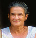
Susan Marks
|
Susan is a
55-year-old professor who has been an archaeologist
for 30 years. Her specialty is Incan ceramics,
and she is particularly interested in both
the material composition and the iconography
of the artifacts. Susan considers herself
to be "not good with computers,"
but simultaneously prides herself in her ability
to keep track of the latest archaeology technology.
Software with a steep learning curve just
irritates her. She is more inclined to farm
out computer work to the several PhD candidates
that she advises. Computers (and, perhaps,
graduate students) are tools to use in her
research-she has no interest in them for themselves
except as they may further the work in her
field and dislikes when they waste her time
with extraneous tasks. Furthermore, she keeps
paper copies of all her notes and important
documents in filing cabinets because she does
not trust computer media to be persistent.
Thanks to her many years of experience, she
is well-connected to other archaeologists
and professors in her field, so she is confident
that she can speak with some authority on
many aspects of archaeology-from field methods
and site administration to chemical analysis.
She lives alone, but spends more time in the
field or the lab than at home. Her office
is filled with archaeological artifacts and
knickknacks from her work abroad, but it is
not cluttered. She likes everything to be
just where she wants it, and gets upset if
it takes her more than a minute to find an
item that she has set aside.
On the side, Susan enjoys working with pottery-not
only is it soothing, but it gives her some
insight to pottery methods used by the ancient
peoples whose works she studies. In addition,
she loves to travel and will jump at any chance
to attend overseas conferences.
Susan's Goals:
To get her research done without having
to focus on the tools or technology itself
To make a difference and stand out from
other researchers in her field
To make contacts all over the world-expanding
her information network through people
|
|
|
Persona
#3
Rachel Richardson |
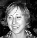
Rachel Richardson
is an undergraduate studying Anthropology
with a focus on Archaeology at the University
of California, Berkeley. After high school,
she took a couple years off before deciding
to return to school. She is now 23, in her
junior year and hooked on school. She is starting
to research graduate programs but is unsure
whether her focus should be on ceramics, bone
or soil. She has traveled to South America
a few times and would love to travel more.
In the past she was never much of a computer
user but being in school has made her realize
the value of email. She now uses email and
instant messaging to keep in contact with
family and friends, including some she met
in South America. She is still a little fearful
of the computer but fortunately she shares
an apartment in the Mission with two roommates,
one of which is very tech savvy. When she
is not at school or a Mission taqueria she
loves to read from her extensive library of
books. She loves to collect things that tell
a history, for example, she has saved every
Muni fastpass since she moved here from Boston
when she was 18. She enjoys cooking vegetarian
meals for her roommates and friends.
Rachel's Goals
To get a clearer focus on her academic specialty
To get into a good graduate program that
will afford her travel opportunity
To someday live in South America
|
Scenarios
These are the two primary scenarios
that were developed from the above personas. Variations
on these scenarios were used for our user tests.
Scenario #1: Rachel's Fieldwork
Opportunity
|
Rachel knows
that she needs to gain some experience in
archaeological fieldwork if she is going to
pursue a career in archaeology. While looking
up possible sites, she discovers an opportunity
to volunteer on a dig this summer near Chincha
Valley in Peru. She remembers from her Andean
Archaeology class that parts of the Uhle collection
came from Chincha Valley, so she checks out
www.uhlecollection.edu, a website her Professor
recommended as a great information source
with amazing images of the collection. She
browses through the online collection looking
at photographs of artifacts. She is not searching
for anything in particular, but she is fascinated
by the images and daydreams of excavating
similar artifacts herself. Maybe this summer
experience will inspire her to choose a specialty
for graduate school.
|
Scenario #2: Susan's Pottery
Analysis
|
Susan is in
the midst of an ongoing research project into
Incan pottery-specifically, she has been working
on a chemical analysis of ceramics to see
whether they were used for cooking, storage,
or as decorative objects. In the course of
her research, she has discovered that Berkeley
houses many Incan artifacts, including ceramics,
excavated by Max Uhle. She has used the Uhle
Collections @ Berkeley website in the past
to do some preliminary research, and is now
at the stage when she needs to analyze the
artifacts in person. At her office computer,
she brings up the website for the Uhle collections.
She searches for ceramics that appear to be
burnt-possibly in a cooking fire. Susan browses
through related artifacts and selects several
that she thinks would be ideal for the first
steps of her analysis. She prints a list of
the selected artifacts with the appropriate
museum number so that she can locate them
in the physical collection, as there are no
computers in the basement which houses the
artifacts. Finally, she calls the collection
curator to arrange a time when she can visit
the collection.
|
[Top]
4. Final
Interface Design Description
Functionality
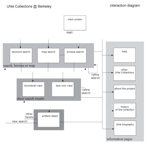
Our final prototype allows a user
to search through the Uhle Collections using three
options: keyword search, map-based browse and category
searching. Each additional search option adds a new
parameter to the search results. Users are able to
add and remove search parameters as they wish. We
provide a thumbnail view, a text view and an artifact
detail view.
Interaction Flow
View
Larger Diagram
Not Implemented
Initially our system was to have a user log in option.
This feature was not integral in the interaction flows
of searching. This is a feature that will be implemented
at some point in the life of the project but not during
this stage of user interface development.
Our map has limited functionality due to a lack of
specific information data in the collection. Some
items provide region information but not all. We hope
that the future of this collection includes refining
this data so that the map can become more of a functional
piece of this interface. Currently users may select
a region to add a location parameter to the search.
Also, we have only implemented a subset
of the checkboxes. Artifact Class, Material Type,
and Location are all functional. However, we did not
have data for Physical Attributes, Time Period, or
Documents in our database. The facets are included
on the interface to show the intended functionality,
but they do not in fact work.
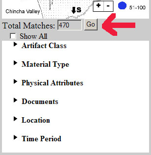
Finally, the "Total Matches"
number is not active. This is merely a result of time
constraints for this project-we chose to focus on
making the checkbox and search items functional and
were therefore forced to relegate the "Total
Matches" number to a the bottom of the list.
Prototype Tools
Low-Fi Prototype
Tools: Our prototype was primarily paper based,
with some features using transparencies, printouts
and Post-Its.
Pros:
- Speed in creating - This prototype
was really easy to build and fun.
- Spontaneous fixes - During user
testing we were able to provide spontaneous solutions
to unanticipated actions.
Cons:
- Slow "computer" - While
testing our human computer was slow to respond but
out participants were patient.
- Hard to test all features - Using
paper and markers it was hard to tell if users would
really notice some of the changes once the prototype
was web based.
- Paper cuts - Ouch.
Interactive Prototypes (First,
Second and Final)
Tools: These prototypes were
built in HTML and JavaScript and use CSS. We used
the following software: Macromedia Dreamweaver, Adobe
GoLive, Adobe Photoshop, TextPad, TextWrangler, and
Taco HTML Edit (text editors for the Mac). A pre-made
script from http://www.dynamicdrive.com was used for
the menus, albeit modified extensively for our use.
The database is written in MySQL and is connected
to front end search features using PHP.
Pros:
- Reusable code - Using HTML and JavaScript reduced
future coding by building on the base we have written.
- Realistic representation - Using these tools through
the iterations of the prototype it was easy to simulate
what features might look like when fully implemented.
Cons:
- Many error pages: Through the design
and testing process we did not fully implement duplicate
features to save time. For instance we did not make
all of the checkboxes active in the first and second
prototypes. However during testing our users managed
to find a lot of those unimplemented features.
[Top]
5. Design Evolution
The following sections describe the
design changes we made throughout the course of the
semester, from rough initial diagrams on paper to
a working interface on the computer.
Initial Sketches
After we carried out preliminary interviews with primary
users and a comparative analysis with other search
interfaces, our initial designs were focused on three
different methods for accessing the information in
the Uhle Collections database: Browse,
Search,
and Map-based
Browse. For this phase of the design, we developed
each method on its own to better understand the strengths
and weaknesses, although we knew that elements of
all three designs would be incorporated into the next
iteration of the design.
The browsing-centered design allows
users who have some prior knowledge or experience
with archaeology to explore the collection along one
of four top-level categories: Location, Time Period,
Material, or Artifact Type. Also, making the categories
visible allows relative novices to get a broad picture
of the collection's contents as a whole.
A "Google-like" approach
was applied to our search access point. It allows
the user to enter a keyword in the main page and immediately
bring up a list of results relevant to the search
term.
Lastly, in response to preliminary
user interviews, we proposed a map-based method for
accessing the Uhle Collection data. Through this method,
the user has an excellent visual representation of
where artifacts were discovered in relation to each
other and their surroundings.
Low-fi Prototype
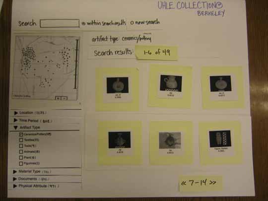
The purpose of the first prototyping experiment was
to determine whether our initial design ideas were
natural and easy for our prospective users to use
without prior training. We had combined the all three
methods from our initial design. We based part of
our model on Flamenco's tightly integrated search-and-browse
function, but geared conceptually toward artifacts
rather than images. We also wanted to test whether
map-based browsing was useful.
Our low-fi prototype was primarily
paper based, with some features using transparencies,
printouts and Post-its. The basic layout of our prototype
involved three main sections: title, navigation, and
display. The title displayed the project name across
the top portion of the screen and does not perform
any function. The navigation located in the left-hand
side of the screen was composed of three ways to search
the collection: keyword search, interactive map, and
browsing top level categories. On the right-hand side
of the screen, the main content of the page was displayed,
such as information about some of the artifacts from
the collection in the opening screen, or search results
with different presentation options like thumbnail
images or text only views which were added on later
testing.
After our first user test, we found
out that every user liked the checkboxes that displayed
all the available metadata they could use for browsing
when beginning their search. We also learned that
users had a tendency to navigate to "Related
Document" through the artifact detail screen
rather than through in the top-level "Documents"
category. Most critically, we discovered that there
was some confusion among the archaeologists about
terminology. There was overlap conceptually between
some terms and many questions about proper classification
were raised throughout the tests.
First interactive Prototype
With our first interactive prototype, we tried to
address the many issues that were brought to our attention
from low-fi prototype tests. The framework of the
first interactive prototype was built in mainly HTML
and JavaScript. Because the backend database for the
collections was undergoing extensive reworking, we
implemented temporary mock-up search results.
Overall, our first interactive prototype
remained quite similar to the low-fi prototype in
terms of basic layout and navigation. However, based
on user testing of our scenarios using the low-fi
prototype, we made changes to the following items:
Title links: The information about the site
and project as a whole moved under the title and remained
constant when users navigated through the collection.
Text only view: Similar to an Excel spreadsheet
of the artifacts, this allowed a user to easily compare
metadata between artifacts.
Artifact indicators: Inspired by Flamenco,
these numbers represented the number of items remaining
in the collection when that facet was checked. In
our low-fi prototype, users were confused by the sheer
"number of numbers," so we chose to simplify
this as a single number at the top of the category
menus and added a "Go" button so that users
had more control of the amount of displayed results.
Heuristic Evaluation and Second
Interactive Prototype
In our second Interactive Prototype, we refined the
system interface based on the Heuristic
Evaluation we received from the PhotoCat team.
Much of the feedback was valuable and some of the
changes are briefly outlined below.
Function Heuristic Evaluation by
PhotoCat Uhle Solution
|
Function
|
Heuristic
Evaluation by PhotoCat
|
Uhle
Solution
|
|
[H7 Flexibility] (Severity
3)
|
Search
|
The gray background combines
three forms with three different "Go"
buttons.
|
Separate color sections to
distinguish the separate areas.
|
|
[H1 Visibility] (Severity
3)
|
Search
|
Confusion of 'Show All"
button.
|
Added the ability to
expand all the menus and close all the menus.
|
|
[H10 Help and Documentation]
(Severity 4)
|
Help
|
No help visible from
for the system.
|
Added a help page to assist
users.
|
|
[H5 Error Prevention and
H6 Recognition rather than recall] (Severity
3)
|
Browsing information
|
Unclearness of "Remove
link" option.
|
Created a colored box that
surrounds the entire parameter set so that
remove is more easily associated with the
grouping.
|
|
[H7 Flexibility and efficiency
of use] (Severity 3)
|
Browsing information
|
The
position of the "views/thumbnails/text
only" menu and visibility.
|
Changed the layout of the
thumbnails/ text only views. Also implemented
radio buttons that indicate which the user
is looking at.
|
Final Usability Test
We conducted the final usability test with our second
interactive prototype. Because our users tended to
be very exploratory and because our prototype was
limited enough that tasks tended to run together,
we focused on qualitative rather than quantitative
data for this round of testing. Even though our users
rarely made "errors", we had to address
several issues in our final prototype. The most important
changes we made to the prototype as a result of the
final usability test include the following:
- Improving graphic design to more
effective and efficient use of interface
- Improving map-based browsing method
- Connecting to working database
Usefulness of the Evaluation Techniques
Our final prototype has come a long way from our initial
design, and the various evaluation techniques helped
us turn our dream project into reality. Each evaluation
method brought with it different issues or information
that we needed to improve the next iteration of the
prototype. Preliminary interviews with primary users
gave us an array of possible ideas about basic layout
and functionality. The low-fi prototype yielded feature
and terminology refinements. Both the first and second
interactive prototypes brought to our attention the
overall usability of the design.
Among all these useful evaluation
techniques, the low-fi technique was the most valuable
because it was the first time we could test with actual
users. Because of the unrefined and clunky look and
feel of the paper prototype, users were likely to
be more forthcoming about the problems they saw, and
to suggest alternatives. The issues that users brought
to our attention remained as major themes for us to
work with to improve our system throughout the project,
such as the constant reworking of terminology for
proper classification. Such rich results were not
as evident in later testing cycles, although we believe
that further work will yield greater refinement.
[Top]
|
|
|