|
Individual Assignment - Diana Stepner
Question 1: Heuristic Evaluation - Site Overview
Question 1: Heuristic Evaluation - Using
Jakob Nielsen’s
Ten Usability Heuristics
Question 2: Heuristic Evaluation – Bicycle
Gear-shift Redesign
Question
1: Heuristic Evaluation - Site Overview
The “Rider Mel’s Mountain Bike Guide
to Moab” interface is supposed to give visitors a preview
of the contents found in the “spiral bound 5 x 8 book” titled
Rider Mel’s Mountain Bike Guide to Moab. In support, the
site provides links to sample trails, a method for ordering the
book, photos of Rider Mel, reviews of the book, and a way to
contact the book’s author – Rider Mel. The interface
designers hope by clicking through these links and reviewing
the contents, visitors will perceive Rider Mel to be a credible
mountain bike rider (possibly an authority, at least in the Moab
trails) and subsequently be enticed to purchase his book before
traveling to Moab for some mountain biking of their own.
Question
1: Heuristic Evaluation - Using Jakob Nielsen’s Ten Usability
Heuristics
The first column provides the Nielsen heuristic that was violated.
The terminology was obtained from Nielsen’s useit.com
site.
The second column explains why the specific aspect of Rider Mel’s
Mountain Bike Guide to Moab violated the heuristic. After this
information a severity rating is provided. It follows the premise
posted on Nielsen’s site and is determined based on a combination
of frequency, impact, and persistence of the problem. The ratings
follow a 0 to 4 scale and map to the following information:
Severity Rating
0 = I don't agree that this is a usability problem
at all
1 = Cosmetic problem only: need not be fixed unless extra time
is available
2 = Minor usability problem: fixing this should be given
low priority
3 = Major usability problem: important to fix, should be
given high priority
4 = Usability catastrophe: imperative to fix this before
site can be released
The last column includes recommendations for correcting the violation.
Nielsen |
Rider
Mel’s Mountain Bike Guide to Moab |
Recommendation |
Visibility of System
Status (H1-5) |
- The links underneath the Rider Mel’s
Mountain Bike Guide emblem don’t change color
for visited or active states, while links in the middle
(main) content area and bottom of the page (e.g. Back
To The Moab Information Site), do change color. As
the area of the site the visitor is currently viewing
is not indicated by a color. [Severity 3]
|
- Link colors provide important contextual
information to users. Colors should be used to convey
visited links and current location.
|
- A tag indicating when the site was last updated is
not provided. As a result, it is impossible to say
when the guide was published and how reflective the
trails
are of current conditions. A similar situation arises
with the “New” tag found on the Ordering
page as well as some of the photos presented after clicking
on the “Photos & Videos” link. A definition
of “New” is not provided, so the user is
left wondering if online ordering and the photos were
added last year or last week. [Severity 4]
|
- A “Last Updated” date should
be added to the Interface. In addition a definition
of “New” should
be provided, at least for the photos. Even better would
be included some context around the photos. For example “Rider
Mel during a trip to Moab in November 2003”
|
- Unfortunately the only date found on Rider Mel’s
site is associated with the Book Reviews. They are not
very recent. Including the dates in these instances reduces
Rider Mel’s credibility. [Severity 3]
|
- Removing the dates from the book reviews would
be a good idea. Instead Rider Mel could include links
to the online articles. Only after going this extra step
would visitors find out the actual publication date
|
Match between system and the real
world (H1-2) |
- The “About Rider Mel” page does
not tell the visitor about Rider Mel. Instead it describes
the Mountain Bike Guide. [Severity 4]
|
- The “About Rider Mel” should
introduce Rider Mel, provide his credentials (qualifications),
and explain why a visitor should find Rider Mel credible
to write a Mountain Bike Guide
|
- The tone of Rider Mel’s site
is similar to the attitude reflected in websites and publications
mostly targeted at young males interested in extreme sports,
such as skateboarding, snowboarding, and mountain bike
riding. For example referring to the web contest as “stupid”.
As a result, individuals who are looking for a rough-and-ready
mountain bike guide might believe Rider Mel really knows
what he is writing about. But, other more seriously minded
individuals might perceive the language to be immature
and look for a more serious source. [Severity 1]
|
- Rider Mel should clean up the language on the Contest
page. Doing so will prevent potentially purchases of
his book from being deterred.
|
Consistency and standards (H1-4) |
- Most web sites have the site logo function
as a link back to the Home page. Rider Mel’s
interface does not follow this practice. If the site’s
logo is not a link, typically the Home link in the
navigation area appears as the first link. Rider Mel
does not follow this practice. Instead the Home link
is last. [Severity 2]
|
- Rider Mel’s Mountain Bike Guide logo
should be a link to the Home page. If he does not want
to follow this precedence, the Home link should be
first in the left-hand navigation area.
|
- The font style used on the bulleted list on
the “Home” page is similar to the style used
to represent links on other sites. As a result, many
visitors might try to click on “Simple Maps” or “Easy
to follow directions” to be taken dynamically to
sample contents from the appropriate section of Rider
Mel’s mountain bike guide. Similar confusion arises
with the CCNow image found beneath the left-hand navigation.
Typically images used to promote a site’s sponsor
or reseller are clickable and will spawn another window
or take the user directly to the sponsor’s or reseller’s
site. [Severity 4]
|
- Each of the bullets in the “About Rider
Mel” page should be links and take the visitor
to sample contents that reinforce the statement being
made in the bullet. If this is done, the Sample Trails
is not required in the left-hand navigation. Instead
Simple Maps could take visitors to a Sample Trail map.
Clicking on the CCNOW image should take the visitor to
CCNOW’s site.
|
Aesthetic and minimalist
design (H1-1) |
- Each of the links in the left-hand navigation
bar serves a specific purpose and reinforce Rider Mel’s
desire to sell his Mountain Bike Guide – except
for the Cool Links link. The label does not convey
a clear purpose. Unfortunately the user needs to click
through the link in order to understand the purpose… Rider
Mel's Recommended Sites. Why a visitor would want to
know the sites Rider Mel recommends visiting is unclear.
[Severity 1]
|
- The Cool Links link should be removed. If
the About Rider Mel page truly introduced Rider Mel,
the links could be presented on the same page. They
could be positioned in a way to reinforce Rider Mel’s
knowledge of Mountain Biking through reinforcing “in” brands.
|
- Rider Mel’s site seems to have been
designed around the book’s title design. Given
its prominence and the lack of information provided
about Rider Mel, the visitor is left wondering if the
logo’s prominence is designed to distract from
the text and other aspects of the site. Also the size
of the logo decreases the efficiency of the site’s
navigation. The visitor’s eyes are drawn to the
logo. Only after scanning a quarter of the page does
the visitor come across text and navigation. [Severity
4]
|
- More efficiently using the contents of each
page would make navigating through Rider Mel’s
site a more pleasant experience. Using the “About
Rider Mel” page as an example, the size of the
book’s title could be reduced at the top of the
page. The text identifying photos from Rider Mel’s “latest
mountain biking adventure” could be removed as
well since they are not related to the book. In addition
the sentence “Click her to get your copy NOW!...” should
be reworded. It should say “Get your copy online
now!”. The entire sentence could be a link
|
Question
2: Heuristic Evaluation – Bicycle Gear-shift
Redesign
Before redesigning the bicycle gear-shift, one would need to do
a Needs Assessment. Specifically identify who the users are, their
goals, and the tasks they need to perform. The reason being, there
are different types of bicycle riders. Individuals who compete
on the level of Lance Armstrong would have different needs from
someone who rides a bicycle once or twice a year. Professional
riders would require more control over the gear-shifting whereas
casual riders would probably be content with intervening as little
as possible with the bicycle’s controls. To obtain clarification,
one would need to observe riders, conduct interviews, and study
existing successful designs. Armed with this information, as well
as an understanding of which users and tasks to support, the designer
would be able to hone in on specific improvements. For purposes
of this assignment, I’m going to focus on redesigning the
gear-shift for a casual rider.
As we learned in Lecture 5, “Frequent users remember more
details whereas infrequent users may need more prompting”.
This implies, casual riders may not remember how gear-shifts work.
To make matters worse, because bicycles do not have standard gear-shift
designs, riders who are lucky enough to recall how one model works
may be back at square one when trying to shift gears on a different
bicycle. Most likely they will try to rely on mental models or
mappings to recall how the gear shifts control the gears on a bicycle.
For example, individuals who ride a stationary bicycle at the gym
develop a mental model of how a bicycle works. If they typically
use a stationary bike which controls the intensity of the ride
through a dial, the individual will probably expect a dial when
faced with a “real” bicycle. Along the same lines,
individuals who have ridden motorcycles may apply the mental model
they have gained through this experience to predict how the speed
of a bicycle should be controlled. Unfortunately mental models
do not always represent the truth – and both motorcycle and
stationary bike riders may find themselves at a loss when faced
when a standard bicycle.
Given the various mental models people could apply to bicycles,
it might be best to rely on mappings to redesign the gear-shift. “Johnson & Roberts
claim that it is not actually the familiarity that makes the real
car easier to drive than the [keyboard controlled] ‘computer
car’…. The thing that simplifies the driving is the
use of distinct controls for direct manipulation; steering is done
with a steering wheel, speed is controlled with the accelerator
pedal, the gears with the gearshift handle, etc. In contrast, the
hypothetical computer car has only one control: the keyboard.” Applying
Johnson & Roberts’ principle to bicycles, having one
distinct control for gear-shifting instead of four (2 silver levers,
2 black levers) would simplify the task of riding a bicycle. A
single control would manage the intensity of both the front and
back gears.
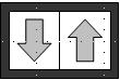
On other devices, such as mobile phones, cardiovascular equipment,
and blenders, the volume, intensity, and speed respectively are
controlled by a toggle or push-button switch. A label on the switch,
usually in the design of an arrow, indicates the direction of the
control. For example, an up arrow indicates an increase (louder,
harder, brighter, etc.) whereas a down arrow indicates an decrease
(softer, easier, dimmer, etc.). Using this model, I would attach
two controls to a box that could be placed on the bar connecting
the right handle bar to the left handle bar. The box would be small
enough so a rider could manipulate either control with the thumb
of one hand. Pushing on the control labeled with an up arrow would
cause the bicycle ride to get more difficult. Pushing on the control
labeled with a down arrow would cause the bicycle ride to get easier.
The connection between the up / down control would be managed by
the bicycle, so the rider would no longer need to worry about which
one of the 24 difficulty levels they were in. Instead they would
simply focus on whether or not they wanted a harder or easier ride.
 |
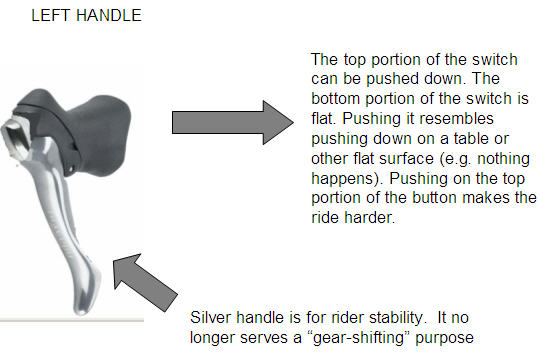
Along the same lines, another design separates
the controls. The one with the up arrow (pushing it makes the rider
harder), would be placed on the left handle bar. Pressing the control
would make the ride harder. The control with the down arrow (pushing
it makes the ride easier) would be placed on the right handle bar.
Pressing the control would make the ride easier. Again the rider
would not need to worry about which gears they were manipulating.
The level of intensity they select, based on clicking the controls
on their right and left handle bar) would determine which gears
were used.
Appendix
Individual Assignment
- Diana Stepner (.doc) |