|
Assignment #4: Low-fi Prototyping &
Usability Testing Introduction The Healthy Communities Network System is a as web-based knowledge management information system which offers an easy to understand dashboard view of a community’s quality of life, and tools to help people get involved in efforts to improve their community’s health. The system will serve as a set of templates that can be leveraged and customized by local communities while the underlying system remains centrally maintained. The first community interested in having its own version of the system is Marin County, California, and the first system implementation will be customized specifically for Marin County. Purpose and Rationale of the Experiment Our 213 project focuses on designing a quality of life dashboard
of indicators for the Marin County Healthy Communities System. In
order to analyze and evaluate our initial interface design, informal
usability testing was conducted based on a paper prototype of the
system. The goal of the usability testing experiment was to alert
us on any interface design or usability issue that was of concern
and needed to be addressed. Comments, opinions, and suggestions
from the testing subjects could help us to improve the overall design
of the system, making the interface more user-centric. Usability
testing is a relatively inexpensive, yet effective method to gather
information on potential problems with any new system design. We took
advantage of this testing method to correct any existing problems before
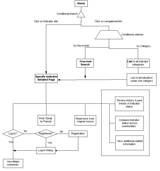
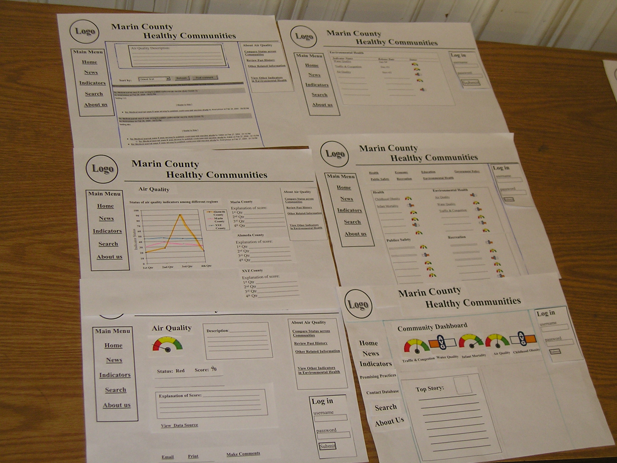
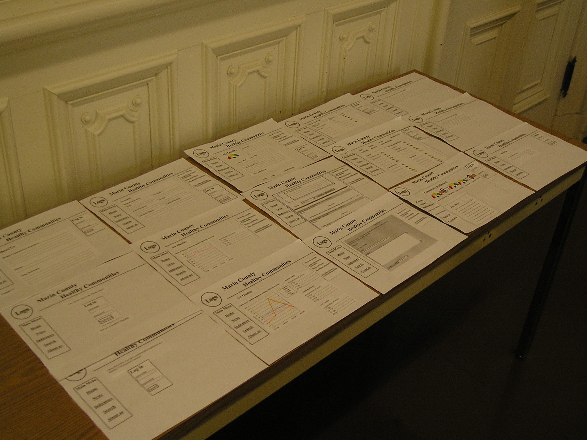
further development. We prepared a set of paper mock-ups as our prototype. The home page was made from pieces of print-outs and stick-on post-its, which could be easily moved around during layout design and user testing. The system pages that we created for testing included a homepage with an indicator dashboard, an indicator master list's page, a detailed page for one specific indicator, a page to review past history of that indicator, a page to compare indicator status across communities, a page that had additional related information on the indicator, a page to view or make comments about the indicator, an overall search page, a log-in page, a registration page, and an about us page. The homepage had six navigational links on the left panel: Home, Indicators, Promising Practices, Contact Database, Search, and About Us. Promising Practices would mean successful stories and model projects that could be followed to combat community health issues. Contact database would be contact information of other people/professionals who are interested in improving community health. Promising Practices and Contact Database are features that are not being designed for IS 213, but we included these empty links on the homepage to show the subjects that these features would be available in the real system, so that they would better understand the system even though no interface testing was being done and the inside pages were not being prototyped. The content of the homepage included a dashboard of selected indicator dials. The dials represented the status of the indicator and were clickable to lead to a detailed indicator page for each indicator. There were two types of indicator dials, one was color coded with green, yellow, and red. A needle pointing to one of the colors would show the status of that indicator with green meaning good, yellow meaning average, and red meaning bad. The other type of dial applied to indicators that could not be interpreted as good, average, or bad. For example, an indicator on population density would be hard to associate with a rating. In that case, the dial would be a horizontal bar that was cut into two parts. The middle line was labeled as "Average", and when the left part was colored, it would mean that the indicator was below average. In our case, a below average population density indicator would mean it was below the average of a gold standard, i.e. the national population density average. The detailed indicator page had functions for users to email , print, and make comments. Users would need to log into the system before viewing or making comments. All the indicator related pages had a right panel with links to review past history, compare status across communities, and view additional related information. The additional related information page would have links such as local resources and discussion board. Interaction Flow Diagram
Pictures of the "Paper Prototype"
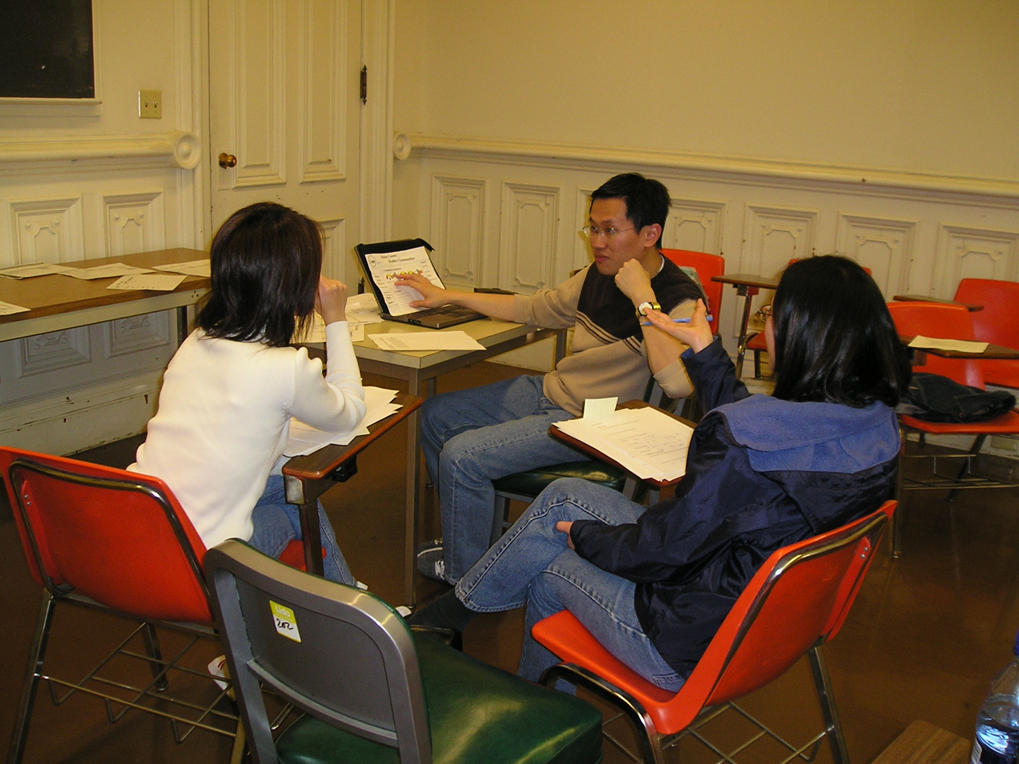
Pictures of the Usability Testing Sessions Participants Three participants were selected to participate in our usability testing experiment. The selection was made so that the subjects would exhibit the characteristics being described in our personas. The first subject was a female graduate student with a professional background in health care. The second subject was another female graduate student who really cared about community health issues and wanted to make changes. The third subject was a male engineer who recently moved to the Bay Area and wanted information on his new community. Task Scenarios Goal 1: Get Information on Air Quality – subjects were imagined to be public health officials working for Marin County. They were asked to find out how Marin County was doing on air quality in general. The information needed would include past statistics, how Marin compared with other Counties, and other local organizations that worked on improving air quality. In this goal we looked for whether the subjects could directly get to specific information on one indicator when that indicator was displayed on the homepage. Goal 2: Share Information on Air Quality with others – after getting the relevant information from goal 1, the subjects were asked to share the information with others by emailing, printing, and leaving opinions on the site. In this goal we looked for whether the subjects could find and use specific functions that were available on each indicator page to send emails, print, and make comments about that indicator. Goal 3: Search for Information on Other Health Related Topics – subjects were given three community health topics and were asked to search for general information on those topics. In this goal we looked for whether subjects could navigate the site successfully to use the indicator master’s list or the search tool to find indicators that were not displayed on the homepage. Procedure We prepared by setting up a desk, chair, and the paper prototype
for the user. Ran Li acted as the “computer”, Florance
Gee as the “facilitator” and Nettie Ng as the “Note
Taker”. When each subject came in, we gave a brief introduction
on ourselves, the system being evaluated, and the purpose of the
usability testing experiment. The subject was then asked to sign an
informed consent form and a records release consent form. After signing
the forms, instructions on the testing procedure was given along with a
short demonstration on how to “play computer”. The subject
was then given three goals to be achieved using the paper computer
system. Each goal was written on paper and given to the subject
separately. The subject was encouraged to speak aloud on the thought
process as we observed and took notes. Pictures were taken during
the process. After the goals were carried out, the subject was asked
to report on issues, concerns, questions that arose during the test.
Some follow-up questions related to the interface design were also
asked afterwards. The subject was then given the chance to share any other
suggestions and comments. We looked for ease of use in navigating the entire site and overall comfortability with the system design and layout. If a subject had problems using a system, it was an indication that the problems would have to be addressed and design would need to be improved. In achieving each of the three goals, we looked for answers to
the following questions for all three subjects. Could they locate
the appropriate functions and information within a reasonable time
frame? How long did it take them to complete each task? Could they
get to the right pages the first time? Or did they have to go through
many trials and errors before getting to the correct information?
Were they able to use the right links for the right information?
Was the wording clear to them? Did they understand the relationships between
the pages? Was the grouping of links intuitive? Were most of the features and functions obvious and self-explanatory? What
caught their attention? What was particularly frustrating and confusing?
Was the overall experience positive and were they pleased with
the results? The answers to these questions all helped us to evaluate
the usability of the interface design and the system layout structure. In general, our subjects were able to complete most tasks without too much difficulty. However, there were some inconsistencies among subjects on how they perceived different functions in the system. Interestingly, functions that seemed obvious to one subject might not be clear to others. The section summarizes the key testing results. Please refer to "Raw Data" under Appendices for additional observation results. Goal #1 – Get Information on Air Quality The most noteworthy feedback we observed from the subjects was that each of them used different paths or methods to achieve goal 1 – to find out how Marin County was doing on air quality. To get to the air quality indicator page where the information could be found, subject 1 clicked on the air quality indicator dial on the dashboard. Subject 2 clicked on the “Indicators” link on the left panel while subject 3 used the “Search” link on the left panel and typed in “air quality” on the search box, which would not be the most effective way to look for an indicator. The rest of the tasks under goal one were relatively straightforward, and all subjects were able to accomplish the tasks without much difficulty. Goal #2 – Share Information with Others Goal two was intended to test the function of sharing and exchanging information specifically on the indicator by using the print, email, and post comment functions on the detailed indicator page. Since such a specific action or task is usually done when users browse through information on an indicator, those functions were placed on the air quality detailed indicator page, the first stop of air quality information in our prototype. Subject 1 used the “Discussion Board” link from the additional indicator information page to view and post comments with others, which could be one of the ways of approaching the task. Subject 2 attempted to use the “Contact Database” link on the left panel of the homepage to get “contact” information on other people/professionals, which she thought might possibly include email addresses and phone numbers, and she could then email them and leave comments. Since the "Contact Database" link was empty, the subject was not able to achieve this goal successfully. Subject 3 was able to complete the whole task following the intended path. Goal #3 – Find out How Marin is Doing on Other Community Health Related Topics This goal was intended to test on the “Indicators” link
on the left panel. Clicking on the link would take the user to the
indicator master list page where users can see all indicators listed under all
categories. Some indicators were omitted from the dashboard, as only selected
indicators would show up on the homepage to catch user attention.
Subjects would need to use the “Indicators” link on the
left panel to achieve this goal. Subject 1 first tried the “Promising Practices”
link on the left panel and then she ended up using the search function
to look up information for all three topics. Subject 2 utilized all possible
paths (dashboard, search, "Indicators" link) to find the indicator
information on the three given topics. Subject 3 was able to complete all
tasks by using the "Indicators" link. Upon discussions, almost all subjects expressed different levels of doubt on the terms “Indicators”, “Contact Database”, and “Promising Practices”. Their meanings were not clear, and the subjects admitted that they had clicked on those links without knowing what they really would lead them to. Those links were used mostly on a trial and error basis because they were the only links available. One subject suggested having mouse-over explanations for all links located on the left panel to avoid confusion. The term “Indicators” was not clear to all subjects who failed to relate the link "Indicators" on the left panel to the indicator dials on the dashboard. Therefore, two subjects relied on the search function to look up information on indicators on their given topics when indicator dials on these topics were not on the dashboard. Two subjects suggested labeling the two (dashboard and "Indicators" link) with the same name, e.g. community indicators, so that the relationship would be more obvious to first-time users. Furthermore, most subjects thought that the indicators on the dashboard were all the indicators available in the system. One possible solution to this is to have a“see more” or “view all” link near the dashboard to lead users to the indicator master list page where the rest of the indicators can be found. The test also reflected some UI design problems on the indicator dials. One of the dials on the dashboard was very confusing. Subjects could not interpret whether the indicator status was above or below average due to poor display and design of the dial. One even thought that the dial was presented because the related indicators were still under construction. One subject also pointed out that its design was completely inconsistent with the other one, where the grading was very clear using the red, yellow, green color-coded system. For the term “Promising Practices”, only one subject responded with a close enough interpretation for its intended purpose. Two other users had totally no clue what it would refer to. For the term “Contact Database”, two subjects misinterpreted it. One thought it would allow contacting people within the Healthy Communities Organization while the other thought it would lead to some old data because of the word “database”. The term “Contact List” was suggested upon explaining what it was intended for. “Local Resources” was the only link among all tested links that all subjects had no difficulty interpreting. Regarding the print and email links, one subject suggested that
such links should be available on all pages that had information
on the indicator. Moreover, the “Make Comments” link should
be renamed to, e.g. “View and Make Comments”, to make
it clear that the link would lead to a comment
page where comments could both be posted and viewed.
Testing Instructions Goals Questions Raw Data Consent Form Records Release Consent Form
|