|
Assignment #3: Scenarios, Competitive Analysis,
and Initial Designs
February 24, 2004
Revised Personas,
Revised Task Analysis
Scenario #1 Scenario
#2 Scenario #3
Related Work / Comparative Analysis
Initial Design Sketches
Work Distribution Table
The folllowing scenarios
are based on a revised project scope of focusing on only a dashboard
of indicators for the Healthy Communities Project.
Scenario #1:
Nancy’s current project for her internship at the Center for
Children’s Health is to develop programs to educate parents,
teachers, and children themselves on the issue of childhood obesity.
The childhood obesity problem has exacerbated in recent years in
Marin county. Many local public health newsletter and newspaper
articles have mentioned the issue and are calling for actions. Nancy
goes to the Healthy Communities website, and finds that childhood
obesity is presented as a health indicator that needs attention.
She reads all related information about the indicator; she reads
current news articles, stories, and resources about the issue. She
also reviews recent trends and statistics. She further researches
on the site to find out what other communities have done, especially
what programs they have created to combat this issue. She wants
to get suggestions and recommendations from similar programs developed
from other communities without duplicating efforts. Based on information
from this website, she drafts a teaching program to educate teachers
and parents on ways to combat childhood obesity. Since implementing
a successful public health requires support from various community
groups, Nancy goes back to the Healthy Communities website to email
the indicator information to other local public health leaders/professionals
/organizations that might be interested in collaborating with her
on the teaching program.
Scenario #2:
Marcos Smith needs to do some research on water quality across different
communities in the Bay Area. He logins into the system and goes
directly to the indicator master list page. He knows the indicator
he is looking for is a indicator belonging to the Natural Environment
Catagory. After narrowing down to this one catagory, he finds several
subcatagories. He is not sure exactly which subcatagory the indicator
belongs to, so he decides to use the keyword search tool. By typing
the word "water", he gets the link to the "water pollution" indicator.
He views the indicator status at different locality levels and across
different communtiies. He goes on to read more related information
based on all the available links. He comes up with a preliminary
analysis based on the findings from this site. He leaves some comments
and shares some of the information from his analysis at the site
before he logs off.
Scenario #3:
It is now three months since Maurice and his family moved in their
new home located near a freeway in Oakland. Their son, Morris, has
been sick since last week with symptoms of sneezing, coughing, and
itchy eyes. His wife brings him to a doctor and finds out he is
suffering from asthma. Maurice is told by the doctor that it might
have something to do with the air quality in the living environment.
Maurice is searching on Google hoping to learn about asthma, and
to learn about the air quality in Oakland. It returns with many
results, and he clicks on the one call “Oakland Healthy Communities”.
At the top-middle section of the homepage, he sees an eye-catching
dashboard with several color-coded indicators on it. He clicks on
the one says “Air quality” to lead him to a page with
explanations of air quality conditions and factors on the region.
He reads about the explanation of information source and feels confident
with the credibility of the information. Maurice also uses the search/link
function on this page to search for related information on air quality.
After reading all the information he wants to learn about, he bookmarks
the homepage and prints the air quality indicator page for reference.
[Top]
Related Work / Comparative
Analysis
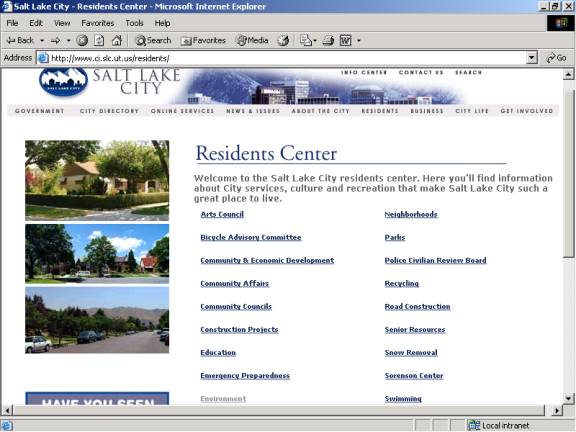
System 1 - Official site for Salt Lake City, Residents'
Page
Most of the community-based websites do not have health/life-style
related indicator/index easily accessible on their site to promote
health condition awareness in the community. Even if health/life-style
related subjects are available, users are usually presented with
very simple information on the subject along with some external
links for them to find out information regarding the condition on
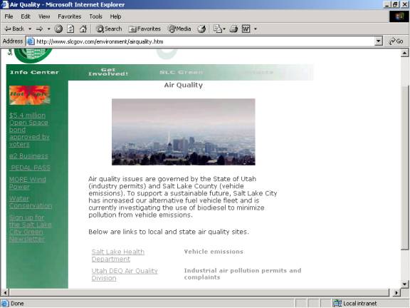
that particular subject. The Salt Lake City site has two links available
under “air quality”; one has to click on Utah Department
of Environmental Quality (DEQ) Division of Air Quality in order
to find out how the city is doing on the subject of air quality.
Once the users get to the DEQ page, they have to go through two
more steps in order to obtain the city’s air quality reports
or any indicators for air quality performance of the city.
- Weaknesses:
· The system is not proactive enough and lacks the function
of making residents aware of health conditions of the community
· Difficult to search for indicators on different subjects
· Some indicators may not be available if those links to
external sites are not available under the subject
- Strengths:
· The site is easy to maintain as external links are used
to show data for indicators
Indicators - Real Time Map/Data
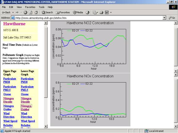
- Weaknesses:
· Poor presentation of graph (what is the relationship
between the green and blue lines?)
· Fail to compare data with a standard. Users are presented
with numbers with no explanation of how the city is doing (good/fair/bad?)
and what different indexes mean
· Unable to track past history
· Unable to compare status of indicators across different
communities
- Strengths:
· Has the power to compare different types of air quality
indexes on the same page
Indicators - Current Air Quality
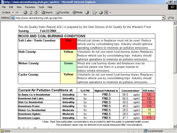
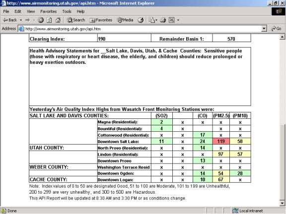
- Weaknesses:
· The presentation of the indicators is not eye-catching
· The table is difficult to understand
· Explanations of the data in the table are difficult to
find (note is located at the bottom of the table)
· Unable to track past history
- Strengths:
· Some indicators are color-coded to better differentiate
the levels of quality (Unfortunately there is no explanation of
which color stands for what level of quality)
· Indicators for different counties or cities are compared
side-by-side on the same table
· Interpret the data for users (unhealthy/moderate) under
the table of “Current Air Pollution Conditions”
[Top]
System 2 - Virginia Center for Healthy Communities
(http://www.vahealthycommunities.com/default.asp)
The goal of this website is to create an independent voice for
community health issues for residents in the state of Virginia.
It has information on health policy decisions related to community
health.
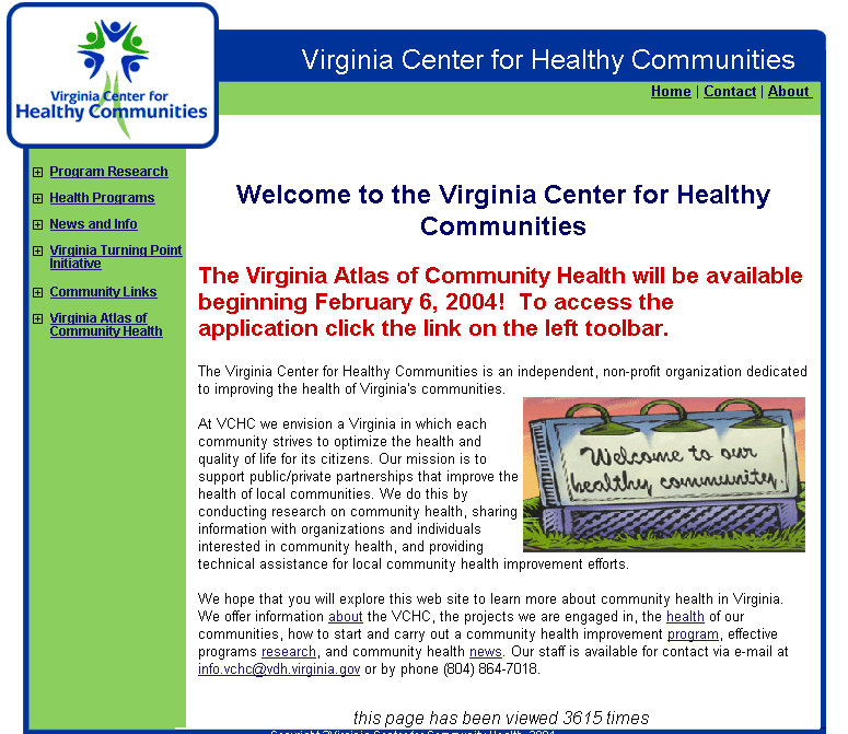
The website interface is simple and straightforward, making it
easy to understand and navigate. There are three navigational links
at the top right hand corner of the interface, but the location
makes them hard to be spotted right away. There is also a left navigational
bar menu. When one menu item is clicked on, all the sub-menu items
will come up underneath it. Some of the menu titles do not relate
well to the underneath content. For example, under the menu item
“News and Info”, one would assume to find news articles
and related information about health programs in Virginia, but surprisingly,
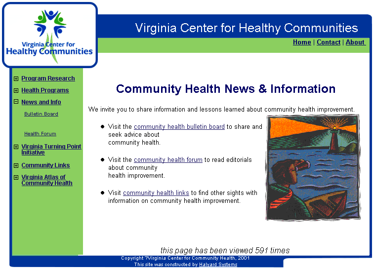
the submenus “Forum” for discussion and “Bulletin
Board” for announcements come up, as shown in the next graph.
One would not have assumed the existence of a discussion forum just
by looking at the main menu.
In terms of the information, it is a very educational site with
a lot of good information. It has many State public health reports
and survey results available, but again you would have to search
for them as you do not know that they are available just by looking
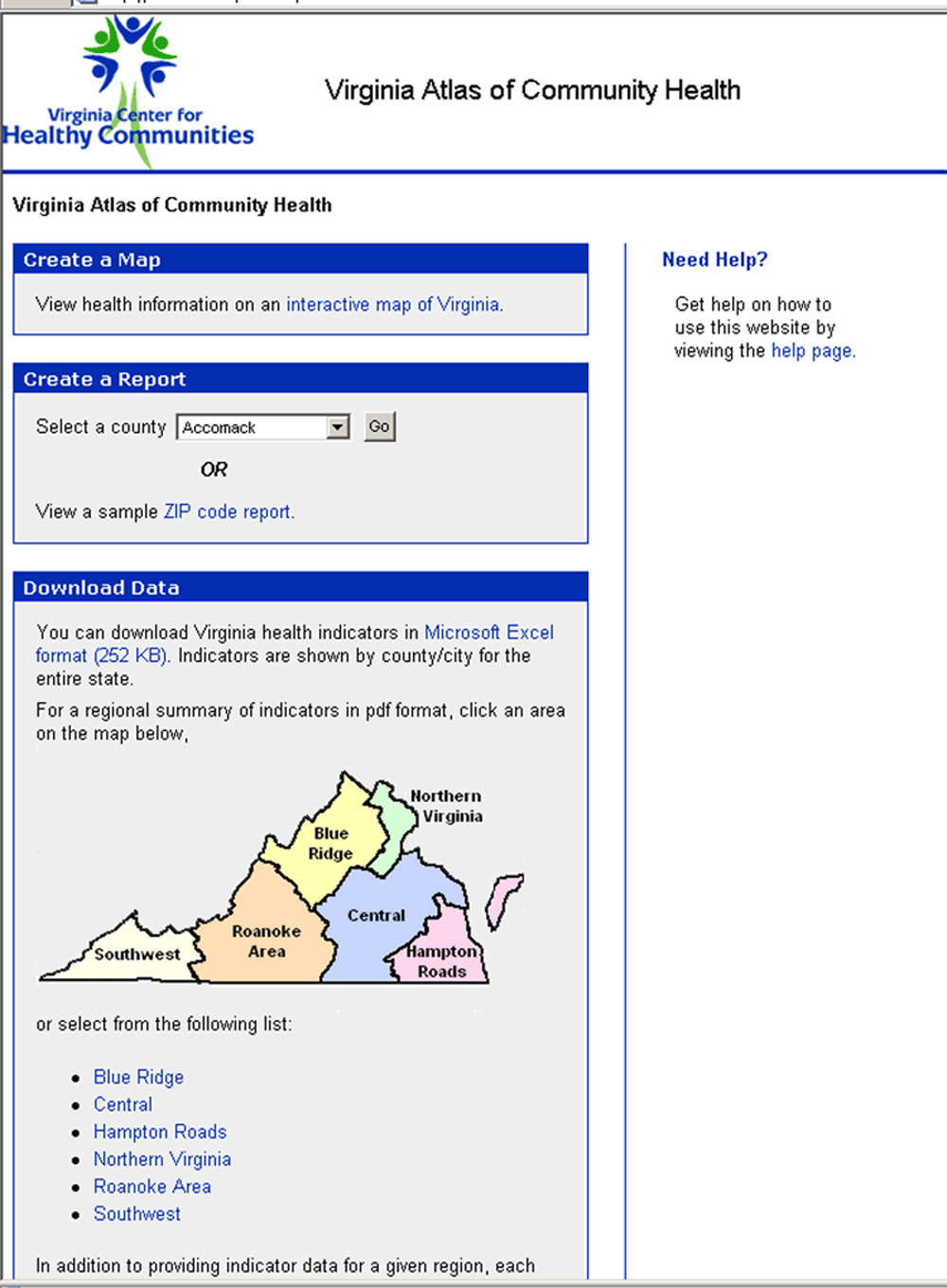
at the home page. You also have the ability to view indicator reports
by zip code and by community, as shown in the next graph, though
only local data are found in these reports. All the indicator values
cannot be compared across different communities, or compared over
time, or compared against national data.
However, much of the site information is not being updated continuously,
and old data are still at many places. The discussion forum and
bulletin boards are also not being maintained, in fact both links
are currently not functional, and there is no indication whether
they will be made available again.
The presentation of the information is very plain and dull, there
is nothing that really catches your attention and makes you engaging.
User can only digest the information, and there is no incentive
to do anything about all the community health issues that are being
described; no action tool is available for users to get involved
and actually make changes. Users can only send an email to the site
administrator, and there is no further contact information if a
user is interested in a community health project and would like
to learn more or become part of it. There is also no search function
or site map to help you find any specific information.
[Top]
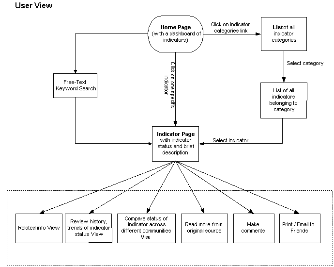
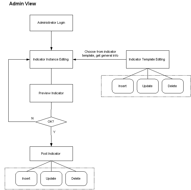
Initial Design Ideas
Design Flow Chart
Design Sketches
Florance's Sketches
Ran's Sketches
Nettie's Sketches
[Top]
|