|
Assignment #5: First
Interactive Prototype Introduction The Healthy Communities Network System is a web-based knowledge management information system. It will serve as a tool that tracks community health issues, promotes sharing of community information and best practices, and helps people get involved in making community decisions. The system will serve as a set of templates that can be leveraged and customized by local communities while the underlying system remains centrally maintained. The first community interested in having its own version of the system is Marin County, California, and the first system implementation will be customized specifically for Marin County. One of the main components of the system is a dashboard of indicators that reflects a community’s quality of life, and our IS 213 project focuses on designing such a dashboard for Marin County. Task Scenario 1:
Get Information on Air Pollution 1. Go to homepage of Marin Healthy Communities. 2. Click on the air pollution indicator dial on the dashboard (alternatively you can click on “Community Indicators” on left panel and select the air pollution indicator from a master list), and that takes you to the air pollution indicator page.
3. View general information on how Marin County is doing on air
pollution.
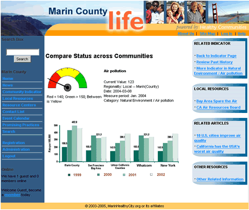
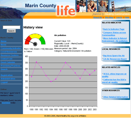
5. Click on the “Review Past History” link on right panel to look up old data on Marin air pollution.
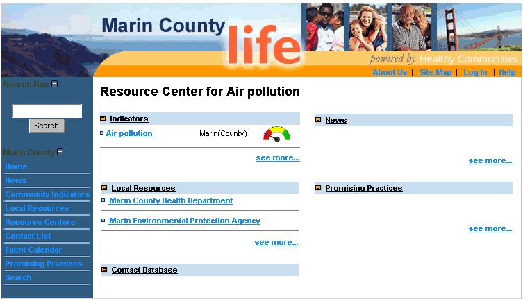
6. Click on the “Other Related Information” link on right panel to go to a resource center page on air pollution.
7. A list of air pollution related organizations are listed under
“Local Resources”.
1.Go to homepage of Marin Healthy Communities.
2. Click on the air pollution dial on the dashboard (alternatively you can click on “Community Indicators” on left panel and select the air pollution indicator from a master list), and that takes you to the air pollution indicator page.
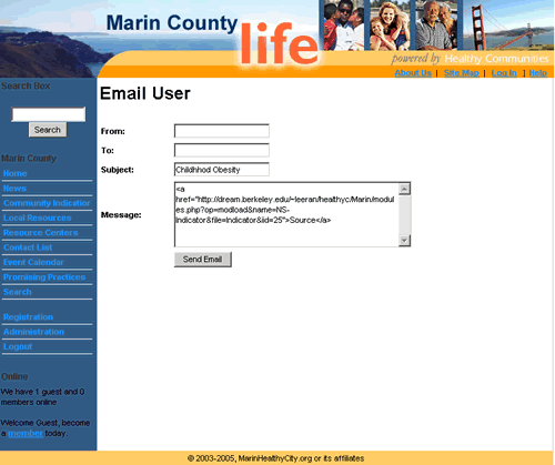
3. Click on “Email to Others” on bottom of the air pollution indicator page to email the page link to others.
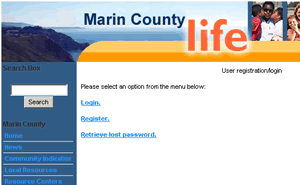
5. Click on “Login/Create an account” on bottom of indicator page to register if you want to post comments.
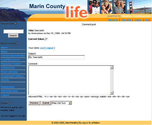
7. Go back to the air pollution indicator page. 8. Click on “Post Comments” on bottom of air pollution indicator page to post messages on the topic of air pollution for other users to view.
Steps for achieving task scenario 3: 1. Go to homepage of Marin Healthy Communities.
2. Click on “Community Indicators” link on left panel to go to master list of all indicators.
3. Select the water quality indicator to look up information on
water quality. Alternative steps for achieving task scenario 3: 1. Go to homepage of Marin Healthy Communities.
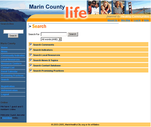
2. Click on “Search” link on left panel to go to search page.
3. Type in “water quality” in search text box and check
Indicators and hit “Enter”. Differences as a Result of Low-fi Testing
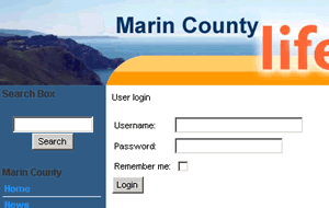
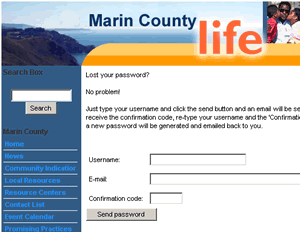
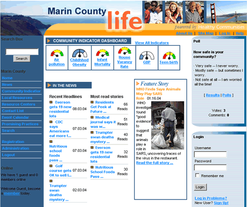
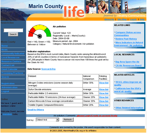
The goal of our first interactive prototype is to reflect the overall functionalities of the indicator feature. Our design focuses on the tasks of viewing, searching, and sharing indicator information as described in previous write-ups. With such design focus in mind, we developed the following system pages in our first interactive prototype. System Pages Developed Homepage - Mainly divided into three columns. Left column is the intranet-wide navigation (e.g. home, indicators, local resources, contact list, search), which is standard for all system pages. Middle column mainly consists of the Site News Items (e.g. dashboard of indicators, news, feature story, resource centers). Right column consists of the Poll and Log-in blocks. The very top of the homepage is the Page Title and Intranet Identifier/Logo. Indicator Master List Page - The purpose of this page is to showcase the most viewed indicators under all community health categories. At a glance, users can easily determine how the community is doing by looking at the dials. This page is particularly useful to users who are not looking for specific indicators but are interested in knowing in general the overall health quality of their community. A search box is also available on the top of the page to allow users to search on all indicators available in the system. To get to the Indicator Master List page, users can use the Community Indicator link on the left navigation bar, or the View all indicator link on top of the dashboard on the homepage. Individual Indicator Page - This page gives detailed information of an indicator. It consists of an explanation of the current status of the dial as well as any additional graphs, tables, figures, or numbers that would help reflecting the condition of that indicator. All indicator pages consist of four blocks at the right column. They are Related Links, Local Resources, Related Articles, and Other Resources. They provide links for additional information that is available both inside and outside of the system specifically for each indicator. In addition, Related Links consists of links that would lead to the Compare status across communities and View indicator history pages. Users can enter the Individual Indicator page by clicking on the dial on the Dashboard on the homepage or from the Indicator Master List page, or by performing a search for the specific indicator. Search Page - This is the system-wide search page. Users can perform free-text search and they have the options of searching content by features as specified by checking the checkbox next to each feature. Multiple selections are permitted. Users can use the link on the left navigation bar to get to the Search page. Email Page - This page consists of a form that allows users to email others the indicator information. The system would automatically show the indicator name on the subject line of the form, and the internet address link of the indicator page in the message body. Users would be led to this page once they click the Email to others link located on the Individual Indicator page. Post Comment Page - This page consists of a form that allows users to post comments on the indicator page. Users would be led to this page once they click the post comments button located at the bottom of the Individual Indicator page. Overview of the UI Actually Implemented We learned from our usability testing that the dashboard, located at the middle top of the homepage, is a good tool to capture users attention and to showcase what we can offer with the feature. As a result, we decided to put most of our efforts in improving the presentation of the dashboard, including the graphics, wording, layout and so on. Besides the Dashboard, we also worked on other system pages to gradually start mapping out the contents of the indicator feature. We also tried to improve the presentation of information (both numeric and graphic) on any given indicator on the individual indicator pages. Since the goal of our users is to view and/or use the information in one way or another, it is important to ensure that information is presented in a way that is easy to retrieve and understand. What was Left Out and Why In our first prototype, we incorporated almost all functionalities that we tested for in the low-fi prototype testing. It is doable because we were able to narrow the scope of our project appropriately in our initial design process, and only to focus on functionalities that are related to our task scenarios in the subsequent usability testing process. The only feedbacks that we did not incorporate into the current design were the ones not related to indicators but yet were tested in the usability testing for future referencing purposes. For example, we kept the term Promising Practices, even though we found that its meaning was not very clear to most users. The rationale behind it was that we plan to improve the documentation of the overall system in our future prototypes, i.e. to add the function that will give short explanations on all left navigation links when performing mouse-over on the links. Tools Used We first developed a mock-up of the interface using Dreamweaver. We then built our first interactive prototype using PHP. PHP allowed us to reuse the HTML elements from the mock-up when we started building the interactive prototype. The graphical components were created in Photoshop and Fireworks. We were able to integrate the mock-up into the prototype without duplicating efforts. Screen Shots not Shown in Storyboards (User Login and Registration Screens) Login Selection Page Login Page Registration Page Retrieve Lost Password Page How to Run the Interface and the Scenarios Please follow each task scenario as shown above to run our interface. All the functionalities described in our task scenarios are available for use. You can also refer to System Pages Developed under Prototype Overview for detailed explanations of the layout and functionalities of each system page. Storyboard for Task Scenario #1Storyboard for Task Scenario #2 Storyboard for Task Scenario #3 Link to Presentation Slides |

 .
In this case, the needle pointing green means good, yellow means
fair, and red means bad. The other indicator dial
.
In this case, the needle pointing green means good, yellow means
fair, and red means bad. The other indicator dial  or
or  is to represent indicators
that cannot be assessed as good, fair or bad
is to represent indicators
that cannot be assessed as good, fair or bad or
or  is used to represent below and
above average indicators.
is used to represent below and
above average indicators.