|
Assignment #7: Second
Interactive Prototype Prototype Overview We have received some valuable comments and suggestions from the MappingChina group. The following UI design changes are made in response to the major issues addressed in the heuristic evaluation. Changes are listed by location and/or functionality. HE comments are presented in Italic, and UI design changes are presented in bullet points immediately afterwards. Screen shots are used to illustrate the changes. Left Navigation Bar (throughout the system) We had a number of comments on graphic design issues that might affect navigation. For example, the visibility of the items in the left column is very poor. Already, the column melts into the background and so seems like secondary or unimportant information. On top of that, the blue text disappears into the blue background.
Search The search function is a crucial part of any website. We found the search delimiters to be techy and confusing (_ALLWORDS , _ANYWORDS; Search all words [AND] and Search Any Words [OR] ). Also, we felt that the search function should be only the simple box on the home page, with perhaps an option for an advanced search. We also werent sure what we were searching for - Indicators? Articles? Locations? Currently, the search results page from the search box query on the home page is another search box and list of categories under which to search. Its too much work to enter a term in the home page search box, then get another search page where the user has to refine the search. The user should have the choice upfront whether to do a simple or more advanced search.
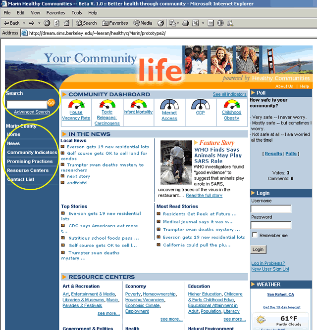
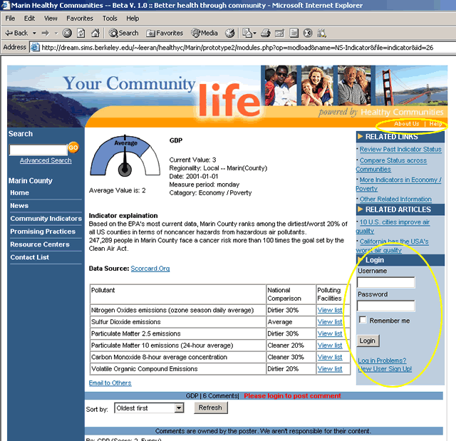
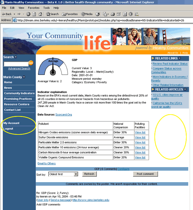
Right Navigation Bar (throughout the system) Login/Registration The log-in/registering process and functionality of the site should be very clear. Right now it is very unclear. None of us could determine how the log-in process flow worked, or which features required a log-in versus which didnt. Can one still surf information before logging in, or only after logging in? We didnt know. We also felt that after registering or logging in, the user should be taken back to the page he/she was working on. Right now, the registration process goes to a dead end.
When the user clicks on Registration (from the left hand column), he/she is taken to a page that makes them choose Register again from a list whose options dont make sense (Login, Register, Retrieve lost password). Why is the user looking at logging out or finding a password here when they presumably have not even signed up or logged in yet?
Before Login
After Login
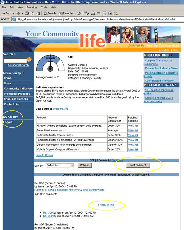
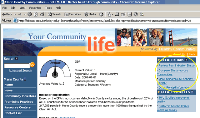
Right Navigation Bar (inside individual indicator page) We were also confused in some cases by the right sidebar. For example, when viewing the Compare Across Communities page, the Review Past History link on the right sidebar is confusing. Does this refer to past comparisons of all counties? Because the right sidebar isnt visually/graphically separated from the page contents, the tendency is to think the two are related. Perhaps by separating the sidebar more forcefully from the page, this link would make more sense and make the user see that the sidebar elements relate to the Air Pollution category as a whole, rather than the county comparison page.
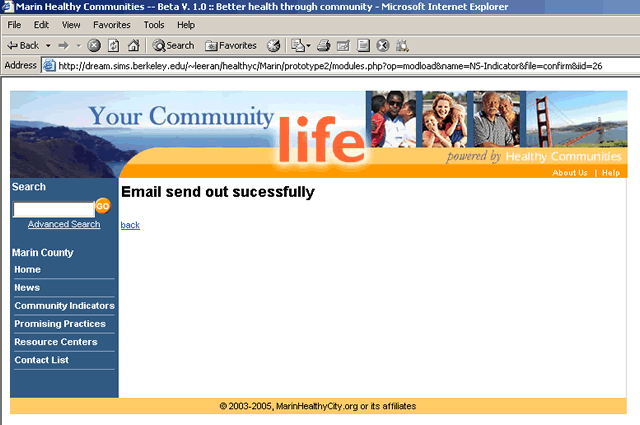
Middle Well (inside individual indicator page) Email/Post Comments Because this is one of your major scenario items, we felt it was important to make it clear from the home page how to accomplish these desired tasks. However, we couldnt figure out how to email information or post without first having to drill down for information. And some pages didnt have an email link at the bottom. After we emailed a page, there was no confirmation page. We werent sure if our email was sent out.
Terminology We did not change some of the names we use in the site: Community Indicators, Contact List, Promising Practices,and Resource Centers. We made some changes on these terms according to our first usability test already, and we believe their meanings are reasonably clear at this point. Since our target users are public health professionals and people interested in community health issues, they probably are familiar with these terms. Although our heuristic evaluators recommend that we change theses terms again, we think that different people have different interpretations and it is hard to have terms that please everyone. Dials and Graphs Another heuristic suggestion is to change the dials and to add scales and labels for graphs appropriately. We are also leaving this change as it will take a reasonably long time to do any graphical redesign. We hope to be able to incorporate improvements in this area for next prototype. Indicator Information Due to time constraint, much of the content information for indicators is on the topic of air pollution, such as indicator explanation, data source information, graphs, etc. For example, under the infant mortality indicator, the content is still displaying air pollution information. We will update the content for most of the indicators for next prototype when we have more time to make the changes, as it is too much information to change at this point. Indicator Links on Resource Center Page The resource center link on the left hand navigational bar leads to a resource center master list page. From that page, users can choose a specific topic and learn about all related information on that topic. Since we are only focusing on the indicators for the 213 project, we do not plan to make changes on the resource center related pages (These pages were just added for users to understand the scope of the project). Icons on Indicator Master List Page One of the heuristic recommendations is to delete the indicator dials on the indicator master list page because the icons make the page look too information intensive. We disagree with that and we believe that with careful design and layout, the dials on the master list page will help get users' attention and give some brief information on the status of each indicator. In that way users can easily find out which indicators are doing well or doing poorly with a simple glance. How to Run the Second Interactive Prototype The second interactive prototype can be run similarily to running the first prototype. Please click here to find instructions. |