From Paper Prototype to First Interactive Prototype
We made several changes to the prototype in moving from a paper-based system to an interactive one. Besides adding functionality that works without human intervention, we changed multiple aspects of the design.
New method of comparing and transferring annotations from other genes
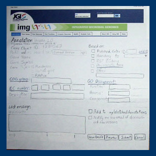
The pre-fill drop-down menu was surprisingly the most controversial aspect of our initial design. As you can see in the image below, we originally thought to have a drop-down menu near the top of the Update Annotation screen that would provide a list of best-matched homologues. Upon selecting an item from the list, the information from that homologue would be used to automatically pre-fill the rest of the annotation information, although users would still be able to edit and tweak these values.

Update Annotation page in the paper prototype.
Users were, in general, extremely wary of this functionality. They cited issues such as annotation errors propagating quickly throughout the system, or the problem of what to do if one discovers a gene has been annotated incorrectly after it has already been used to propagate data through mutliple other genes. It seemed that this option made the task of annotating a little too easy. Participants wanted a system that would require more deliberation on the part of the scientist.
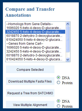
To this end, we implemented the following form:
This form appeared in the "Update Annotation" page, allowing users to select related genes of interest and use multiple comparison tools to get an overview of the related annotations. Once users clicked "compare selected", a page with columnar information for the gene under annotation and each gene selected for comparison loaded into the browser. For each gene, all the annotation fields appeared in rows with radio buttons, and the user could select the value they considered appropriate for the current gene (or leave the initial value).
No drafts
As shown in the bottom right-hand corner of the image at the top of the previous section, the paper prototype allowed participants to save draft versions of annotations, which would be accessible on their MyAnnotations page, for later submission. After testing, we realized that this draft would generate synchronization problems if another user wanted to modify the annotation while the first user was still working on a draft. We also noted in our user testing that users tended not to close their browser or navigate elsewhere on the site when asked to show us how they would leave the system on walking out for a break. Because drafts seemed to cause more problems than they solved, we chose to cut the "draft" functionality entirely and plan on using a timed lockout function.
Existing wiki sites vary in their approach to this problem. TWiki, for example, uses an edit lock to avoid the situation, as we plan to do. Wikipedia handles the version control problem with an "edit conflict" dialog box provided to the second user, who is responsible for manually merging conflicting versions. This makes sense for large chunks of textual information that are constantly undergoing revision and improvement but is less applicable to the small, rarely revised set of data fields that make up a given annotation. An "edit conflict" dialog box might be useful for handling complex, ongoing discussions, but we anticipate that the vast majority of genes will enjoy no more than a handful of modifications. Moreover, the merging of two different functional assignments seems unlikely to yield satisfactory results.
Additional evidence fields (PFam and UniProt)
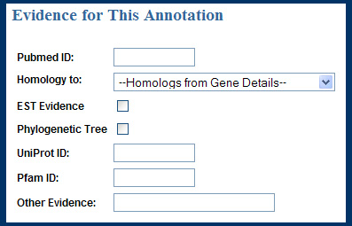
Another participant suggested additional evidence fields for PFam and UniProt. These were added to the Evidence section of the Update Annotations page, as shown below.

Evidence area of the Update Annotation page in the first interactive prototype.
Automatic previews (can be turned off in prefs)
In order to decrease the number of buttons in the "Update Annotation" page, and also because none of the first-time users submitted their annotations without previews, we decided to remove the "preview" button and to make previewing automatic upon submission. We agreed that there should be a checkbox in the IMG user preferences so that power users can opt out of this automatic preview option.
Voting buttons on gene cart page
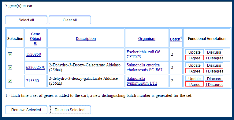
There are two points of entry to our system: the gene cart and the gene details page. Previously we only implemented the voting system ("I Agree" or "I Disagree" to particular annotations) on the gene details page, but users indicated a great enough confidence in working with genes in their gene cart that they preferred to have these options available in the gene cart. Hence, the Gene Cart ended up looking like the snapshot below.

The Gene Cart as represented in the first interactive prototype.
Hyperlinks in discussions
Participants wanted embedded hyperlinks within the discussion page, so that they could provide external resources. This is easily implemented.
Flags to indicate genes recently annotated
One participant suggested flagging genes in the gene list that had been recently annotated in order to indicate that they were under discussion. Not only does this give the viewer a sense of how "green" an annotation is, it is also an incentive for users to contribute their own expertise to new annotations.

The Gene List page in the first interactive prototype.