The Low-Fidelity Prototype
To visualize the first version of the Geneboree annotation system and facilitate construction of the prototype, we developed an interaction flow chart. This showed the major pages in the system and how we expected users to move through them.
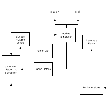
Next, we built a low-fidelity prototype to represent the important annotation pages. We constructed the prototype with paper, sticky notes, and acetate overlays. Part of the challenge in building it was determining how to represent the existing IMG system and its relationship to the new pages for annotation. We chose to print out, in color, pages from the existing system that we did not alter. We built the new pages in black and white.
Two important pages for our system were based on existing IMG pages but altered for annotation. The Gene Details page in the current version of IMG contains a data table at the top, which we decided to divide into two tables, one of which showed the data for functional annotation. We built the prototype of our version of the page by starting with a printout of the existing page. We made alterations with a "cut and paste" technique, cutting out the old table, mocking up new data tables and controls by hand on a separate sheet of paper, and taping those in between the parts of the page that would remain unchanged. The page was completed by a removable homolog table, which we placed over the ortholog cluster table when users chose to view homologs (an existing feature of IMG that was needed for annotation). We created our own version of the Gene Cart page in a similar manner, printing the existing page and adding buttons.
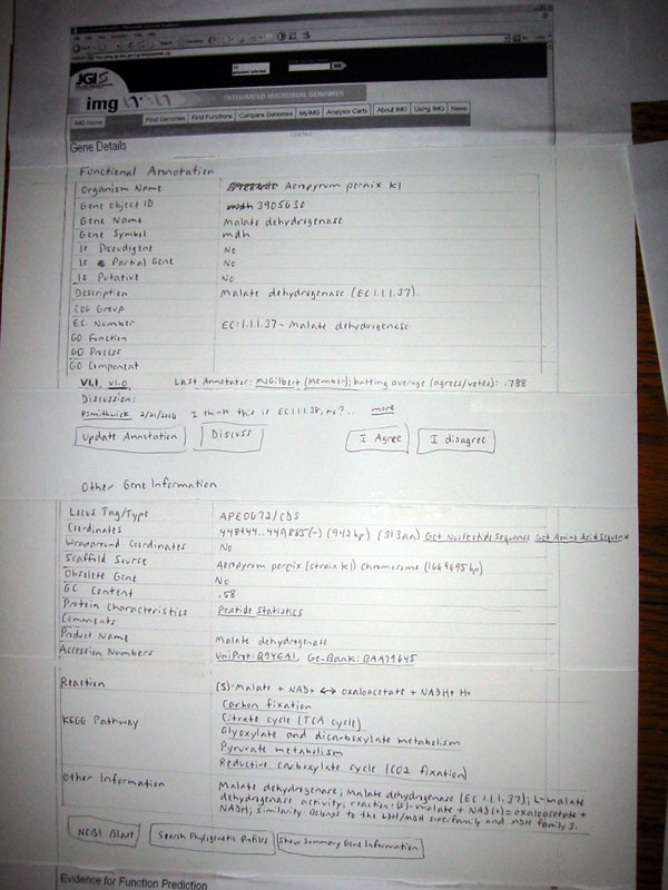
Top half of the Gene Details page, showing new tables.
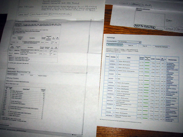
Lower half of the Gene Details page (left) with Homolog table (right).
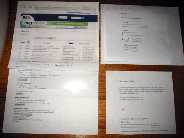
Gene Cart page (left) pictured with login page (upper right) and description of how to become a fellow (lower right).
To simulate the conditions of being logged in or not logged in, we created acetate overlays, one for each condition. As our users moved through the system, we placed one of these two overlays atop each page they viewed. We also used acetate overlays for the page on which one updates an annotation, to show state changes as participants used the form controls. We had overlays for COG group, GO function, and gene name. The display of these items depended on the state of the prefill menu and text entry boxes. The prefill menu itself was represented by a sticky note, which we pasted in place when users pulled down the menu. The same menu doubled as a menu for optionally indicating which homolog an annotation was based on (if based on homology).
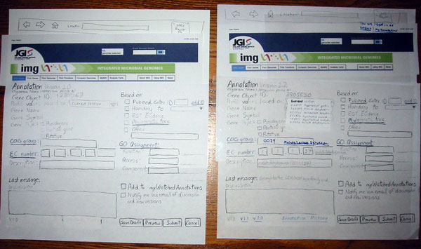
Pages for updating annotations. The version to the right shows the COG group filled in and the prefill menu pulled down. The acetate overlay for logged in users is also shown at right.
The Annotation History page has internal anchors, so we built a "scrolling" version that folds to position a specific version of the annotation at the top of the page.
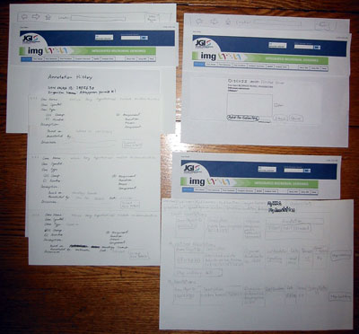
Annotation history (left) with multiple-gene discussion form (upper right) and MyAnnotations page (lower right).
We had one acetate marked with a highlighted rectangle to indicate the state of the "disagree" button. When users indicated their opposition to an annotation (as requested in the scenario) by clicking on the "disagree" button, we placed the overlay on top of it so that it appeared to change color.
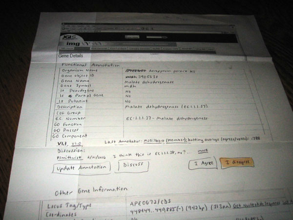
The Gene Details page after the user clicks on "I disagree."
One page, the Become a Fellow page, was used only for presentation, as we wanted to ask users whether they thought the advantages of and criteria for becoming a fellow were reasonable.
Since the annotation pages are shown in a popup, we needed two browser windows, so we built two paper "browsers" on which the pages were overlayed. Thus, users could make use of standard browser controls, such as back and forward buttons.
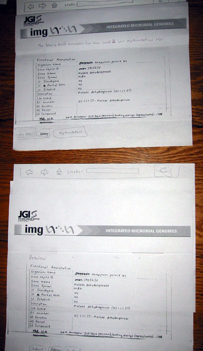
The Draft Annotation and Preview pages, shown in our two "browsers."