Second Interactive Prototype
The second interactive prototype for Geneboree addresses notes from the heuristic evaluation by the LightsOn group as well as intended changes we did not have time to make for the first interactive prototype. There were no large-scale changes to the site (that is, no content moved to a different page), but there were many small changes within pages.
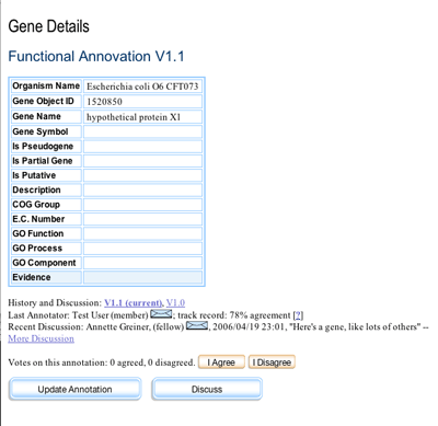
On the Gene Details page, we reorganized the information directly below the Functional Annotation table. The objective was to create a more cohesive grouping for this area. In order to accomplish this, we decided to depart from the existing IMG design a little, designing new buttons that we believe offer better percieved clickability and look less like tabs. In particular, smaller voting buttons allowed us to move them in line with the text about voting. The color of the voting buttons was changed to a more neutral one (brown rather than red). We also introduced an envelope icon to indicate mailto links.

Reorganized annotation area of the Gene Details page
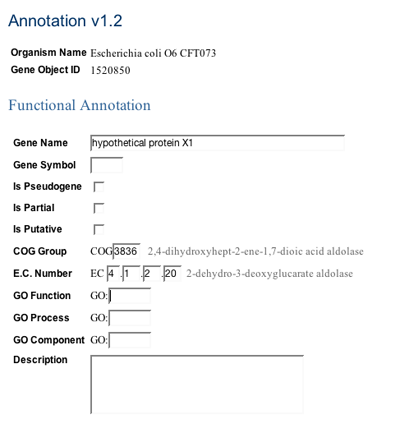
The Update Annotation page and other pages involved in updating an annotation (preview and confirmation) were given a simplified template, to make them visually different from other pages in the site. They now appear more like dialog boxes than separate web pages. We removed the navigation bar and other items above the IMG logo, except for the login bar. We removed all links not related directly to the task of updating an annotation, to prevent users from going astray and losing track of the window.

Top of the Update Annotation page showing formatted fields and ontology terms
As part of our intended changes, we corrected table styles on several pages. We formatted the input fields precisely for the Update Annotation page, to prevent user errors in data entry. User entries in these fields are now preserved across trips to the Compare and Transfer page, and the comparison table's radio buttons now behave correctly. We also added the display of ontology terms beside the corresponding number field when users enter a new term number.
We also set up the registration process to collect annotators' full names so that their real-world names could be used in the system wherever we indicate who made an annotation. After much deliberation, we arrived at a better name for the "batting average". The system now reports a "track record" with a percentage agreement.