Final Design
Annotation
The Geneboree collaborative annotation system allows all members to modify the annotation for any existing genes. To do so, they need only click “update” or “update annotation” from the Gene Cart or the Gene Details page respectively. This will bring up a comparison tool they can use to identify related genes and then transfer the relevant annotation fields to their current, selected gene. Alternatively, they can opt to edit the annotation fields by hand, although we anticipate this feature will be used only by a minority of scientists who consider themselves expert annotators.
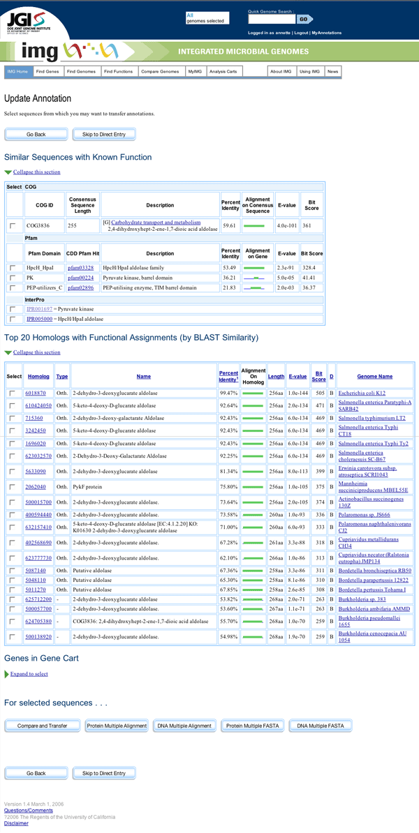
Mock-up of Update Annotation Page
On the first page presented to the user, they are given the opportunity to select genes for use in their comparison. This step is necessary to narrow the field of genes being compared to those with suitable similarity and features. The list leaves out genes that are merely hypothetical proteins, since transferring annotation data from such genes would be a mistake. Users can elect to view a multiple alignment or download a multiple FASTA file for analysis before proceeding to the Compare and Transfer page. These analysis resources open in separate windows, as users will need to return to the Update Annotation page to make their changes.
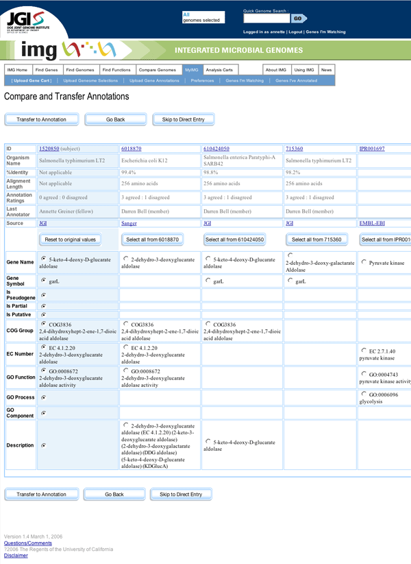
Mock-up of Compare and Transfer Page
At both steps in this wizard-like interaction flow, users have the option to skip to a Direct Entry page, on which they can enter annotations manually into form fields.
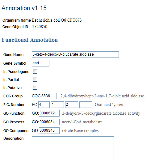
Direct Entry Page
Discussion
On the right sidebar of each Gene Details page will be a running discussion of that annotation. Using a kind of “blog” format, the most recent entries will bubble to the top, giving the page more of a dynamic, interactive look and feel. After the first two or three most recent comments will be a text entry field and a “submit” button, that the member can use to provide one-click feedback. The only difference between the interfaces that members and fellows see is that fellows will also be given the option of agreeing, disagreeing, or expressing no opinion about the annotation. This functionality will be useful not only for other members, in gauging the accuracy of a given annotation, but also in aggregate to judge the reliability of the other annotators.
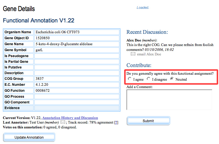
Gene Details Page with discussion sidebar. The content shown only to members is highlighted in red.
The only difference between the functionality seen by members and fellows is that members do not see the voting options.
From the Gene Cart page, users have the ability to click “Discuss,” which will direct the browser to a page with an entry field at the top and past discussion on the current version of that annotation in chronological order from most recent at the top to least recent at the bottom. As with the Gene Details sidebar, the only difference between the “fellows” view of this page and the “members” view is that fellows are able to assess the validity of the annotation through voting.
Annotation History and Discussion
Each version of each annotation will maintain a separate discussion thread, since debate regarding the accuracy of a previous version should have no bearing on the current version.
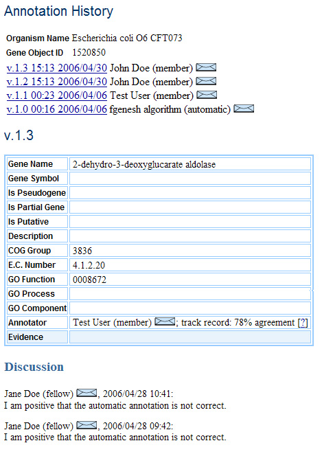
Annotation History Page
From the Gene Details page, the Genes I’m Watching page, and the Genes I’ve Annotated page (discussed below), one can browse to a page showing all the annotation history as well as associated discussion for a given gene. This Annotation History contains a list of versions at the top, allowing quick access to previous versions without scrolling.
Membership
There are three levels of membership: guest, member, and fellow. The guest is the default user status, which provides access to all the existing functionality of the current IMG system. Guests can see the same functionality that members can; however, when they try to access it, they will be redirected to a login page from which they can create a new account. This strategy was chosen because creating an account is an extremely low-overhead process, and we wanted as many users as possible who were interested in this system to have a dedicated account.
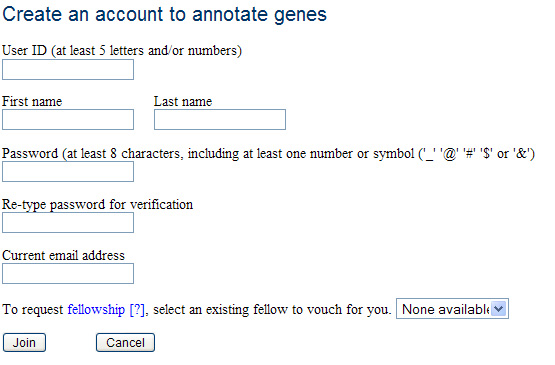 Account Creation Page
Members are individuals who have created an account. They can update an annotation and add comments.
Fellows are members with proven authority. Members become fellows either by completing a minimum number of annotations while maintaining an average approval rating above a certain level (currently, we feel 50% agreement is reasonable), or by being recommended by an existing fellow. Fellows have the ability to vote on other annotations and to comment on multiple genes at once from the Gene Cart.
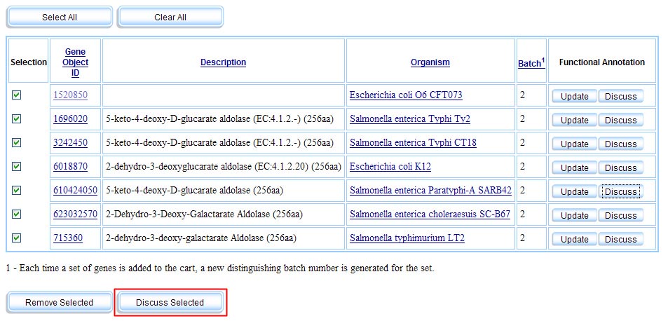
Gene Cart Page with "Discuss Multiple" Functionality. The button in red is only made visible to fellows.
Members and fellows are both privy to two personalized pages, Genes I’m Watching and Genes I’ve Annotated. Genes I’m Watching shows genes that the individual has tagged as genes they would like to keep track of (users can also opt to have emails sent to them regarding any changes to or discussion about these genes). Genes I’ve annotated is an automatically generated list of all the genes that user has annotated. Both lists can be sorted by a variety of criteria, in anticipation of users assembling hundreds or even thousands of genes of interest.
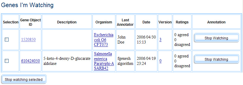 Genes I'm Watching
 Genes I've Annotated
Modifications to the Existing IMG System
While we tried to keep our modifications to the existing IMG system as minimal as possible, there are multiple usability problems that bear some mention in this report. One feature that would be relatively easy to change is the appearance of buttons, from a flat, box-like shape to a 3-dimensional, more standard “button” look. Another feature we would recommend for the existing system is the ability to collapse different sections of pages, particularly the very long pages with lots of technical information, so that the user can focus on only the fields of interest to him or her. We would also recommend more of a visual separation between sections, possibly with the use of horizontal bars so that the information can be visually and mentally grouped.
These are only the “least-impact” changes we would recommend. There are a variety of more involved changes that we would recommend be explored, such as a new system of navigation with better feedback, the development of a “dashboard” interface, and the rearrangement of the page header, which consumes too much valuable screen space in such an information-intensive application as this. All of these modifications, however, are outside the scope of this project.
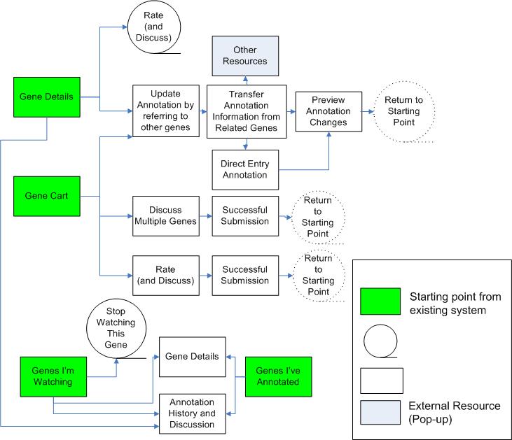
Flowchart of The Final Design
Unimplemented Functionality
Though our second prototype was fully interactive, our final design includes a number of pages represented only as mock-ups. We decided to make significant changes to the flow by scrapping the "Update Annotation" pop-up, incorporating its functionality into the main flow by supplementing it with supporting data and introducing two routes for updating annotation. We separated the "Compare and Transfer" tool into a page for selecting a subset of sequences to compare and a page for transfer and kept the form from the old "Update Annotation " page for direct input. Since these changes were major, we chose to allocate our resources to developing these mock-ups (included in the beginning of this section).
We also made an attempt to rebuild the Gene Details page to include the Discussion form, but were not able to make it fully functional because it introduced a login dichotomy: Gene Details is accessable to everyone, but the discussion functionality must be protected by login. The partly functional HTML mock-up is available here. The final design would keep Gene Details accessible to nonmembers but require users who are not yet logged in to log in once they hit "Submit".
Throughout all of these iterations, we have only developed "fellow" functionality, and have not implemented the more restricted "member" functionality. To support this in the future, the system would check for "fellow" access, and if the user was only a "member," then the ranking functionality as well as the batch comments would disappear.
We have not implemented the rendering of COG, GO, and EC Number ontology descriptors for the filled-in entities. Though they become visible upon manual annotation entry, we would also like to see them appear in the "Compare and Transfer" page (reflected in the mock-up) and the direct entry page for the entities that already have values.

Mock-up of Direct Entry page with term completion
On the Direct Entry page, we would like to implement a "Revert to Previous Version" button that would reset the annotation fields to the state of the last submitted annotation.
On the Genes I'm Watching and the Genes I've Annotated page, we would like to support sorting of the list of genes by the different criteria in each row. Thus, the table headers might look like this:

Mock-up of header of Genes I'm Watching, sorted to show the least recent annotation first

Mock-up of header of Genes I've Annotated, sorted to show the most recent annotation first
Tools Used
To create our interactive prototypes we relied on MySQL, PHP, JavaScript, HTML, and CSS. We used Dreamweaver for HTML coding and made heavy use of Dreamweaver templates. The database was created and managed via both the command line and YourSQL (a Macintosh application that provides a graphical user interface for MySQL databases). We debated on the use of Perl, but then decided in favor of PHP because of the skills and experience that among the team members.
The MySQL relational database was used to handle dynamic generation of data and support update funtionality. A set of data necessary for testing core annotation functionality was populated in the database; however, since we couldn't possibly replicate every aspect of IMG, secondary links such as those on"Gene Details" below the "Functional Annotation" section link back to the IMG system.
PHP 4.0 (currently available on the SIMS dream server) and Javascript were used to support database calls, login functionality, and client-side interactions.
Overall, we found these tools to be adequate for handling the complexity of the coding, however, working with Dreamweaver templates proved to be difficult. We have run into a "Dreamweaver-takes-control" problem, where the application would not accept template changes and would overwrite modified files to a previous state without the user's consent and ability to restore the changes. We have come to the conclusion that we were facing a software deficiency in Dreamweaver's template implementation.