Assignment 4 | March 9
January 26th, 2009 | Published in e. Color I | 672 Comments
Assignment 4: Color (due March 15)
In preparation for this week’s assignment, you identified palettes of 3-5 colors that express your sense of color harmony. Apply these color palettes to one of the compositions you created for the Assignment 2 (Layout) or the Assignment 3 (Deconstructing Type). Using your palette, create at least three different designs that take advantage of your color palette. Hints: Think about interactions and different contracts of colors:
1. Contrast of hue
2. Light-dark contrast
3. Cold-warm contrast
4. Complementary contrast
5. Simultaneous contrast
6. Contrast of saturation
7. Contrast of extension
Please post your assignment here by Sunday, March 15. Be prepared to discuss the type of color contrasts you are creating in each of the three designs. You will present all 3 designs at the workshops on March 30th and April 20th.
March 14th, 2009 at 12:14 pm (#)
My first poster uses the palette from last homework.While this poster plays with contrast of hues and the reds and yellows do blend in harmoniously, I felt that it could use another strong color that accentuates this contrast for the text. Hence, poster #2 with blue added. The addition of the blue, in my opinion, makes the second poster livelier than the first. In poster #3, I experimented with subtle transitions from cold blues and greens to warm yellows. Pink is a good example of a color that borders between cold and warm and is situated at a point in the color wheel where the magenta just begins to ‘heat’ up to red. The yellowish tinge of the pink in this poster brings out that transition. Its location also makes it appear as if it were getting the light from the underlying yellow. The final poster plays with the complementary colors of dark blues, green and yellows. In fact, the greens were meant to look bluer, but I believe to have lost some color information on copy from Photoshop to Illustrator.
In all the three posters, I tried to emphasize a journey from cold to warm, or dark to light to sync the colors with the theme of the posters (which is a process of healing through therapeutic art).
http://picasaweb.google.com/j.vasudev/InterfaceAesthetics#
March 14th, 2009 at 4:44 pm (#)
After making some of the changes suggested in the feedback and critique I decided to add color to the text of my third poster to create more of a feeling of movement.
For the first poster I decided to use my lightest color against text with a gradient applied.
For the next one I tried to use it against the bright red for brightness and contrast.
For the third I experimented with making each line of text a different color.
March 15th, 2009 at 3:21 pm (#)
I created four posters using contrast of hue, light-dark contrast, cold-warm contrast and contrast of saturation.
1) Light-dark contrast
My original palette was using colors with similar hue and different brightness. I tried brightness contrast first in order to use the palette.
2) Contrast of hue
Next, I tried to use various hue with high saturation and brightness. I picked some colors from red, blue, green, etc. Contrast of bright and saturated colors makes the canvas very vivid.
3) Contrast of saturation
I think contrast of saturation is quite similar with light-dark contrast in white background. I picked the orange color for main color and created derivative colors by changing saturation value of the color.
4) Cold-warm contrast
Finally, I tried cold-warm contrast. I employed pink and orange as warm colors and skyblue and navy as cold colors. I tried to symbolize an island in the ocean. (The part which is colored in orange represents an island, and surrounding blue represents ocean.) I think this contrast makes audiences focus on the time of the poster.
* My palettes used for each poster is summarized in the picture below.

March 15th, 2009 at 3:53 pm (#)
For this assignment, I used the two palettes that I put together last week as well as a new one. I also applied some of the critiques from a couple weeks ago and revamped my vertical layout. Coincidentally, the new layout worked really well with the color palettes I have chosen.
This one is the new palette. I played with the saturation and lightness and darkness, trying to create the image of a gloomy frown that gradually lightens and brightens into a cheerful smile.
For the next one, I used the palette:
I tried to capture the contrast between frown and smile using the contrast between the different hues. The transparent faces were saturated a bit more to enhance their visibility.
The third palette I used was:
These colors incorporated contrasting hues, light-dark contrasts, as well as cold-warm contrasts. I applied the warmer color to the smiley face and the colder color to the frowning face.
March 15th, 2009 at 4:38 pm (#)
I interpreted the assignment as using the same palette in three different ways, so my three are all using the same palette. The first uses the original white background, which keeps the look pretty light and airy. It allows each hue to stand on its own.
I decided to try using the sky blue as the background, and this allowed me to start playing with interactions between the colors more. I found that the yellow and the orange stand out best from the blue background. Both are complementary or near complementary. The yellow also gets contrast from the difference in brilliance. The paragraphs at the bottom seemed to be more readable with the good old black of the original.
This last one was an attempt to see if I could make it work with the polyhedron being green. The green never seemed to work all that well with the blue background, I think because they were too similar to each other. I decided to go with yellow to see how that would work. That led me to using purple for the main type.
March 15th, 2009 at 5:06 pm (#)
The predominant colors in my color palette were complementary: blue and orange. I played around with different styles and used different types of contrast for my three designs.
For the first design, I used four colors from my palette. I kept the clouds intact as much as possible and used them, along with the Cracked font, to create a gritty image. I placed the pairs of blue and orange with similar saturation near each other for the most part. There was also some light-dark contrast with the bright blue and the black.
For the second design, I took advantage of contrast of hue. I picked the shades of orange and blue that captured the liveliness at my wedding. The orange and blue had high but not complete brilliance. By choosing orange and blue I also took advantage of complementary contrast.
For the third design, I experimented mostly with contrast of saturation. Using orange as the main color, I chose colors with much less saturation to soften the design. The Underpainting effect further softened the image and added some texture.
Of the three, my favorite is the second one. It is clean and readable, and features my favorite color combination!
March 15th, 2009 at 5:10 pm (#)
I struggled a lot initially with this project particularly due to my lack of dexterity with the tools but ended up having fun with it anyway. Another thing is my saffron flower had strong contrasts in colors that I had difficulty implementing organically to the context of the posters. I chose my original photo of the wine and cheese and tried to manipulate the colors to reflect the violet and earthiness of the flower. As per the earlier feedback, I selected colors for the type from parts of the photo to make it weave more seamlessly.
I decided to play with colors using the black and white contrast posters I worked on. That proved to make color incorporation more playful and thematically fluid.
I tried to be mindful of the color compositions of the flower and the arrangements to make things flow and prevent the contrasts in color from being too jarring.
March 15th, 2009 at 5:47 pm (#)
For the last assignment, I completed my color palette from the picture of Auroras (Polar Lights). Thus, to begin with, I try to represent the effect of greenish glow by light-dark contrast. I keep the sky in dark blue, changing gradually into light green toward the building. Meanwhile, the greenish glow itself also fades lighter from bottom right toward upper left to strengthen the power of direction. Finally, I change the title in yellow-orange as a contract to the blue sky.
http://picasaweb.google.com/HsinHsienChiu/Ass06#5313595986654208194
For the second try, I use both light-dark contrast and similar hue (green for the sky and yellow-orange for the ground) for color integration in the meantime. For light-dark contrast, I keep the middle track in white and have both ground and sky in dark hue in the middle, fading gradually into the upper right in green, and lower left in yellow.
http://picasaweb.google.com/HsinHsienChiu/Ass06#5313596001429898130
Regarding the third composition, I make the ground in dark hue in contrast to the light sky. Besides, I put some blue near the surface of the ground, and make the sky in light orange as contrast of hue to blue.
http://picasaweb.google.com/HsinHsienChiu/Ass06#5313596014818410338
March 15th, 2009 at 5:54 pm (#)
The first poster is a hue contrast exercise. I used the contrast of red, yellow and saturated yellow. Based on the guild line of assignment 03, I matched red and yellow like a colorful jigsaw puzzle; yellow is the adjacent color of red, and red letters on yellow background. The contrast of red and yellow makes strong and delightful atmosphere. To emphasize the title of the project, I used saturating yellow cubes – almost white- on such strong contrast of red and yellow.
http://picasaweb.google.com/lh/photo/FpzhiBPg-y0pcAR9-IVIBA?authkey=Gv1sRgCPu-uP-2h8zkRw&feat=directlink
The second poster is based on cold-warm contrast exercise (including light-dark contrast). I used white color and two blue tones. The light and deep blue colors are adjacent to white color areas. I also used the white letters inside the blue cubes and the blue letters inside the white cubes. The contrast among cold colors and white color makes a fresh mood.
http://picasaweb.google.com/lh/photo/W8ZjQumTiCHNYa3H-GHswQ?authkey=Gv1sRgCPu-uP-2h8zkRw&feat=directlink
On the third poster, I exercised contrast of saturation with gray tones. I used three blue colors for cubes through variation of gray tone. I also saturated color of hand to make gray-blue tone. To emphasize the gray-blue objects, I used yellow background. Such contrast of the yellow background and the gray-blue objects makes both stable and cheery atmosphere. In the other sample, I used pale gray as background color. The pale gray can support the effects of gray tones: serene variations.
http://picasaweb.google.com/lh/photo/vfcw9jtPvaTNpbiumio5uQ?authkey=Gv1sRgCPu-uP-2h8zkRw&feat=directlink
http://picasaweb.google.com/lh/photo/LrD2PRhNyvf9FSMTVC9o5A?authkey=Gv1sRgCPu-uP-2h8zkRw&feat=directlink
March 15th, 2009 at 7:14 pm (#)
My original poster exhibited an almost entirely blue color scheme which varied the lightness and hue of the blue to distinguish the title bar in the foreground from the tree behind it and call out the leaders on some of the text blocks.
My color palette, from last week contained seven colors drawn from a vegetable dish.
For my first variation, I chose to work at the ‘Yam’ end of my palette, picking the two most saturated colors - a red and two oranges - as my basis. I strove for a color contrast that inverted the blues of the original and then paired them with a deep red background.
My second variation plays on the cold-warm contrast seen in the original vegetable dish that I tried to capture in my palette. This variation pairs an orange background with a green band and tree. I also played with the saturation contrast by pairing this saturated green and orange with a very desaturated green from the ‘Leeks’ end of my palette. By pairing this desaturated green with the saturated orange, I managed maintain some contrast in the title text, despite changing it from white to orange.
For my final variation I tried to play at the lighter, greener end of my palette and created a version that played with light-dark contrast by using a lighter beige background and rendering the text in a dark green. In this case I turned the white band and tree silhouette white and tried to use the absence of color to draw attention to them.
March 15th, 2009 at 8:15 pm (#)
http://rhyencoombs.com/projects/misc_images/aesthetics/horizontal_color.jpg
http://rhyencoombs.com/projects/misc_images/aesthetics/vertical_color.jpg
http://rhyencoombs.com/projects/misc_images/aesthetics/vertical_desaturate.jpg
March 15th, 2009 at 8:25 pm (#)
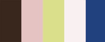
This was my color scheme from last week:
I ended up using the horizontal composition + line, although I made a few changes to the layout based on feedback.
The first layout mostly has contrast in light and dark, particularly the dark brown background versus the light pink foreground. I was also trying to play a little with foreground/background in the bottom half of “MANGA.” I generally think of pink and brown as warm tones. There’s a little cold-warm contrast in the tiny line of green going across the page, and in the blue in the pictures.
This layout plays more with contrast of saturation, although not much. There are shades of darker pink, and the background gradually shades from the darker pink to a lighter pink. The blue and green provide some cool contrast to the warm pinks and brown, and the green shades to blue, visually signaling that the eye is going to the second half of the page. I also added a brown background to the green line for visibility.
I think there’s more cool-warm contrast in this piece; the bottom half is brown and shaded brown and the top half is blue and shaded blue. The pink in the top half also contrasts with the green and the blue, while the green in the lower half provides a contrast to the brown.
March 15th, 2009 at 8:32 pm (#)
Version #1
http://www.elizabethshemaria.com/wordpress/wp-content/uploads/2009/03/assignment_4A.jpg
Version #2
http://www.elizabethshemaria.com/wordpress/wp-content/uploads/2009/03/assignment_4B.jpg
Version #3
This is my favorite of the three designs.
http://www.elizabethshemaria.com/wordpress/wp-content/uploads/2009/03/assignment_4C.jpg
-Elizabeth Shemaria
March 15th, 2009 at 8:37 pm (#)
I chose may diagonal poster for this assignment:
I reworked the color palette using the same photo of outside of Giannini Hall from last week using Kuler. I think it is a lot better:
To start I just tried to mimic the original colors of the poster with the palette. I think that this use of color plays most with contrast of saturation but also with complimentary colors (the blue - greenish sky is almost directly complimentary to the somewhat reddish - gray). Note the text on the upper part of the column — it looks like it is wrapping around the column to me b/c of how the text color looks darker on the column than against the sky — neato example of relative color!
For the second poster, I tried to use light / dark contrast to make the important text really pop out. The red building and ironwork seem to be in the foreground compared to the grey - brown sky. This I think is an improvement over the 1st poster in which the sky looks as if it is in the foreground. The blue flower and reddish building and ironwork also exhibit cold / warm contrast.
For the third poster, I am playing mostly with light / dark contrast with both the main text against the background photo and within the photo itself. I think that this poster improves the second because the “Strawberry Creek Native Plant” text is fades nicer than in the second.
Overall in this assignment, I was *really* surprised at how different the colors looked when used in different configurations.
March 15th, 2009 at 9:36 pm (#)
I chose a single poster layout with witch to experiment with the color palette I had selected. Below are my three designs.
March 15th, 2009 at 10:35 pm (#)
This is my color scheme from last week.

For this assignment, I simply played around with the arrangement of the colors. I played a bit with the alpha channel, and with frames, but everything I did seemed to detract from the feeling I was trying to evoke with the poster.
Here are three versions, each a slightly different interpretation of the theme:


March 15th, 2009 at 11:53 pm (#)
My palette from last week was “Christmas”, which wasn’t really what I wanted to use for these posters. I chose a new palette based on one of my favourite photos of Toronto, an HDR image of downtown at night.
Starting with a simple range of electric blues of differing darkness
Then playing with a combination of cool/warm colours
The same, but on black — wow, totally different feeling with the same colours
Working with a different poster, removing the busy background and trying to capture the bright blues on the grey-purple night background
Putting the key text in contrast
Going a little crazy!