Assignment 1: Typography
January 26th, 2009 | Published in b. Type I
Assignment 1: Typography (due February 9 in class)
In this typography assignment, you will integrate positive and negative form by creating a single element out of multiple letters:
a. Download pdfs at http://people.ischool.berkeley.edu/~daniela/type
b. Choose 2 or 3 letters (from the same or different fonts)
c. Cut, crop, shift, turn, repeat, or otherwise transform the letterforms to create your new form.
Preserve the integrity of all letters while creating a single unique form.
Please post your compositions here by Sunday Feb 8th. You will present your design to the class for critique on Monday March 2nd.
February 3rd, 2009 at 9:51 pm (#)
This is what I have come up with:
My original idea was to combine my first and last initials (the letters S & T) into something resembling a dollar sign. I had an urge to do this because I have been “signing” my initials on documents for the latter half of my life by printing the letters directly on top of each other, noticing that they almost resembled a dollar sign; I wanted to play with fonts at a level of precision where I might be able to realize my envisioned form, or at least create an equally clever/elegant one.
I started with the letter “T” from the Bodoni font. I thought that the highly curved serifs on the top of the character could be meshed with the curves of an “S” in some way, and I liked the thick, clean base (with no curves at the bottom).
When looking for an “S”, I realized that it was very difficult to choose one from the sans-serif fonts; the combination of such a heavily serif-ed “T” with a super-slick “S” did not look right, so I went back to the serif fonts. I noticed that all the “S” characters had a “head” and “tail”, as if they were snakes. I thought that might create an interesting effect, but most of the “S” serifs were so jarring compared to the body of the character that they created a kind of “serif-overload” when merged with the “T”. I went with the “S” from the Garamond font, as it had the calmest serifs while still having that animal-like personality.
When I overlaid the two characters, the “S” was not nearly wide enough to connect to the serifs of the “T”. At the same time, I noticed that the “S” did indeed look like a snake, perhaps slithering around a pole that was the base of the “T”. I decided to use the curved serifs of the “T” in a different way; I flipped the “T” upside-down and created something of a bowl for the “S” and the base of the “T” to sit in.
I cleaned the form up by removing the non-curved serif from the “T” (as it was interfering with the top of the “S” snake at this point) and was satisfied with the result. There may be a slight excess of serifs on the left side of the image, but I believe there is enough whitespace between them that the image is clear.
~~~~~~~~~~~~~
Feedback:
You created a wonderful, almost dollar-sign symmetry without loosing the letters S and T. Because of the second peak created by the end stroke of S, it looks more like you combined three letters instead of two. Also, since you turned the T upside down, an L is more visible than a T. What would happen if you removed the end of the S so that the S dissolved into the cross bar of the T?
February 6th, 2009 at 11:51 pm (#)
Similar to Simon, I decided to do my initials. For a long time, I have been drawing them in one fell swoop, starting at the base of the J, using it to come into the M, and then ending the M with a final cut to the right, making an L.
It never really looked very good as far as initials went, but it always got the job done, and seemed like a logical template to use for this project.
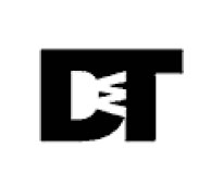
To make my image, I looked at all the font faces and tried to find one where the letters would easily merge together, without losing too much of their individual character. I could have used the sanserif faces, but they seemed painfully businesslike. The DWT logo above, for example, looks downright industrial to me. After looking at many of the faces, I ended up using the Bodoni italics set, since the serifs in the set were almost identical from one letter to the next.
I’m fairly happy with the final product, though my initials are MJL, not JML, so that’s a little confusing. I also find that the J and the L overpower the M somewhat, leaving it sort of the loser of the logo, whereas it should be the winner, since it’s my first name’s initial.
~~~~~~~~~~~~~
Feedback:
Clever use of redundant vertical strokes on the J, M and L. We see the total form first, but can easily pick apart the individual letters. Italic Bodoni also elegantly forms a dynamic, light shape. Playing more with the dot on the J and the height of the L ascender could reduce the complexity of the shape, creating a bolder form. Have you considered removing the dot altogether?
February 7th, 2009 at 12:40 am (#)
I started with the Baskerville ‘g’ because it has such gorgeous, sleek lines of varying thickness. I later realized that combining more than one complex letter or character, especially in a seriffed font, is challenging, and that characters with simpler lines and curves were better integrated. In seeking a letter that could be unified with the ‘g’ and still remain distinguishable, I came across the ‘i’ and, in playing around, decided to give the unified form some life. Thus, the dot of the eye because the eye of a snake. I’m not entirely satisfied with the upper lip of the ‘i’ jutting out into the middle, but I do like the way the serifs of the ‘i’ melt into the environment around the snake. I added the white ‘3′ to emphasize the round shape around that curve of the g and also balance out the blackness of the shape with more white. I like that the ‘g’ naturally curves in towards the middle, just like a snake.
http://picasaweb.google.com/bobacita/Miscellaneous#5299972232356876578
~~~~~~~~~~~~~
Feedback:
Although the form you created is a single shape, we first recognize the individual letters. This is largely because the 3 and ‘i’ add texture to the G but do not transform the shape of the G; the G dominates the other two letters. The shape created by the dot of the I and the end of the G is playful and the most interesting part of this logo form. Perhaps instead of using a G, you could replace the upper right form with a lowercase R, creating a simple composition out of an ‘r’ and ‘i’.
February 7th, 2009 at 11:57 am (#)
I started out by looking for letters with edges that would allow them to integrate smoothly with others. It was like trying to fit in the pieces of a jigsaw puzzle– a process of discovering vantage points in the letter’s shape that would serve either as hooks, or as bases, to which other letters could connect or merge with. After some experimenting, I found out that serif fonts had smooth edges but they were also curvier with a lot of strokes. While they added a regal appeal, the image always seemed cluttered. Sans serif fonts were more rigid, but also more crisp and less chaotic. Many were also business-like. I was looking for an aesthetic middle ground.
The Cs and the S in the first image are composed of two different sans serif fonts. I used Ayuthaya, a Mac-specific font for the Cs and Myriad Pro for the S (Neither seemed like a prototypical sans serif font to me. Both had a softer look than many other sans serif fonts I have seen; sans the fussiness of serifs, of course). I like the sudden increase in the thickness of the Cs towards the middle. This subtle randomness adds a sense of playfulness to the image. The unbalanced positioning of the Cs, which was a design choice, is meant to emphasize the playfulness by also giving the letters a carefree character. I also love the way inscription cuts the shape. The more I focus on it, the more I notice a 3D quality that sort of brings out the blackness around the S.
I am taken in by letter reflections. Joining such letters is easy as one slickly fits into the other. I tried the same thing I tried with the C’s with the 9’s. Both the 9’s and the ‘o’ are Minion Pro, which is a serif font. The curves near the head of the 9s give it a droopy look, and I simply love the way the tails branch out.
Baskerville is one of my all time favorites and so, the third image. What I especially like about this one is the way the I cuts through the J and K. It looks like a piercing arrow that is cutting the K at the point where the smaller lines join the axis.
http://picasaweb.google.com/j.vasudev/InterfaceAesthetics#
~~~~~~~~~~~~~
Feedback:
You created several interesting forms out of three letters. The 9’s and O uses symmetry well to reinforce the and first looks like a bow rather than a letterform. In the J-K-I logo, the stem of the J and K create a thick line that dominates the logo. What would the logo look like if you overlapped the vertical stroke of the J and the left-most vertical stroke of the K?
February 7th, 2009 at 2:24 pm (#)
Before getting started, I carefully examined each letter on the font sheets that were handed out to us and subsequently studied them on illustrator, playing around with their outlines. I doodled around and started putting letters together and tried to make them coalesce and form a unified whole. During the typography lecture, I was reminded of the painstaking precision and deliberation that goes into the creation of type that one can easily forget about on a regular basis. The discussion about serifs creating an eye-grippiness and how Philip Morris developed the least grippy font for its smoking hazard notices was thought provoking and underlined the importance of type in our lives and how it can influence our ability to even retain information.
The choice of the letters for the assignment r, t and u has no special meaning but rather it was what seemed to work for me among the various letter combinations I had experimented with. I chose the font type Helvetica I think after being inspired by watching the Helvetica movie trailer. The ubiquity of the Helvetica font in our lives was something I had completely taken for granted.
What was really fun about the assignment for me is that for the most part, my association with type is in the font sizes 10 through 12. Rarely do I get to see a type so up close and personal, magnified to the point in which I can see every calculated curvature and angle, and deliberated thickness. I was incredibly mindful of maintaining the integrity of the original font when modifying certain angles for the purpose of cohesion of the 3 letters and hope that I have succeeded in doing so.
http://picasaweb.google.com/threeqube27/I290IAS09#
~~~~~~~~~~~~~
Feedback:
The three letters nicely overlap to create what looks first like a single form, but can be parsed into an R, T and U. The shape resembles a reversed and side-ways S. I wonder if the two encased areas (under the horizontal stroke of the R and between the two vertical strokes of the U) could be more carefully balanced. You could balance this space by adding a bit more space between the vertical stroke of the T and vertical stroke of the R.
February 7th, 2009 at 5:01 pm (#)
I chose to use my initials: TFC. At first, I chose a large Serif font, Bodoni, for T because I wanted to use the hanging serifs as some sort of balance weight, but I realized it didn’t really fit the assignment description and the letters would be mixed up.
Then I decided to play with the negative and positive space, so that positive space (inside the T) would be surrounded mostly by negative space. All the negative space of the letters are connected to form one element.
I still wanted to stick with the large Bodoni T because the the contrasts in the thickness really appealed to me. The thick line of the T gave me a lot of space to fit something inside, so I had two choices: putting the italic Garamond f in the middle or putting a block-like sans serif c in the middle of the T. Although the C would have had a more interesting affect on the overall look, I chose to use the f because the fluidity of the thickness and serifs were more feminine, representing me more than the masculine, blocky C would have.
I chose to have the Garamond C sitting (more like reclining) on the bottom serif of the T, because it created a sense of hierarchy. T goes first, then F, then C. Using a large white C behind the black one to cut it into the T, instead of just allowing the black c to sit on it because the C is a part of my name as well, not just something that sits on my name, as a sort of add on. I felt that putting the C in there would create more unity in the element.
~~~~~~~~~~~~~
Feedback:
You created a compelling asymmetry by placing the small C at the bottom right, creating an almost anthropomorphic composition — the C looks like he is comfortably resting at the foot of a large T-shaped tree. Although the F is hanging nicely from the top the T, the T dominates the composition. Also, did you carefully consider the fit of the cross bar on the F within the vertical stroke of the T? What would it look like if the F was a bit larger, allowing the cross-bar of the F to move beyond the edges of the vertical stroke of the T?
February 7th, 2009 at 10:39 pm (#)
Like most people, I chose to use my initials, although I ended up not using “T.” The “j” is Caslon italic, and the “k” is Garamond italic. I liked the organic curves of the j and the k, and I originally wanted to take ten j’s or so and rotate them to form a circle around the dot. I eventually decided to reflect the j in on itself (and I found out the dot wasn’t symmetrical when I tried to rotate it), and made the combined j shapes into sakura petals.
The serif of the k was annoying, because it brought a sharp, angular feel to the butterfly, but after I turned it around so the serif was facing up, like the wings, I found it felt more like antennae. I doubled the curvy part of the k to look more like a pair of wings.
~~~~~~~~~~~~~
Feedback:
This is a clever and well balanced use of letterforms for illustrative expression. While you used more than three letterforms in your composition, the forms successfully represent a new form — the flower and bee — while still remaining legible as letters. Do you think this composition works as a logo? Why or why not?
February 8th, 2009 at 12:32 pm (#)
http://www.wjwillett.net/other/IS290Assignment1(Typography-Letterforms)-Willett.png
I was interested in playing with characters in a way that would subvert the flow of text on a line in interesting ways. I was struck, particularly when looking at some of the sans-serifs provided, by how irregular the angles of a few letters (particularly v and w) are from the grid. In Univers, the main strokes of these letters are angled 18º away from vertical ascenders and decenders of most of the remaining characters, although most of the other sans-serifs provided have similar angles. I wanted to play with the angles of these letters to create characters that would upset the trajectory of the entire line of text - causing a break from the conventional grid and upsetting the layout of the page.
Because w is so commonly paired with h as part of the digraph ‘wh’ - most often in the interrogatives who, what, when, why, etc. - I chose this pair of letters as the basis for my new letterform. In both the lower and upper case, the w in sans-serifs finishes with a clean angled line that aligns nicely with the left-hand ascender of the lowercase h.
The actual construction of my altered character is fairly unremarkable. I pulled the ‘w’ and ‘h’ from Univers Bold and stacked their edges with the lower corner aligned so that the slope of the w causes the h to pivot off of the baseline at 18º. Examples of this for two common ‘wh’ words are shown, along with a sentence broken by the new letterform.
A final experiment at the bottom shows the same conjunction of letters using the Caslon uppercase W and lowercase h. Because the letterforms are more curvilinear, the end result is a little more ambiguous and is less satisfying in that it doesn’t suggest an angular break from the conventional line in the same way the Univers version does.
~~~~~~~~~~~~~
Feedback:
You create an interesting ligature by combining the W and H. In addition to its simple, visual impact, you cause an interesting disruption in the text, shedding some light on how much letterforms impact layout. It would be neat to see an animation of someone typing with your ligature, continuously turning the text when a word contained a WH. That said, the composition still looks like a combined W and H rather than a new form. This could be easily changed if you rotated the letters so that the W was less immediately legible.
February 8th, 2009 at 2:02 pm (#)
http://img16.imageshack.us/img16/5479/chh01dh7.jpg
http://img3.imageshack.us/img3/1173/chartresplanzm1.jpg
Inspired by Architecture, I intent to design my initial (Chiu, Hsin-Hsien) as a master plan of a classical cathedral. First, I place “C” on the left hand side serving as the main space (dome) of the cathedral. After, I rotate the first “H” to 90 ∘and connect it to “C” on the right, being as the main entrance and service space of the cathedral. Finally, I insert the second “H” into the inner part of “C” as an altar of the cathedral.
http://img141.imageshack.us/img141/4641/copyofchh02ea5.jpg
http://img16.imageshack.us/img16/627/catherdalsectionresizeog6.jpg
My second try is to combine both H as the main body of a cathedral face, and rotate C to 90 ∘, placing it above two H by using the shape of C as a dome of the church. It becomes an elevation or section of a cathedral consequently.
http://img3.imageshack.us/img3/1978/arc01zd7.jpg
http://img3.imageshack.us/img3/38/arc02se8.jpg
I try to play with the other set of words “ARC”. I let A and R share the same vertical element, and connect C to the right bellow part of R due to the similar curve. The second try of “ARC” is to wrap C with R, and integrate them into A.
~~~~~~~~~~~~~
Feedback:
A nice set of architectural typographic studies. The first composition is quite compelling and does not need the additional small H. The small H complicates the back form, and reads as decoration rather than as part of a single shape. The second composition makes good use of symmetry and balance. Pay attention to the awkward small stair created by the ends of the C on top of the Hs. The third composition also works well without the small C, which complicates the the black form.
February 8th, 2009 at 2:38 pm (#)
1. Linking Curves: “S”, “h”, “e”
I would like to express “ delightful and light curve continuity” according to the stork of Garamond and Bodoni font. I located skewed and rotated “e” on the tail of “S”, then I put “h” on the tail of “e”. The composition of letters reminds me of some images: a flying bird or a musician who plays a huge horn on the chair. (pic.01)
http://picasaweb.google.com/lh/photo/0ckUn8HGnhdiJZccaicwKQ?authkey=Feofh5MWvWg&feat=directlink
2. Serif composition – “f”, “l”, “y”
The ball shaped serif and curved tail of Garamond font are pretty attractive. I let the tail of “l” overlap with the arm of “y”. (pic.02) The composition seems similar to Chinese calligraphic letters.
http://picasaweb.google.com/lh/photo/6WXhWmVT-eG-7BeI3CQ_pQ?authkey=Feofh5MWvWg&feat=directlink
3. Negative/positive composition-“e”, “a”, “t”
I linked the negative space of “a” to negative space of “e” and the positive space of “e” to the positive space of “t”. To make more natural and interesting links, I adjusted the scale of “a” and “t”. (pic.03)
http://picasaweb.google.com/lh/photo/jOE5VWbU2tpYJ4ACmcY8qg?authkey=Feofh5MWvWg&feat=directlink
~~~~~~~~~~~~~
Feedback:
An exciting variety of compositions. The last san-serif form is most striking because it conveys a compelling single form as well as individual letters. The smooth flow of one letter into another plays nicely with figure and ground. The form could be stronger if you thinned the T slightly so that the bottom of the A did not cut into the T. The right side of the A could use the left side of the vertical stroke of the T. Also, be careful of stretching letterforms, particularly in the first composition. The second composition is very elegant (although the Y is difficult to make out).
February 8th, 2009 at 2:56 pm (#)
http://oksure.net/external_image/ia09/assignment2.jpg
When I first saw the “g” in Baskerville font family, I was attracted by its affluent details. From the time, I decided to use the character. I especially focused on its hook. I thought the hook could be used as a metaphor for an actuator of holding something, so I adopted two “g” as two actors in my canvas. Their hooks became their hands.
Then, I needed a medium on which these two actors could play. I chose “O” from Baskerville family again. Other “O”s from sans-serif fonts seemed too plain because they usually maintained consistent width over the whole perimeter. The stroke of Baskerville’s “O” was largely variable over the circle, so it showed dynamics as a medium that I was looking for. I rotated the character 90-degree so that I could easily connect “g” to sides.
After setting up my small world, I felt I needed some marks that could distinguish two actors from each other. For this purpose, I used the “I” character in Trade Gothic font. By paralleling three “I”s, I could create a pattern that could be overlaid. One “g” was marked on its circular part, while the other “g” was tagged on its ear. This pattern was also used on the “O” as well. After marking three parts of the picture, I enlarged the pattern and covered the whole picture with the magnified pattern.
In conclusion, my assignment shows a dynamic world on which two actors play with or fight each other.
~~~~~~~~~~~~~
Feedback:
The angle of the Gs creates a dynamic composition. While the textures on the Gs is interesting, it does not strengthen the overall form, which reads as three individual letters rather than a single new form. Perhaps by decreasing the size of the O you can integrate the O into the bottom half of the Gs, creating a more condensed form.
February 8th, 2009 at 3:52 pm (#)
I am working on TGIF project which will establish an educational native plant garden and nursery for restoration of Strawberry Creek on campus. The garden/nursery will be located in the Wellman court in front of Giannini Hall. My plan is to complete the majority of this class’s assignments with this project as a constant theme.

I choose the letters S, C, and G for Strawberry Creek Garden and wanted the type to match the exterior of Giannini Hall — kinda sophisticated and scholarly. There is also really great ironwork at Giannini. Therefore I chose Garamond Italic because of it’s thin and tall structure which matches the ironwork. Garamond also feels scholarly to me. I actually was experimenting with matching up various Baskerville number characters on the circle serifs at 120 degree angles to suggest a triangular shape when I had the idea to try to match the flatter serifs of Garamond. They matched well in basic form but need a bit of chopping to make them flow exactly. I liked the repetition of the S, C, and G in the upper portion of the letter and the contrasting subtle differences in the lower portions of the letter. I wasn’t quite satisfied however because the thinness of the S, C, and G caused the positive (black) part of the design to be too weak. I tried reversing the positive and negative and was pleased.
A side note — I found making combinations of characters was much easier when I was able to choose any character to satisfy a form I had in mind. Once constrained to a specific set of characters, the exercise was much harder. I’m including some of the extra forms I made b/c it was fun…my favorite being the lowercase g formed from the lowercase o and a of Egyptienne italic and the lowercase l from Bodoni italic…

info290_assignment1
~~~~~~~~~~~~~
Feedback:
The spinning SCG pin-wheel successfully transforms the letters into a single unique form. Your use of a serif font reinforces the lightness of the letters, seemingly blowing in the wind. The additional compositions explore an impressive range of solutions. The last composition (Qi9) creates an unexpected facial expression, while preserving the legibility of the letterforms. Be careful how you stretch and distort the letterforms, especially in the pin-wheel composition.
February 8th, 2009 at 4:32 pm (#)
My initials! Yes, I’m so creative…
I set out at the start to do something swirly, but I couldn’t really get anything going that I was happy with. I then had a vision of something in a late-70s/early-80s logo style, a la MUNI wordmark. This was the result.
At first I tried the P below the S, with the lower curve of the S forming the rounded edge of the P. I think this version works better though because of the openness and symmetry of the shape. It also creates a “single path” feel. I almost wanted to add dashed lane markings down the middle…
I wanted to use a sans serif font that was very straight edged, but with a bit of variation in the thickness. This is Franklin Gothic Demi. The different thickness options of Franklin Gothic were tempting at first, either to go very thin or very thick, but I chose something more middle-of-the-road for my first endeavour of this kind.
One thing I found interesting is how at the same font size, the S was taller than the P! When editing the letters, I had to then flatten the S a bit so they would be the same height. Joining the top of the S and P is obvious, no special tweaking there. I also straightened the bottom of the S, which originally had an upward curve, so it better mirrored the top of the P.
When I was finishing up, I realized that the lower horizontal line of the P felt very thin in comparison to the heavier middle of the S, so I thickened that up as well. Interesting how much you notice about a couple of letters when you start mucking about with their shapes.
http://farm1.static.flickr.com/196/3264282269_9f7fb0d2c4_o.png
~~~~~~~~~~~~~
Feedback:
This is a strong, bold geometric letterform. The font you used is not one we discussed in class. Did you try this composition using another san-serif font such as Futura or Univers? Although perhaps more difficult to manipulate, the top end of the S could still create a bridge to the P.
February 8th, 2009 at 7:42 pm (#)
I decided to use my initials as a logo that would fit with my portfolio site http://www.pickoffwhite.com
For my portfolio I wanted a clean, bright space where people could concentrate on the work. So I used similar colors for the logo and a sans-serif font, Univers, to continue the clean feel.
Unfortunately, my name Lisa Pickoff-White, forms very difficult letters to work with, L, P and W. I decided to form an interlaced box with them, which worked well the geometric forms of Univers.
http://www.pickoffwhite.com/wp-content/uploads/2009/02/initials2.jpg
~ Lisa
~~~~~~~~~~~~~
Feedback:
Your composition successfully creates a new form out of individual letters while remaining legible. The lowercase san-serif L reads more like an I. Did you try this composition using only black letters? The individual letters may be more difficult to read, but a capital L would be more apparent. In all black you would also more easily notice the awkward small space between the curve of the P and the W. You could change this by moving the curve of the P just barely closer to its main stem, filing the small hole.
February 8th, 2009 at 10:07 pm (#)
I too decided to experiment with my initials as a logo for the portfolio site I’m building. I wanted something clean, simple and elegant, without losing a sense of play, so I chose the Garamond family. I also wanted to experiment with size to illustrate hierarchy, so chose to keep both letters lowercase. As my first name is pretty distinct, I often use it alone, so I decided to make the “r” significantly larger than the “c” (300 pt vs 50 pt). I adjust the size and tilt of the “c” to fit perfectly along the curve of upper “r”, which also required changing the font of the “c” to Garamond Bold. Finally, I chose to allow the edge of the “c” to bleed out into the white space, as I liked the way it shaped the “r” into a thick curl, evoking a second “c” in gray.
http://rhyencoombs.com/projects/misc_images/aesthetics/rhyen_post_two.png
~~~~~~~~~~~~~
Feedback:
This is a wonderful play with figure and ground. The eye can fluidly move back and forth between the R or the C by moving each into the foreground. You build of the integrity of both letters, using one to alter the other. Although the form of the R is largely untouched, the C adds a fun texture, which, as you pointed out, creates a second dark C.
February 8th, 2009 at 10:31 pm (#)
I combined the numerals 6, 0, and 9 from the Garamond font in an overlapping, left-to-right sequence. I chose Garamond because its numerals largely lack serifs, which would make overlapping them visually noisier. Also interesting, is that the 6 and 9 forms are one and the same, simply rotated 180 degrees.
Placing them on either side of the zero preserved a diagonal symmetry, which I enjoy. Finally, by setting white numerals on a dark background and applying a drop shadow, I was able to give a sense of depth to the arrangement of the numerals. The top of the 6 and bottom of the 9 appear to originate from the same depth as the zero, then they curl under and over it, respectively.
http://www.ljuba.net/609.png
~~~~~~~~~~~~~
Feedback:
This composition relies on balance created by the complementary 6 and 9. The density of the form almost completely disguises the numbers. The ribbon effect depends heavily on the use of shadow. If no shadow was applied, a flatter shape would emerge and an additional 6 and 9 would become visible in the center.
February 8th, 2009 at 10:36 pm (#)
For my logotype, I wanted to do something with a short word instead of random letters. So, I started thinking of three-letter words, and “pod” popped into my brain. I liked that the three letters echo each other but are also distinctive in letterform. For example, the circle of an “o” is often symmetric, while the circles in the “p” and “d” are asymmetric. In Univers, the asymmetry is accomplished essentially by shifting the white space within the circle from side to side. Another thing I like about Univers for this design is that the circles are nearly but not quite round, like real peas. The letters have a nice friendly simplicity, like the friendly simplicity of a pea. I extended the ascender and descender a lot, to get them to reach across and “cover” the “peas”. To make the covering a little distinct from the peas, I also made the lines of the ascender and descender thinner. Finally, I went for an angle that put the peas–rather than the ascender and descender–vertical, to emphasize the graphic aspect of the arrangement.
http://people.ischool.berkeley.edu/~agreiner/assignments/pod.png
~~~~~~~~~~~~~
Feedback:
A nice study of angle, keeping the O vertical while rotating the p and d. The composition might be a bit bolder if you had closed the gaps between each circle, creating a more densely packed row of O’s. Be careful not to distort the thickness of the curves on the p and d and the right angle of the end strokes, particularly in the upper right corner.
February 8th, 2009 at 10:47 pm (#)
http://farm4.static.flickr.com/3322/3266215000_04ee543c9c_b.jpg
~~~~~~~~~~~~~
Feedback:
You created an interesting logotype using line and letterform. What would the letterforms look like if placed on a solid background? The small angular space between outside of the W may become more visible, and shapes more bold. The background lines create a gradient effect that produces less contrast between the white letterforms and the background toward the bottom. The letters successfully read both as a single new form and as individual letters.
February 8th, 2009 at 11:12 pm (#)
I thought a logo composed from my initials would be useful to have as a freelance journalist when I graduate this Spring. I worked with the E in Trade Gothic with the A and S in Caslon. The E is 250 pt, while the A is 55 pt and the S is 95 pt. I sized the A and S so I could fit the letters within the black space of the E while maintaining a slight bleed into the white space. I intentionally left the top left corner of the A and top right corner of the S without this bleed to create a sense of balance. I like the clean lines and curves that this design creates, as it would fit well with my journalism portfolio site.
-Elizabeth Shemaria
http://elizabethshemaria.com/wordpress/wp-content/uploads/2009/02/eashemaria1.jpg
~~~~~~~~~~~~~
Feedback:
Your composition plays with a number of elements: scale, position, color and font. The black form that emerges is very complicated. We register the logo, thus, as individual letterforms more than as a new form. By using of two different fonts, you have made the chore of combing the letters more challenging; it harder to fit the curve of one letter into another. You can create a bolder form by using one of the two letters in the E and finding ways to minimize the small shapes created between the white letter and the E (e.g., eliminating the black triangle currently at the top of the A).