Assignment 7 | April 13
January 26th, 2009 | Published in i. Web | 312 Comments
Assignment 7: Web Design (due April 19th)
In this assignment you will explore the design of a website by creating a new (a) homepage and (b) sub-page for one of the following:
(1) your school’s website
(2) your personal website
(3) your personal project
We encourage you to create a site map and wireframes for each page before beginning your graphical design. The pages can be designed as html documents or as static images.
Please consider:
- your desired audience
- the persistence of your navigation
- visual hierarchy
- highlighting the most important or useful information
- visual consistency within and across pages (color, layout, type)
- minimizing visual redundancy (if you do not need it, remove it)
Post your designs and description of your designs on the web by Sunday, April 19th.
April 17th, 2009 at 1:51 pm (#)
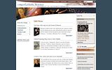
I redesigned my personal website. The original website can be found here: people.ischool.berkeley.edu/~carolc/.
The redesign was motivated by a desire to keep the visual aesthetics of the website light. The font in the original website lacked personality, and the background was too dark. The color choices needed improvement.
For the redesign, I changed the black and pink lettering to white, a light shade of blue taken from the water, and a sandy brown taken from the sand. I removed the black background and framed the content with a lighter shade of the sandy brown. I moved my name away from the noisy waves and placed it on the sand, in line with my chin. Then I moved the navigation to the top of the page, and placed it in a font size that would catch the eye but not overshadow my name.
Rather than use lines or boxes, I aimed to use white space to delineate the sections. I’m not sure if I’ve succeeded in doing that. I also tried to leave enough space on the top and bottom of each page. Wherever possible, I used grids to align text.
April 18th, 2009 at 9:32 am (#)
I’m working on a new user interface for the BART ticket kiosks. The software is built in Adobe Flex, which renders to the Flash player in the browser, so I’ve decided to submit the home and map pages for this assignment. In building these pages, I had carefully considered the intended audience of new and infrequent BART riders, so simplicity and intuitiveness of the design were high priorities to the extent they could be achieved while using the preexisting BART hardware.
When riders approach the new kiosks, they are greeted by the following screen:

There are really only 2 choices, buy an exact-fare ticket to a specific location or buy a large value ticket for multiple uses. The quick ticket options are really just shortcuts to buying exact-fare tickets to either airport in the Bay Area.
When the user selected “Choose a Destination”, they are taken to the map page, where they are asked to choose a destination zone. From there, they can choose a station within that zone they want to go to.

April 18th, 2009 at 11:11 am (#)
I am in the process of finishing up my master’s project, a multimedia story about Downtown Santa Cruz. I have been working on designing the inside pages to flow well with the home page.
http://www.elizabethshemaria.com/wordpress/wp-content/uploads/2009/04/shemaria_website.png
Here is an inside page I designed last night for a collection of “man on the street” Interviews:
http://www.elizabethshemaria.com/wordpress/wp-content/uploads/2009/04/shemariawebsite2.png
April 18th, 2009 at 2:59 pm (#)
I decided to redo the College of Letters & Science webpage.
For the home page, I took out the edges of the boxes on the right side. The original edges were outlined in black with a drop shadow, but I felt that they didn’t match the overall tone of the page. I also changed the navigation so that the links follow the curve of the banner. The page itself is pretty nice, in my opinion, but some parts just didn’t match the rest of it.
Original:
The subpage (more like sub-sub-subpage) was completely awful. There was no consistency, it was old-fashioned and boring, although it did get its point across. Most of the changes were made to relate to the homepage.
original:
April 18th, 2009 at 4:23 pm (#)
I redesigned the Tokyopop homepage and the first-level Manga + Comics page.
Redesigned main page:
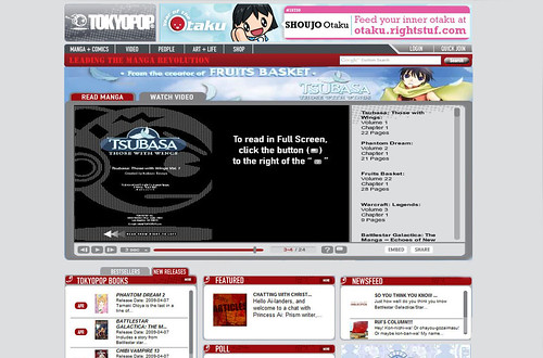
For the main page, I made the blue background a light gray. I felt the blue could have worked with the red and gray color scheme they had, but all the different-colored images in the content called for a more neutral background. I also moved the search box into the navigation strip, since that’s where most users expect it to be. I aligned “login” and “quick join” with the divide between the red and gray line. I removed the text “Home,” as I felt it was unnecessary and redundant.
I expanded the “Read Manga/Watch Video” banner, since it seems to be the most important thing on the page and had it cover the area previously taken up by an ad and part of “Newsfeed.” I felt the ad was extremely distracting, especially given that it is one of the few elements completely above the fold, which gives it an emphasis disproportionate to its importance. I also made a slight adjustment to the gray area in the banner to fit the grid.
I moved the bottom ad from the middle column to the right column, again to decrease its visual importance. Having it in the middle breaks the flow from left to right, whereas putting it in the right column is more in keeping with convention (right-column ads in Google search, Gmail, etc.). I also resized the widgets (”Books,” “Featured,” and “Newsfeed”) so that they fit a grid and aligned the titles of the widgets with each other, as opposed to some titles being aligned with the tabs on the widgets.
Redesigned Manga + Comics page:
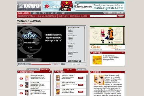
For this page, I also changed the background to light gray to match the homepage and to contrast a little with the background color in the widgets. I made the same changes to the navigation bar (added the search, resized “Login” and “Quick Join”), along with removing the distracting pinkish background from “Manga + Comics.” I moved all the content on the page down to create more space for the title, which I enlarged. I right-aligned the title to make it more visible. I moved the breadcrumb under the title and made the title of the current page red instead of gray to emphasize where the user currently was.
I also shrunk the ad and moved the “Staff Pick” widget up to fit a grid. My redesign mostly focused on organizing the elements a little more and giving the user more white space, as the original page is extremely crowded and flashy (some of the ads are animated, adding to the effect).
April 18th, 2009 at 9:35 pm (#)
I was inspired by one of the slide’s from Daniela’s lecture last week in which the main themes were cascading down in a diagonal staircase fashion. I liked the simplicity and the clean aesthetics of the layout.
I wanted to create a faux website of the fictional company “threeqube” and emulate the aesthetics of that slide which I felt had a lot of interactivity and dimension. This is my first stab at it.
I would love to build on this beyond this rudimentary level layout.
April 18th, 2009 at 11:15 pm (#)
I worked on redesigning the iSchool homepage. Broadly, in the redesign, I changed the font to Gil Sans Light as I felt that the earlier one lacked character and visual appeal.
The film reel in the homepage floats to the left - I removed this, and let it extend on both sides. The unaligned film reel also gave a sense of clutter – even though the text was well contained, it did not appear to be so. It seemed like aligning the film reel solved this problem – the text now seems to be contained within an implicit outline. I also left-aligned the text for better readability.
I moved the menu on the top to the bottom of the page. I did this because I noticed that this menu contained options that weren’t important enough to occupy this prime real estate. Having done this, I moved the menu on the left corner to the top. This menu is now a ‘slide out’ (see the sub-page) with the sub-menus sliding out on click.
I got rid of the column in the leftmost corner and also the shadowed lines. I removed the left-most column because I felt that it was occupying too much real estate to convey too little information. I also didn’t think the shadowed lines added any aesthetic quality to the page. I played around with the content organization removing redundant categories and doing away with certain pieces of information.
I also added a ‘Go’ button to the search box.
I chose the People page for the sub-page. The main change here is that I restricted the number of people that were displayed per page. Students are now grouped according to the last names and are all displayed together. This particular screen shows a frame with students having last names beginning with “B”. A navigation bar is introduced to facilitate navigation by last names. This display is more like a shifting frame (commonly used to display photos) rather than a fresh page for every last name.
In addition, I made the entire row that corresponds to the students, clickable. Clicking on this will take the user to the student’s page. Also, move over highlights have been added.
http://picasaweb.google.com/j.vasudev/InterfaceAesthetics#
April 18th, 2009 at 11:30 pm (#)
I reworked my department’s homepage and faculty page. Here is the original homepage followed by my rework:
I tried to address the following:
1) The lack of obvious header. In addition to enlarging the header and making the department name more obvious, I added more descriptive images of ERG.
2) I condensed the left menu (it will have sub-menus in later pages) and put it under the header.
3) I toned down the electric blue text.
4) I added photos to highlight the feature items. These would change as new items were added.
5) I worked on a grid.
Issues: It’s pretty standard — nothing crazy inventive — maybe this is OK b/c ERG is a science / policy academic group. I’m not really happy with the Arial font in the header. I bottom aligned the text on the main stories — not sure if this was a good choice, but top aligning those text boxes also didn’t look right.
Here is the original and reworked sub-page — the faculty page:
Things I focused on in the rework:
1) Added photos! much more interesting
2) Note the sub-menu for People@ERG
3) Worked on grid
4) Note I switched the images in the header — I used the face for the people. I would use the wind turbines for research, etc.
Issues: I wasn’t sure about my color choice to indicate the item chosen in the menu and sub-menu….
April 19th, 2009 at 1:36 pm (#)
For this assignment, I decided to redesign a news website mockup away from a more traditional newspaper site to something more slick and futuristic, perhaps better suited to a technology news site. However, I wanted to do this without altering the layout at all, so that the original coded template can still be used with only minor modifications to graphics and CSS.
BEFORE (click to full size):
AFTER (click to full size):
The header was the major obvious first change, removing the busy background photo, adding gradients, and changing to a monochromatic colour scheme. Also I didn’t really like the way the second level menu was detached from the main content, and felt that joining these would simplify the design.
I removed lines in some places (section titles, highlighted article), but also added bordered boxes around the two column news boxes partway down the page in order to better define these. The layout is on a grid so I made the edges of the boxes in line with the grid and added padding to the contents.
I also felt that the headings for the sub-sections were a bit too subtle and not clear as links, so in addition to removing the lines, I increased the font size and added the >> arrows after the title. Colour wise, the blue accent is the same, but the red deepened in my edited version.
Another very small touch I like here is that in order to make it a bit more modern and cleaner, I changed the >> bullets under the “MORE STORIES” sections to simple square bullets and indented the second lines of the headlines.
On the story inner page, I removed the unnecessary content at the top and updated the typography in the same way.
April 19th, 2009 at 4:44 pm (#)
I redesign my personal research website for this assignment. There are four levels in hierarchy:
http://picasaweb.google.com/HsinHsienChiu/Ass07Web#5326567275111187474
http://picasaweb.google.com/HsinHsienChiu/Ass07Web#5326567305826965138
There are two major ideas: 1) to use icons to visually simplify the categories and 2) to keep all the links and content on the same page without scrolling pages up and down. Thus, I use flash based html for 1024 x 768 pixels in optimization. Besides, the reading fluency starts from left to right. Once the user click the 1st menu on the left, the second categories shows on the right consequently.
http://picasaweb.google.com/HsinHsienChiu/Ass07Web#5326567314749668082
After, the main content, including texts, pictures, diagrams, illustrations, are shown on the most right having the largest space of entire page.
http://picasaweb.google.com/HsinHsienChiu/Ass07Web#5326567287733148370
Here are some more example pages:
http://picasaweb.google.com/HsinHsienChiu/Ass07Web#5326567329324562130
http://picasaweb.google.com/HsinHsienChiu/Ass07Web#5326567341015036386
April 19th, 2009 at 7:10 pm (#)
I designed the web-page for Interactive Blocks, an Imaginary project. Potential users of this web-page are adults; parents, teachers, and researchers who are interested in the projects, so I used texts - Garamond fonts which have saturated color variations - rather than colorful graphical expressions. In order to emphasize more soft and cheery atmosphere, I used yellow background for the main page’s photo. It seems to well match to overall white background outside the photo area.
http://picasaweb.google.com/lh/photo/3JUD65Fdg6vs4jWFQVnhXA?authkey=Gv1sRgCMCK19r62eC-Fw&feat=directlink
If a user touches – rolls over- one of menu buttons, the menu button’s text color will be changed, at the same time, sub-content buttons will be shown, then the user can click one of sub-content buttons. The buttons’ color palette comes from the title’s colors. In order to organize contents, I located video media on the left side, then located text and image on the right side. I want that users see video first, then they read more details through texts and image area depending on their interest. It seems more effective for easy understanding of contents.
http://picasaweb.google.com/lh/photo/iki_YDO9wYaY6X4yBXJ4Gg?authkey=Gv1sRgCMCK19r62eC-Fw&feat=directlink
April 19th, 2009 at 7:15 pm (#)
I designed a website for my personal project. The project is half built in HTML and half designed as image.
The following is the main page for the project. Top navigation bar highlights country selection. Since Google Streetview is main component, it is placed at the center. Right next to the streetview scene, related places and relevant pictures are placed.
For the sub page, I chose to design a page when users click on country selection link. Each country page has a flag header which is cropped from the flag of the country. It was interesting that every flag can be distinctively represented by cropped image. Below the flag header, sub category buttons are located.
April 19th, 2009 at 8:43 pm (#)
I wanted to create a new site that would be simple to update and would expose all of my work in a clean, straightforward layout that was very easy to navigate. I created a set of initial sketches (not shown) as well as a set of greyscale mockups, seen below for the main page and for a basic sub-page.
The main page features the standard personal web page fare - a headshot and short blurb, then a long blog-roll of publications, media projects, and design work. Items are listed by category and laid out in reverse chronological order. A set of links at the top of the page provide quick jumps to the each of these categories. This links bar is retained across all the pages of the site and provides a quick way to jump back to this master list. As a career graduate student (…or at least it seems that way) references to publications and an overview of my research are the most pressing pieces of information I’d like the site to provide. As a result, publications are listed first.
One of the aspects of the old site which I hoped to preserve was the use of large, colorful images of each of the projects or pieces. These images provide a visual index to the work. Moreover, I’m particularly interested in conveying the visual style of my work . As a result, I chose to represent each of the items with a relatively large image on the main page accompanied by a title and a one-sentence description (see below).
The sub-page for each item is also dominated by a large image. A longer description of the piece is provided to the right along with links to web-posted work and documents. Additional images (if any) are shown as thumbnails below. Mousing over any of these thumbs will cause it to be loaded in place of the large image at left.
MAIN PAGE (full resolution)
SUB-PAGE (full resolution)
Again, I wanted the page to be colorful and to give a sense of the visual style of my work, which often involves repurposing digital photos. My original mockups use an aerial image from my photo collection as the backdrop. However, I’m designing the page so that it can be easily modified to feature alternate photos from my collection.
April 19th, 2009 at 11:01 pm (#)
I made some changes to the iSchool web site. You can see the new pages at the links below.
Home page
Most of my time was spent on this page, with the goal of simplifying and making a clearer visual hierarchy on the page.
The original version has some odd shadowing, which doesn’t really work because the shadows on the left and right side of the page look as though the light sources are in different locations. I removed the shadows and replaced the one on the left with a thin rule. The filmstrip across the top was also odd, because it didn’t cross the entire page. It stopped at one of the distracting shadows, and the black background next to white gave the edge a jagged look. I continued the filmstrip across all the way to the edge of the page and removed the right-side shadow.
Another distracting thing was the use of a background color on one column that didn’t deserve such visual weight. I removed the background color and added thin, grey borders to separate the columns more subtly. The “don’t miss” and “breaking news” columns are now treated more similarly than before. In the original version, the images in this section were placed below their explaining text, which had the effect of making the images appear to be related to the wrong text. I moved the images above their text to fix that.
The navigation in the original showed little difference between the main navigation and the secondary navigation, making it hard to determine which one was intended as the main one. I increased the font size and spacing on the main navigation. I also turned the disclosure carets, which look like type rather than disclosure triangles, into solid disclosure triangles. That adds a little more visual interest as well as a clearer purpose.
I decided that the distinguished lecture feature should be given the most visual weight, so I gave that section a larger heading with the red color used elsewhere for page headers.
The “media center” area bothered me with its use of red and its centered text. I made most of the text blue and left-aligned the text.
About page
For this page, I just tried to follow through on the design decisions I introduced on the home page, to make it consistent. I carried through the changes to the navigation and the removal of the shaded edges. I took the red color out of the info box, so that the red is reserved for the page header and its corresponding navigation bar item.
April 20th, 2009 at 12:28 am (#)
For this assignment, I spent some time reworking my homepage, and attempting to clean it up a bit. This was actually my first time attempting anything major in The GIMP, so I had a hard time figuring out all of its complicated ways.
Before setting out on the revamp, I noticed a number of things that needed to be fixed in the before shot:

My main two goals were to clean up clutter, and to align things more cleanly throughout. I’m pretty happy with the color scheme for the moment, so I didn’t play with that too much.
Here’s the after version:

In this version, I cleaned off some white margins so that the site bleeds to the edge, I aligned a number of things to a left hand margin, and I removed some items that were causing clutter (such as by lines, the search area, and links after each post to “mlissner’s blog”).
April 20th, 2009 at 1:04 am (#)
I took this class in part to help me build on my Web site for my masters project.
http://pickoffwhite.com/movies/
You can see the dark to light influence I’ve been working on in the posters, the color scheme applied, and a reworking of the logo.
April 20th, 2009 at 11:23 am (#)
http://farm4.static.flickr.com/3525/3459676087_631e027d5c.jpg
http://farm4.static.flickr.com/3609/3459676129_e91143b1ff.jpg
May 8th, 2009 at 4:57 pm (#)
As others have mentioned, I took this course to help me design my multimedia master’s project, “Foreclosed.” I went through several layouts for the final site, which holds three audio-slideshows. My goals were to: 1) keep all content above the fold, 2) maintain a simple and intuitive interface and 3) emphasize the images with a minimalist, cinematic presentation.
My first couple of designs for the home page looked like this:
http://rhyencoombs.com/projects/misc_images/aesthetics/foreclosed_alt.png
http://rhyencoombs.com/projects/misc_images/aesthetics/foreclosed_alt2.png
I carried over the font, Garamond Pro, and simplicity of the poster exercise, but decided against the brown background, as it would not be a neutral enough background for every image. I then realized that the red line might also detract or clash with the images. I was also concerned about how clear it was that “one”, “two” and “three” led to slideshows, and not just a photo gallery, and that the viewer would not know where to begin. Finally, I realized that, while I would need to accommodate more text, a long block of text on the right would reduce the amount of “white” space and make the content feel cramped.
So, for my home page redesign,
http://rhyencoombs.com/projects/misc_images/aesthetics/foreclosed_home.png
I decided to shift the player toward the middle, and added a play icon, which jumps to slideshow one. I then used only clean white lines to set the player apart, and dropped the text to the bottom, where it could have more breathing room. I brought in the red accent as the rollover color for links, including “one” “two” and “three,” as well as my name in the credits. I considered using red for those links without rollover, but concluded that would be distracting.
For the interior page,
http://rhyencoombs.com/projects/misc_images/aesthetics/foreclosed_interior.png
I added a semi-transparent layer over the frame, title and text, to give the sense of having entered a theatre. To indicate which slideshow the viewer is watching, the respective “one” “two” or “three” shows up in its standard white, while the rest are grayed out. The player bar only appears on mouseover.
Overall, I consider the design a success, as it met my three goals. The final project can be seen here:
http://rhyencoombs.com/projects/FORECLOSED/foreclosed.html