
| Home | |
|
|
|
| 1st
Interactive Prototype 2nd Interactive Prototype |
|
|
|
|
| Assignment 1: | |
| Project Proposal | |
| Assignment 2: | |
| Personas, Goals, and Task Analysis | |
| Assignment 3: | |
| Scenarios, Competitive Analysis, and Initial Design | |
| Assignment 4: | |
| Low-fi Prototyping & Usability Testing | |
| Assignment 5: | |
| First Interactive Prototype | |
| Assignment 6 : | |
| Heuristic Evaluation of SFNight Prototype | |
| Heuristic Evaluation: | |
| SFNight's Evaluation of BookMarket (external site) | |
| Assignment 7 : | |
| Second Interactive Prototype | |
| Assignment 8 : | |
| Pilot Usability Study | |
|
|
|
| Work Distribution | |
| Project Vocabulary | |
|
|
|
Assignment 4: Low-fi Prototyping and Usability Testing
Introduction
Prototype
Method
Test Measures
Results
Discussion
Appendices
Work Division (separate page)
I. Introduction
The Book Exchange for SIMS Students (BESS) is an online exchange designed to help SIMS students buy and sell used textbooks from one another. This system will put buyers and sellers in touch with each other; it will not allow on-line auctions or currency exchange. BESS will faciliate email communication between buyers and sellers of textbooks.
The system may assist in price comparisons, but it is not designed to help sellers get the highest prices. Sellers will be allowed to list a suggested price and whether or not he or she is willing to bargain.
Purpose and Rationale
Our primary purpose was to test how easy it was for our subjects to use the buying and selling interfaces. We wanted to test whether the interface communicated the general purpose of the site. We also wanted to discover if the pages flowed in a logical manner.
Specifically, we wanted to discover:
- if the site was easy to navigate
- if the language was easily understood by subjects in the target age group
- if users were able to locate all the primary functions in the interface
- if users were able to complete tasks
II. Prototype Description
We designed a paper template of our interface upon which we added specific features according to each screen's needs. Our template consisted of the Navigator browser window plus a navigatonal sidebar and top banner that appeared on every page throughout the site. We photocopied this template and used it for every screen in the site. We wanted to ensure the most "realistic" experience by fitting our interface components onto an 8.5 by 11 inch sheet of paper, which is close to the size of a browser window on an average computer screen. We felt that having a separate page to represent each screen, rather than changing many widgets on one master screen, would facilitate the speed and efficiency of "playing computer." We added moveable widgets as the interface required, such as pull-down menus and personalized text.
We changed the interface throughout the test cycle. We revised wording and drew in text and form fields when our subjects repeatedly made the same mistake on a screen.

Homepage of BESS with pull-down widget

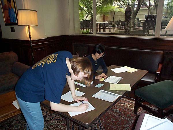
Setting up our materials before the test. The test took place in the Great Hall of the International House.
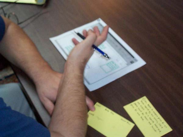
One of our test subjects, Subject 1, suggesting a change.
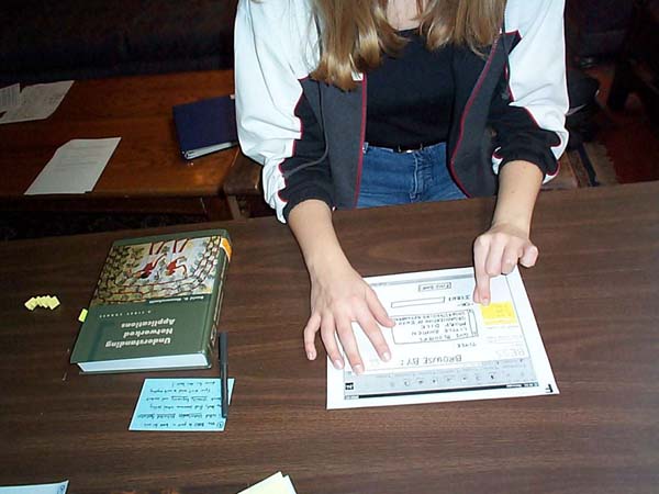
Susanne plays computer.
Shirley and Mary change the interface on the fly.
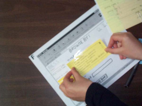
Shirley improvises by adding a new text selection box.
III. Method
Participants
We decided that our test subjects should come from an age group representative of SIMS students. Therefore, our three subjects came from three age groups: Subject 1 is 45, Subject 2 is 19, Subject 3 is 27. One of our subjects is also an international student. Even though our product will be used by SIMS students, we made a conscious choice to test non-SIMS students with attributes similar to SIMS students: experience with buying books, using email applications, and browsing the Web. We chose non-SIMS students because we felt they would be less biased, less attuned to UI principles, and less knowledgeable about Web navigation and how Web sites "should look." This will set our interface at a level more appropriate to incoming SIMS students.
Task Scenarios
Task 1:
- Use BESS to compare prices for books required by two courses, IS 213 and
IS 214. At the end of this task, you should be able to write down the books
required for each class and the lowest price for each. (We gave subjects
a card upon which to write their findings.)
What we looked for:
- Can the test subject use BESS to compare prices? Can s/he easily navigate between two different course listings?
- How does the user find required books for each course, i.e. through Search or Browse? Do test subjects use the large icons on the home page, or do they use the sidebar search and quick browse functions? At any point, does the test subject seem lost or confused?
Task 2:
- Use BESS to find someone who's selling a book called GUI Bloopers and contact them.
- Revised task wording: Use BESS to buy a book called GUI Bloopers.
What we looked for:
- Does the user find a book from the title list or via search?
- Is the buy process intuitive? During the buy process, how does the subject choose which buyer to contact? Does the subject want to click on the buyer's name or on the "Contact Seller" button?
- Does the subject utilize the comparison list of prices from other book commerce sites?
- Does the user understand the true nature of the transaction-- that s/he has contacted the seller, but that s/he has not actually purchased the book, and that s/he is not under obligation to do so? Does s/he get confused about whether the site is an auction?
Task 3:
- Use BESS to post a book called Understanding Networked Applications for
sale. After that, find someone who's selling Usability Engineering and
contact him or her.
What we looked for:
- Is it easy for the subject to switch back and forth between "buy" and "sell" functions?
- Is the sell process easy and intuitive?
- What kind of information does the subject type into the sell form? Do they enter comments? Are there any fields that are there but not needed, or needed but not there?
- Do they use the other sellers' information and prices to set their own prices?
Generally:
- Are there functions that users looked for on the interface but couldn't find, either because the functions weren't there or because they weren't noticeable or labeled correctly?
Procedure
Subjects were greeted by Mary, the moderator, and seated at a large table. Shirley, the recorder, sat at their left, taking notes on a legal pad. Susanne, the computer, stood across from the subject and switched the screens. Mary read the script and asked if the subject had any questions. She then had the subject sign a consent form. She read the tasks and gave the subject index cards detailing the tasks for reference. As the user clicked through the interface ("clicking" with a ballpoint pen), Susanne produced the appropriate screens. Users were encouraged to think aloud during the proceedings. When users made an unexpected choice, sometimes we did not have the appropriate text prepared, so we had to improvise with the materials we had on hand. After the completion of all tasks, we debriefed the subject, sometimes showing them certain screens to help them recollect their thoughts on problem areas. When all questions were answered, we thanked the subjects and, after they left, discussed the session briefly to decide how to improve the test for the next subject.
IV. Test Measures
- Screen sequence - did users prefer one entry/access point over another? If so, is the preferred one the most prominently displayed or, alternately, the default value?
- Whether or not users had to hit "Back" button - if users use the Back button, it usually means they hit a dead end or did not pick up the navigational cues on the screen.
- All comments spoken aloud - what is the user thinking during the process?
- What users typed into forms - are the fields sufficient? Are there unnecessary fields? Are there points of confusion? Are the required elements overly intrusive? Is there a natural flow between form fields?
- Clear failures or misunderstanding of instructions - is the problem with our scenario, the task description, the content, or the prototype?
- Successes - it is important to know what to keep in our prototype.
V. Results
View Raw Data Log
Summary
Concept
We realized that test subjects have difficulty with the concept of BESS.
We need to adjust the interface to make it clear that the system is not an auction
or an e-commerce site. One way to accomplish this goal is to change the system
name to better reflect its function. "BESS," while friendly, does
not sufficiently convey the purpose, and we expect to re-name and re-brand our
system in future prototypes.
Bargaining
Two of our subjects wanted to contact multiple sellers to bargain between
them. Since our interface did not allow the user to send multiple messages,
the testers had to use the Back button several times to contact other sellers.
They also had to enter their personal information multple times. This problem
leads to a bigger system issue. Do we want to design a system that will support
this type of bargaining? Will this feature alienate potential sellers, or will
it instead prove to be a valuable function? This unexpected behavior has led
us to rethink our system design.
Language
Users consistently had difficulties with the terms "buy" and "sell,"
both in the task descriptions and in the interface itself. Direct buying and
selling does not occur on BESS, and we need to emphasize this point in all of
the language we use. Other words/terms that particularly confused people were
"customer," "user," "post," "email,"
and "contact seller."
Screen Layout
Users consistently failed to notice the search box and the course pull-down
menu in the left panel, even though the pull-down menu was bright yellow, the
only colored object on the screen. Users sometimes completely missed these features
until they came to a perceived dead end and were forced to examine the entire
screen in more detail. The subjects often met with a dead end after confirming
one transaction (buy or sell). The test results suggested that we should have
clearly marked "Buy" and "Sell" buttons on every page so
that users can navigate more effectively between tasks. Another navigational
aid would be to clearly mark where the user is in any given process with better
page titles and breadcrumbs.
User Expectations
Another issue our tests brought up is what we expect of sellers and buyers.
Our subjects seemed confused and frustrated when they "bought" a book
and then realized they had to wait for the seller to contact them. They felt
that they were not in control of the process. They looked for further explanation
of what was expected of them as a buyer or seller, and they did not find this
explanation in our current prototype.
Good Ideas
Our tests brought up many good suggestions. One user suggested that the
system send emails to book sellers periodically, asking whether the book has
been sold and urging the user to update the system if it has been sold. The
email will contain a link that will take the user to a screen where s/he can
quickly delete the posting without having to login. Another user noted that
we should have a way to logout from the system and a way to login from the home
page. One user also suggested that clicking on a seller's name might bring up
a list of all the books the seller currently has posted. This feature would
allow a buyer to purchase multiple books from one person for the sake of friendship,
efficiency, or a better deal.
VI. Discussion
Planned Changes
We plan to change the name of our system to better reflect its function.
Our tests showed that our language was not sufficient in explaning the intent
of the system, and the resultant misunderstandings impeded the completion of
tasks. We plan to rethink our entire lexicon and add additional explanatory
text.
We plan to improve our navigational structure by adding more standard navigation to every screen. We will give screens more explanatory titles and to add breadcrumbs so users can see where they are in a process. We also intend to increase the visibility of key functions, such as search and quick browse, that are currently located in the left panel. We will use a combination of color, placement, size, and better labeling to draw attention to these items.
We need to clarify the text on the site to encourage sellers to respond to emails and update their postings accordingly. We also need to inform buyers about what they can expect from contacting a seller. To clarify our expectations of system users, we plan to add a short user agreement that outlines the responsibilities of both buyer and seller. We will ask the user to read this agreement during the buy/sell process. We will also include a privacy statement linked from the home page.
We will include a logout function and an improved login function. We may also let users click on seller names to display a list of all books posted by that person.
Larger debatable issues
We plan to explore the suggestion of better bargain functionalities. We need
to conduct further research within SIMS to determine if the barganing function
is one that users want, or whether sellers would be irritated by spam and/or
overly aggressive bargainers. If we choose to implement bargaining functionality,
we will need to redesign several pages in our interface.
One additional discovery we made questions the entire concept of BESS. Should users be allowed to email sellers directly, bypassing the BESS email interface altogether? Were this to happen, the system would become an information aggregation site rather than a transaction site. We need to think further on this issue to determine the direction of our project.
What the Evaluation Didn't Tell Us
Because we didn't time the tasks, we didn't learn exactly how quickly people
completed their goals. It was difficult to measure learnability, since we did
not test users with repeat tasks. The evaluation was conducted in an artificial
environment - we will get different feedback when we are able to sit users down
at actual computers and watch them work with a web-based prototype. Also, since
we gave them specific tasks, we didn't see what they would do if they were given
the chance to explore the system on their own.
Overall, we felt that we learned a great deal from the testing process. We discovered many problems that we never anticipated, and we received many valuable suggestions. We came to appreciate the paper prototype because we would have wasted a lot of time coding this prototype electronically.
VII. Appendices
Script
Low-fi prototype photos
Informed consent form
Example of task reference cards
Raw data log
VII. Work Distribution
Work Distribution is on a separate page.
Copyright © 2001 Chan, Eklund, and Trombley. All rights reserved.