
|
||||||||||||||||||||||||||||||||||||||||||||||||||||||
Assignment 7: Second Interactive Prototype
Page Contents:
Overview of UI design changes
Prototype overview for usability test
Fixes for heuristic violations
Second prototype instructions
Work Distribution
Overview of UI design changes
Our evaluators compiled 15 Level 3 violations on our interface. The violations were spread throughout the heuristic categories: Heuristic #5 had three violations, the highest frequency. Additionally, the majority of violations were not located any one screen. The dispersed nature of the violations meant that we did not focus most of our time on one or two violations or screens. Instead, we worked on many small violations throughout the system.
There were, however, themes to the evaluators' comments. One problem that we attempted to fix in this iteration and will continue to face is system vocabulary and explanatory text on the Web pages. We have vastly improved our explanatory text, adding help and frequently asked questions. We have improved instructions on many screens by simplifying wording and removing redundant text. The most important change we have made is to rename our system. Instead of BESS, we will call our project the SIMS BookMarket. We feel that this name better reflects the intent and functionality of the system. Here is our logo:
![]()
Figure 1. Our logo.
Other changes we implemented included: adding privacy information, redesigning our seach box, fixing GUI bloopers, and giving more information about system status (i.e., how many copies of books are available).
Prototype overview for usability test
We have implemented additional functionality to assist future usability testers. In our first prototype, some functions had to be hard-coded. Our second prototype gave us the opportunity to fully implement more complex parts of our interface. The largest fix was the implementation of the book posting function, so that the seller can view his or her actual posting after submitting it to the system. Other fixes include allowing the user to suggest a book for the BookMarket sale list.
Here are some things that are still hard-coded but will not prevent users from conducting a usability test:
- Login: users cannot login or create accounts
- Contacting sellers via system email: buyers cannot send mail to sellers through the system
- List of sellers buyer wants to contact: buyers cannot choose which sellers to email
- Editing a posting: users cannot edit postings
- Deleting a posting: users cannot delete postings
- Using search: search results are hard-coded
Fixes for heuristic violations
Level 4 Fixes
None.
Level 3 Fixes
1. [H1: Visibility of system status ] There is no information about how many books are available for sale. The user cannot gage how large the forsale book pool is. Also, the user cannot tell if the site is for searching SIMS textbooks only or also includes related books and readers?
Fix: On the Buy Books page, we write how many titles and copies BookMarket holds. For example, the page currently says, "BookMarket currently has 24 books for sale. "
2. [H2: Match between system and the real world] When completing Task 1 - looking for "buy" books. The tabs "sell books" and "edit posting" seem pretty obvious as for what they may do. The not so obvious tab / link choice is "find books". Not sure if "find books" relates to buy since search is considered a separate task.
Fix: We changed all tabs and text to say "buy books." In our explanatory text, we explain to the user that he or she not actually buying a book, but that he or she can find sellers from whom to buy. This is a system term that has been a recurring problem for us. We eagerly await user testing to discover whether the combined effect of our vocabulary changes throughout the system will make the "buy books" term useful instead of confusing.
3. [H2: Match Between System and the Real World] In Sell Books page, after user completes the posting steps, the new page will show a link for 'View your new posting as it appears on BESS'. Following that link, the user will see all the other people who are also selling that book, and make an offer to buy! I can think of no task scenario for a user to buy and sell the same book at same time, so this function is out of place.
Fix: We removed the link that says "View your new posting..." and simply display the posting information directly on the confirmation page.
4. [H3: User control and freedom ] When selling a book, user cannot add new book to sell. She can only choose from one of the existing books. Ideally, the systems should give user the flexibility and control of what book she want to sell. Given the limitations of current project scope, it should be clear to the users from the beginning the type of books the system provides.
Fix: Currently, we are trying to implement a form for the user to automatically add a new book to sell that is not in the current list. However, we have not been able to implement this functionality for this assignment. For now, we refer the user to the administrator's email. The user tells the administrator the book information, and the administrator enters the book request manually into the system.
5. [H3: User control and freedom] By clicking at Amazon.com at the Find Books, users may navigate there and get lost to go back to the system. Better provide the link to another window.
Fix: We changed the external links to Amazon.com and BarnesAndNoble.com to open in a new browser window.
6. [H4: Consistency and standards] The interface mixes buttons with sentences, like in Buy a Book page. This is the result of the problem related to Minimalism Design and use of too much information.
Fix: On the Buy a Book page, we removed the "sentence button" and left one GUI button, "Make an Offer." We decided that a Cancel button was unnecessary because the user is not in a multistep process from which to cancel. Also, the navigational tabs at the top of the screen are sufficient exit cues for the user.
7. [H4: Consistency and standards] The interface presented an E-mail address layout not standard, and not helpful for those users who automatically copy and paste their e-mail, or very used to quickly type.
Fix: We decided to leave the email address layout as is because we feel that the format cues the user to the type of information the system wants. Although the format prevents users from copying and pasting their email, we believe the error prevention attributes are worthwhile.
![]()
Figure 2. The current email address layout in BookMarket's forms.
8. [H4: Consistency and standards] It is not clear why there should be a login link as well as an account button. The two should really mean the same, an area where the user needs to login in order to perform tasks with his/her account.
Fix: We removed all links to "login" on each page. If the user wants to login immediately from the home page, she must click on the "My Account" icon that is at the top of every page. If the user tries to sell a book and she has not logged in yet, the system will automatically call up the login page before the she can fill out the sell information.
9. [H5: Error prevention] In the Login page, the user is presented with both user login for existing members and sign up for new members. The current layout requires users to choose whether they are new or existing users, and then continue. This can be confusing.
Fix: Instead of having directing both existing members and new members to the same login page, we separated the two tasks. Now, the login screen only logs in existing members. New members click on a link that will take them to the Create a New Account page.
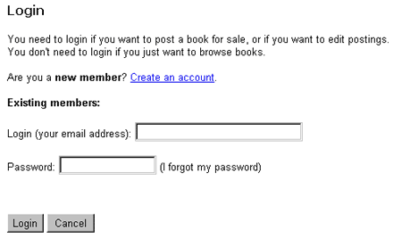
Figure 3. New members click on the "Create an account" link
while existing members can just login.
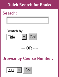
10. [H5: Error prevention] The Search feature presented in the BESS interface can confuse users, and generate an error message. The "Go!" button looks as if it is only related to the "Title". Since there are only a few categories, an appropriate cluster layout using radio buttons can display all the categories and prevent errors.
Fix: We redesigned our Search box. Instead of using a drop down menu for the search criteria (Title, Author, ISBN), we used radio buttons. We placed the search criteria before the text box so that the user notices them faster.
 |
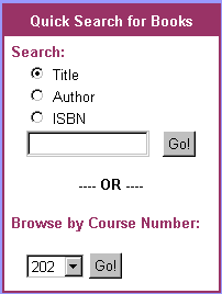 |
| Figure 4. Original search box. | Figure 5. New search box |
11. [H6: Recognition rather than recall] In the search results, users do not know if the book listed is actually available for purchase. One has to actually look up each individual book description to find out if there are copies available for sale.
Fix: We added the number of copies for sale next to each book
title. We also clarified the text to say how many titles were found,
versus how many copies. In the example below, 5 titles and 12 copies total
have been found.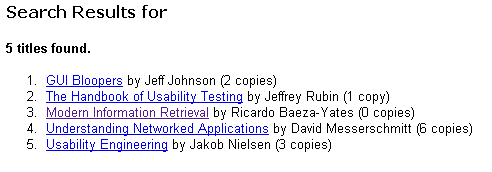
Figure 6. The number of copies for sale is noted next to each book
title.
12. [H6: Recognition Rather than Recall] In Sell Books page, user needs to enter personal information every time s/he wants to sell books out. Could be a tedious process if a second grade student wants to sell out a big part of inventory.
Fix: We plan to fix this problem when we implement the login functionality. In our design, before the user can sell a book, she must login. From the login information, the system can fill out forms automatically with her personal information. However, the login functionality does not work yet in this prototype. We hope to get this fixed in our next interation.
13. [H8: Aesthetic and minimalist design] The interface has too many explanations that we feel are not needed. A general problem is the extra textual description that accompanies processes. The extra units of information compete with user's goals of saving time by forcing users to do extra reading. This is found throughout the whole interface.
Fix: We edited all our pages and removed unnecessary and redundant text. Originally, we thought the extra text would be useful information, but we learned from the heuristic evaluation that it proved to be annoying or distracting. Specifically, we removed the text, "Remember -- there's no obligation to buy" next to the Send Offer button on the Buy Book form. We removed all text next to buttons and labeled the buttons themselves more clearly to reflect their functions. We also took the evaluator's suggestions for redesigning the account maintenance page. In general, we sought to make our second prototype less wordy.
14. [H10: Help and Documentation] There is a Login hotlink in the upper right area of each page (it turns Logout in Sell page). But how login can benefit the user is not mentioned in the pages, no even an explanation for its functionality. Clicking on Help, it gives less than under Account.
Fix: Our second prototype contains much more explanatory text about BookMarket, privacy policy, user guidelines, and the benefits of using the system. The Help page also includes an FAQ. As mentioned earlier, the links to login have been removed. The login function is now within the Account page.
15. [H11: Trustworthiness] Trust became an issue in web systems. Users need to know who is offering the system and who is responsible for its maintenance. This information probably will be available at the Member Guidelines and Privacy Policy. But at the homepage something minimal such as the identity of the responsible organization should be visible, so users would know who is responsible for the system. Also users need to know how to contact the responsible organization/individual in case of problems.
Fix: The home page has a statement of responsibility, our team members' names, and an email link to one of us in case of problems. There is also a link to BookMarket's Privacy Policy. The Help page has the Member Guidelines.
Second prototype instructions
Copyright © 2001 Chan, Eklund, and Trombley. All rights reserved.