Assignment 8: Pilot Usability Study, Formal Usability Test Design & Final Presentation
Formal Usability Design
Method | Measures | Results
Pilot Usability Method
Method | Measures | Results
Discussion | Appendices | Work Breakdown | Presentation
The purpose of this assignment was to perform a
pilot usability study for the second interactive prototype of SkillShop.
Our main goals consisted of discovering whether the changes that we
made actually improved the usability of the system or degraded it in
any way. This also gave us an opportunity to test novel
functionality that had never undergone user testing and to evaluate
its design and its overall effect on the ability of users to perform
their required tasks easily and smoothly.
There has been no user testing of our system (outside the Heuristic Evaluations) since SkillShop was still in paper prototype form. Since then, many changes have been made, including the addition of new scenarios, new functionality, and, most importantly, the transformation of the system from paper to an interactive website. As part of this process, we also designed and conducted a separate formal experiment to evaluate SkillShops current employee rating system.
The experiment was designed to test the criteria for the Feedback Form used by employers to give feedback for temporary workers. The experiment took into account what the appropriate criteria should be and the importance of each criteria.
Hypothesis: The presence of more detailed criteria will decrease ambiguity and lead to better user satisfaction.
Participants
Participant 1: Participant 1 is a male in his 40s who has a MBA and works in Technology. He has worked in hospitality in the past as a bartender. He currently manages a large team of people and has extensive experience providing feedback for employees.
Participant 2: A 27 year old female was has a Bachelor of Science degree and works in Finance. She is extremely tech savvy and has a great deal of experience providing feedback for colleagues.
Participant 3: Participant 3 is in his twenties and is working towards his Master's Degree. He has experience working in user interface design and usability testing and can provide insight on the design of the form.
Participant 4: Participant 4 is a late twenties female student. She has performed managerial duties in the past, and has experience with employee evaluations.
Formal Usability Test Measures
Independent Variables:
Feedback Form- Levels:
1) Simplified: Single word descriptors for criteria
2) Descriptive: More descriptive text explaining criteria
Dependent Variables:
1) Participant Satisfaction- subjective questionnaire given to
participants after the experiment to rate the two interfaces on a
certain scale.
2) Task Completion Success- Whether participants were able to
complete the feedback form entirely without problems
3) General Understanding about criteria in feedback form
Tasks
Two tasks are created that ask the user to take the role of a catering manager and rate two temporary workers for two different events. The level of difficulty for each of the tasks is meant to be the same
Task 1
Task 2
Blocking: Within-Subjects, 4 Participants
A within-subjects experiment allowed the two interfaces to be compared between the subjects. Each participant used each type of rating form (simplified criteria form, descriptive criteria form). The type of interface presented were in a counterbalanced order across participants. 2 participants were presented with the simplified criteria first and 2 participants were presented with the descriptive criteria first. Two tasks were be distributed across both types of interfaces. The order in which the tasks were presented were also be counterbalanced.
Participants
We
recruited four participants that were either managers or have some
kind of experience managing people in the past. It is not necessary
for our participants to be catering or restaurant managers but it is
a requirement that they have experience filling out employee
evaluations and providing performance feedback.
Process
Each participant completed the two tasks on the two forms. Once the first task was finished for one form the procedure should was repeated with the next task on the other form. The testing session concluded with a survey to measure user satisfaction.
The order of the tasks were counterbalanced.
|
Participant # |
Simplified Criteria Form |
Descriptive Criteria Form |
|
1 |
Task 1 |
Task 2 |
|
2 |
Task 2 |
Task 1 |
|
Participant # |
Descriptive Criteria Form |
Simplified Criteria Form |
|
3 |
Task 1 |
Task 2 |
|
4 |
Task 2 |
Task 1 |
Measuring Participant Satisfaction
After testing was completed for both search interfaces the participants should complete a brief questionnaire rating the two forms using Likert scales. The use of Likert scales will help us gauge the respondents' feelings or attitudes about the criteria and what criteria they think is appropriate or important. We will also include an ordinal question where the participant will rank order the criteria.
The Descriptive Criteria Form received the most user satisfaction. The Post Experiment Survey asked the user to rate each criteria based on the statement, "The criteria is easy to understand" from 1( Strongly Disagree) to 5 (Strongly Agree). Tallying up the results of the post experiment survey the criteria for the Descriptive Form received an average score of 4.4/5 whereas the criteria for the Simplified form received an average score of 3.4/5.
We also asked the users to rank the order of importance of each criteria. For the simplified form all users ranked each term differently. "Speed & Accuracy" averaged to be the most important criteria among the four users and "Positive Attitude" was always ranked as the least important. For the Descriptive Form "Ability to follow instructions" and "Ability to perform required tasks" were always ranked first or second and "Ability to maintain a positive attitude" ranked last in all cases.
In terms of the comment box, all users believed that it was important to have it. Other important criteria users mentioned we were missing include, trustworthiness, punctuality, professional appearance, and quality of work.
Participants
Three participants were used for Pilot usability study.
Participant 1: A female in her mid-40's and she is the Manager of a restaurant at Berkeley who has to take care of managing staffs everyday. She is very comfortable with computer and uses computer everyday
Participant 2: A graduate student in Civil Engineering. He has worked part-time jobs in the past and has experience searching for jobs online. Participant 2 is in his early twenties and is an expert computer user. He uses the computer everyday for academic purposes.
Participant 3: A 20 year old female who is doing her undergraduates in UC Berkley. She has past bartending experience and very familiar with food service industry. She is familiar with computers, but not comfortable saying herself expert.
Apparatus
All the five participants tested our interface using laptop computers. Since our application is browser-based, it was not significant for us to try the tests on different operating systems and different computers. However it was important to try out different browsers. Three participants tested the application using Firebox and other two participants used Internet Explorer.
The sessions were not audio or video tapped. We had one team member play the role of facilitator and another taking notes and running the timer. Notes were taken during each of the usability studies to make sure that all the observations can be brought to enhance our design.
Tasks
The tasks for this usability study were almost same with our previous usability tests. However minor changes have been made to task descriptions to give the participants better clarity.
Task 1- Employer Account Signup
As a catering manager you heard about SkillShop, a temporary hiring marketplace for the food service industry, and you want to check it out and explore some of the system’s features and functionality. Sign up for a free user account to get started.
Task 2 - Jobseeker Account Signup
As a jobseeker you heard about SkillShop, a temporary hiring marketplace for the food service industry, and you want to check it out and explore some of the system’s features and functionality. Sign up for a free user account and get started with SkillShop.
Task 3 - Jobseeker Job Search
You are in need of some extra pocket money so you want to find a job in San Francisco for Thu April 29. You are busy in the morning but can work the evening shifts starting after 3PM. You have past experience working as a bartender, server, and host but prefer to find a bartending job because it pays the best but you don’t have that much experience.
- Login into SkillShop with your login ID and password
- Search for a job that fits your availability and apply for it.
Task 4 – Find Employee
Now that you have an account with SkillShop you’ve just checked your staffing schedule for next week and notice one of your servers cancelled for a large event next Thu evening May 4th. Try to find out a suitable replacement for the employee.
- Login into SkillShop with your login ID and password
- Search for potential employee who fits the schedule of 4th May
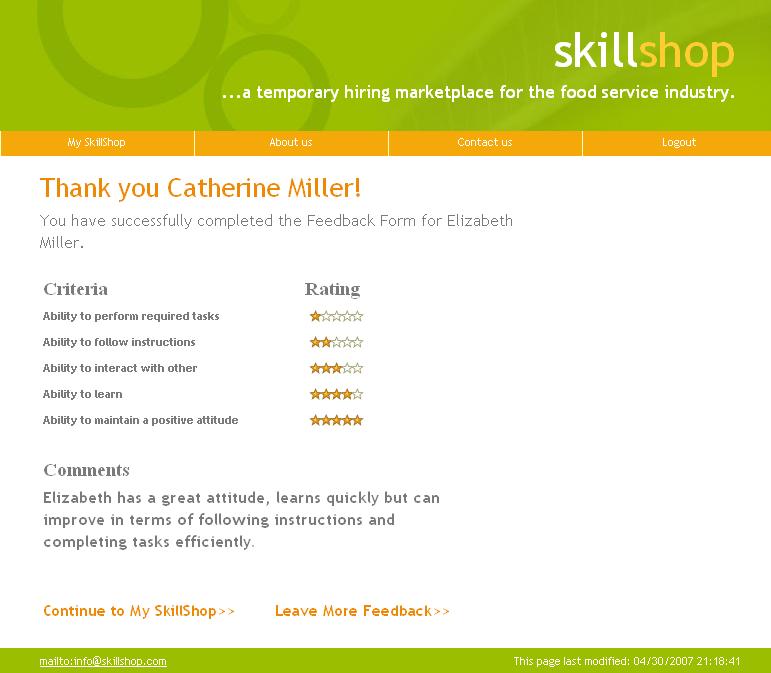
Task 5 – Leave Feedback for employee
You log in to SkillShop and see that a previous employee has requested for feedback .You click on “Leave Feedback” link and post feedback for the employee.
Procedure
As a first step to the usability tests, one of our team member scheduled time with the participants and we met each participant in the South Hall. After a brief introduction with the team members, we brought the participants to the room we had prepared for testing.
The participant was given a short description of our project as well as an overview of the testing procedure. It was made clear to the participant that we were interested to find out the design flaws and we were not testing them. We also let him know that we appreciated all feedback, both positive and negative. The facilitator reminded the participants that no questions would be answered during the testing, and encouraged them to think aloud as they interact with the interface.
Tasks 1, 4 and 5 were given to the participants who were representative employers and the user was asked to complete these three tasks one at a time using the interactive prototype. Task 2 and 3 were given to the participants who were representative job seekers. After each task was completed we asked the participants to talk about the task they had just performed; what worked well, and what did they find difficult or confusing.
During the testing, observations were recorded regarding the users actions, including the ease/difficulty in which the user completed the task and understanding/confusions about certain aspects of the interface. After the participants finished the tasks we concluded the testing session with a post-test discussion.
Once the tasks were complete, the participants were asked to complete a brief survey. At the end of the survey, the participant was asked for any additional overall feedback or questions they had regarding the prototype. The team thanked the participant for their time and made sure they could find their way out of the building.
Screenshots
1. Jobseeker sign-up form

2. Employer sign-up form

3. Leave Feedback

4. Find Job

Our main goal while conducting the pilot usability test was to measure user satisfaction. Hence our test measures were more qualitative than quantitative. We were interested in finding out if the participants could complete the given tasks smoothly. More than measuring the time and other quantitative factors, we wanted to know if any features on our interface caused any kind of confusion in the user’s mind. Hence along with user satisfaction, we also measured number of errors so that we could get a better sense of what was being conveyed to the user. Also we wanted to know if the changes that we made actually improved the usability of the system or degraded it in any way. We closely observed the participants reactions while performing the tasks, taking note of any feature or ambiguous term which came in the way of the users being able to perform their required tasks easily and smoothly.
As part of this process, we also designed and conducted a separate formal experiment to evaluate Skillshop’s current employee rating system.
Throughout the experiment the following information was recorded and served as our test measures
- Time for each form be completed
- Number of questions asked about criteria
- Number of criteria submitted blank on the form
We chose these quantitative test measures so that we could easily compare the forms being tested. We also asked our participants to fill out post test surveys to get a better idea of user satisfaction.
From the data gathered from the pilot usability tests, users completed the tasks with few problems overall, although several pointed out parts of the interface that were less than clear. The account signup process for both employer and jobseeeker took approximately the same amount of time, 1 minute 40 seconds on average for employers, and 1 min 52 seconds for jobseekers. In the case of jobseekers, the average number of criteria on the signup form that were submitted blank was 11, and the average for employers was 10. These numbers coincide with the number of fields that were not "required" on each form.
The search task for the employer (Find Employee) took an average of 28 seconds, and the search task for the jobseeker (Find Job) took an average of 34 seconds. Interestingly, all but 1 user initially asked about the radius widget, but subsequently answered their own questions after exploring it. Each type of user filled in the search fields with exactly the criteria given in the task, filling out only the minimum number of fields necessary in order to get to the response.
Leaving feedback is an employer task with no equivalent for jobseekers, hence we cannot perform comparative analysis on the usability for different types of account holders. On average, employers took 49 seconds to complete this task. Each user questioned the meaning of the wording, but filled in a rating for each criteria anyway.
The pilot study gave us very insightful feedback on our current design and helped us identify the changes that we would have to work on prior to any "real" testing of the interface. Overall, users liked the design of SkillShop. They commented on its professional look and easy to use interface. There were, however, suggestions made in various places and difficulties that need to be addressed for the next iteration of the system.
Starting with the formal design experiment,
almost all users mentioned not being able to notice the rollover
help icons that had tool tips that further explained the meanings of
each of the rating criteria. This could have been one explanation
for the fact that there was a general preference for the more
descriptive criteria, rather than the previous simplified version.
Users often had trouble deciphering the criteria in the simple
format and the fact that the help icons were not obvious did nothing
to improve matters. One of the changes that could be made here is
making the help icons more prominent or move them to a location that
is more clearly visible to users. It would seem, however, that the
feedback is pushing us to use the new, more descriptive version,
which may not even require additional help at all.
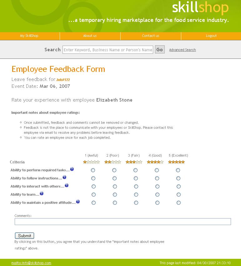
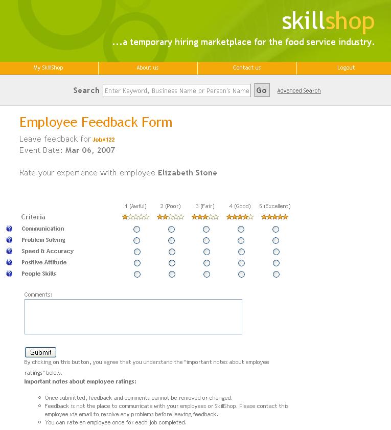
Improved Feedback Form
Hovering over the question mark icon gives tool tips that
further explain the Criteria.
Rating Confirmation Page
Another comment that users made was that the "important information" section in the ratings page is currently underneath the submit button, potentially causing many users to miss that section entirely. The proposed change was that the section be moved above the submit button to make sure that users will get a chance to read that information before submitting the rating and moving on to the next page.
Original Feedback Form
"Important information" is below the submit button.
We also received a very interesting comment in relation to the ratings forms. One manager pointed out that, in California at least, an employer that posts negative feedback is open to a "defamation of character" lawsuit. However, defamation only applies if the employer is lying. As such, employers would have to have proof to back up any negative claims they make about the employees. This may deter employers from giving negative feedback, undermining the benefits that come from information transparency that the system is supposed to offer.
Whether we can do anything right now to address the aforementioned issue is not entirely clear. Our system theoretically works in a way that all ratings are averaged together so employees cannot easily tell if a certain employer gave them an overall negative rating. The issue of "comments" is one that we have not found a solution to yet. Do employees get to see the comments? Do other employers get to see the comments? Are comments needed at all? We have decided that these matters fall outside of the scope of strict UI design but that it would be very important to revisit should SkillShop be actually deployed one day.
Some other minor details that interviewees
outline included changing some of the wordings of sections and tabs
to make it clearer. Another interesting comment we received multiple
times was that our description for SkillShop ("A temporary hiring
marketplace") was difficult to understand. The suggestion was that
we use more layman terminology, especially in our homepage and
initial pages, so that all users have a better understanding of what
our system is about and why it is very useful.
One of our major changes we could make to
future testing is the addition of more parts of our website that
have recently become actually functional rather than just mocked up.
It was sometimes very hard to fake some of the interaction and get
an accurate feel for what users would have trouble with because much
of the functionality was not actually built out. We have since been
working very hard to get as many pages created so that there are no
more broken links or "under construction" pages in addition to
getting many of the previously "fake" pages tied into our
backend system so that there is true interactivity in the
functionality. Hopefully, this will allow us to gain even more
insightful feedback in future tests and help us make SkillShop into
the effective and easy to use system that it is meant to be.
Post Experimental Design Survey
Jobseeker Interview Notes
Employer Interview Notes
Informed Consent Form
|
Saud Al Shamsi |
Debbie Cheng |
Alana Pechon |
Bindiya Jadhwani |
Meghalim
Sarma |
| Pilot Testing | 20% |
20% |
20% |
20% |
20% |
| Write-up | 20% |
20% |
20% |
20% |
20% |
| Website | 0% |
50% |
50% |
0% |
0% |
Presentation
Presentation