Assignment 4: Low-fi Prototying & Usability Testing
User Interface Design
- Assignment 1: Project Proposal
- Assignment 2: Project Personas, Goals, and Task Analysis
- Assignment 2 Appendix A: Interviews
- Assignment 3: Project Scenarios, Comparative Analysis, and Preliminary …
- Assignment 4: Low-fi Prototying & Usability Testing
- Assignment 5: First Interactive Prototype
- Assignment 6: Heuristic Evaluation of …
- Assignment 6: Play it by Ear's Heuristic Evaluation of iNaturalist
- Assignment 7: Second Interactive Prototype
- Assignment 8: Pilot Usability Study
- Assignment 9: Third Interactive Prototype
System Architecture / Document Engineering
I213 User Interface Design and Development
Prof. Marti Hearst
Nate Agrin
Jessica Kline
Andrew McDiarmid
Ken-ichi Ueda
Contents
Introduction
iNaturalist.org is a proposed online community for people interested in the natural world. It serves three purposes: providing software tools for recording information about nature, sharing that and other sources of natural history information, and facilitating communication between naturalists. For this project, we have chosen to develop the interface for submitting observations about objects in nature, specifically, living things. This involves three kinds of data: the identity of the organism, the time of the observation, and the location of the observation. We have chosen to focus on the location-selection interface. This is not as simple as selecting a point on a map, because an amateur naturalist may wish to identify location by a named place, or by creating and naming his or her own area on a map. Identifying and selecting the species observed is another interface challenge we will broach in this project, but our primary efforts will be directed toward the spatial problem.
In preparing for our lo-fi usability tests, we had initially planned to test prototypes of two tasks -- uploading new observations and searching for observations already in the system. As we began the former, we realized that the complexity and limited time would prevent us from testing both in a single session. Consequently, we were only able to test two options for the uploading interface, one in which observations are created in list form, then individually dragged to a point on a map (the "Any-Order" interface), and one where observations are created by clicking directly on the map (the "Map-First" interface). Each interface was tested on three users (described below) with varying levels of computer- and nature-savvy. As stated above, the principal feature being evaluated was the location-selection interface. Other dimensions of interest were the pros and cons of batch (outing) vs. individual (observation) adding, and the procedure for uploading photos. These have been primary areas of discussion throughout the project, and the tests proved helpful in refining and revising some of our choices. Lo-fi paper prototyping made it easy for us to develop each option quickly, and in addition enabled us to make slight modifications between tests.
Prototype
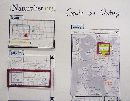
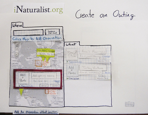
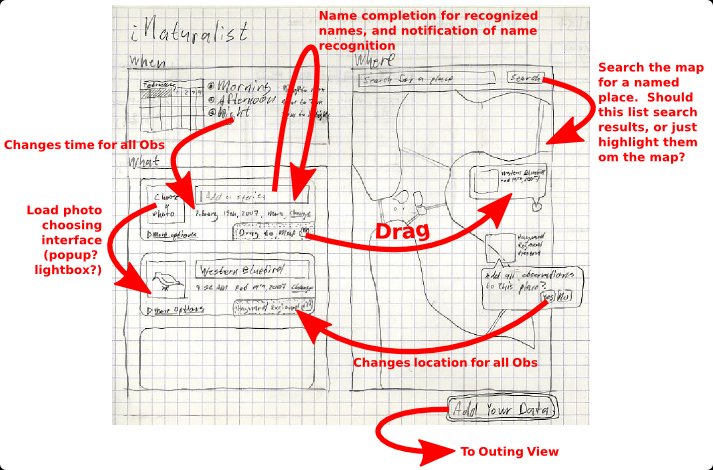
Our interface consisted of several 11x17" pieces of paper as screens, with titles and component regions sketched out. Components were cut and colored paper, affixed with handles to be moved around easily and reconfigured. In the Any-Order interface, sections were labeled 'When,' 'What,' and 'Where'; In the Map-First interface, sections were labeled 'Where' and 'What,' with the calendar/time interface appearing as a pop-up dialogue.
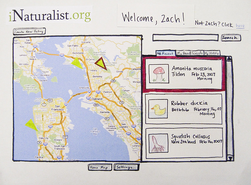
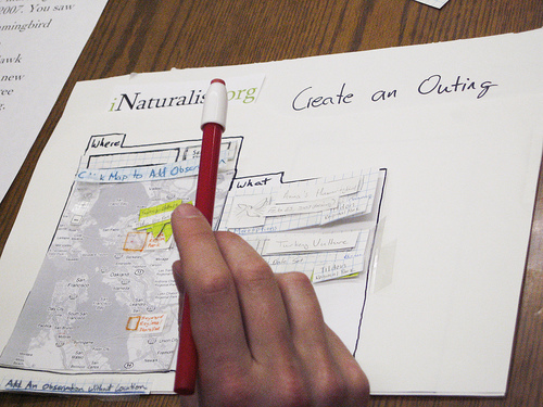
Welcome Screen and "Mouse"
Any-Order Interface
This interface treated the outing as the atomic data element for iNaturalist. 'When' and 'Where' information could be batch-added in any order to a list of observations, with the information then editable at the observation-level individually. Alternatively, observations could be dragged (using pop-off flags) to either specific points or named places on the map. The distinction was originally made via a pop-up that appeared when the user dropped the observation flag on the map. In the third test, the flag included a text readout of real-time latitude/longitude information, which would change to a named place when held over that place's label on the map.
Map-First Interface
This interface presented only a map at first, indicating that clicking on the map would create an observation. Alternatively, a link was provided to create an observation independent of location. Once created (via the link, or by clicking a new point on the map), observations would populate a 'What' list similar to the Any-Order interface. Date/time information could then be edited individually.
Both interfaces provided a link at the observation level to add a photo. The popup up was conventional file-uploading dialogue (path box, 'Browse', 'OK', 'Cancel' buttons). In addition, both interfaces provided a 'Done' button to commit changes to an outing.
Method
Participants
At first we contacted several avid birders in the area for our lo-fi prototype evaluation. However, due to scheduling conflicts, we were only able to schedule one of these ‘hot birders’. We then discussed our ideal participants for this evaluation and decided to recruit a more representative sample of our personas. Therefore, we scheduled other casual naturalists that we had not previously interviewed. Three participants were used to test our lo-fi protoype. Our first participant is an avid birder as well as a member and trip leader for the Golden Gate Audubon Society. The second participant has been traveling around the world for three years. She grew up backpacking, hiking, and birdwatching, and continues to participate in outdoor activities as she travels the world. The third participant was a biology major as an undergraduate, took an ornithology course, and also had a research position that required that he watch birds on a daily basis. While Participant 3 no longer goes birdwatching, he participates in many outdoor activities.
Task Scenarios
We gave each participant the same two tasks to complete for each interface. (Although it is generally not a good idea to let users test two interfaces with the same task, our sample size was so small that there was not much room for grouping or blocking.) The tasks read as follows:
- You went to Tilden Park in Berkeley on a Saturday morning (2/24/07). You saw three birds: an Anna's Hummingbird, a Turkey Vulture, and a Red-tailed Hawk. Go to iNaturalist, add a new outing, and add these three observations to the outing.
- You took a digital photo of the hummingbird. Upload the photo and add it to your observation.
The tasks were designed to test our most important functionality: the ability to record observations in nature. These observations include elements such as location, time and date, photos, and a name associated with the observation. However, we did not specify the order that participants should record these elements.
Procedure
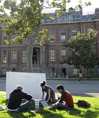 We began our lo-fi prototype by illustrating storyboards compiled from our initial design sketches (Appendices). After a discussion of our storyboards, we began building a paper prototype of the main function of iNaturalist, submitting observations about objects in nature. We continued the building process at Ken-ichi’s house; we not only played with scissors, pens, and glue, but also ate a nice meal (Ken-ichi and Andrew made a Spanish Chicken Chorizo Dish and a beet salad with toasted filberts, respectively.) At this time we also decided to build an alternative prototype in order to determine most intuitive layout for this interface. Once we completed the paper prototypes for both interfaces, we developed the task scenarios, practiced interacting with the interfaces in accordance with the task scenarios, and prepared for other aspects of the test by printing consent forms and task descriptions and buying food for our participants.
Once the participants arrived, the greeter, Jess, introduced them to the other group members and explained their roles during the evaluation: Andrew as the computer, Ken-ichi as facilitator, and Nate as a note taker (Jess also served as another note taker). While the other group members finished setting up, the greeter offered the participant food (one of our participants later noted in her blog that she really enjoyed her chocolate chip bagel and cream cheese), explained the purpose of the evaluation, and introduced the concept of a paper prototype. The greeter also noted that questions during the evaluation should be directed to the facilitator as well as informed the participant that they were free to leave the study at any time. Lastly, and most importantly, the greeter emphasized that the purpose of the evaluation was not to test the participant, but rather to evaluate the interface and discover both its positive and negative aspects. The participant then signed a consent form and asked additional questions.
After the greeter finished with the above introductions, the facilitator explained the evaluation in greater detail. This explanation included a demonstration of how to interact with the human computer, an introduction to the interfaces requiring evaluation, and a request for the participant to verbalize any thoughts or actions as he or she interacts with the computer. The facilitator then described and displayed the tasks for the participant to complete.
Once the participant completed the tasks for an interface, we discussed his or her experiences before proceeding with the next step (either the evaluation of the other interface or a general discussion of iNaturalist). In the discussion we followed-up on any questions or issues that arose during the tasks as well as asked the participant questions specific to the interface:
- Was anything difficult or confusing about the interface?
- Was there anything else you disliked?
- What did you like about the interface?
At the end of both evaluations we asked the participant general questions regarding iNaturalist:
- Is there any important functionality missing from either interface?
- Which interface did you prefer? Why?
- How would you describe your experience using iNaturalist?
- Do you have any questions?
We concluded by thanking participants for both their evaluation of the interface as well as their time.
Test Measures
Given the preliminary state of the interface, our primary goal in testing was simply to obtain a general, qualitative understanding of its usability and how users felt about some of the interface elements we had incorporated. To this end, we asked our participants very general questions about their experience, whether they found any particular task hard, if they liked certain elements, etc. We were particularly interested in how users added location data to their observation, and whether they would have opinions regarding the Map-First versus Any-Order interfaces. In addition to offering them two interfaces with the same task, we specifically asked participants to compare the two interfaces.
Additionally, we intentionally did not specify an order in our task instructions so that we could to observe the natural sequence each participant took to record elements of an observation. We also looked for the participant’s familiarity with the Google Maps-style interface and the ‘drag and drop’ method. Lastly, we observed the difficulty level of completing the various task elements, any confusion regarding wording and layout, and the participant’s general enjoyment of their experience completing their task.
Results
Common Elements
Home page
- All the participants easily found their way from the home page to the ‘Add Outing’ page. Two Participants noted that they were initially drawn to the tabs above the list on the right, then had to look around to find the 'Create New Outing' button.
Observation Data Box
- After an observation had been added to the map, the “Drag to Map” dialogue was changed to a set of coordinates or displayed the name of the location the observation was associated with. Users found this confusing when they wanted to move the observation again, because the “Drag to Map” text was no longer visible. Some users wanted to drag the flags on the map to facilitate this functionality; alternatively, one suggested that clicking the location information should make it editable.
- Generally users clicked ‘More Options’ in the observation dialogue box because they were curious. Closing the expanded options which appeared after clicking ‘More Options’ caused confusion. Participants should have clicked ‘More Options’ again in order to close the expanded view.
- Date editing for individual observations caused confusion. Most users assumed they could click on the text of the date to type or select a date from a calendar. Instead, they were directed to click the text ‘Change’ next to the date which would then provide them with a calendar interface to change a date.
Any-Order Interface
- Participants were immediately drawn to the large calendar box in the top left and used it to set the date and time, which then set the date and time for all the observations. No users attempted to readjust the time using the displayed time bar.
- Participants noted they could add any data in any order.
- When placing observations on the map within a named place, users were confused by a dialogue that was displayed asking if they would like to associate their observations with a general place or a specific location.
- Users were not clear if the search bar above the map looked for locations on the map or for other observations on the map.
- One participant expected the map to highlight the name of the place they were clicking on in a similar fashion to the other highlighted locations on the map.
- Participants did not understand if adding more observations after setting batch defaults would also add the date, time, and location associated to the general outing to the new observation.
- Users noted confusion regarding how to add multiple observations of the same species.
- Participants noted the tension between usual versus unusual sightings, and the desired geographic placement of a species seen many times in an outing versus a species seen only once. That is, a commonly seen species might not require an exact location of observation, whereas an uncommon species would require a more exact placement.
Map-First Interface
- Two of the users understood that continuously clicking the map added new observations. However, one participant interpreted the interface as clicking the map to set the location for the entire outing. This user then clicked a link we provided to add observations with no location assigned to them worded 'Add Observation Without Location', assuming that this implied each subsequent observation would then inherit the location set when the first observation was created by initially clicking on the map.
- A dialogue message that asked if the user would like to add the location to a single point or a general location caused confusion.
- One participant noticed that a latitude/longitude readout would change as the location flag was dragged across the map.
- Changing the date for each observation was noted to be tedious and the text to change the date, which simply read ‘Change’ was not intuitive.
- Actions associated with clicking the map during different steps of the data entry process caused confusion. It was not clear why, in certain cases, data entry boxes were closing when clicking on the map, or when new observations were being added after clicking on the map. (Map-First interface)
- Users generally missed the lack of any batch data functionality which were present in the Any-Order interface.
- Between the three users, participants 2 and 3 felt the map-first interface was more pleasing and less like data entry. Participant 1 felt that the map first interface did not provide the batch data options that a user might require, and noted that dealing with other potential users’ expectations insofar as location could require varying levels of abstraction.
Discussion
Things Learned
Modality is Confusing
Our paper prototype had an editing mode and a viewing mode for an outing, and this tended to confuse users when they were done adding a new outing, had clicked "Done," and wanted to go back and edit the outing. Based on this result, we decided to abandon these modes and have a single view for an outing that allows the creator of the outing to edit it.
Batch Editing is Critical
All participants explicitly expressed a desire for batch editing functionality or the ability to establish defaults for new observations. Even with only three observations to add in the task, the redundancy of adding each observation to the same place was obvious. This was an issue we had anticipated and attempted to address with the "When" portion of the interface, which set the date and time for the entire outing, and the ability to click a place on the map in the "Any-Order" interface to add all observations to that place, but these were clearly not enough.
Participant 1 stated a need for batch addition of many species names, and as the only active birder among the participants we thought this was an important insight. In fact, one of our very preliminary design sketches featured such an interface, where species names were simply listed in a text area, but we abandoned it in favor of the single-species observations in our paper prototype, which we considered simpler and more visually engaging. Participant 1 also suggested that text entry of species names itself was tedious, and that a check list of possible species might be a more useful way to select many observed species at once. We found this intriguing as well, and it once again demonstrates the need for batch functionality in habitual use.
Data From Other Users At Every Stage
One of the goals of iNaturalist is not only to allow users to manage their own data, but to let them explore the data of others as well. We intended to support this through our Search/Browse interface, but we did not have time to prototype it, so we did not test it. Nevertheless, two participants both expressed a desire to see other data while they were adding their own, not only their own past observations but also the observations of others, especially when those observations were in the same area to which the participant was adding, or concerned the same species. This demonstrated that the data browsing and social sides of the site are actually more important than we realized, and that we need to incorporate them into every part of the site. Every time a user sees an Observation represented, it should afford the opportunity to find more like it.
People Like Photos and Maps
Participants 2 and 3 clearly found the map to be the most engaging part of the interface, followed by the photos. Both expressed a preference for the Map-First interface over the Any-Order interface, and both added photos without being prompted to do so. On the one hand, the clear attraction of the map and photos over species names and other properties validates our fears that, as one participant put it, the task of recording observations is "like homework." That is to say it can be mundane and tedious. On the other hand, not every part of the experience is dull, and the exciting components can be enough of an incentive to complete the less exciting ones.
Named Places and Specific Locations
Location is a complex concept that can be difficult to represent in language and in pictures. Based on our interviews and the personas they inspired, it was clear we had to support adding both very specific locations and more general locations corresponding to communally recognized places, usually places with a name. Our potential users were not interested in noting the exact tree in which they saw a very common bird, as they were likely to have seen many and did not bother recording every single spot. However, if they saw something important, they wanted to be very specific, to notify others or to revisit the area later.
Distinguishing between these two types of location was easily the most contentious part of our prototype design process, and was certainly the most problematic interface component during the testing. In both of our "Add Observation" interfaces, participants experienced confusion when prompted to choose between adding their observation to a "Named Place" or a "Point." Vocabulary played a role in this, but when the meanings of these terms were explained to them, the participants still had difficulty knowing when they were adding a to a named place (general) or a point (specific).
Part of the problem, of course, is that any general location contains an infinite number of specific locations, and a two-dimensional map can only represent the two in the same space, making it difficult to drag to one kind of place and not the other. Potential solutions to this problem include surrounding named place extents with an "active edge" and title, and dragging an observation onto these active areas would add to the general place, while dragging within would add to a specific place. Alternatively, users could select a general named place from a dropdown containing all named places, or just the places visible in the current map extent.
Things Not Learned
Time Interface
None of the participants spent much time exploring the date/time selection interface. Our task descriptions specified a date and time that were specific options on the interface, which could have lead to this behavior. Nevertheless, we did not get a general impression of how this component performed.
Data Collection Habits
Participants were generally excited about maps and photos, but we did not learn about the probability that they would have made note of that data in the first place.
Non-Task Map Issues
The map attracted the most attention from all participants, but we did not find out how users might use it for open-ended exploration. Our task script was fairly specific, so participants generally did not explore the map, with the exception of Participant 2, who spent a brief amount of time clicking in arbitrary locations, which require some ad hoc responses.
Persistence of Default Settings Beyond a Single Editing Session
Whether default or batch settings would last after having clicked "Done" came up in the tests. While this is important, it was not an issue we had anticipated.
Other Thoughts
Our three participants worked out very well; in fact, each participant resembled one of our personas. Participant 1 resembled Ted Sinclair because he is a well-respected birder in the area and is in search of a tool that will allow him to record his discoveries both thoroughly and efficiently. Participant 2 reminded us of Adam Thompson because she enjoys interacting with friends through social networking sites and in interested in using a site relevant to her travel experiences, specifically sharing and discovering things that can be seen around the world. Participant 3 was similar to Jenny Takahashi in that he is a thorough note taker and a casual yet experienced birder.
This correspondence was not intentional, and we hope it suggests that our personas accurately capture the needs of our potential users.
Work Contribtion
| Task | Andrew | Jess | Ken-ichi | Nate |
| Storyboarding | 33% | 1% | 33% | 33% |
| Scheduling Participants | 0% | 100% | 0% | 0% |
| Prototype Design | 25% | 25% | 25% | 25% |
| Testing | 25% | 25% | 25% | 25% |
| Analysis | 25% | 25% | 25% | 25% |
| Write-up | 25% | 25% | 25% | 25% |
Appendices
Storyboard
Raw Interview Notes
Interview 1 (3/5/07)
OBSERVATIONS INTERFACE
- Clicks on 'Add new outing'
- Adds date and time
o Wants to setup outing as a whole
- Adds species
- Drags observation to map
o Confused about adding to a named place / point
o Wants to add location information that's not available in the map interface, such as typing in 'boardwalk' when Tilden park info generates (perceived initial message as an option to further refine the location)
o Not sure if he's adding further species or different locations on callout box when adding to named place o Wants to refine the location by clicking and dragging on the 'flags' on the map.
- Clicks on more options
o Might use it to add data about the location, like 'on the boardwalk', or to add more info on the species
- Clicks on the Done button
o Hopes that this saves his data
- Tries to search by typing boardwalk into the search box and clicks search, and cancels when can't find it
o Wanted to add a new point so that it could be found at a future date, Felt that 'add point' was inappropriate, that it represented the ability to be able to add named location places o Wants a better way to exit a window
- Tries to add photo but still in edit mode
o Didn't like edit outing because it implied editing the entire outing
- Clicked done
User's Thoughts: Come back with many >40 species on a list - didn't like individual iterations, just wants to batch add, essentially. Suggests pick list, thinks it's better than a free text form, liked the idea of check boxes using standardized English names (can be found online). Thinks autocomplete interfaces are 'excellent' and very helpful. Would prefer the use of location based hierarchies that include a primary and secondary location, for example: Tilden park, Boardwalk. Also encourages GPS entry capability. And if his place is not found, he wants to add it to the database. Cut and paste data is fine.
MAP INTERFACE
- Clicked on create new outing
- Clicked on Tilden, presented with 'add to point / add to location', zooms in further
o Worried that he hasn't clicked in the exact spot o Doesn't like the 'add to point / add to location' option
- Types species name
o It isn't clear that its a text box at first
- Adds date
o Originally confused about date 'change' option o Wants to batch add this to all o Unclear whether new observations be included in this outing
o Clicked on 'more options' to add date to everything
o Clicked 'cancel' to close 'more options' which may not have the appropriate response to it
** We added a 'add an observation link'
- Clicked 'add an observation'
o Assumed that his 'session' was one time and one place so now that he set his location he simply kept clicking 'add an observation'
- Adds a photo
o Kept using the path box to try and name the photo
- Clicked 'Done'
o Wonders what happens after that
User's Thoughts: Outing implies a day in the field, questioned how you have multiple locations. Session can have 1:1 correspondence with various measures, eg day, hour, etc. Questioned how you handle a species that you see multiple times. Notes that birdwatchers are 'sloppy' because they're interested in novelty. Tension between where you see usual v unusual birds (Seeing california towee means you are "sober and outdoors"). Ordinary birds seen in a day don't need a specific location, while unusual birds need the exact location. Typing is a pain. A pick list is better (in taxonomical order) because it forces standardization. Don't want ordinary species represented by a point, want them represented more generally.
Interview 2 (3/5/07)
OBSERVATIONS INTERFACE
- 'Create an outing' found and clicked
o Liked looking around the homepage to explore features on the homepage
- Clicked Tilden on the map first, Clicked add all obs to this place
o Noted that she could have added location by dragging. Also realizes that she doesn't have to accomplish her tasks in a particular order
- Clicked 'morning'
- Clicked 'feb 23'
- Added species name
o Confused by text box (thinks its a button)
- Clicked more options, adds text
o Hopes that 'more options' allows user to see the entries of other people o Wants to close text box once text has been added (Couldn't figure out how to close more options)
- Clicked 'add photo'
- Tries adding location another way, by dragging observation box
- Added to 'Named Place'
o Finds 'add to named place'/'add to point' confusing o Suggests we change the wording to 'Add to Tilden'/'Add to GPS coordinates: 1, 2'
- Submits findings by clicking 'Done'
- Clicks on 'Edit this Outing'
o Confused about what to do at this point. * n8 note: maybe we should forward to your page? Indicate someway that you are done
- Added more text, and a photo
- Edited species name
- Clicked 'done'
- Wonders what would have happened if you had clicked on the map first, Tried clicking on the map again after leaving edit mode
o Confused as to why the map is not responsive o Says would probably hit the back button about five times. *n8 note: do we support back button functionality?
- Click on claremont country club.
o Finds adding a new location confusing when a park is not already highlighted.
- Click on map produces the 'add this point to all locations'
o Annoyed at 'add this point to all' dialogue, even more annoyed when all locations are changed from Tilden to Claremont, drags changes back
o Also wonders if the new entry would also obtain the outing's date. *Ken-ichi thinks yes
- Added another photo of a mushroom, clicked 'done'
User's Thoughts: Thought it would be interesting to see what other people saw in Tilden that day, or maybe during the process to think about other people. Basically thought she would like to have been engaged a bit more. Map interface most confusing. Search bar didn't make sense. "Search the map" doesn't specify what you are searching for. Felt like the up close map would imply that you had to chose a specific location. Listings look like homework (so she prefers the map to the what and when elements).
MAP INTERFACE
- Clicked 'Tilden' Highlight box
- See 'add place dialogue'
o Essentially same concern as before, proposes helpful wording such as "tell me where you saw this"
- Tries to click and write in date with no success
o Doesn't like that you can't change this field, Associates 'change' with a change to the general input, Suggests changing 'change' to 'edit date'
- Added a photo
- Created new entry
o Confused about clicking outside the current dialogue and how the most recent moves to the list on the right.
- Clicked on the map again, this time chose to add to a specific point
o Commented that it would be nice to see the pictures in the flags displayed on the map
o Commented that she would have zoomed in more to pick a specific point
- Clicked 'Done'
o Confused about 'done' and clicking outside the box doing the same thing
User's Thoughts: Liked that it was all visual, made data order entry was more useful. Preferred the map interface. Not as overwhelmed (not homework). Everything being connected to each observation made more sense. Again commented that having things in different locations on the map would be interesting, like seeing who else commented on similar things in the same regions on the map, or wants real time interactions with others (afraid that if all observations are for tilden it will be more cluttered.) Asked about what to do when you see something but you don't know what it is.
Interview 3 (3/6/07)
OBSERVATIONS INTERFACE
- Clicked on 'create new outing', but Saw the options on the right of the screen
- Go in order of top left, so start with time
- Click on map before the species. Would explore before clicking on tilden. Found more options would click tilden from there and then apply this selection to all options
- Clicks on add species flag
- Wonders why there are three flags and three empty species numbers
- Clicks on text and types
- Clicks on more options because curious (before adding new species) and adds notes. Clicks again to make it disappear
- Wouldn't get any closer or more specific about location at this point. Would then continue adding species, and repeats with the last one
- Would click on add photo for fun. And would browse and click on redtailed hawk. Happy when it works as planned. (Another user that likes photos before being asked to)
- Clicks on done
New task on fly: Would the scroll down bring more empty flags. To change location would click on change (but this is associated by date). Drag observation to lake anza, Click on add species name, click on photo, be done. (Wouldn't drag to Lake Anza unzoomed because its too far, so would search for tilden. When click on lake anza doesn't want to add species to this named place. Clicks cancel. Then drags to place. Boundary differentiatation makes some sense. From batch option would want to be able to change location for more specific option for a special type a bird.
User's Thoughts: Would probably look at the map and want to explore how detailed the park is. Tries after the task. Clicks on drop down menu. Wants a reset map options so that they don't have to unzoom, unzoom, unzoom. Wanted more than more options. Different wording would be better than more options such as add text. Maybe also add weather observations. Liked that it corresponded to other options such as mapping functions, airline functions
MAP INTERFACE
- Clicks on map
- Adds species name
- Adds a photo
- Clicks change to change the date, changes date and time, clicks on done, Clicks overall done done
- Highlights anna's hummingbird and wants to delete but can't
- Clicks outside the map to un highlight and gets observation popup
- Clicks on add observation without location and drags to map.
- Clicks on date but nothing happens, instead clicks on change and is happy that the same date is there
User's Thoughts: Liked that the date came up defaulted when given a popup. But didn't even want to have to deal with the popup Looked for a way to select the same location for every entry. Like that the interface was more location based. Liked the simplicity of the original page (do you mean he liked the batch editing on the original page? -n8). Build on the fly. It is easier to account for different locations in one day. Wants a 'set as default' option in some of the potential batch function operations.
Summary Discussion
- age bias
o p1 was very data oriented, just wanted check boxes and input fields, went straight for the What o p2 and p3 were much more interested in the map, photo
- possibly split into 2 interfaces based on Ted vs Jenny/Adam
- Any-Order vs. Map First
o p3 liked Map First, but missed batch operations o p2 and p3 like Map First, qualitatively (not "homework") o p3 said he liked not having data entry fields first off
+ sort of like p2's "homework" comment
- Clickout vs. Done/Cancel
- Wikimapia-style all-map interface?
o what does this solve?
- "More Options" needs better text
- Batch box
- editing modality
o edit and view should not be different o clicking on the date should change the date
- need to vis. descriptive data
- clicking on Obs in View should show Obs View
Attachments
- storyboard-record_data.jpg (90.5 kB) -
Storyboard for add-observation page
, added by kueda on 02/26/07 21:56:31.

