
Introduction
Our test was designed to validate the basic principles and assumptions surrounding our initial design of a wireless lighting control system (hereafter named "LightsOn Pro"). In addition, we hoped to reveal usability problems which we could address in subsequent versions of the interface.
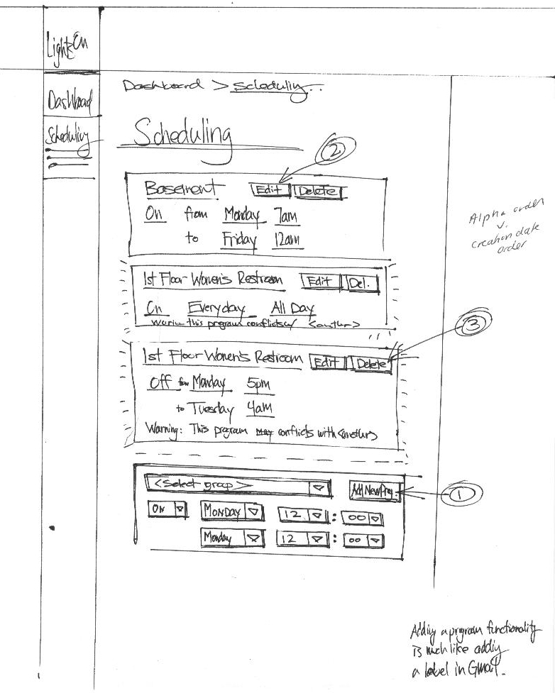
The LightsOn Pro system consists of three major pieces of functionality: light scheduling, energy monitoring, and light failure identification. These three pieces are linked together through a system-wide navigation system and a summary dashboard. In addition, we use a concept of "lighting groups" to provide shortcuts or aliases for lights that often share the same usage patterns or functions.
Using cut-out paper mock-ups we hoped to discover if the organization actually proved useful and intuitive to the user. While we constructed the navigation and page organization based on the best information we had, it is only through testing of potential users of our system that we could discover if our basic assumptions were correct.
Prototype
The first step in our prototype production process was to create an interaction diagram. Stepping through our list of persona tasks, we tried to build a work flow that made sense to both Dan and Tomas.
Once we felt confident that the interaction flow diagram showed the pathway needed to accomplish all these tasks, we moved on to brainstorming prototype ideas. We saw the needs of Tomas and Dan as diverging, so the interaction diagram led us to create two separate dashboards. Each dashboard centered on one of our two main personas, showing only the information that we felt was most important to that persona. We decided that, although there was some sharing of functionality, we were really looking at two distinct interfaces. At the advice of Professor Marti Hearst, we decided to focus on Tomas's dashboard. By limiting the scope, we could be sure to develop a quality interface within one semester.
We divided up the main sections of the interface among group members and then reconvened as a group to discuss our designs. As a group we were able to address each feature of the interface and attempt to achieve consistency across the page and views. For example, we wanted to be sure that editing, saving and deleting need to be consistent from page to page.
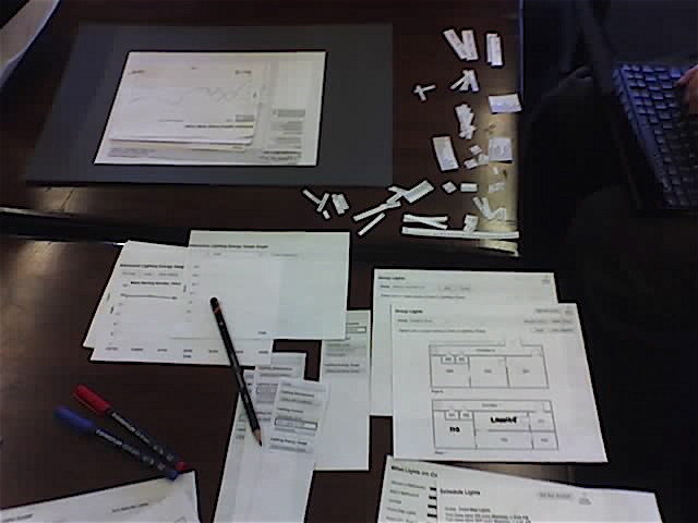
Once each function had been addressed, we converted all of the sketches into Visio diagrams. This helped eliminate discrepancies in group member drawing styles, sizes and mediums. In addition, the added clarity of the printed word helped remove one more variable from the test. We also created many extra widgets such as blank drop-down menus, text boxes and building maps so that we could react to the participant's actions on the fly during the test. Lastly, we used transparencies to provide instantaneous feedback for graphs, highlights and showing room selections.
Method
Participants
Three participants were used for low-fi prototyping. We came across our first participant, Participant 1, at the inception of this project. We intended for him to be used as part of the persona development phase, but due to scheduling conflicts we instead decided to enlist him for low-fi prototyping testing. Participant 1 is in his mid-50's and he is the Operations Manager for UC at Berkeley. Participant 1 is a unique user because he must pay the electric bills separate from the campus Physical Plant and spends most of his time at the computer managing the Martin Luther King Student Union.
Our second participant, Participant 2, is the Facilities and Building Operations Manager at Haas School of Business. Participant 2 has been working closely with the Physical Plant to identify ways in which the school can minimize lighting usage. The team had originally contacted her by performing a search on UC-Berkeley's website to identify building coordinators on campus for our online survey.
Finally, our third participant, Participant 3, is the Business Operations Specialist at this school, the School of Information, in South Hall. Participant 3 has many other duties outside of lighting but was interested in the interface mostly for lighting maintenance.
Procedure
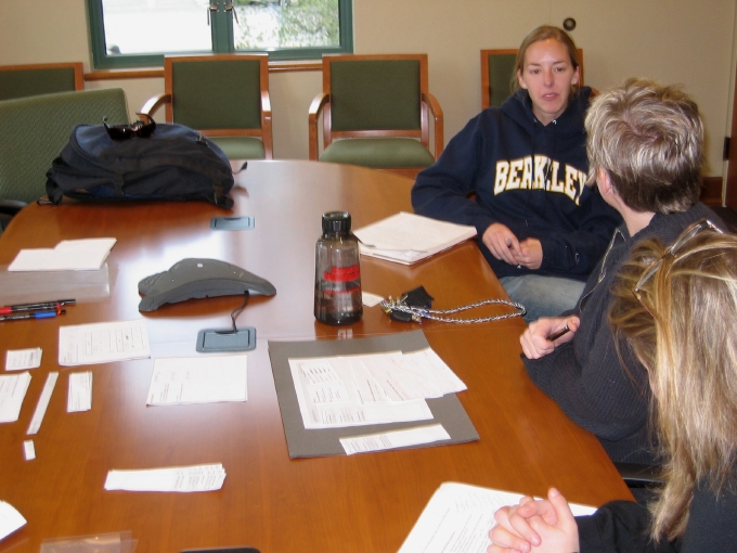
After introducing the participant to the team, we began explaining the general goals of the LightsOn Pro system and how the testing session would operate. We read the participants our project goals and assured them that it was the system that we were testing rather than their abilities to operate the system. We asked for open and critical feedback, emphasizing again that it was just a first draft and that we were not married to any specific design implementations. Additionally, we asked that during all the tasks that they do their best to "think out loud." The tester explained that this is very useful because it helps us see where flaws in our system lie.
The tester gave the participant a quick rundown of the basic format the next hour would follow. We then produced two consent forms and asked the participant to read over the forms and decided to which, if any, they agreed. (As a note, all participants agreed to all terms presented on both the data collection and the video recording consent forms.)
We began the testing with a series of questions aimed at establishing the relative familiarity a participant had with computers and the degree to which their job involved lighting.
- How often do you use a computer at work or at home?
- What computer applications do you use most frequently?
- How would you describe your duties at work as they relate to lighting?
- How often do you interact with the lighting system?
- Is lighting energy conservation part of you job?
- Is light maintenance part of your job?
- Is lighting control part of your job?
The user was then asked to step through four tasks using the paper prototype. The tasks were presented one at a time. At the point were the user had completed a task or it seemed they were unable to progress any further, we moved on to the next. The tasks were designed to test the major areas of functionality. Each one included a few additional steps intended to explore some of the more advance functionality of a section. No quantitative measures were taken during these tasks; the participants were only observed. Areas of confusion and comprehension were noted. Estimations as to the speed and ease at which each task was completed were also noted and factored into our conclusions.
Task 1:
You are a building manager and it is first thing Monday morning after a long weekend and you want to use the system to discover if there have been any lighting failures while you have been away. You are building manager for a natural history museum you want to find out which lights are broken so you can phone the maintenance department and have them fix them.
What would you do to find out which lights are broken? Which lights broke over the weekend? Which lights have been broken the longest? Which l lights still need your attention?
Task 2:Your museum is having a special showing all this week. In honor of a new exhibit the museum main exhibit hall is staying open 3 hours later all week. Change the lighting schedule for building 1's main exhibit hall to stay on until at least 10 PM rather than 7 PM.
Once that is done, you realize that for the safety of the visitors you want to keep the three rooms adjacent to the main exhibit hall lit until at least 10 PM as well. Make that change.
Task 3:How did it get so late? The company picnic is tomorrow so everyone took of early and obviously in a rush. You realize you are the last one out of the building but many of the building's lights are still on.
Turn off all of the building's lights except your own, room 101.
You decide maybe it would be best to leave the hall lights and outside lights on as well, so you can find your way out safely. Turn these lights back on.
Task 4:Earth Week is next month and it occurs to you that you haven't had time to closely monitor the buildings lighting energy use. It would be great if you could tell the staff how much energy we have saved.
Find out if the lighting energy use has gone up or down from last month.
How is does energy usage to date compare to this time last year?
After participants completed the four tasks, we proceeded to ask them a few follow up questions.
- What were your general feelings about the interface?
- Would you use this software?
- Is there anything you wish the system did that it does not currently do?
- How could we make the interface better?
We ended our meeting by thanking the participant for taking part in our study.
Results
Task 1
In this task, many of the users did not utilize the information that was presented on the initial dashboard page. Instead, most preferred to use the navigation bar on the left side of the page, jumping directly to the detailed views. In another instance, a user felt that the dashboard item labeled "Recent Lighting Problems" didn't display enough information. This user felt that the dashboard should have also listed the nature of the lighting problem in addition to its location and time of occurrence. Also, the user raised issue with the way that the dashboard item displayed dates for each lighting problem. Our current design displays the date associated with the problem as "relative" dates (i.e. "Today" is displayed instead of 03-08-2006. "Yesterday" is displayed instead of 03-07-2006). The current design also orders the recent problem items in reverse date order under a "stack" metaphor with the most recent occurrence on the top of the list. The user, however, felt that numeric dates and chronological order of dates was more natural. Other users also expressed some confusion over what the "[new]" indicator represented in this dashboard view and it was unclear to them if this indicated attention on the users part. These issues call into question the amount of information that our design should convey.
Task 2
The scheduling task revealed many problems with our current design. Between the three different users we observed differing behavior and expectations with editing lighting schedules. In one test, the user did not realize that editing the values in the edit boxes presented could change the current schedule. Instead, the user elected to click on the "Add a Line" link that, in our design, actually creates a new schedule point in time for the lighting group to turn either on or off. In another test, the user attempted to set both the start and end points of a lighting schedule interval with a single line. The user first selected the "On" value from a drop-down list and then set the start time of a schedule interval. The user then attempted to set an off time by just flipping the drop-down value to "off" without adding a new schedule line. Many of the values allowed for scheduling, like "Every Day" or "Weekend", were designed to easily express regular and periodic schedules. One user expressed a desire for scheduling by specific dates to allow for single-day, one-off schedules. Also, since the task asked the user to change the schedule for a special event, a couple of the users expressed a desire for a function to remind them when the schedule should be set back to regular operating hours.
Task 3
In this task, there were again inconsistencies in the way the users interacted with the design. The first user pointed and clicked on the floor-plan map to select rooms before clicking on the "off" button to turn them off. Another user, however, first clicked on the "off" button before proceeding to select the set of rooms that she wished to turn off. This suggested that the user interpreted the interface to operate in a modal manner, which we had not intended. Two of the three users were also unsure about how to turn the outside lights off. This may be due to the lack of an enclosing border that denotes an outdoor lights area of effect. The lines representing the indoor floor plan enclosed rooms, these serve as natural indicators of a lights area of effect. Outdoor lights lack this demarcation.
Task 4
Testing the energy monitoring task also revealed substantial problems with our current interface design. In one test of the interactive line graph, the user felt that only comparisons between the same time period across yearly data would yield meaningful results. Any other comparisons (e.g. comparing energy usage from this month against that of last month) would afford misleading results due to seasonal factors in energy usage. This particular user also requested a feature to export gathered data into data formats that he could then import into data analysis software. It is not clear how useful this feature would be to users of our system who are not bill-payers or not experienced with more advanced data analysis. The task ordering may have also had an effect on how successful the users were in completing this task. We had originally expected that the user would answer the first question in this task by looking at the data available on the dashboard. However, since this task followed testing of the lighting control interface, the user was left at the lighting control page at the start of this task. Thus, having no dashboard on hand, users navigated directly to the interactive line graph.
Discussion
Low-fi prototyping provided great insight into how we can better model lighting management and troubleshooting. Task 1 highlighted problems users had with the dashboard or the specific page in which to view new and existing lighting problems. One user indicated that he did not want to see lighting problems if they had already been "reported." This indicates that the page-view should have options in which users can choose to view new, reported and completed problems. Some of the difficulties that two of the user encountered indicated that the page-view needs to either be a log of problems or a to-do list. We should express this in dashboard widget. Also, there must be a better metric to express how long an item has gone unfixed. Finally, after rethinking the relationship between the dashboard and the page-view, we decided we needed a better way of distinguishing each view and concisely deliver the message that there are lighting problems from dashboard.
Task 2 revealed some interesting problems with the way each participant viewed Group and Schedule in our interface. The confusion surrounding the "add a line" link indicated that there are reasons to automatically provide one line for turning a group of lights on and one line for scheduling them to turn off. There are good reasons to support having only one line, and we must do additional research to understand how users would use these functions. We also found there was a disconnect lighting groups and scheduling. A visual representation of the current group being scheduled would be helpful. This is one path to pursue, and another is to reconstruct these two functions entirely. We would like to find out how often groups will be used, and we wonder if groups can be local instantiations at the time of implementing a schedule.
For Task 3, we found that the task flow was not well represented by the layout. Participants treated the on/off buttons as mode indicators rather than an action. To better represent the task flow we may need to move the buttons below the building floor plan. We also need to provide feedback on the submitted action; this was hard to represent with the low-fi prototype. Additionally, since two of the participants did not know how to turn the outside lights on, we need to render floor-plans to show that outside lights are manipulatable.
Finally, Task 4 was designed to show the usefulness of the energy metrics on the dashboard and the graphs on the Interactive Lighting Energy Usage Graphs page. One user indicated that a month-to-month comparison was not as useful as a month-this-year to same-month-last-year metric. This may indicate a difference in level of expertise as well as the time commitment made to the role as building coordinator. The graphs were confusing and hard to read, and there were some problems with using the "comparison line" option. We need to investigate whether the graphs should be trend lines or histograms, and we also need to look at displaying aggregate values like that on the dashboard. The drop-down boxes for generating the graphs also need to be redesigned in order to provide more information and support better task flow.
Throughout this testing process it was interesting to watch participants struggle and succeed, and then juxtapose this to how they answered post-testing questions. The disconnect between their that struggles and their post-test enthusiasm indicates that the concept was valuable. It also shows to what extent our participants blamed bad design on themselves rather than the designer.
Work Breakdown
| Ivan Tam | Lindsay Tabas | Katrina Rhoads | John-Mark Josling | |
| Interaction Flow | 33% | 1% | 33% | 33% |
| Prototyping Design | 20% | 20% | 30% | 30% |
| Prototyping Construction | 10% | 5% | 80% | 5% |
| Testing | 18% | 40% | 18% | 24% |
| Write-up | 25% | 25% | 25% | 25% |
| Web Page Update | 0% | 0% | 50% | 50% |
Appendices
Proposed SurveySurvey Results
Interaction Flow Diagram 1
Interaction Flow Diagram 2
Interaction Flow Diagram 3
Prototype Designs for Testing (PDF)
Testing Script
Consent Form
Video Consent Form
Raw Testing Notes