
Appendices | Presentation | Work Breakdown
Introduction
A pilot usability study was conducted on the LightsOn Pro Second Interactive Prototype using five participants. LightsOn Pro provides a online control interface for wireless lighting devices. These devices provide a more granular control over a building's existing lighting systems and can report three different kinds of lighting problems - ballast, bulb or power. The LightsOn Pro system provides users with the ability to view a list of current lighting problems, see what lights are currently on, turn lights on and off, schedule lights and view energy usage graphs.
The main focus of this pilot usability study was to detect interaction issues and design flaws. By having the participants think out loud throughout the test we were also able to ascertain participants' satisfaction, frustration or confusion with different areas of the interface. The secondary focus of this study was to conduct a preliminary comparison of the First Interactive Prototype Add New Schedule function implementation against the Second Interactive Prototype Add New Schedule function implementation.
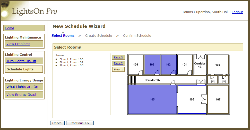
Add New Schedule - Wizard
Pressing "Add New Schedule" on main Schedule Page launches this 3-step wizard.
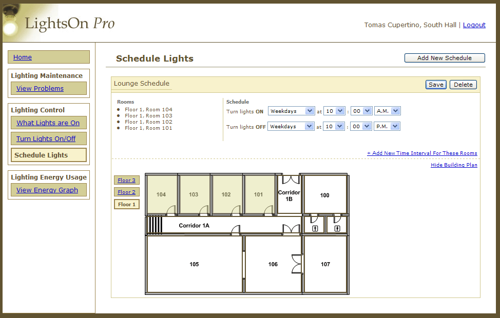
Add New Schedule - Stack
Pressing "Add New Schedule" simply adds a new, blank schedule in-line on the page.
Method
Participants
Participant 1 is a 55 year old male with some college experience. He is an associate development engineer responsible for several buildings. He spends less than 10% of his time troubleshooting the lighting system. His most frequent tasks include: controlling the lighting system manually, scheduling lights, checking for lighting problems, receiving lighting reports, reporting those problems, scheduling maintenance, and performing maintenance himself. His responsibilities also include: receiving reports, doing in-person inspection of lights, and reporting problems. Participant 1's most frustrating task is managing these lighting problems until they have been resolved.
Participant 2 is a 55 year old female with a Masters degree. She is a Library Director and is in charge of a single floor in the building in which she works. Her frequent tasks include: controlling lights manually, checking the lighting system for failures, and scheduling maintenance. She spends less than 10% of her time troubleshooting the lighting system, and her most frequent task is contacting maintenance to have lights fixed. The most frustrating part of her job is the long response time for getting lights replaced and the need for repetitive calls to the maintenance facilities.
Participant 3 is a 28 year old male with some college experience. He is a facilities manager for a science department on campus, and, as part of his job, is responsible for lighting tasks related to the entire building. He spends less than 10% of his time every day dealing with the lighting system, but his typical daily tasks include scheduling lights, receiving lighting problem reports, reporting those problems, scheduling maintenance and performing maintenance. His most frequent task is reporting lighting problems and his most frustrating task is dealing with the slow turnaround time between reporting and fixing a problem.
Participant 4 is a 45 year old male who has graduated from a certificate program. As Principal Lab Mechanic, he is responsible for supporting senior level instructional labs for his department. He spends somewhere between 11-25% of his time troubleshooting the lighting system, and in doing that, his most frequent tasks are monitoring energy usage, scheduling lights, receiving problem reports, scheduling maintenance and performing maintenance. His most frequent tasks include turning off lights that are not being used and calling in lights that do not work.
Participant 5 is a 42 year old male with a Bachelors degree. He is a building coordinator on campus working with other agencies on issues of building maintenance. He is responsible for the operations of one building. He spends less than 10% of his time troubleshooting the lighting system, where his most frequent tasks are receiving reports, reporting lighting problems and scheduling lighting maintenance. He also spends time working with student groups on issues of energy efficiency. His most frequent lighting tasks include detecting and reporting lighting problem, and he would really like to find a system that would help reduce lighting usage during his building's off-peak hours.
Only 1 participant rated themselves as very energy conscious, only 3 participants showed interest in being able to use an automated schedule lights function (although most deemed this an important feature), and 2 different participants also saw a lighting repair alert system as extremely useful. The group as a whole was spread fairly evenly on a 1-5 Likert scale concerning the usefulness of seeing building energy usage.
Apparatus
Three of our five participants (P1, P2 and P3) tested our interface using an IBM Thinkpad X41 with a wireless computer mouse. With these three participants, we were able to record screen interactions using the software application: PyVNC2SWF. PyVNC2SWF captures screen actions to create Flash recordings of participant action. These recordings were used to help the team with its final redesign and the third interactive prototype. We also used the recordings to measure how long it took each participant to complete the tasks.
The other two participants (P4 and P5) tested our interface on a PC computer in the South Hall computer laboratory. Unfortunately, we were unable to record these two tests because the software could not be installed on the machine.
All participants completed the tasks using Internet Explorer. This was necessary because LightsOn Pro had not yet been made cross-browser compatible and only worked correctly on Internet Explorer.
Tasks
Task 1:You are a building manager who is responsible for reporting lighting problems to the building electricians. It is first thing Monday morning and you want to use the system to discover any lighting failures that occurred over the weekend.
- Find out which lights are broken.
- Please identify which lights broke over the weekend, Saturday, March 3rd and Sunday, March 4th.
- Which lights have been broken the longest?
- Which lights still need to be reported to the electrician?
- Find out the nature of the broken light in room 101.
- Mark the broken light in room 101 as reported as you have now contacted the electrician.
- Make a note to yourself that you are waiting on a replacement part before the light in room 101 can be fixed.
Your building is having a special showing all this week in honor of a new exhibit. The building is staying open 1 hour later all week.
- Change the lighting schedule for the lounge (rooms: 101, 102, 103, 104) to stay on until 11 P.M. rather than 10 P.M.
- Once you have changed the lounge you realize that for the safety of visitors you want to keep the two rooms adjacent to the lounge (rooms: 105 and 106) lit until 11 P.M. as well. Change the lighting schedule to keep rooms all 6 rooms (101, 102, 103, 104, 105, 106) on until 11 P.M.
The company picnic is tomorrow so everyone took off early and is obviously in a rush. You realize you are the last one out of the building, but several of the building's lights are still on.
- Turn off all the building's lights except your own, room 101.
- You decide maybe it would be best to turn the first floor corridor (1A) lights on so you can find your way out safely. Turn corridor 1A's lights on.
Earth Week is next month so you decide to check on the lighting energy usage and inform the staff about this month's progress.
- Has the lighting energy use gone up or down from last month?
- How does energy usage for this month compare to this month last year?
- How does energy usage for this year compare to last year?
It is finals week next week, so you the building decides to open the student lab (room 105 and 106) early for students. As the building manager, create a new schedule called "Early Morning" which turns the lab lights (room 105, and 106) on at 6 A.M. and off at 10 P.M.
(Repeat task for both scheduling methods. Alternate users starting with Wizard or with Stack style first.)
Procedure
We met each participant in the South Hall lobby and brought them to a room our team had prepared for testing. The volunteer was introduced to the team and given a short summary of our project as well as an overview of the testing procedure. We reminded the participant that it was the interface we were testing, not them, and that we appreciated all feedback, both positive and negative. The participant was then given two release forms to sign before beginning the test.
A member of our team would then walk the participant over to the workstation and begin asking them to attempt each of the tasks. At the beginning of each task, the participant was asked to "think out loud" whenever possible. During the test the other team members took observational notes. For the three participants who tested the interface using the IBM laptop, the session was also recorded using screen capture software.
The final task included running through a brief scenario using two different versions of our schedule page. Participants were randomly pre-assigned groups to determine which version they saw first. Participants 1, 2, and 3 used the Stack version first and participants 4 and 5 used the Wizard version first.
Once the tasks were complete, the participants were asked to complete a brief survey. During this, a team member read the questions to the volunteer and requested a 1-9 response. At the end of the survey, the participant was asked for any additional feedback or questions they had regarding the prototype as a whole. The team thanked the participant for their time and made sure they could find their way out of the building.
Screenshots
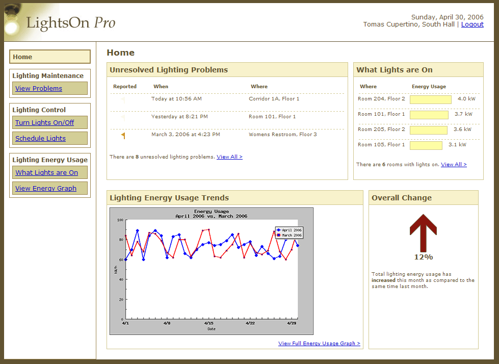
Dashboard
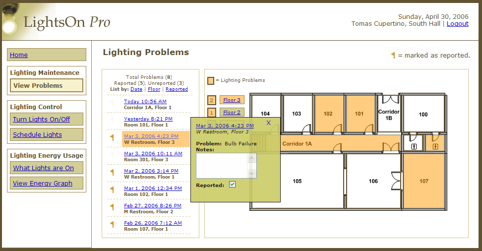
Lighting Problems Page
Add New Schedule - Wizard
Turn Lights On/Off Page
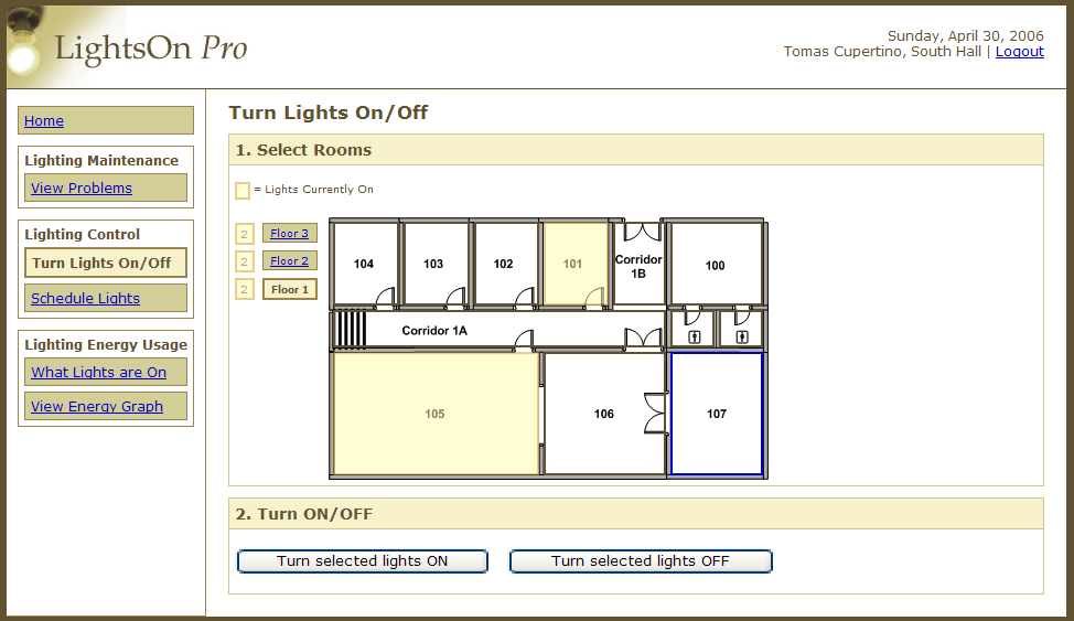
Turn Lights On/Off Page
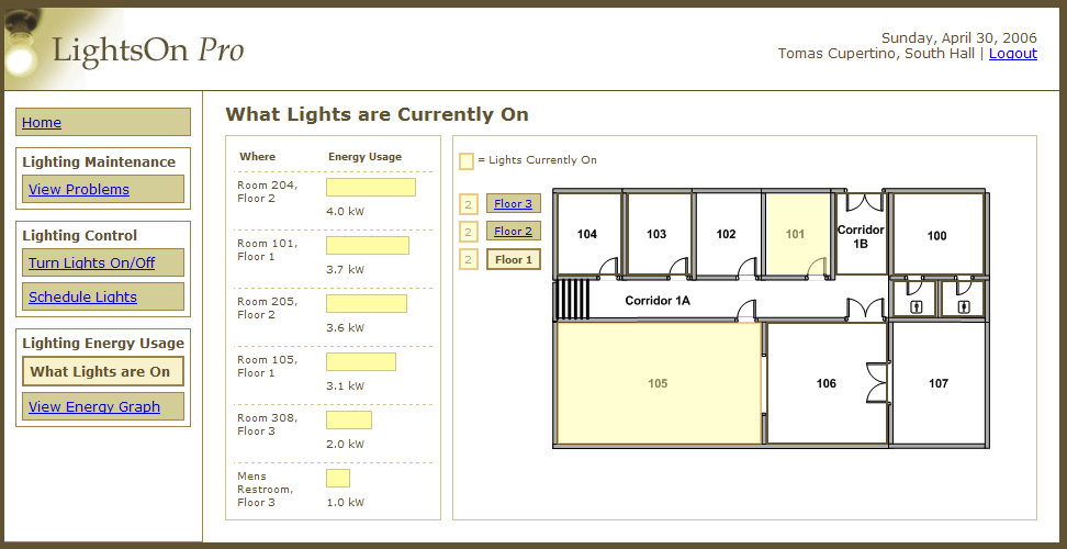
What Lights are On Page
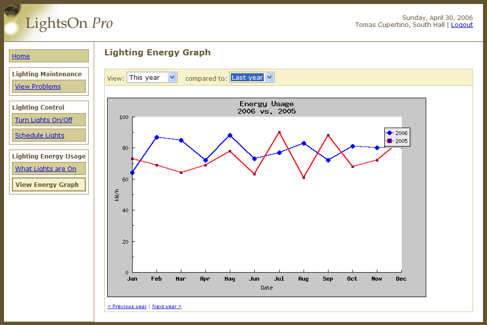
Energy Usage Graph Page
Test Measures
In the earlier stages of design we devised two different interfaces for adding a new lighting schedule. The first version we called the Stack interface; the second we called the Wizard interface. For the Stack interface, we felt that its strength was the ability to allow the user to add a new schedule without leaving the main Schedule Page. The strength of the Wizard interface was that it broke the task of adding a new schedule into smaller sub-tasks. The hope was that the Wizard interface would be very simple and easy to use, especially for novice users. The Stack interface was implemented in the first interactive prototype and the Wizard interface was implemented in the second. The results from this pilot usability study will determine which of the two (or perhaps both) interfaces we should implement in the third prototype.
For our pilot test, we chose to measure the time required to complete the "Add a New Schedule" task on each of the two interface versions. Specifically, we tested whether the new Wizard interface was more efficient than the Stack interface we had developed in the first interactive prototype.
With participant permission, we recorded three testing sessions with screen recording software. We then later reviewed these recordings and measured the amount of time it took for the participant to complete the task. The starting point was measured at the instant that the participant was given control of the mouse and the end point was measured at the final click needed to complete the task (e.g. clicking "Save" in the Stack version and clicking "Finish" in the Wizard version).
For each participant, we switched whether they would see the Stack or Wizard interface first to reduce ordering effects. Participants 1, 2 and 3 used the Stack interface first while participants 4 and 5 used the Wizard interface first.
Results
From the measurements gathered from the three recorded testing sessions, participants took 52.67 seconds on average to complete the task with the Stack interface. With the Wizard interface, users took an average of 56.33 seconds to complete the same task for an average 6.96% increase. The participants took more time completing the task with the Wizard interface.
The questionnaire data seems to suggest that the participants preferred the Wizard interface. On a scale of 1 to 9, participants responded on average with 7.4 for both quickness of use, 7.2 for ease of use and 7 for how fun it was to use the interface. For the Stack interface, however, participants responded on average with 6.75 for both quickness and ease of use and 7.75 for how "fun" it was to use the interface.
Our tally of errors that participants made between the two interfaces suggests that the Stack interface was more error-prone, with 4 total errors made versus the 3 total errors made with the Wizard interface.
Overall, the current data suggests that the Wizard was the better interface. Even though the task took longer to complete, fewer errors were made and the users seemed to find the interface easier to use.
Discussion
Design Changes Discussion
We discovered a variety of interesting problems during this pilot usability study all of which we felt could be solved or improved fairly easily in our next design iteration.
Schedule Wizard - Breadcrumb Navigation Issue
Perhaps the most frustrating interface problem to watch occurred on the New Schedule Wizard page. Every participant attempted to click on the step breadcrumbs at the top of the page in order to proceed to the next step in the wizard. Most participants eventually discovered the Continue button at the bottom of the page but one participant never even found this and had to abandon the task completely. Our solution to this problem is to simply hyperlink the next breadcrumb step so that the user can click on it or on the Continue button at the bottom. We considered removing the buttons at the bottom of the page altogether but decided that these are standard and having both options would not detract at all from the usability of the page.
Schedule Page - Building Plan Edit Issue
Another major problem we discovered during the test was on the Schedule page. When asked to edit the schedule, participants tried clicking on the building plan multiple times in an attempt to select rooms, not realizing that the edit button needed to be clicked first to activate this functionality. We discussed graying out the colors on the building plan to signify that it is not active. However, we decided that without a side-by-side comparison of active versus inactive, it would be difficult for the user to recognize the difference. We further discussed making the entire page editable at all times, meaning that the user could edit any element on the schedule without explicitly clicking an edit button. However, we decided that it would be very easy to make a slip on the page (e.g. accidentally deselect a room or change a time) and users may not realize that they changed anything. The solution that we believe may work best is to pop up a dialog box when the user clicks on the building plan while it's in read-only mode. This dialog will ask if they would like to enter edit mode. They can choose "yes" or "cancel" from the dialog.
Lighting Problems Page - Saving Notes Issue
On the Lighting Problems page, participants struggled with not knowing how to save or close the callout that appeared when they clicked on a lighting problem link. They eventually found the "x" in the upper right-hand corner but did not seem to feel confident that this would save the changes they made. We decided that it was important to stick with conventions so we will likely add a save button and a cancel button to the bottom of the callout to make the possible actions clear.
Lighting Problems Page - Value of Sort Functionality
Also on the Lighting Problems page, participants seemed unsure of the purpose of the sorting links at the top of the problems list. Part of the issue may have been that we did not indicate which field the list was currently sorted by. Another issue may have been the fact that it was difficult to see sorting changes because the problems are in list format rather than table format. We discussed changing the list to a table but the width requirements would reduce the amount of room available for the floor plan. In addition, we reevaluated the value associated with the sort function. We believe that the sorting value is actually low for our target users and therefore we may consider removing it completely from the interface.
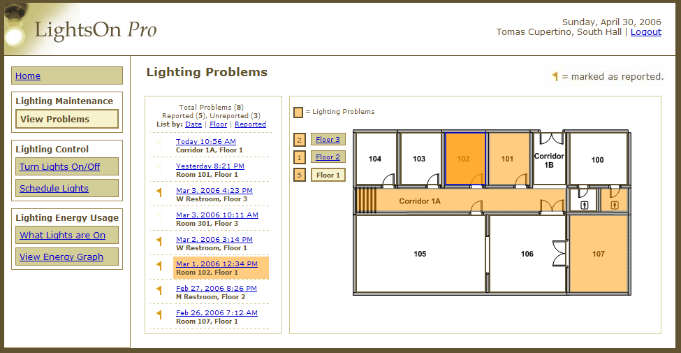
Lighting Problems Page - Building Plan Interactivity
Another issue on this page is with the building plan interaction. Mouse-over events make the building plan look interactive and therefore many users attempted to click on the room to learn more about the lighting problem. We decided that it would be most useful and natural for the problem callout to appear when the user clicks on a room, just as it does when the user clicks on a list item. However, the callout should appear relative to the user's current mouse position.
Lighting Problems Page - Reported/Unreported Confusion
Finally, we noticed that there might be some confusion with the reported/unreported iconic representation on the list. Currently, a very faint flag appears to the left of unreported items and a bright orange flag appears to the left of reported items. Participants did not seem to immediately understand the significance of these flags and often missed the flag legend in the upper right of the screen. Our problem therefore is twofold: 1) we must move the legend closer to the list and 2) we must consider revising what icons we use for reported and unreported items. We feel that the unreported items are the more important and should have a more prominent icon than the reported items. Currently, it is the opposite. One possible solution that we discussed is to use the bright orange flag for unreported items and use a very faint flag with a light blue letter "R" overlaid on top. The "R" would stand for reported and the icon as a whole would appear much less prominent than the bright orange flag.
Energy Usage Graph - Legend Location
All of the participants expressed frustration with the location of the legend on the Energy Usage Graph. The legend overlapped the graph slightly and the participants all tried in vain to drag the box off of the graph. Our solution to this problem will simply be to move the legend completely off of the graph.
Energy Usage Graph - Add Export Functionality
Some of the participants mentioned that they wish the graph was more like what they get from Excel. We thought that an export feature might be useful for these users so that they can create whatever types of reports they need or want from the raw data. This feature would likely be for the more advanced users.
Energy Usage Graph/Home Page - Summary Data
Although the section with the arrow on the home page contained the answer to one of our tasks, none of the participants even noticed this section. Instead, they all attempted to find the answer using the energy line graphs. We decided that this data is important for users and that we need to make it more prominent. On the Dashboard, we think that moving the arrow within the energy graph section would tie these two related ideas together better. On the Energy Graph Page, we thought adding the arrow and a small summary data table would also be valuable.
Experiment Discussion
Overall, we were satisfied with the structure of our pilot study. However, if we were to conduct a real study with a larger number of participants, we would alter a few things.
In a full experiment we would make sure that all of our sessions were recorded. During our pilot study we were only able to record three of the five sessions.
We would also like to spend some time with the participant prior to beginning the test to familiarize them with the test building. For example, we think it would be useful for them to know how the number of floors and the general building layout so that they can complete the tasks without having to first take the time to understand the building.
For the tasks relating to scheduling, we feel that the experiment might be more relevant if we have the participant create the first schedule themselves, rather than having a schedule already present in the interface.
Our post-test survey could also be improved. For the pilot, we asked questions about whether the page was fun, if the interface was natural and if they found completing the task to be fast. In a future study, we would condense this down to a basic satisfaction question and then ask them more detailed questions regarding the tasks that they completed. In addition, we think that having the participant fill out the survey in a private area might provide more honest answers. We would still like to ask for free-form comments and suggestions in person.
Lastly, we think it might be beneficial to distance ourselves more from the interface during testing. For example, in our pilot test we made it clear that we designed the interface. We wonder if this may have influenced their response during and after the test, perhaps skewing it to be more positive. In a full experiment, we might want to make it seem more like that we are testing the interface on the behalf of another group of designers rather than our own.
Presentation
Presentation SlidesAppendices
Participant Release Forms
Testing ScriptConsent Form
Video Consent Form
Miscellaneous
Task 5 SurveyPost-Test Survey
Screen Recorder Tool
Sample Screen Recording (Participant 2)
Storyboard for New Schedule (Stack)
Storyboard for New Schedule (Wizard)
Raw Survey Data
| P1 | P2 | P3 | P4 | P5 | |
| Lighting Problems | |||||
| Useful | 9 | 7 | 9 | 5 | 9 |
| Quick | 7 | 9 | 9 | 9 | 9 |
| Easy | 5 | 8 | 9 | 9 | 9 |
| Natural | 8 | 8 | 9 | 9 | 8 |
| Turn Lights On/Off | |||||
| Useful | 9 | 1 | 7 | 7 | 9 |
| Quick | 8 | 8 | 9 | 8 | 9 |
| Natural | 8 | 8 | 9 | 8 | 9 |
| Energy Graph | |||||
| Useful | 9 | 3 | 6 | 8 | 9 |
| Quick | 5 | 7 | 6 | 8 | 9 |
| Easy | 5 | 7 | 6 | 4 | 2 |
| New Schedule - Stack* | |||||
| Quick | 5 | ? | 6 | 8 | 8 |
| Easy | 5 | ? | 6 | 8 | 8 |
| Fun | 6 | ? | 9 | 8 | 8 |
| New Schedule - Wizard* | |||||
| Quick | 7 | 8 | 9 | 9 | 4 |
| Easy | 7 | 7 | 9 | 9 | 4 |
| Fun | 7 | 7 | 8 | 9 | 4 |
* P1, P2 and P3 tested the Stack version first and the Wizard version second. P4 and P5 tested the Wizard version first and the Stack version second.
Raw Task Times (Seconds)
| P1 | P2 | P3 | P4 | P5 | |
| New Schedule - Stack | 48 | 77 | 33 | - | - |
| New Schedule - Wizard | 86 | 47 | 36 | - | - |
Raw Error Counts
Mn = Minor error,
Mj = Major error
Minor errors (Mn) were counted when the participant expressed significant confusion or perhaps made a wrong choice that they eventually recovered from to sufficiently complete the sub-task. Major errors (Mj) were counted when the participant was unable to complete the sub-task sufficiently or when they required help from a member of the team.
| P1 | P2 | P3 | P4 | P5 | TOTAL | |||||||
| Mn | Mj | Mn | Mj | Mn | Mj | Mn | Mj | Mn | Mj | Mn | Mj | |
| T1 - Lighting Problems | 3 | 1 | 3 | 1 | 0 | 1 | 2 | 0 | 0 | 0 | 8 | 3 |
| T2 - Schedule | 0 | 1 | 0 | 2 | 1 | 0 | 1 | 0 | 2 | 0 | 4 | 3 |
| T3 - Turn Lights On/Off | 0 | 0 | 0 | 0 | 0 | 1 | 1 | 0 | 1 | 0 | 2 | 1 |
| T4 - Energy Graph | 1 | 0 | 1 | 0 | 0 | 0 | 1 | 0 | 1 | 0 | 4 | 0 |
| T5 - New Schedule Stack | 1 | 0 | 0 | 1 | 0 | 0 | 1 | 0 | 1 | 0 | 3 | 1 |
| T5 - New Schedule Wizard | 1 | 0 | 0 | 1 | 0 | 0 | 1 | 0 | 0 | 0 | 2 | 1 |
| TOTAL | 6 | 2 | 4 | 5 | 1 | 2 | 7 | 0 | 5 | 0 | 23 | 9 |
Work Breakdown
| Ivan Tam | Lindsay Tabas | Katrina Rhoads | John-Mark Josling | |
| Participant Relations | 0% | 100% | 0% | 0% |
| Pilot Testing | 30% | 0% | 30% | 40% |
| Write-up | 25% | 25% | 25% | 25% |
| Web Site Update | 0% | 0% | 100% | 0% |
| Presentation Slides | 2% | 15% | 3% | 80% |