
 |
Assignment Five:
Scenarios (link to Assignment 4) • Overview of the UI Actually Implemented • Low-fi differences • Storyboards • Sketches
Overview • What was left out • Tools
Description of how to run the interface and the scenarios
Revised Interface design
Overview of the UI Actually Implemented
The biggest lesson we learned from low-fi testing is that users want simple functionality and ease of use. They also want consistency of structure, terminology and navigation, not only within the application, but also with other familiar scheduling software. As a result, we developed a very simple navigation consisting of three main sections, and concentrated on providing focused functionality in each section. This was particularly challenging because we needed to provide various functionalities in a clear and uncluttered manner. In our present UI design we also took advantage of the affordances offered by a calendar interface by allowing users to directly interact with it.
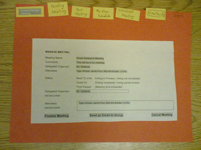
The main difference as a result of low-fi testing is that all meeting management functionality is now consolidated onto one page, instead of separated into different tabs. Before low-fi testing, users had to go to one tab to create a meeting, to a different tab to see what meetings were still not decided, and to another tab to see upcoming meetings that had been decided. As a result, this resulted in six tabs, as the photo above illustrates. Our test subjects were very confused by the navigation, particularly with "Pending Meetings". It was unclear what "pending" referred to.
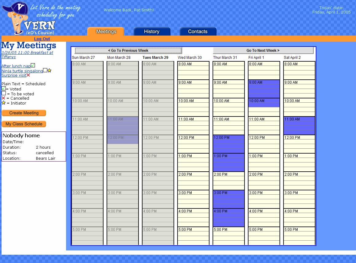
These test findings led to us to design the interface pictured below. The number of tabs was reduced from six to three for ease of navigation. Creating, editing and voting for meetings, as well as inputtng a weekly class schedule, are all done from the same page. Additionally, upcoming, pending, and cancelled meetings are consolidated into a single list with a status icon next to each item for easy identification. When the user clicks on a meeting link, meeting details appear in the lower area of the left navigation bar. If the user wants more specific details, they can click on the link in the meeting details and they are taken to a separate webpage.
Sketches of planned, but not yet implemented screens
We implemented almost all of the screens in our prototype on a high level, except for a display of vote tallying percentages, in part because we felt that we needed more feedback about how users will want to visualize this display (pie chart, graph, tooltip, or numeric only). In our second prototype, we plan to work on implementing more functionality and working links between these screens. Screenshots of our planned prototype are found in Assignment 4.
Prototype overview
Our first interactive prototype consists of the following four main pages:
Login Page
This is the first page the users encounter whenever they access Vern. Existing users may log in by entering their registered emails and passwords. If they forget their passwords, they can request the passwords to be sent to them via email. New users need to register with the system before they can use Vern.Meeting Page
This is the default page users encounter after they have successfully logged into Vern. The page is divided into two panels. The larger right hand panel contains a calendar showing a users weekly meetings in colored time-slots. A meeting summary window will pop up if the mouse is hovered over each time slot. The smaller left hand panel contains a list of meetings, some meeting management functions, and a link to the class schedule view.History Page
This page consists of a table listing all of the meetings that have taken place before. Each list item includes information about a meetings date, name, description, attendees and initiator.Contact Page
This page displays a list of the contacts name and their email addresses. There are also buttons for the user to add, edit and delete a contact.See Screenshots for details
What was left out and why
Fortunately, we were able to incorporate most of the functionalities in our specification "wish list". The items that were left out are functionalities that compliment and enhance existing functions. The main reason they were left out is that we didn't have enough time to code these enhancements. Items we would have liked to implement are:
We hope to be able to develop and to incorporate these features into future prototypes of VERN, time permitting. However, the software's current effectiveness will not suffer if they are not implemented.
The tools we used allowed the diversity of our team's talents to work together as well as independently while not stepping on each other's toes as our team designed, developed, and assembled the prototype. We used CVS to manage the files and code for the site, Eclipse for java development, Photoshop and illustrator for graphic design, and DreamWeaver for HTML layout. Additionally, we used free JavaScript scripts to enable cross-platform dynamic HTML effects for the site.
CVS, while good in practice, was difficult to use by the team. The combination of the need for command-line check in and check out, the unfamiliarity of the team with merging conflicts, and some CVS problems when moving between windows and UNIX platforms caused some glitches, but over all it allowed us to safely keep track of the site's development and gave us the ability to roll back changes as needed. An ideal solution would allow the files to be both checked out and edited locally on a windows machine, which would have required individual PHP servers.
The Eclipse development platform was of average use for designing the applet - the developer wasn't as familiar with GUI design in Eclipse as would have been ideal, so there may be additional tools to assist with the complicated java AWT layout options that the author was unaware of. However, the rapid development and tweaking abilities of Eclipse allowed for extensive modifications of the calendar visualization applet. For the purposes of the prototype, no constrains were placed on the product of commonly used java run times, and the end user is expected to have the latest and greatest browsers and java run-time to use the site correctly.
Our site's major functionality was developed in PHP, useful for rapid development of this sort. There were no major issues with using PHP, and the flexibility and rapid tweaking of PHP coding allowed us to quickly make patches and test alternatives. It also cut down on the necessary HTML coding significantly, allowing us to eliminate redundancies in the page's code.
Color blindness played a large part in our considerations for the green/yellow/red color map development and alternate ways to access the site. It changed our color scheme significantly, and we still need to revisit the color approach, possibly adding additional icons or other visual representations to differentiate between the three types of time that can be marked off.
Other tools used in the development of the prototype had varying levels of success. Our paper prototype worked wonderfully for our purposes, the ability for users to scribble directly on the paper when marking up times confirmed that users have an intuitive feel for marking out blocks of time on a calendar. However, the paper prototype did make it harder to spot "gaps" in our interaction flow, something that we found out during initial user testing when people clicked somewhere unexpected and we were missing a confirmation screen. We attempted to use Denim, and while the multi-level view of the site would have been useful, but for whatever reason didn't run fast enough on the computer being used to be usable. We believe it is also geared towards a 100% tablet interface, something that the designers were not used to.
Screenshots
Description of how to run the interface and the scenarios
Load the VERN prototype into your browser. At the login screen, create a new login if necessary.
Scenario #1:
You are professor at SIMS, and trying to work out your schedule for the upcoming week using VERN.
- Login to the system
- Check your calendar for this week
- Scroll over the calendar and review the Breakfast at Tiffany's Meeting
- Review the Breakfast at Tiffany's Meeting Details (there are two ways to do this from the previous screen)
- Look at the voted on After lunch nap meeting to see what times were selected
- Review your meetings history to see when your last meeting was with your Nobel Prize Winning group
- Schedule a project meeting with your Nobel Prize Project group
- Create a group called Nobel Prize and add 3 members (Forrest Gump, Papa Smurf and Lil Kim)
- Note: Enter your own email address when scheduling this project meeting
Scenario #2:
You are a student in SIMS who has received an invitation in the email from a professor trying to schedule a kickoff meeting for their potentially Nobel Prize winning research project.
- Check your email (from the professor in Scenario #1) and click on the meeting invitation link
- Respond to the professor's request for meeting times
- Put your class schedule into the "My Weekly Schedule" screen. (this is the same html page for the First Prototype, but conceptually is a different screen)
Scenario #3: (functionality will not be implemented in First Prototype, please ignore this scenario)
You are Cookie Monster, an admin for the SIMS department. Please perform the following tasks with Vern:
- Login to the system
- Look at the kickoff meeting for "Nobel Prize Winning Project" and pick a time that everyone seems to agree to. Then pin it down as as confirmed meeting