
 |
Assignment Four:
Introduction
VERN is a web-based meeting scheduling tool that automates and streamlines the time and labor intensive process of agreeing on meeting times. The objective of VERN is to reduce the amount of effort and time required to organize a meeting, while providing an informative, easy-to-read display accessible to everyone in the SIMS community. Our primary goal is to develop a tool that is simple, intuitive, and efficient enough to use that both non-technical and non-calendar users are compelled to use the system. The challenge in reaching this goal is to determine how users currently go through the process of scheduling, to improve on features offered by existing meeting scheduling systems, as well as to determine how the process can be improved to offer a better system. The core of the VERN solution is an intuitive graphical drag and drop display where the user can utilize the mouse to quickly select and manage meeting times. This core is supported by a well-designed site offering additional functionality and features.
The purpose of our usability study is to test a number of design features and possibilities that were brought up in our interviews and for which we felt we needed further testing before deciding on the best design specifications. (See the Exploring Design Differences table below for internal group design preferences after we had consolidated user interview results and constructed personas). We created a low-fi prototype of our proposed solution and conducted three usability tests to evaluate our design choices.
We also wanted to test the design decisions we had already agreed upon to make sure they were equally understandable and instinctive for users who knew nothing about our system. By creating a very interactive and flexible prototype we allowed the user to interact with the system directly to assess the intuitiveness of our design.
| Decision | Options | Steve | Ben | Jing | Lilia | Sarita |
| The two-round approach of marking available first, then marking unavailable if no match found | Available Only, Unavailable Only, Available First, then Unavailable | AFTU | AFTU | AFTU | AFTU | AFTU |
| How to show a "merged" set of availability / unavailability calendars | Tabs, Columns, Colors | Colors | Colors | Colors | Colors | Colors |
| The option of mapping a pre-determined list of meeting types to how the meetings are "marked up" | In Scope,Not in Scope | In Scope | In Scope | In Scope | In Scope | In Scope |
| The use of "levels" of preferred times, and "levels" of flexibility of meeting times | In Scope, Not in Scope | Not in Scope | Not in Scope | Not in Scope | In Scope | Not in Scope |
| Navigation | Tabbed, Side, Popup | Tabbed | Side | Tabbed | Side | Tabbed or Side |
| Selecting available dates | Click and Drag (Applet),text entry / javascript calendar | Applet | Applet | Applet (possible limitation to time choices?) | Applet (browser / platform capatiblities?) | Applet |
Prototype
Our team built a comprehensive site-wide low-fi prototype to test several initial potential designs of the system and to gather initial user feedback about key design choices. We chose to build the low-fi prototype “Lego” style, making individual components from the specific navigation and interaction elements, that were assembled live in front of the user. This approach of separating out design components allowed us increased flexibility in testing different navigation, naming, and interaction possibilities.
Our team assembled a prototype through a multi-stage process. Initial team discussions and brainstorming led to several design variants of the critical process flows of creating a meeting and indicating availability, allowing our team to come up with differing concept-drawings of key points of functionality. In addition, a debate around the scope of the prototype was encouraged within the team, encompassing features such as a contacts list and "weekly" standard calendar of repeating events. These design discussions allowed our team to quickly identify a common overall flowchart for the site, providing a framework for site navigation and laying the foundation for testing our design variants and terminology.
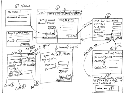
Our site wide flowchart was used to identify the individual pages and functional elements that were necessary for the testing. Our team then used Word to create wireframes that were technology and style independent beyond the click level and used rendered graphical mock-ups along with construction paper overlays to represent advanced GUI interaction with calendars. Our team also created initial dialog boxes, result messages, and terminology for the system to complete the end-to-end user experience of using the website.
The following describes key elements of our low-fi prototype and the development process:
|
Initial concept sketch during brainstorming
(See prototype1.gif - prototype7.gif in the appendices for the complete set of brainstorming designs)
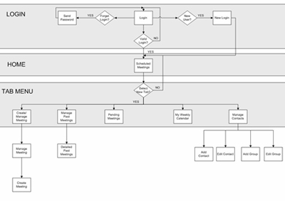
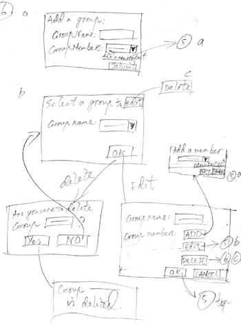
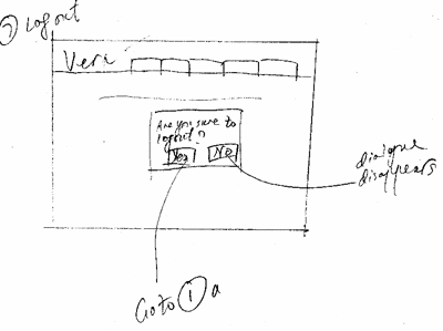
Consolidated Site Navigation/Flow
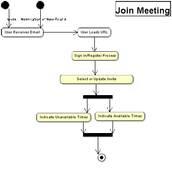
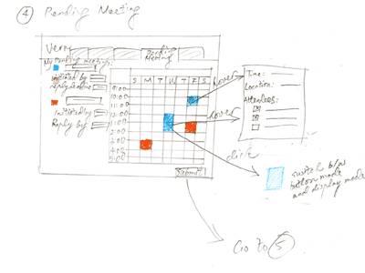
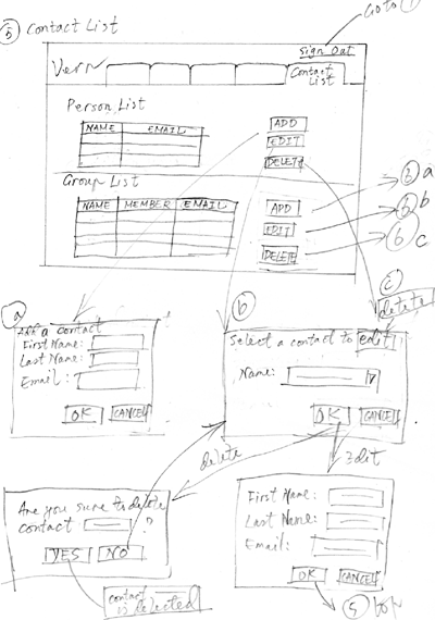
Detailed Interaction Flow
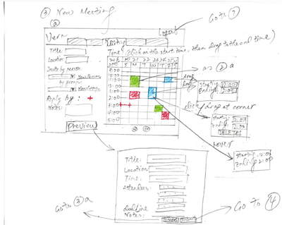
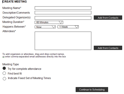
Example of Design Variant
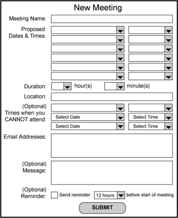
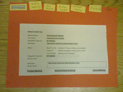
Live example of the 'Manage Meeting' Screen
Live example of the 'Hover Mouse' Design Feature
Live example of an 'Accept Meeting' design variant tested
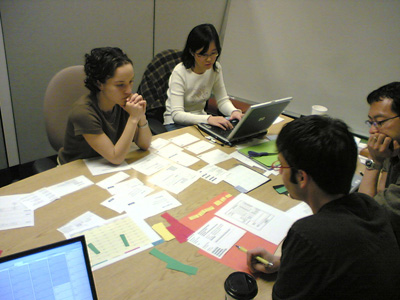
Our group performing the low-fi testing (With permission of the participant)
|
Method
Participants
We selected our participants based on the criterion that they should be representative of the intended users of our system. Three people at SIMS participated in our test. The first participant is a PdD student with a background in human-computer interaction, who represents the "power user" of our system. The second participant is a professor with a social science background, who represents the non-technical and more relaxed user. The third participant is a first-year Master’s student with no declared major concentration, who represents a user in the middle of the technical spectrum.
Procedure
Each usability test had three or more VERN group members playing a role in the test. One acted as the facilitator who gave instructions and prompted the participant for thoughts and opinions, one played the computer to simulate the responses to the participant’s actions and the other one or two worked as the observer and took notes on a laptop. Only the facilitator spoke during a test. The other experimenters remained silent and only joined in the discussion during the debriefing session, or if there was a significant opportunity for learning using a short in-depth discussion on a component that the user had just completed.
At the beginning of each test, the facilitator briefly introduced the system, gave the participants a consent form to fill out, and assured them that the test was confidential and that they could quit at any time. Then the participants were given the paper prototype and were asked to perform a series of tasks based on three user scenarios, placing themselves in a variety of roles. The directions for the tasks were read by the facilitator at the pace of the participants’ interaction with the prototype. The participants used their finger and a pen to indicate their actions, and thought aloud as they moved about the system. When the test was complete, the participants were asked about their overall impressions and any problems they found with the system.
Task ScenariosScenario #1:
You are professor at SIMS, and trying to work out your schedule for the upcoming week using VERN.
- Login to the system
- Check your calendar for this week
- Check your calendar for next week
- Look for any meetings you have schedule previously to see if the times can be pinned down
- If any of them can be pinned down, inform all the meeting attendees of the final meeting time
- Schedule a project meeting with your new Nobel Prize Project group
- Schedule a 1 hour kickoff meeting for this group.
- (optional) Create a group called Nobel Prize and add 3 members (Forrest Gump, Papa Smurf and Lil Kim)
- Make sure that your admin, Cookie Monster, has delegated authority to finalize the meeting
- Schedule a 1 hour kickoff meeting for this group.
Scenario #2:
You are a student in SIMS who has received an invitation in the email from a professor trying to schedule a kickoff meeting for their potentially Nobel Prize winning research project.
- Login to the system
- Look at the meeting invitation from your professor
- Respond to the professor's request for meeting times
- Put your class schedule into the "My Weekly Schedule" screen.
Scenario #3:
You are Cookie Monster, an admin for the SIMS department. Please perform the following tasks with Vern:
- Login to the system
- Look at the kickoff meeting for "Nobel Prize Winning Project" and pick a time that everyone seems to agree to. Then pin it down as as confirmed meeting
Test Measures
We looked for user responses and reactions to the primary design questions that we had developed. Some of these were more general usability questions and some were specific tasks that we designed for novice users who were not familiar with our system.
- How quickly did the user understood the visual, drag and drop interface? How much explanation (if any) was needed?
- Does the GUI drag and drop interface offer significant advantages over pull down menus and other more textual interfaces?
- How clear was our terminology?
- Did the tabbed menu make sense? Was it clear what the role of each tab was?
- Did the grouping of meetings by type make sense?
- Did users understand the difference between a meeting attendee, organizer, and delegated organizer? Did the user understand differences in functionality based on which role he was playing?
- What happened if there was an inability to schedule a meeting based on the original set of meeting times? Did the user agree with our suggestions on how to respond?
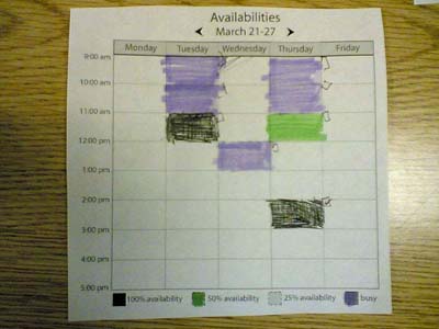
- How well did the user understand the red, yellow, and green representations of meeting time availability?
- Did the user understand the flow between links and pages?
- How long did it take the user to accomplish each task as it was dictated to them?
Results
Though some glitches in the interaction flow became apparent during LowFi Prototype Testing, for the most part, the users were able to find their way around the paper user interface for VERN. Some labels were confusing, but the users eventually found what they needed and figured out the various features of the application. At no time was a user completely lost and helpless. This confirmed to us that the navigational structure and functionalities we had developed are well-designed. However, our terminology and detailed screens need to be consolidated and clarified.
Summary of Test Observations:
- Test subjects were excited by the idea of a web-based meeting scheduling tool for SIMS
- Logging into system and setting up an account was easily done
- 'Next' and 'Previous Week' buttons on calendar view work well
- Title of 'My Weekly Calendar' was unclear; 'My Weekly Class Schedule' was more understandable as a set of repeating events
- Submit button in 'My Weekly Calendar' was confusing
- The select and drag interactive calendar was well-liked and easily mastered, though having a text input alternative is also preferred
- Different calendar views were confusing. Users almost universally preferred one consolidated view of availabilities, scheduled meetings, and meetings needing resolution
- The Furnas language problem: Pending Meetings versus Scheduled Meetings versus Manage/Create Meeting tended to confuse people. What's the difference and what info can you find where?
- The Pending Meetings tab confused all users
- The Contacts feature was well accepted, and having individual and group contacts on one page was preferred
- The 'Delegate' feature for delegating meeting schedule was also well-accepted, though its implementation was not entirely clear
- The traffic light colors for marking availabilities on calendar were easily understood
- Creating a meeting was easily done; responding to a meeting invite was less clear
Discussion
What did we learn from the low-fi evaluation?The results from the lo-fi evaluation appeared to reiterate lessons from the textbooks and class presentations:
- Users want to have a single, uniform interface. A single calendar view was the overwhelming favorite. The challenge is being able to represent all the necessary information in a visual form on a calendar view
- Click and drag was the interaction of choice. When presented with a calendar view, the initial action of the users was to attempt a click and drag operation. Popup menus were considered usable, but not preferred
- The Vocabulary Problem! In our internal group deliberations, there was a lot of debate around what to name menu items and selections. Many users commented on the labeling we used being unintuitive (for example, "submit" on submit buttons should be more descriptive of the action). For meeting times, a preferred labeling might be "preferred","possible" and "unavailable"
- Surprisingly, users wanted to be able to distinguish between individual contacts and group contacts (contrary to what we had read in Johnson's GUI Bloopers pg 262). Despite wanting to see individuals and groups made distinct, people did not want them on a separate page. The contact page was considered useful, but there is a preference for a very transparent GMail style interface (where names and aliases are learned automatically).
- Tasks that we had partitioned into different tabs on the interface could be made into direct interactions with a calendar view. For example, to create a new meeting, we required users to go to the New/Manage meeting tab, when they seemingly prefer being able to click on an empty time slot on the current calendar view and creating a meeting directly.
- Our method of displaying the list of upcoming/pending meetings was too cluttered and did not give enough information. It would be better to merge into a single list with some sort of status icon on each line that informs the user of the status of the meeting.
- Meeting attendees want to be able to see how many people have agreed upon the different times, they also want to know what times key/important/tenured attendees have made available
- Users like the idea of a "My Weekly Schedule" that contains their weekly recurring activities. Coming up with a uniform color scheme to identify various blocks is important
The changes will reflect the observations in the previous section:
- Focus on a click and drag calendar view as the main interaction for users
- Have a uniform color scheme to represent meetings, preferred times, possible times and unavailable times
- Display how many meeting respondents have agreed to each proposed meeting time
- Make it possible to view the suggested schedule of key meeting attendees
- Allow new meetings to be scheduled by clicking on the calendar instead of going to a separate tab
- Perhaps use "ghosting" or lighter shades of colors in order to represent background information (such as existing schedule) when users are to make selections
- Merge textual information into a single list (pending/need-voting/confirmed meetings, group/individual aliases) and use colors and/or icons to distinguish their states.
- Use preferred/possible/unavailable as the labels for selecting meeting times
- Label buttons and tabs more carefully and specifically
What the evaluation could not tell us?
The evaluation has its limitations.
- Our test population was only 3 people. While we hoped to select good representatives, the fact it is that we used small population and many forms of selection bias are probably at work. All observations may not be generalizable.
- We won't know how good our next answer to the vocabulary problems are until we try them out
- We only tested the web interface interaction and did not examine what would be useful content to include in the email notifications
Appendices
Consent Form for Lowfi Testing
Brainstorming Prototypes