
 |
Assignment Nine:
Link to our Final Prototype
Problem statement
Scheduling meeting times between many users is a tedious, inefficient process requiring numerous emails or phone calls. When one user has a conflict, the entire discussion must be regenerated, requiring each user to again assert his or her list of availabilities and conflicts. Among large groups of users, the number of iterations required can become unwieldy and irritating. Adding to the frustration, some invited attendees forget or neglect to respond to meeting requests in a timely manner. Additionally, every semester, professors must revisit the task of determining office hours while trying to incorporate personal and student schedules.
There is also the issue of existing calendaring programs, including Outlook, handheld PCs, annd others: SIMS has not and is unlikely to standardize on a common calendaring platform such as Outlook, nor is Berkeley likely to implement a centralized scheduling system. Moreover, when using scheduling programs, oftentimes inputting data is time-consuming and complicated by having too many options. Having to re-enter email information for people participating in a meeting can make the data tracking process even more tedious. Sometimes meetings are scheduled during holidays or during final exams because they are coordinated so far in advance. And when the results of possible meeting times are displayed, they tend to not be descriptive enough. Key information is misisng, such as people's names, the flexibility of time slots, and identification of people without whom a meeting cannot occur. Providing a streamlined web-based tool to automate the scheduling process would reduce the amount of effort and time required to organize a meeting, while providing an informative, easy-to-read display accessible to everyone in the SIMS community.
Solution Overview
VERN is a web-based meeting scheduling tool that automates and streamlines the time and labor intensive process of agreeing on meeting times. The objective of VERN is to reduce the amount of effort and time required to organize a meeting, while providing an informative, easy-to-read display accessible to everyone in the SIMS community. Our primary goal is to develop a tool that is simple, intuitive, and efficient enough to use that both non-technical and non-calendar users are compelled to use the system. The challenge in reaching this goal is to determine how users currently go through the process of scheduling, to improve on features offered by existing meeting scheduling systems, as well as to determine how the process can be improved to offer a better system. The core of the VERN solution is an intuitive graphical drag and drop display where the user can utilize the mouse to quickly select and manage meeting times. This core is supported by a well-designed site offering additional functionality and features.
Personas and Scenarios
Personas described in Assignment #2
Scenarios described in Assignment #3
Final Interface Design
Description of Functionality
Our third interactive prototype provides the following functionalities:
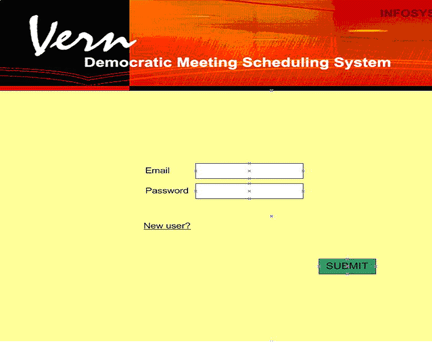
- Login/Logout: Existing users may log in by entering their registered emails and passwords. If they forget their passwords, they can request the passwords to be sent to them via email. New users need to register first before they can use VERN and are taken directly to the Meetings Page after registration. Logged in users may choose to log out of the system at any time.
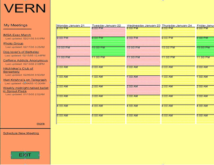
- View Meetings: Users can view a list of their weekly meetings by browsing along the sidebar of the Meetings Page. The meetings are grouped into the following three categories: awaiting your vote, waiting to be finalized, and confirmed. Meetings initiated by the users are marked with yellow stars. Currently, each meeting is listed with only its title. Optimally, it should also contain the time of the meeting.
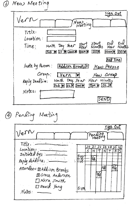
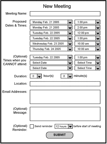
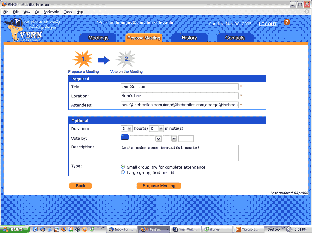
- Propose Meeting: Users can propose a new meeting by specifying the meeting’s title, location, and invitees. They may input additional information, such as the duration and voting deadline for the meeting. GMail style autocomplete is available to speed up the data entry process.
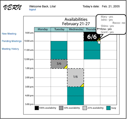
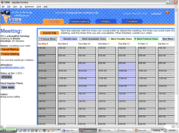
- Vote on Meeting: After a new meeting has been proposed, the initiator and invitees can vote on the appropriate meeting times by indicating their preferred, possible, and unavailable times on the scheduling applet. They can also specify their weekly class schedules on the applet to avoid having to repeatedly mark these schedules as unavailable times for future meetings.
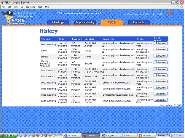
- Manage History: The History Page lists all the meetings that have been created before and allows users to reuse such past information to create new meetings.
- Manage Contacts: The Contacts Page enables users to create and edit individual contacts and groups.
- Help: Context aware help makes it possible for users to get assistance when and where it is needed quickly and easily.
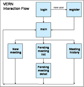
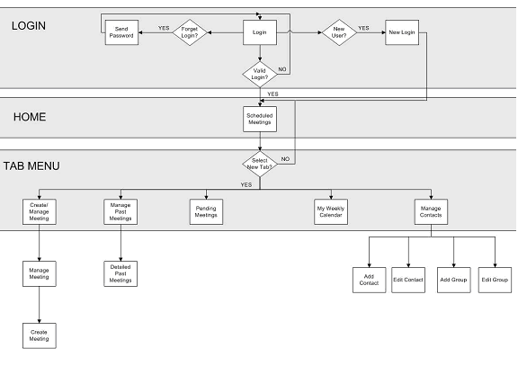
Main interaction flow
INITIATOR
- Create a new login
- Directed to My Meetings homepage
- Propose Meeting
- Fill out name, etc.
- Add new contacts or groups, if desired
- Vote for personal meeting selections
- If desired, view Meeting Details to verify that votes are submitted properly
- If desired, create meeting from history page
- If desired, create contacts and groups
- As administrator, finalize or cancel meeting
- Logout

ATTENDEE
- Receive email from initiator
- Link to meeting and vote
- Redirected back to My Meetings homepage
- Option to review meeting details
- Logout

What was left unimplemented?
We were able to incorporate most of the functionalities in our specification "wish list”. There are items that we would like to implement but were left out because we didn't have enough time to code the functionalities. The items not included in this prototype are:
- Finalize Meeting: When a meeting reaches its voting deadline, VERN should notify the initiator to finalize the meeting. The system should make recommendation about the preferred or possible meeting times based on the votes cast by all participants. The initiator can decide to finalize, cancel, or extend the voting deadline for a meeting at any time.
- Interactive Weekly Calendar: The calendar in the Meetings Page was designed to provide users with a graphical view of their weekly meeting schedules. The current calendar displays a different background color for elapsed time and allows users to move from week to week. But it does not display any meeting information and does not produce any meeting hovering effect.
- Propose Meetings in Contacts Page: One of our testers in the Pilot Study mentioned that he would like to be able to create a meeting when adding individual contacts and groups in the Contacts Page. This would save users from having to reenter information for invitees in the Propose Meeting Page.
- Search for Meeting: Some users expressed a desire for the ability to search for meetings in VERN. The search function would be particularly useful in the History Page where there may be a very long list of past meetings for users to go through.
Tools used to develop the system
The VERN system was developed with a wide range of technical and user interface specific tools. The graphics were developed with Photoshop and Illustrator, and were positioned with a variety of tools including DreamWeaver and direct text editing. The site was then dynamically enabled through using PHP, tied into a mySQL back-end. As development progressed, the team attempted to isolate the interaction with the database into a single PHP file to minimize efforts when changing the UI. Of these tools, the PHP and mySQL environment was provided by SIMS IT. The mySQL environment was of an older version, which led to minor hiccups but no significant development hurdles. Some members of the team chose to develop locally using the Xampp Apache bundle (www.apachefriends.org/en/xampp.html), which contained a pull-string windows platform configuration of apache, PHP, and mySQL. DBDesigner4 was used to design the underlying data model. The applet interface was developed and debugged using Eclipse. Throughout the site JavaScript was used to enhance the UI, as well as tie the voting applet into the DB backend.
Tools used for prototyping and implementing the UI
Other tools used in the development of the prototype had varying levels of success. Our paper prototype worked wonderfully for our purposes, the ability for users to scribble directly on the paper when marking up times confirmed that users have an intuitive feel for marking out blocks of time on a calendar. However, the paper prototype did make it harder to spot "gaps" in our interaction flow, something that we found out during initial user testing when people clicked somewhere unexpected and we were missing a confirmation screen. We attempted to use Denim, and while the multi-level view of the site would have been useful, but for whatever reason didn't run fast enough on the computer being used to be usable. We believe it is also geared towards a 100% tablet interface, something that the designers were not used to.
Pros and cons of these tools for your project
- Graphic Design: The tools used for graphic design are industry standard. While at times we had to rely on Lilia if there was a minor change to a button wording, overall, having a central point of contact for graphic consistency was highly beneficial for site consistency. We had minor problems with sharing the raw format files of the buttons due to inconsistent versions of Adobe products, but nothing major.
- Applet Development: Eclipse was an excellent environment for applet design, helping with the debugging and continuous refactoring process.
- Web Development : Web design was a difficult process, combining dynamic enabled pages with the auto-generated code produced by
DreamWeaver. Our team had the most success designing static pages through DreamWeaver to help with the layout and rapid prototyping, then adding dynamic elements manually.
- Version Control: CVS proved to be the largest hurdle for our team to manage. There were continual issues with merge conflicts, CVS hiding errors from the user, issues when moving between different platforms, and some users having difficulties getting the version control running smoothly. What our team needed was a basic version control system, something that provided change management without advanced options and without the option to delve into the wrong section of the file system in an attempt to get it working.
Enabling Dynamic Content PHP/mySQL/JavaScript
PHP proved to be an excellent cross platform environment, and was very usable by our team members. The similarity to Java proved to be beneficial, as well as the simplicity of writing loops and switch statements. We successfully consolidated the mySQL access into a single file, leaving a series of API calls for the rest of the site to use. There were difficulties with consistency in the code, and once our team started using the PHP “Define” constructs to standardize references to information, we were able to significantly cut down on bugs and miscommunications.
Design Evolution
Changes from initial sketches, low-fi testing, HE, and final usability test
The user interface experienced a gradual evolution from our initial sketches, to low-fi testing, to heuristic evaluation, and to the final usability test:
Initial Sketches
There were three major design paths that we wanted to explore. They share many things in common:
- Oriented around a grid based calendar view
- All are heavily visual and color oriented
- None assume interaction with external calendar, but do use email in order to notify users
- All use a voting based system, similar to eD and will inform users of the current status of the meetings
- All support displaying how many respondents have replied to the meeting request, to give an idea of how close the meeting is to being finalized.
- Distinguished by the complexity of their user interface: Java applet, tabbed html/javascript interface, non-tabbed html/javascript interface
- Java applet allows users the ability to use the mouse to drag over a calendar area in order to select meeting times
- Two other designs share the same interaction flow, but implement the user interface differently via tabbed and non-tabbed interfaces
- The tabbed interface is somewhat similar to the existing eD design. The tabs allow users to move from task to task very directly.
- The non-tabbed interface is lightweight and straightforward. It doesn't depend on Java, and the lack of tabs simplifies the design. This interface, if kept simple enough, may even be usable on a web-enabled PDA.
- Java Applet Oriented Graphical Interface
- User Process Flowchart

- Login
- New User

- Calendar Display

- Select Meeting Time Display
- User Process Flowchart
- Tabbed HTML/Javascript Interface
- Flowchart for Tabbed and Non-Tabbed
- Screen Sketches

- Flowchart for Tabbed and Non-Tabbed
- Non-tabbed HTML/Javascript interface
- Calendar Display
- New Meeting Screen
- Pending Meetings List

- Calendar Display
Low-Fi Version
Our team built a Lego-style" low-fi prototype for testing. Navigation and interaction elements were constructed out of colored paper and assembled live in front of the user. This approach of separating out design components allowed us increased flexibility in testing different navigation, naming, and interaction possibilities.
- Initial concept sketch during brainstorming
- Consolidated Site Navigation/Flow
- Detailed Interaction Flow

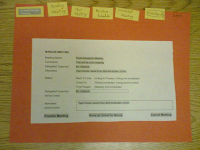
- Live example of the 'Manage Meeting' Screen
Our low-fi prototype in progress, showing the Lego-style" components being assembled live in front of the user.
- Live example of the 'Hover Mouse' Design Feature
This shows one of our more successful design methods: the pop-up with information details around a meeting time. Also visible is the calendar interface which combines a week view with color paper overlays that indicate time preferences marked by the user.

- Live example of an 'Accept Meeting' design variant tested
This represents one of our "consumable" interfaces where we encouraged the users to draw directly on the page, simulating how the system would react to user's mouse movements.
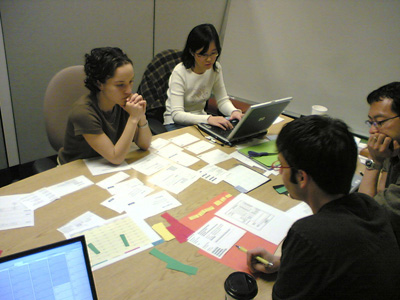
- Our group performing the low-fi testing
(With permission of the participant.)
Heuristic Evaluation
- Changes from low-fi
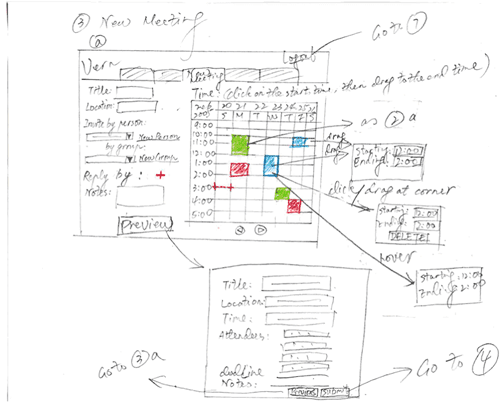
- Click and drag to create meeting
- Have a uniform color scheme to represent meetings, preferred times, possible times and unavailable times
- Display how many meeting respondents have agreed to each proposed meeting time
- Combination of calendars
- admin buttons disappear for non-admin users
- Merge textual information into a single list (pending/need-voting/confirmed meetings, group/individual aliases) and use colors and/or icons to distinguish their states
- Use preferred/possible/unavailable as the labels for selecting meeting times
- Lo-fi
- had different calendars
- had more tabs, including pending
- displayed the list of upcoming/pending meetings in a cluttered manner and did not give enough information.
- Unclear terminology
- Prototype
- More meeting management functionality on one page
- Implements "administrative" privileges
- Consolidates numerous tabs into three major categories with sub-functions within each one
- Merges upcoming/pending meetings into a single list with a status icon on each line
- When voting on a meeting, Meeting Details displays how many people have agreed upon the different times, and what times key/important/tenured attendees have made available
- New meetings can be scheduled by clicking on the main calendar instead of going to a separate tab
- Merges textual information into a single list (pending/need-voting/confirmed meetings, group/individual aliases) and uses colors and/or icons to distinguish their states
- Did away with "pending meetings" and changed terminology to "voted", "to be voted" and "finalized"
Final Usability
Feedback from the Heuristic Evaluation was implemented into the final usability iteration of VERN.
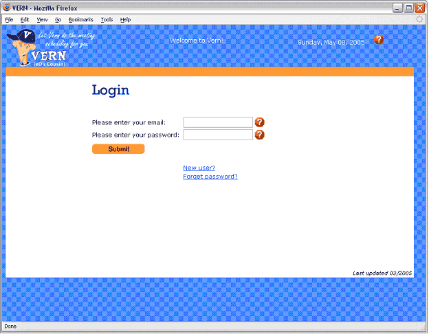
Log-In
Help icons aid the user in logging-in. When a new user registers, they are taken directly to the landing page instead of having to log in to enter, as before. (Our testers really hated it.)
Landing Page/Meetings Calendar
This page used to feature lots of icons defining the different meeting statuses. That was was stripped down to just icons defining the initiator. Meeting statuses were separated into three categories for clearer readability.

Propose a Meeting
The tab for this section was changed from "Create Meeting" to "Propose Meeting".
Also, a starburst icon displays that proposing a meeting is the first of a two-step process for setting up a meeting time. Lastly, the input fields were separated into two areas clearly marked as 'required' and 'optional'.
Voting on Meeting Time Preferences
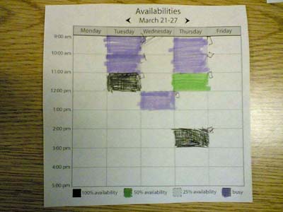
Time slots are now by default unavailable. The user specifies available and preferred time by 'painting' the time slots with the corresponding color.
Voting Confirmation Page
This is a new screen that informs the user that their vote has been received.

Meeting History Page
Meetings now appear in the History section as soon as the user is invited to one. The initiator icon has been added for easy identification, and a 'Schedule' button has been implemented for easy recycling of the meeting data.
Contacts Page
The functionality for creating Groups from individual Contacts was added along with buttons to edit individual contacts.

Major Changes and Why They Were Made
- Consolidation of major sections/tabs
- Began with 5 sections: Meetings, New Meeting, Pending Meetings, Confirmed Meetings, History, Contacts
- Evolved into 3 sections: Meetings, History, Contacts
- Ended up with 4 sections: Meetings, Propose Meeting, History, Contacts
- Change in terminology
- New Meeting --> Create Meeting --> Propose Meeting
- Pending Meetings --> Awaiting Your Vote, Awaiting Your Decision
- Meeting Details
- At first, displayed in a separate screen
- Then, displayed in the left navigation area under meeting statuses
- Finally, displayed in the same screen as when voting on a meeting
- Process for voting on a meeting
- Is now clearly a two-step process; icons guide the user
- Required and optional input information is separated into two clearly labeled dialog boxes
- A confirmation page communicates to the user that their vote has been accepted
- Visual presentation is now more consistent
- Implemented the use of orange buttons throughout the site instead of having some orange and some gray
- Action buttons are now positioned in more intuitive locations. E.g., "Submit Vote" button is to the left of instructions.
- Voting page calendar is uniformly gray to show all times as unavailable by default, until the user marks the time slots otherwise
- History section features the icon denoting "initiator" status for meeting where the user was the initiator
- Contacts section features more functionality
- Groups can be created from individual contacts
- A meeting can be proposed from the Contacts page
- Vern saves contact information for people invited to a meeting from the Propose Meeting section
The relative values of Lo-Fi Prototyping, Heuristic Evaluation and Pilot Usability Testing
Comparing the three evaluation techniques can be metaphorically related to Goldilock's experience in the home of the three bears:
- Lo Fi Prototyping - "This one is too soft!"
- Pilot Usability Testing - "This one is too hard!"
- Heuristic Evaluation - "This one is just right!"
What do we mean by "too soft" and "too hard"? We don't mean that they produce results which take more or less effort (Heuristic Evaluation generated a lot of work for our team). In fact, all three approaches were valuable, providing feedback at different phases of the UI design - but HE seemed to occupy the sweet spot. By discussing our experiences with the different approaches, the meaning of "too soft" and "too hard" should become more clear.
Low Fidelity Prototyping
Our Lo Fi prototype was an extremely valuable way of testing out different UI design options. The flexibility of the paper based approach allowed us to try out many options with very little effort. At the same time, because the user interface was such "low fidelity", we were only able to evaluate user interface issues at a coarse and fairly qualitative manner. For example, the very quantitative measures of timing, error rates and related metrics that Pilot Usability addresses were entirely impossible to perform using paper cutouts and the Wizard of Oz interface simulation. Compared to usability testing, Lo Fi is very soft (in the sense of soft == qualitative).
Heuristic Evaluation is also highly qualitative, but compared to Lo Fi, the feedback from the HE were far more complete and concrete. This is in large measure due to testing against a more fully realized interface. Because the Lo Fi interface is very coarse, it is only reasonable to expect coarse feedback. As an example, from Lo Fi we discovered that users preferred the click and drag interface for selecting times over a menu popup based approach. However, from HE we discovered details about users's expectations of how click and drag operates, the importance of color selection as well as broader navigational issues that arise when there is a "live" interface that responds in real-time to a user's actions. The level of detail possible when an actual interface is being evaluated cannot be reasonably simulated with paper cutovers and human UI puppetmaster.
It could also be argued that many, if not all, of the insights derived from Lo Fi testing could have been achieved with HE as well. The big selling point of Lo Fi is the low cost to examine this different options. Lo Fi wins in terms of cost/benefit, but in terms of absolute benefits, it cannot compare to HE.
Pilot Usability Study
The pilot usability study was in many respects similar to heuristic evaluation because it was informal and as a consequence, very qualitative. Our hypothetical formal experiment would have been far more quantitative and rigorous and would have many more metrics. Despite its informality, the usability study produced an amazing amount of useful feedback, but most of it was in terms of qualitative feedback on the interface. The formal metrics we measured did not give us the kind of insight into the interface that the open ended discussions provided.
As we discussed in the previous assignment, the Pilot Usability Study was effectively an informal HE and the most valuable insights we derived from the exercise were similar to the results from a heuristic evaluation. A formal Usability Study has potential for more rigorous results, but rigorous answers almost always require very specific and narrowly constrained questions. To perform a proper usability study, you need to properly setup the experiment, conduct it properly and then invest significant time processing the results. It is at the opposite end of the "cost" spectrum from Lo Fi prototyping.
Given the expense, the quantitative results of a usability study usually only answer a relatively small number of formal hypotheses. The verbalization of a user's experience is very qualitative, and more free ranging - and in our experience, yielding more valuable design feedback. This brings us back towards a Heuristic Evaluation style approach.
This is based on our own experience - which is probably not typical for groups conducting usability studies in the field. Our user population is extremely cognizant of user interface issues, and capable of articulating very specific and insightful criticisms of the user interface. But once again, this points to the value of a heuristic evaluation approach.
Usability testing seems very rigorous, but by virtue of it's rigor, it takes a lot of effort and only formally addresses very specific hypotheses. Compared to the results from heuristic evaluation, it seems "too hard". This is not to say we did not gather invaluable insights from the usability test - but the best results were often the consequence of ad hoc HE, and not from hypothesis testing or quantitative metrics.
Heuristic Evaluation
It should come as no surprise that having user interface experts evaluate your interface is the most efficient method to get feedback. The course readings indicated that HE was the most cost effective, and generated the most feedback among several usability tests. Lo Fi was not among the methods tested in the paper). Our own experience supported these findings: the SIMS Alumni Network group identied several dozen UI issues, resulting a reworking of the Vern interface that substantially improved the design.
In the followup Pilot Usability study, we received amazingly useful feedback from one of our testers who was a SIMS student that also had experience in web development.
What this points to is the value of expert feedback, especially against a fairly concrete UI design. The user interface for Lo Fi included a large amount of hand-waving, making it hard to get fine grained UI feedback. The hard, rigorous approach of usability testing is useful when expert feedback is not available, bit it is expensive and narrowly focused.
Heuristic evaluation is the best because it relies on access to high quality information (expert feedback). Because we had ready access to such high quality information, HE was the most effective method. Under other circumstances, it may be more difficult to get expert feedback, but for our circumstances heuristic evaluation was Just right compared to the Too soft of Lo Fi and the Too Hard of a formal usabilty study.
Class Presentation
Final Presentation given on Tuesday, May 3.