|
 |
| Introduction |
The Collaboration Repository is a database
of research documents, field project information, and contributor
information for the area of 'IT and Development.' It will
allow users to annotate text on the site, comment on projects
and documents, search the repository, and provide access other
users to build up a network of contacts. Some of the major
user groups are individuals from academia, research, non-profits,
and government who are working in some area of IT and Development.
The repository will have an open structure, encouraging users
towards open exchange of ideas and opinions.
The purpose of our experiment was to test the layout and
overall intuitiveness of the search page and the edit project/document
page, displaying the annotations, and navigating within the
annotation window. Specifically for the annotations, we wanted
to see how users would want to view the annotations (by thread,
separately, etc), which button labels were confusing, and
whether the user wanted a pop-up window or a frame to hold
the annotations. We also had users perform a card sorting
task to see how they would categorize projects and documents.
|
| Prototype |
We created four main screens to walk users
through the tasks we prepared. There was a search form screen,
the search results screen, an annotation/document view screen,
and an edit document screen,
which all had the same top-level navigation bar.
Our search form consisted primarily of checkboxes and text
fields, some of which responded to user input immediately
(for example, selection of an Area such as 'North America'
opened a list of countries in 'North America' to search).
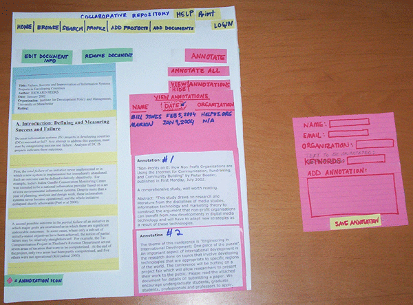
The annotation/document view screen showed how the documents
and annotations would appear in different frames of the same
browser: one on the right, the other on the left, respectively.
We used red index cards to represent annotation-related functions
or windows, and green index cards for documents. We also used
small pieces of colored paper within the document to denote
an annotation icon. Users could click on the icon and view
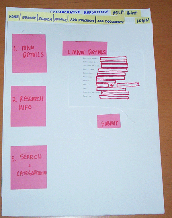
all the annotations associated with it. Finally, the edit
document screen was a simple form containing three main sections
of data to fill out. Users clicked on one of three large navigation
buttons to get to each section of the metadata (such as author,
date), research information (such as participants) and search
and categorization to allow users to enter keywords and categories
to classify their document.
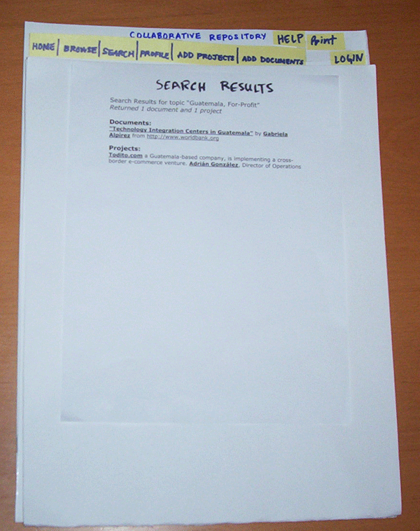
Search Results Screen

view larger
Edit/Add Document Screen
view larger
Search Projects Screen
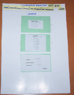
view larger
View Document/Annotations Screen

view larger
|
| Method |
| Participants |
We interviewed three potential users of our
system: a 30-year-old doctoral student studying technology
in developing countries, a 27-year-old computer science student
who is also interested in the same subject, and a 42-year-old
professor of social science. All three had varying degrees
of technological skill, ranging from novice to expert, and
could gain benefits from posting their documents online and
having others annotate them as a form of peer review. Each
participant had different needs and interests and that allowed
us to take into account the details of how he/she would interact
with the system. The computer science student was very knowledgeable
of our system beforehand, while the other two participants
were new to the idea.
|
| Task Scenarios |
- Task: Search for all documents about
for-profit organizations in Guatemala and select what you
might think is most relevant. Please start from the homepage
and determine what sequence of choices will allow you to
accomplish this goal.
What we looked for:
- Find out how intuitive the search interface is for
the user
- Does it meet all the needs of the user?
- How can it be modified to better narrow a search?
- Task: View several annotations in the
document you found in Task #1. Please speak out loud about
your thinking process and items on the page you may find
confusing.
What we looked for:
- We want to see the ease with which the user can find
a specific annotation within a document.
- Can the user understand how to navigate through the
list of annotations made about a specific part of a
document?
- Task: Now we want you to add your own
annotation to this document. Find a piece of information
you think is particularly notable and annotate it.
What we looked for:
- Understand how difficult the user finds the annotation
process.
- How renaming buttons or shifting things around might
help.
- Task: Assume you have already added
your own project to the Collaboration Repository. Please
find your project within the system and edit some information
about your project. The following information must be changed:
url, funding sponsor. In addition ensure that your project
will also be categorized under “Morocco.”
What we looked for:
- This is a larger task. There are many sub-tasks and
we observed how the user navigated to other parts of
the system when not starting at the homepage.
- How to display a large amount of information that
the user will need to edit through a form.
|
| Procedure |
| Five interviewers were present for two of the
tests, and four interviewers for the third test. We rotated
roles as computer, interviewer, and recorder (we usually had
three recorders to get multiple perspectives of our observations).
The interviewer presented a description of our system, our tasks,
a consent form, and our questions to the participant. Meanwhile,
the person acting as the computer moved parts of the prototype
around as the user navigated through the site. Recorders wrote
notes; observing how long it took participants to perform tasks,
what they said, how they did it, and any other relevant information.
At the end of the session, the interviewer asked for any suggestions
on the prototype, and expressed appreciation and positive feedback
to the participant. |
| Test Measures |
We measured the user’s ability to intuitively
understand our icons and layout, ease of performing tasks,
mapping of action to result, additional comments/improvements,
and interaction flow. We noted how long it took users to
complete tasks and move from one screen to another, as well
as their reactions to different parts of the prototype. These
measures will allow us to see how quickly users navigate
the system
and learn to use the system, and if certain parts are hard
to understand.
These measures were chosen to cover many aspects of our
interface. We wanted to have a way to assess our users on
their ability to recognize some of our layout
and navigation choices. We wanted to select a broad array
of measures to analyze different aspects
of our site, and taking full advantage of our evaluator's
limited time. |
| Results |
In our interviews for the information usability
study, we made the following observations that were useful
in evaluating what changes to the UI will be required:
- The "Annotate All" button did not make sense
to any of the users. Our intention was to provide a way
for users to make an annotation that applies to the entire
document rather than particular phrases within the document.
After discussing alternatives with the interview subjects,
we determined that a button labeled "Comment on entire
document" along side the “Annotate” button
would more effectively communicate our intent.
- The "Profile" menu item did not make sense to
any of the users. The Profile page contains all information
about the users logged into the system, including links
to all documents, projects, and annotations they have entered
into the system. We determined that changing this item to
“My Profile” would make this clear.
- Popups vs Frames: All users expressed preference for annotations
associated with the document they were reading to be displayed
in a separate pop-up window rather than a frame side-by-side
with the document. One user expressed a strong desire that
his workspace should not be disrupted, resized or obscured
in any way by the UI, but felt that a single pop-up window
was acceptable because he can easily move it out of the
way or minimize it.
- Logging in: Users expressed differing views of requiring
users to be logged in before they are allowed to annotate
documents. One view is that logging in will help ensure
that those adding annotations will feel like they are a
member of a community, which will help promote better quality
information sharing. Another view was that the ability for
anyone to add comments freely would help encourage wider
participation in sharing of ideas and opinions on the site.
- Printing and saving documents: All users wanted to be
able to print documents and/or save the document to the
PC due to a strong dislike of reading lengthy texts on the
PC screen. This presents a significant challenge that we
need to address in our UI because the annotation process
will require the user to view the text online in order to
locate specific phrases to annotate.
- Search categories: All users had some trouble with categories
we used to narrow document searches. For example, most were
unclear about where to locate “for-profit” documents,
which we classified under “sector.” One option
we are considering is to add several examples in the UI
next to any unclear categories. For example, we might list
“sector” as “Sector (for-profit, government,
etc).”
- Projects vs. Research Documents: Users expressed differing
views on classification of projects vs. research document.
Our initial approach was to integrate the two types of documents
in browse and search results. But two users felt that projects
(i.e. descriptions of field projects) are sufficiently different
from research papers, that they should be kept in separate
sections of the site.
|
| Discussion |
Overview: Overall, there
was a bit of skepticism on the participant's part about other
systems and how our system
was different. We explained that our system would be created
specifically for people working in IT and Development,
and would allow
them to annotate, comment, rate, and collaborate on documents.
The participants liked this idea because they wanted to
know what others in their field thought about their work.
They also expressed interest in having a
rating system to help them
find quality documents.
Entering Documents: Participants
wanted to be able to enter information in one large form,
with internal hyperlinks to different sections of the form
for quick editing. We divided the form into two sections:
Main Details, which would have the most important metadata
for the document/project, and Research Information, which
would contain the rest of the details. We had a separate
section for entering keywords and categorization, but participants
felt they would not be motivated to enter a separate section,
and this section is important enough to be at the beginning of the Main Details section.
They told us the metadata (keywords, categories,
description, etc.) provided the most important information
for users who would want to search the system. The system
should allow a minimal set of standard, required metadata
to describe documents or projects. For example, upon creating a
project, the project creator would select keywords
and categories that describe the project. We used card
sorting to discover
what categories were considered important and how they were
related. This will allow us to understand how our system
can represent document/project information such that it has
a natural associations in the users' minds.
Card Sorting: We realized
that many topics overlap into other categories, and thus
may require multiple representation in
the system.
One participant suggested organizing certain topics under
three overarching categories, and listing the same
topics
under each category. Another participant felt that some topics
were important enough to have their own category. Overall,
many categories and topics were associated with each other
in a similar manner, so the repository can use those categories
in the 'Browse' area.
See card sort.
Navigation:
All participants wanted a "My Profile" link in the
navigation bar that would allow them
to view, edit, and delete their personal profile, documents,
projects, and their annotations. This would also allow them
to control how much of their information is displayed, since
privacy was a big concern in the experiments.
All participants
wanted the annotation input window next to the place
they were annotating, so they would be able to associate their input with the text.
Pop-up windows seemed to be the best solution, since they
are resizable and easy to move around. To achieve a critical
mass of users, the system should not initially require
login in order to annotate. However, the incentives
to logging in are that the user would have more features.
It may be more intuitive to have a search screen grouped by
some main search sections. Possible search
section
headers would be Summary Details, Keywords, and Research
Information, where none of the fields would be required
to search. Internal hyperlinks would then allow the user
to jump to whichever section he wanted to search, just as
with the enter document
information page (mentioned earlier).
|
| Changes to the Interface |
- Icon labels will be changed to use noun-verb phrases such
as 'Comment Here' and 'Review Document' so users have a clearer
idea of what they are doing.
- Provide pop up window for annotation
- Redesign annotate input box (users will be able to see
text they are annotating in box)
- Redesign search page (see above)
- Redesign edit project/document page (see above)
- Various means of printing the document (PDF, Printable
view, text only, etc.)
- Separate search for documents and for projects
- Users found the search screen not to be intuitive, so
we may add small explanations under certain labels (explaining 'Sector'
for example) or question marks that will provide help on
mouse over.
|
| What We Could Not Learn |
Interaction with:
- Browse Categories section
- Login/My Profile section
- Searching for other users or organizations
|
|