Numbered according to Road Sage's heuristic
evaluation.
1. [H1 Simple and Natural Dialog] (Severity 3)
In Mozilla 1.4, the font on the yellow tabs is too small, plus the yellow barely stands out against the orange background.
FIX: The font size was made larger, and the font color was made brighter so that it provides more of a contrast against the navigation bar.
5. [H1 Simple and Natural Dialog] (Severity: 3)
Don't make the user go through the disclaimer page for each added document. The disclaimer will get very tedious when adding multiple documents. This should only appear once, either when the user registers, or the first time the user adds a document.
FIX:
The user will only now see the disclaimer/privacy page upon registering with the system.
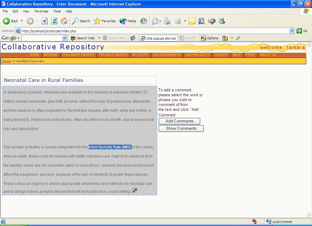
6. [H1 Simple and Natural Dialog] (Severity: 3)
In the Add Comment dialog, it's not clear what the term Text to Comment means, and users probably wouldn't know to select text using the cursor before clicking Add Comment. One way to clarify the latter might be to display instructions in the dialog box, suggesting select the text you wish to add a comment to.
FIX:
Added instructions on how to add a comment "To add a comment, please select the word or phrase you wish to comment of from the text and click 'Add Comment.'" And we added an error message if the user tries to add a comment without first selecting some text. We also implemented the javascript that actually allows the user to select text and have it appear in the "Add Comment" dialog box select text, click Add Comments, and the Add Comments dialog box will display the text you selected in the "Text to Comment" field.
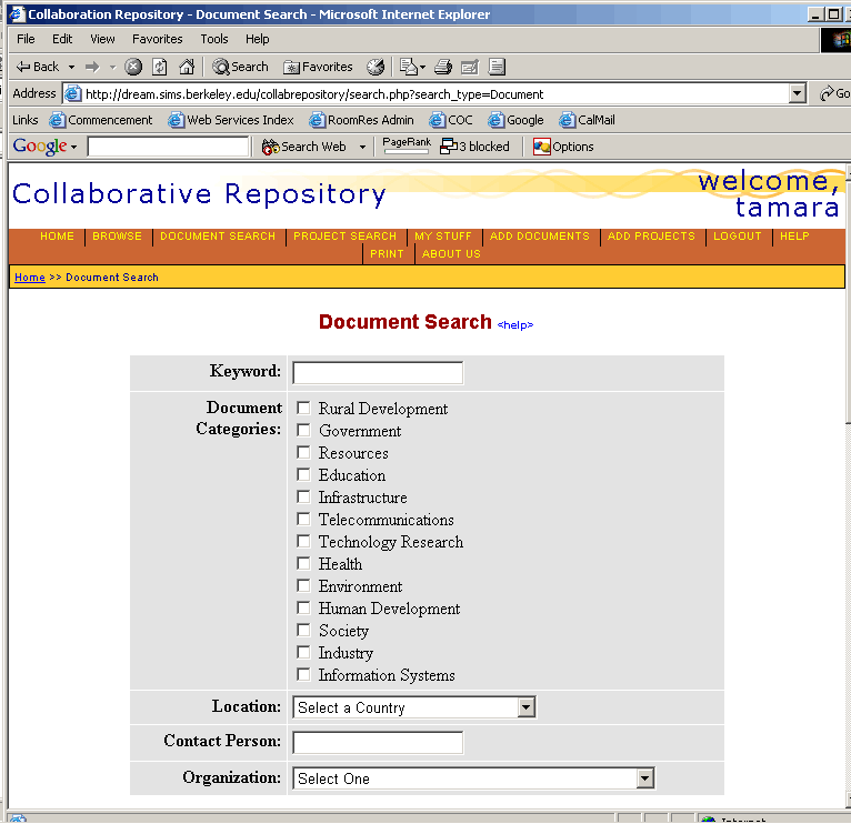
9. [H2 Speak the Users' Language] (Severity 1)
On the Enter Documents form: This may not be a problem if, within this domain of users, the terminology is clear but the meanings of the phrases Research Information and Main Details are not clear, and it's not clear why they aren't in the inverse order, because the term Main Details sounds to us like it's more important than the other term.
FIX: The term "Main Details" was changed to "General Details." We also added help pop-up bubbles for each entry field, which explains the kind of data that should go in that field.
10. [H2 Speak the Users' Language] (Severity 2)
The term url used on the Search Results page might cause some confusion among users, especially those who are not very familiar and comfortable with the Internet. The difference between the url and title is unclear, especially since both seem to be links. Perhaps project Web site or something along those lines would more clearly describe the url column, and perhaps commented document text for the title column might help? (We're not 100 percent sure what these terms mean). At least provide a little help question-mark link next to those titles that pops up an explanation of the given column when clicked. (NOTE: Title and Url also appear on the documententry.php page, the same ambiguity applies there.)
FIX: To address the ambiguity of "url," we got rid of that column on the search results page. As for "title," this was changed to "Project Name" or "Document Name". No help was provided as to what the "Project Name" refers to since there are instructions on the page telling the user to click on the Project Name to view its details. The search results page is only meant to provide an overview of the projects or documents matching the user's search criteria.
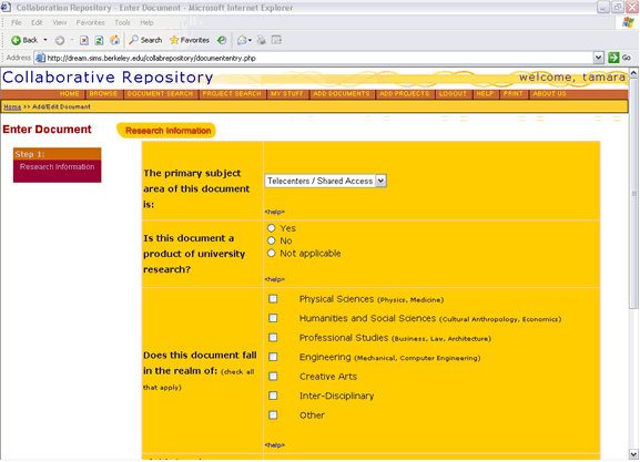
14. [H4 Consistency] (Severity 2)
On the Document Entry form: under main details, why does sample data only fill three of the fields? Does this mean these fields are mandatory? Does it mean nothing? Consider having all fields either contain sample data or contain no data to maintain consistency and avoid making users wonder whether they're missing or overlooking something here.
FIX: The three fields that had sample data are required fields. We made this explicit by putting red asterisks next to these fields.
16. [H8 Precise and constructive error messages] (Severity: 3)
On Search Projects form, clicking the Categories/Activity box makes the system print out a complicated QUERY ERROR message, with little help for what went wrong. Suggested fix: Write some more helpful error message to lead the user to fix the problem.
FIX: This error only shows up when there is an error in the MySQL query statement and it indicates a problem with the search function. It is not something that the user can fix. The error message was modified to tell the user to inform the site administrator of the problem.
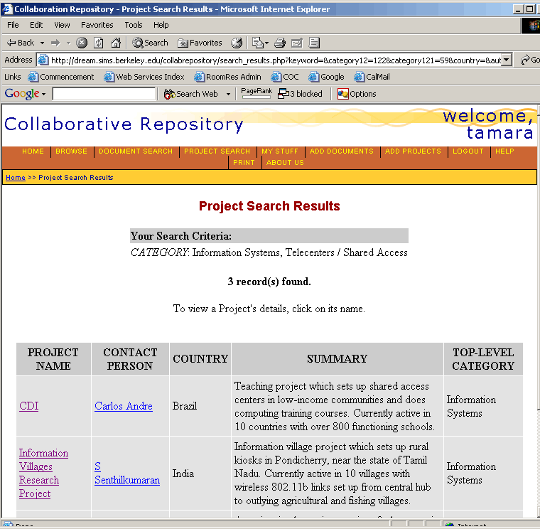
17. [H8 Precise and constructive error messages] (Severity 1)
When no search results are returned, the interface just says "0 records found" on a blank screen. It should provide a brief explanation on how the user can obtain results, plus return the search form.
FIX: Modified so that if there are 0 records returned, it tells the user to submit an empty search form to see all available records in the system. The search form is also displayed so the user can quickly search again without going back to the previous page.
18. [H9 Prevent Errors] (Severity 3)
On the Document Entry page: There's a lot of information that a user might spend a long time entering to this page, and if the window is accidentally closed or refreshed, if power or the connection is lost, etc., a lot of work can be lost because it's not saved more often. Consider placing the two input-form sections now found on Document Entry onto separate pages.
Breaking Web input into smaller steps and saving each step along the way minimizes data loss. This might be especially important for users who are accessing the system from unreliable connections in the field. In later versions, for extra protection you might propose a client-side document template or even a separate client application that lets users enter and save the data locally, then later upload the information when they're connected.
FIX:
The document entry page was broken up into two pages: one page with the metadata and category information, and the other with document general details. If the user has an unreliable connection, she will not lose much information, or she can wait until the connection is better and then continue entering information.
19. [H10 Help and documentation] (Severity 2)
The Project Search page should include some explanation of what is being searched, and how to use the search tool, in addition to displaying the search form.
FIX: Included help text on how to use the search form and what each search field means. Located at the bottom of the search form.
|

