| 
|
|
 |
| Comparative Analysis: The
Digital Dividend Project ClearingHouse |
This tool was created by the World Resources
Institute for putting together a database on IT and Development
projects. The project is supported by Microsoft and by Infodev,
an initiative of the World Bank. In addition to their online
database, Digital Dividends has a downloadable application,
an interactive application called 'Project Finder' which has
all the information currently available online, but through
a more graphics intensive, GIS-mapped interface.
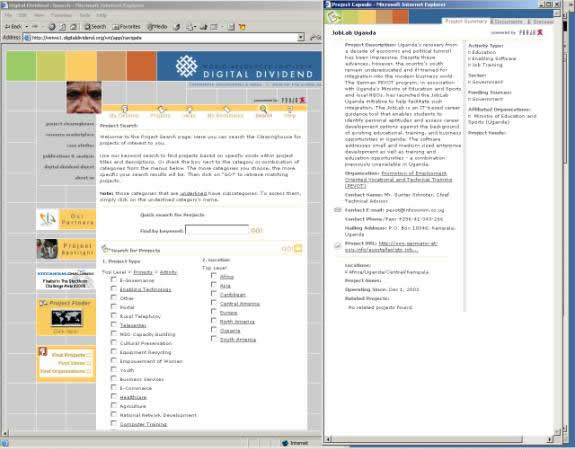
#1 Digital Dividend ProjectClearinghouse Screen and Output

Strengths:
- Large existing database of projects
- The project is backed by very prominent industry entities,
sponsors
- Interactive menu, perceptive understanding of the IT
and Development field, reflected in categorization
- Thoughtful display of projects - designers allowed for
user space to add information on existing projects
- Allows users to browse external documents and discuss
a project online through chat
- There is an interface to add new projects, but it needs
registration by user first
- Categories well arranged, but medium learning curve.
Not instantly intuitive what is the process for selecting
projects
- Comprehensive basic information on projects (Basic summaries,
Complete contact information)
- Good use of regional classification of projects
Weaknesses:
- Very untidy front page, not clear what the goal of the
site is
- No clear explanation to user that there is a searchable
database
- Front page link to projects is obscured behind other
information
- Non-intuitive front page links such as "ideas", "resource
clearinghouse" "project marketplace" which each need a user
to click into for an idea of what they include
- Consistent waste of space throughout the site - most
pages need scrolling
- Advertisements take up too much space on the page
- Very poor classification of projects, despite good categories
- many relevant projects do not show up in appropriate categories
- Slow and graphics-heavy interface
- Redundant features on front page, tries to be a portal,
but could do perfectly well as a database (e.g. Case Studies,
an internally linked resource is also posted on the front
page of the site - also three different links lead to the
same resource of searching for projects)
- Despite large database, no evidence of critical mass
of contributing users
- Very low user input/reviews/interactivity on project
pages within the database, registration process a possible
deterrent
Competitive Analysis Summary
Good Features:
- Excellent basic information on projects
- Good database structure for long-term expansion
- Key relationships with organizations that provide content
and market recognition
Mistakes to Avoid:
- Keep front page very simple, search objective should
be clear at the very first interface with user
- Do not try to be a portal, stick to being a good repository
- Do not underrate importance of indexing the projects
well, so that projects of use to the searcher are not lost
- Making poor use of space
- Using more graphics than necessary
- Using pop-ups to display information, frames or tables
may be a better approach
- Creating multi-tiered information access system is not
intuitive to searchers
|
Back to Assignment 3 Original
Back to Assignment 3 Revised
|
| |
|
 Top Top
|
|
© Copyright 2004 CollaboRepo Team.
All Rights Reserved.
|