|
|
|
Assignment
9: Third Interactive Prototype (Final
Writeup)
- Problem
statement
-
Solution Overview
-
Personas and Scenarios
-
Describe the Final Interface Design
- Describe the
functionality
- Provide a
description of the main parts of the interaction flow.
- What was left
unimplemented?
- Tools you
used to develop the system
- Design
Evolution
- Describe how
your UI changed from initial sketches, low-fi testing,
HE, and final usability test.
- Show what
the major changes were and why they were made.
- Describe which
of the three evaluation technique (low-fi prototype run-through,
heuristic evaluation, pilot
- usability
test) was most valuable to your prototypes usability and
why.
- Link
to class presentation [download
the *.ppt]
- Work
distribution table
|
1.
Problem statement
2.
Solution Overview
For
purposes of demonstrating our project, we have created
a web site that interacts with a database to extract
and display industry, sector, and company data. We feature
overviews and discussions of trends for industries and
sectors, lists of key players, market breakdowns by
sector and company, and company data (descriptive text,
statistics such as location, URL, stock ticker symbol,
market capitalization, and number of employees, and
top competitors).
Our interactive data visualization tool lets users explore
the following relationships:
• Competitive relationships (companies providing
products and services with similar features targeting
the same market);
• Joint venture relationships;
• Mergers, acquisitions, and divestitures;
• Strategic affiliations between companies; and
• Contractual relationships (companies licensing
major products or services from other companies).
With our tool, users can get an overview of:
• The different sectors in an industry;
• The major player(s) in those sectors;
• How one sector compares to another in terms
of market capitalization and number of companies;
• How sectors are related (i.e., do the companies
in one sector have relationships with companies mainly
in another sector?); and
• Those companies with more relationships than
others.
Users can also view deal specifics (dollar amount, date
of inception) and product names and descriptions.
Our visualization will help users see non-obvious information
that cannot be found easily using text-based tools,
such as the patterns of relationships companies or sectors
have with other companies and sectors, and which sectors
offer the best entry to the industry.
3.
Final Personas and Scenarios
We
targetted young entrepreneurs specifically because they
-
tend
not to have very many contacts in the field (in China)
or in-depth familiarity with the domain,
-
limited
funds to afford the access fees to the expensive market
research databases and industry reports
- need to
move very quickly in targetting niche markets, partners
and potential solutions.
Our
sample users reflect different needs for data and diagrams,
language limitations, and degrees of knowledge of China.
Our personas try to address each of these parameters.
Below is the persona of our lead user, “James
Kwong.”. Our primary and secondary users share
several characteristics, including a lack of trust in
online data that does not come with explicit credentials,
the desire for quick, graphical data overviews, and
the capability to drill down for more details.
Persona
James
Kwong
30-year-old second-year male MBA student
James
is an aspiring technology entrepreneur who is
thoughtful and directed. After receiving his bachelor’s
and master’s degrees in electrical engineering,
James worked as a computer chip designer before
moving over to product marketing and sales, where
he found his true calling. His goal after graduating
is to start his own business — he has many
ideas for high-tech services, applications, and
products that he would like to develop and market.
He is interested in the high-tech market in China
because that’s where the greatest opportunities
are taking place.
Although he was born in Taiwan and speaks Taiwanese
and some Mandarin, James’ family moved to
the United States when he was very young, so he
considers English to be his native language. He
feels most comfortable and confident communicating
in English for business purposes. For this reason,
he wants to interact primarily with the American
affiliates of Chinese companies, since GuanXi
and speaking Chinese are essential to doing business
with Chinese companies.
When he first got into marketing and sales, James
attended many networking events and conferences.
Now that he is more knowledgable about the field,
he doesn’t go to as many events, but his
contact network is still a primary source of industry
information. When James hears about a trend or
wants to learn more about a particular company,
he will do some basic internet research and then
call up people he knows to get more information.
James wants to know more about the smaller high-tech
companies in China as well as who they’re
affiliated with in the U.S. so that he can evaluate
them for partnerships or as competitors. He plans
to live and work in the U.S. but travel to China
regularly.
James’ goals:
• Understand the interrelationships among
American and Chinese companies.
• Find out a particular company’s
specialization.
• See where industry concentrations are
located geographically in China.
• Find out who the key players are in each
industry.
• Get contact information for companies,
both American and Chinese.
• Find out information on professional organizations
in China.
• Use a China MapQuest to help.
|
Scenario
James
is a 30-year old enterprising first generation
Chinese-American. He moved with his family t from
Guangzhou, China to Michigan when he was 13. James
completed his MBA a year ago, after working for
4 years as a software engineer at an Internet
software company. During his MBA, he flushed out
the business plan for a software game idea on
the mobile phone platform, and befriended a couple
of Chinese-American engineers with whom he’s
been working on creating a startup to launch this
game. They would like to launch the idea in China,
as its both a strong mobile gaming market, and
because of his team’s advantage knowing
the language and culture.
As
the strategy guy for his team, he wants to find
out what companies are active, and especially
those leading the market, in China. He wants to
both understand the competitive environment and
form the obligatory social and business networks
before fully bringing his idea to market. To map
out his market entry options, he also wants to
know which American firms are actively involved
in China’s wireless telecommunications industry,
and how they are working with Chinese companies
to deploy their solutions.
He
heard about Mapping China through one of his acquaintances
in the Silicon Valley Chinese Wireless Association
and has been sporadically using it since starting
his MBA, to track the wireless market. Today,
he enters the Mapping China URL in his Internet
Explorer browser and selects Wireless Telecommunications
from the Industries selections. He quickly skims
the overviews for each of the sub-sectors to refresh
his memory, but is especially interested in the
pie-charts depicting the market share by leading
company. Things change so fast in China that these
dynamic charts have been useful to quickly summarize
the ever-changing competitive landscape.
He
peruses potential value chain partners to further
explore in greater depth later. Interested in
the latest news with China’s leading wireless
operator, he selects China Mobile for that company’s
summary. However, he doesn’t have too much
time today to read it all, so he selects the visualization
option. This pops up a new browser window depicting
China Mobile’s large network of relationship
with other companies.
He
peruses the Chinese and foreign companies with
whom China Mobile has its key relationships, knowing
that everyone wants to partner with China Mobile
if they want to enter the wireless space in China.
(Viewing all of China Mobile’s relationships
– primary and secondary -- would be very
messy!). He also does this with leading vendors
in the handsets and wireless (middleware) software
sectors. To peruse the potential competition,
he also looks at profiles for leading companies
in wireless content and applications.
|
4.
Describe the Final Interface Design
Because
we were limited by the SIMS final project schedule,
not all of the design specifications we envisioned were
completely implemented in the working prototype. We
had to eliminate the geographic visualizations in favor
of more fully developing our user interface design and
relationship visualization, which we decided was our
application’s most important feature.
Our final user interface design consists of the following
elements:
• home page with company quick-search function,
industry drop-down selector box, links to lists of companies
(alphabetical and by industry), and short-cut to relationship
visualization (general industry visualization);
• company search results page with industry/sector
affiliations;
• industry overview/trends page with links to
industry sectors;
• sector overview/trends pages with market share
breakdown and list of companies in that sector;
• company profile pages with business and financial
summaries, key statistics, top competitors, contact
information, and link to relationship visualization
(company-focused visualization);
• relationship visualization showing
-
industry/sector associations;
-
market size of sectors;
-
competitive relationships between companies;
-
joint venture relationships among companies;
-
company mergers, acquisitions, and divestitures;
-
strategic affiliations among companies;
-
contractual relationships;
-
product information; and
-
key company statistics.
5.
Design Evolution
Our
design has gone through several iterative rounds of
design and testing increasingly refining a feasible
scope given our time and resource limitations. Our original
Low-fi design helped define an initial scope for our
project as offering competitive information. Our second
(interactive) prototype defined our differentiating
factor -- the data visualizations -- but with perhaps
to broad and ambitious an offering. It has become the
grand vision for our project, should we move ahead further
with it. Instead, we focused on the implementation of
one of the visualizations, that of the company and industry
sector relationships.
Low-Fi
Prototype Design and Testing
Picking up on a common goal of our users, we chose to
focus our first design prototype on providing a quick
competitive overview of the wireless telecommunications
industry in China. Such analysis would not only supply
summary information about an industry or sector but
also identify supplier, customer, partner, and competitive
relationships (a “five forces” analysis).
There currently appears to be no simple, online way
to accomplish this. Current alternatives include loosely
structured Internet searches (typically using Google)
and phoning industry analyst friends (as described by
Stella, one of our sample users). We also presented
mapping features, news feeds, and general city information.
We devised two major design concepts, one resembling
a portal (Prototype A) and one centered on a search
function (Prototype B). (See Appendix H for descriptions
and screen shots of these prototypes.)
Because we were still refining the scope, our primary
goal for the “low-fi” design and testing
phase was to put our ideas into an interface context
— make them “real” — and then
get feedback on content and placement. While we didn’t
apply any formal metrics to the test and responses,
we looked to users to shed light on a number of issues:
•
what users thought of the “five forces”
business analysis concept;
• how users wanted to enter the site, either
through a portal or a search interface;
• how intrigued people were by a mapping feature;
• what things users would like to see mapped;
• how helpful news is and how is it best categorized
and displayed;
• whether city information is useful; and
• how users would use a search function.
Our tests
also provided us with crucial basic information, such
as the need to use the same web page format for industry,
sector, and company overview pages, group relevant information
currently in a sidebar with the main page, and provide
a more hierarchical and apparent way to “drill
down” for information.
The most
important result of our usability testing was seeing
which features users viewed as most central to our application.
We offered mapping, job information, news, and general
city information as well as industry analysis, and the
consensus seemed to be that if “five forces”
or competitive analysis was the key component of our
tool, we should dispense with some or all of the other
features. Our users’ reactions and feedback shifted
our perspective back to focusing on this core element.
Based on
this and other observations, we ranked the various features
in terms of importance:
1. competitive industry analysis / efficient, flexible
search function
2. news
3. maps
This ranking
drove further refinement of our design. We merged the
home pages of the two prototypes and more prominently
featured the industry analysis element, better-classified
the industry categories, and honed our intended searching
function to allow users to search within selected keyword
categories. We also began to develop a more interesting
and sophisticated way to visualize and implement the
competitive analysis. We eliminated the “City”
section of our site and reevaluated how we’d present
news. We began to think about better, more apparent
ways to hierarchically structure industry and company
information and refine the list of data we wanted to
include for each. At the most basic level, we standardized
the design of the pages and considered how to present
them, whether as pop-ups or other panes or by using
frames.
First Interactive Prototype
We found,
when faced with putting together an interactive prototype,
that we had some logical holes in our project concept.
We had shifted our focus to providing users with competitive
analyses of high-tech industries. However, from the
beginning, our users have complained about the text-heavy
nature of web sites on China and Chinese companies.
We soon realized that our competitive advantage would
be in offering something other resources don’t
— namely, graphic visualizations of industry and
company data.
We therefore
redesigned our application to feature geographical maps
showing industry concentrations, company clusters, company
locations, etc. as well as graphical visualizations
showing company alliances, about which users can bring
up more detailed information. We came up with the idea
for showing this information after looking at the Faulkner’s
Advisory for IT Studies database, which has extensive
data on company partnerships, contracts, and products/competitors.
This met one of the user needs we identified in the
needs assessment phase, which was to see which companies
were working together. We also considered adding quantitative
visualizations such as pie charts and other graphs to
better help users understand the market make-up of industry
sectors.
We found,
fortunately, that this change in scope did not substantially
change the foundational functionality of our application.
We kept many of the pages designed for our low-fi prototype,
eliminating the features we decided not to use (such
as the competitive analysis and news stories) and arranging
the other data around the maps and visualizations. We
still had the same types of pages — home/orientation,
search results, industry lists, industry/sector information,
company information, and (potentially) city information.
We expanded the company information pages to show the
partnerships and product/competitor visualizations.
Please see
our Master's
Final Project report for details on the design of
other components of the project.
Second Interactive Prototype
For our
second interactive prototype, we looked to build different
ways of displaying the text- and number-heavy data offered
by financial services web sites such as IDC, Yahoo!Finance,
and Faulkner’s. We had solidified the functionality
of our site to offer three types of visualization for
this data: geographic, with maps showing industry concentrations,
locations of high-tech parks, etc.; relational, with
network diagrams showing company relationships with
strategic partners, parent companies, and competitors;
and quantitative, with charts showing market share,
subscribers, total revenue, etc. The main differences
between this and our first interactive prototype were:
•
A third type of visualization — our earlier prototypes
showed only geographic and/or relational visualizations.
We revisited our user feedback notes and discovered
that some users would like to see quantitative data
represented visually, such as which companies held how
much market share in a particular industry/sector.
• No city maps — we eliminated this function,
as it fell outside the scope for this phase. At some
point in the future, offering this kind of mapping function
(a kind of MapQuest for China) might be helpful, but
that will need to be more fully evaluated.
• Table listing details of the relationships shown
on the relational visualization — users might
like to click around the visualization to explore the
company links, but might also like to see all information
(by relationship category, such as strategic alliances
or competitive relationships) laid out succinctly, and
together.
• Single page showing industry lists, company
name search box, and search results list — this
would be a more efficient use of page space, eliminating
superfluous page loading for users.
• Sidebar showing the logos of our data partners
— we had decided to try to market our visualizations
to companies like IDC, Ovum, and Hoover’s; hence,
it was important to indicate that our data would be
drawn from these companies.
Visualization Development
The goal
of the interactive geographic, relational, and quantitative
visualizations was to help users gain an understanding
of the wireless industry in China by seeing the geographic
location of companies and industry/sector concentrations,
the various relationships companies had with one another,
and the market breakdown of sectors by company. We narrowed
down the data we would show as follows:
Geographic
Visualization
The geographic visualization would be demonstrated through
maps of China. This type of visualization would map
industry, sector, or company data, in the following
ways:
• Distribution and concentration of all or selected
industries
• Distribution and concentration of all or selected
sectors in one industry
• Distribution (scatterplot) of all companies
in a sector
• Location of a company, its branch offices, and
its suppliers/distributors
Graphically,
industry/sector concentrations would be marked on the
map by a circle, and the size of the circle would be determined
by the market size of the industry or sector in that area.
An algorithm would be formulated to display the circles.
When the user zooms on a sector, the sector circle will
expand and display all the companies in that sector.
Relational
Visualization
The relational visualization would be demonstrated by
a social networking graph written in Flash that would
map company data, in particular company relationships
comprising:
• Strategic alliances:
- Mergers/acquisitions/divestitures
- Major alliances and joint ventures
- Contracts
- Competitive relationships
We
looked at social network analysis tools and implementations
to get ideas for how to design this visualization. Most
showed only one relationship, such as connections in
a Friendster network or nodes in a computer network.
However, our visualization needed to show different
kinds of relationships in order to make the application
useful. At this point, we weren’t sure we could
apply a traditional social network analysis to our company
relationship tool, but we liked the simplicity and clarity
of such visualizations and decided to give it a try.
Quantitative Visualization
The quantitative visualization would be demonstrated
by a pie chart showing the percentage of each company’s
representation in a particular sector. The visualization
would depict sector and company data. Percentage representations
would be by:
• Market share
• Total revenues
• Capital expenditures
Pilot
Usability Test
The purpose and rationale of our pilot usability study
was twofold: to see how the design, content, and navigational
flow of our second interactive prototype performed with
three proposed user task scenarios, and to formally
test for the first time our relationship visualization.
We were particularly interested in seeing how users
liked the tool overall, how intuitive they found the
control buttons and symbol legends, and what problems
or bugs they might uncover.
The test measures we used were time and number of errors.
We timed each participant for how long it took to complete
each task scenario as well as each visualization task.
“Errors” were considered to be a glitch
of some sort in the navigation or functionality of the
site, not user errors. These “error” events
will be used to make design improvements to the interface.
We learned a number of things from the pilot usability
study:
1. There are differences among users and their computer
abilities and aptitudes. More advanced users tended
to figure things out on their own; lower-level users
became frustrated more quickly with some of the tasks.
2. We needed to make the site more clear, both in terms
of navigational flow and content description. The visualization
might be simplified, with different views clearly described
and features parceled out among the different types
of views, rather than having a lot of data shown at
one time.
3. We discovered that timing the task scenarios didn’t
give us any usable metrics because the users all progressed
through the site at their own pace. Timing reflected
the user’s personality more than the functionality
of our site. The visualization test timing was a little
more successful, as users had already worked through
the task scenarios and so were more familiar with the
site’s functionality; but task times still reflected
the willingness of the user to complete the tasks. One
user abandoned tasks more quickly than the others.
4. All of our users felt that the site’s content,
other than the visualization, was too generic to be
truly useful. They wanted more in-depth analysis. But
all could see the value of the relationship visualization
feature.
5. Many errors were caused by bugs in the coding. For
future testing, the prototype should be as highly functional
as possible.
Final
Prototype
We
modified the graphic design of our final prototype to
be more consistent with that of our visualization. Features
of our
final prototype include:
-
Data
visualization
-
Industry
overviews and relationships
-
Major players by industry
-
Company data and relationships (parents/subsidiaries,
partners, competitors)
-
Resource
links (URLs, government info, associations, conferences)
Here are
some selected screenshots from our final prototype:
|
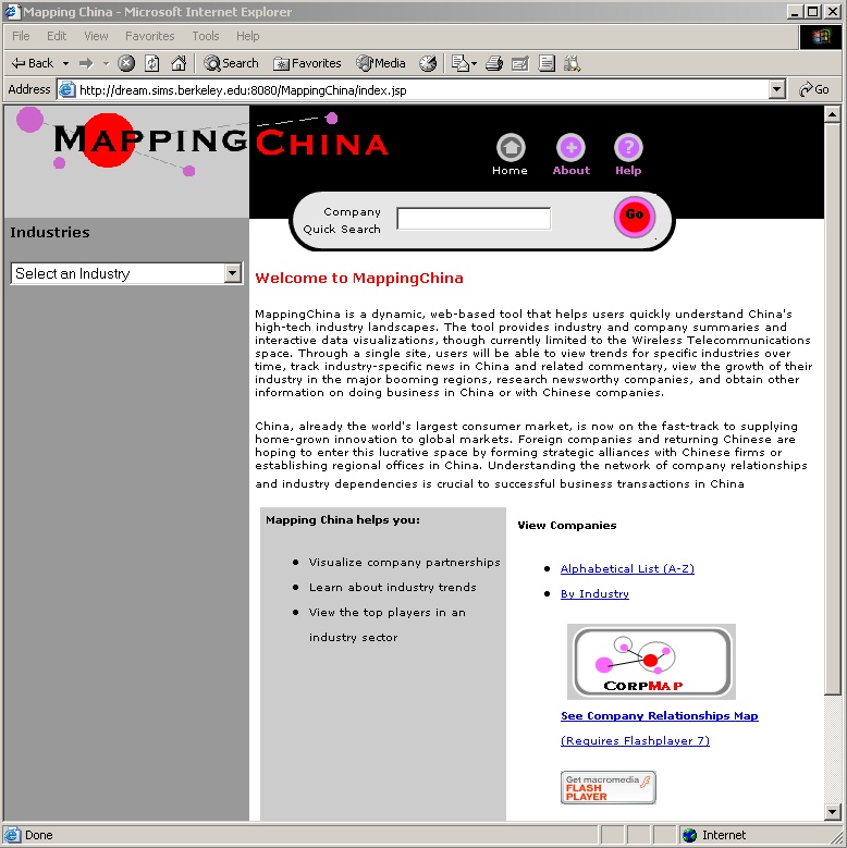
MappingChina
homepage |
|
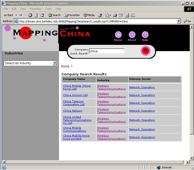
search results |
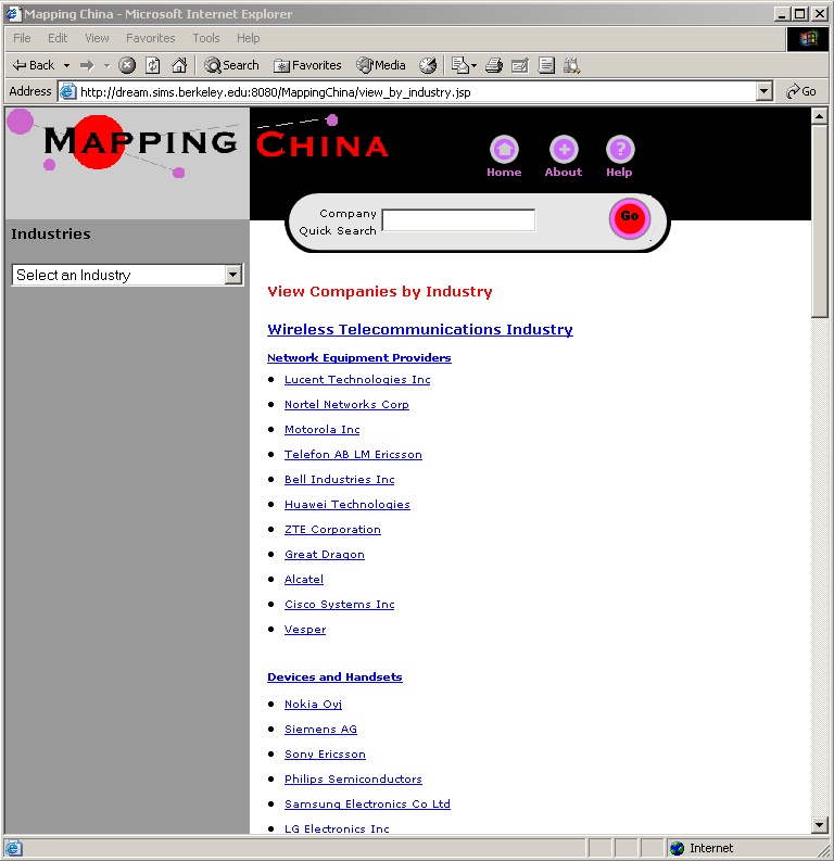
view
companies by industry sector |
|
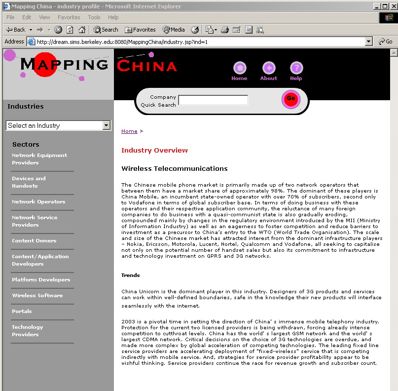
industry
profile |
|
sector
profile |
|
company
profile |
view
company list |
company
visualization (opens in new window) |
|
|
|