from
interviews that users main objectives with such a
tool are related to
1.
Trend-spotting (e.g. finding market opportunities
for new technologies or solutions)
2.
Tracking market/consumer behaviour (e.g. buyer spending
habits)
3.
Tracking industry behaviour (investment, industry
consolidation, etc. – requires a search by industry)
4.
Finding data to validate their own analyses or assertions
5.
Research on specific news event or company.(search
by keyword)
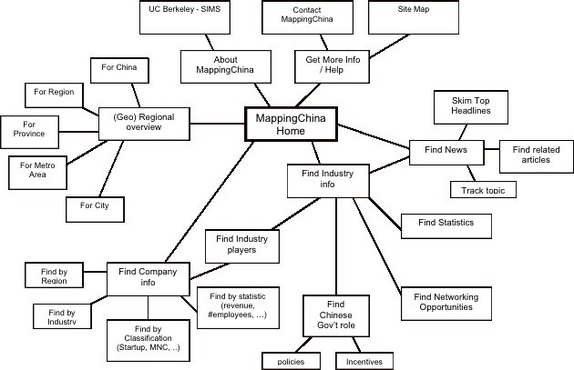
Users
are therefore most interested in finding relationships
between data, such as
•
industry-related news
•
company information, including relationships between
companies (competition, partnerships, foreign affiliations,
etc.)
•
statistics (for a company within an industry, eg.
market share, competitive position)
•
news trends (how news stories relate to one another
or to companies)
•
networking opportunities within selected industry
community.
Industry
and keywords are search filters for locating articles
or information. In some instances, such as looking
for statistics at a certain time period, date is another
delimiter. Industry, therefore, is the main commonality
between most of the elements. Therefore, it would
make sense to relate most of the other elements to
Industry.
Concept
1
(original map-centric concept)
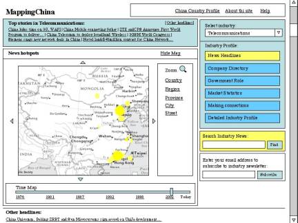
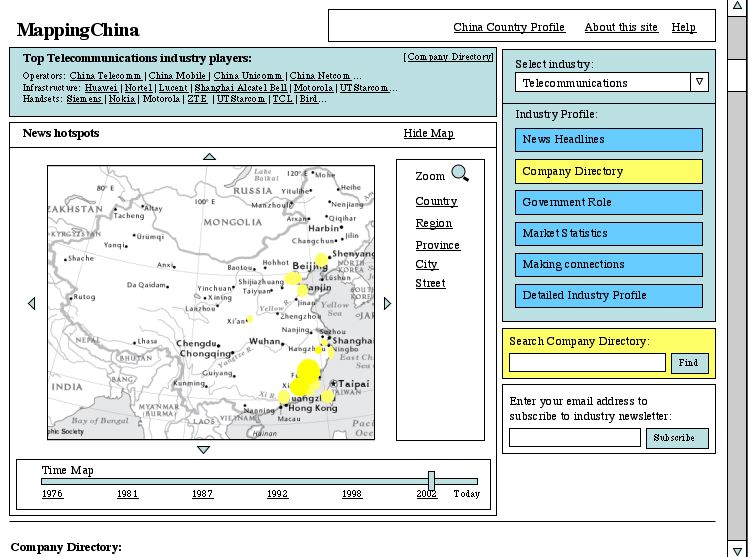
We
originally thought that users might want to understand
where the major hubs of development (e.g. new companies)
and new stories were centered, and track those over
time (hence the time-map). The map would allow one
to zoom in to a region, municipality or city. Most
important information (top anything: news stories,
industry players, etc.) would be listed at the top
with links to each item for more information.
The thought would be that for each element (news,
company, etc.) the map would display different information.
However, we determined that the map need not be as
central to the application as we thought, and determined
that another mapping schema (other than geographic
maps) might be used. Is the application trying to
do too much?

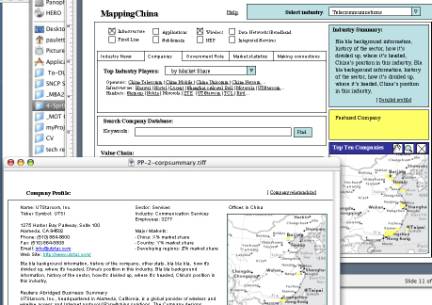
The
interface becomes a large folder about the particular
industry, with subfolders for each of the major types
of information being sought (news, company info, government
activity, market statistics, networking opportunities).
The checkboxes represent the major sub-domains of
the selected industry, and can be unchecked to filter
content showed lower down in the page. It would be
great to retrieve company profile information from
a source like Yahoo! Finance. Some of the design details
remain to be worked out.