While
the purpose of the application is to offer news and
industry information, our James Kwong persona would
like to see the interrelationships among companies
in the U.S. and in China. This lends itself to a possible
solution using an information visualization like SmartMoney.com's
stock map, through which users would access the site's
information.
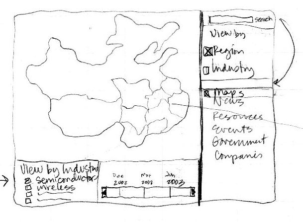
Figure
1A: Entry by Region
Figure
1B: Region/Industry Representation Pop-up
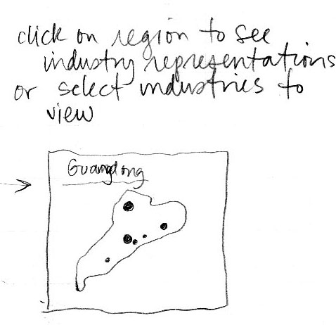
The design shown by Figures 1A and 1B assumes that
users will access data through a geographical map
of China. When opening the site, users will see the
map, with regions delineated. Like SmartMoney.com's
map, when users mouse over the various regions, pop-up
boxes will appear naming the region and describing
its industry concentration. Clicking on a particular
region will bring up that region in the main pane
- the full map will shrink to the upper corner with
the selected region highlighted. The right side panel
will show options for more information on companies
and industries. Both the full map and the region pane
will allow users to see industry changes over time.
Figure 2: Entry by Industry
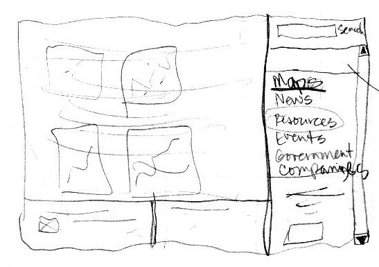
Figure 2 allows entry to the site through an industry
visualization. Users will see basic information by
mousing over the companies in each industry and, when
clicking on a particular industry, will see other
options available in the right sidebar.
Figure 3: News Search Pane
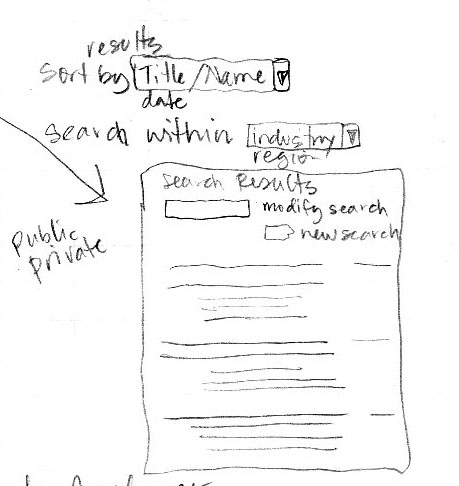
A good search function is essential to this site.
If users want to find a specific company, they can
enter the name and see results on the regional or
industry maps. For searching news, users can specify
a company name or industry and view results by name,
date, or other attribute.
Figure
4: Task Flow Diagram
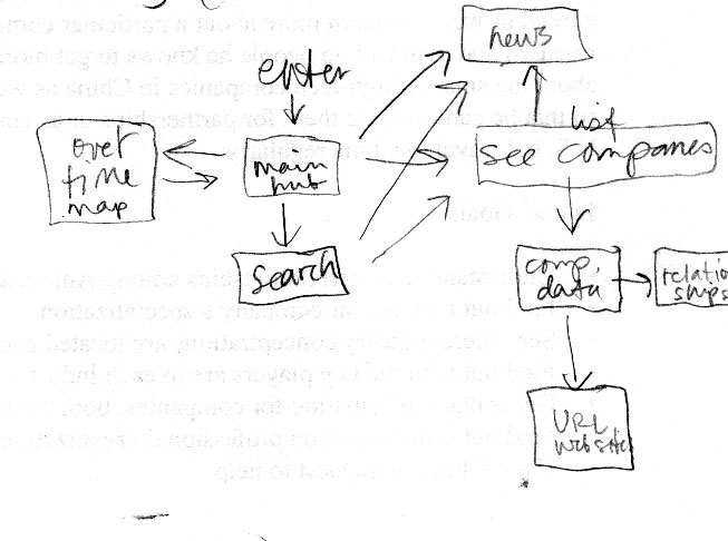
This rough sketch shows that the main hub will offer
views to the maps, to a search function, to news stories,
to companies (through industries, not shown), and
thence to more data on companies, including relationships
with parents/affiliates.