Figure
1: Homepage
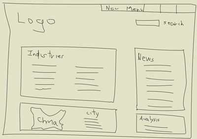
The homepage has 4 main components: industries, news,
analysis, and a map.
Figure 2: Industry Page
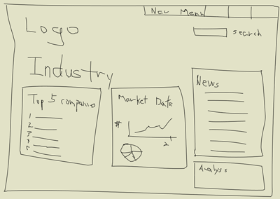
The industries page displays the top 5 companies in
the industry, market data, and graphs. The right panel
will have industry specific news and analysis.
Figure 3: Company Page
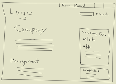
The company page gives a brief description of the
company followed by the management team. The right
panel contains the company's website and contact information.
Below the company info box is a list of the competitors.
Figure
4: Flow Diagram
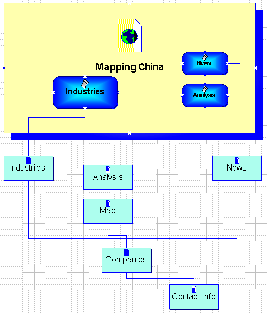
The flow diagram shows various paths by which users
can navigate through the Mapping China website to
accomplish their tasks. First, they may have a specific
industry in mind and want to gather analyst reports
and a list of companies active within this area. From
the analysis page, they can see a map of China that
indicates where this industry is concentrated in.
Alternatively,
users may visit to read the latest headlines. As they
read the news, they may look for more in-dept analysis
of market trends. And if the news article mentions
specific companies, they will want to go to the company
page to learn more about the company and possibly
contact them directly.
This
flow diagram assumes that users want to either get
an overview of a particular industry or keep up with
the latest developments in China's high-tech industry.
As we showed in our competitors
analysis section, many other companies already
offer this type of industry and company directories
as well as news. We hope to differential our product
by embellishing the "analysis" section of
our website, where users will be able to get a rich
visual representation of relationships between various
companies and industries. Thus, users gain a holistic
picture of the players in China's high-tech industry
by looking at diagrams. This "map" page
will be further developed in the next few weeks.