
|
||||||||||||||||||||||||||||||||||||||||||||||||||||||
Assignment 9: Third Interactive Prototype
Contents:
Problem Statement
Solution Overview
Personas and Scenarios
Description of the Final Interface Design
Interaction Flow
Parts Left Unimplemented
Tools Used
Design Evolution
Conclusion
Work Distribution
Go to our 3rd Interactive Prototype. Use Netscape!
Problem Statement
New textbooks for SIMS courses are costly, and textbook buyback services do not offer much money for used books. Many SIMS students have textbooks from previous classes that they would like to sell, but they do not currently have an easy way to connect with potential buyers. Sellers may email class lists to attempt to find a buyer; buyers may solicit upperclassmen who may or may not have books to sell. This method is annoying and not highly effective since the majority of email recipients are not interested in either buying or selling books.
Solution Overview
Our solution to this problem is BookMarket, an online book exchange for SIMS students. Using BookMarket, SIMS students can more easily buy or sell used textbooks. While we focused the system on the SIMS community, BookMarket could potentially be expanded to serve the entire UC Berkeley community.
BookMarket exists to put buyers and sellers in touch with each other; it does not facilitate on-line auctions or currency exchange. We plan to have our site linked from a portal page such as Simians or the SIMS departmental page.
Personas and Scenarios
We refined our original four personas down to two, Sarah McClintock and Yvonne Mallory Carter. Sarah is our primary buyer persona, while Yvonne is our primary seller. However, they may both choose to carry out either type of transaction, so our interface supports easy switching between buying and selling.
Persona #1 - Sarah McClintock
 Sarah
is 24 years old and from Austin, Texas. She earned her undergraduate degree
at Rice University, where she majored in Economics. Prior to her SIMS
career, Sarah worked for Anderson Consulting, developing e-commerce applications.
Sarah
is 24 years old and from Austin, Texas. She earned her undergraduate degree
at Rice University, where she majored in Economics. Prior to her SIMS
career, Sarah worked for Anderson Consulting, developing e-commerce applications.
This is Sarah's second semester in the MIMS program. She lives in Oakland and takes the bus to school--on nice days she rides her bicycle.
Sarah is proud of her old beagle (100 in human years) and her long-distance boyfriend Michael, recently laid off from Dell Computer.
When using the Internet, Sarah dials in on a modem because she can�t afford DSL. She frequently buys books over the Web from sites such as Amazon.com. She is not home during the day, so it is hard for her to receive UPS packages; she often has to take the bus to the UPS center to collect them.
Sarah has used many business applications. She is a confident user of Web technology. She knows what books she needs, but doesn�t know any sellers, so she will need some help in acquiring this semester's books.
Sarah's goals are:
- To buy books as cheaply as possible
- To compare as many options as possible
- Not to commit faux pas by asking peers for used books
- Not to get ripped off by the bookstores
- To see the books for other classes she might take later
- To know more about the people at SIMS
Persona #2 - Yvonne Mallory-Carter
 Yvonne
is a second year SIMS student, preparing to graduate and move into the
work force. She recieved a BFA in graphic design with a minor in dance
from Wellesley. She lives life with an artistic flair: she wears black
matte jersey and really cute scarves.
Yvonne
is a second year SIMS student, preparing to graduate and move into the
work force. She recieved a BFA in graphic design with a minor in dance
from Wellesley. She lives life with an artistic flair: she wears black
matte jersey and really cute scarves.
She doesn't have a boyfriend, but is close to her parents, who are fussy yuppies who still live in her childhood home in Saratoga.Before coming to SIMS, she worked at three different failed startups. While at SIMS, she worked for 30 hours a week at a Web design firm. She's really very excited about her new job as a usability expert at Yahoo.
Yvonne enjoyed her time at SIMS. She always goes to Thirsty Thursday and is often found working in the SIMS labs. Her senior project was an online literacy campaign.
Her secret shame is bad television. She's addicted to Survivor, Dawson's Creek, and Buffy the Vampire Slayer. Spam offends Yvonne.
Yvonne's goals are:
- To sell all books not related to interface design and usability
- To sell books quickly
- To get a reasonable price in a reasonable amount of time
- Not to lug unnecessary books to her new condo in Mountain View
Scenarios
| Task | Summary View | Detailed View |
| Task 1: | Buy GUI Bloopers and sell Modern Information Retrieval. | Sarah is at the beginning of the Spring semester, and she's just decided which classes to take. She hasn't been able to find one particular book, GUI Bloopers, at the campus bookstores, so she decides to use BookMarket to purchase it from another SIMS student. After she's finished contacting a student who is selling the book, she realizes that she can make some quick money by selling a book from last semester, Modern Information Retrieval, via BookMarket. |
| Task 2: | Use BookMarket to compare the available prices of Social Life of Information. Contact all sellers to try to bargain the price down. | Sarah wants to buy Social Life of Information, but her loan payment hasn't come through yet, so she needs to buy an inexpensive copy from another SIMS student. She goes to BookMarket to try to find the lowest price. Then she uses BookMarket to contact all the sellers and tries to bargain among them, offering five dollars less than the lowest price. |
| Task 3: | Use BookMarket to post Understanding Networked Applications for sale. The condition of the book is "excellent." After completing the task, change the posting so that the revised book condition is "fair." | Yvonne is graduating from SIMS in a month. She posts Understanding Networked Applications for sale. The book is in excellent condition. Later that night, she accidentally spills wine on the book, so she decides to be honest and updates the book condition to "fair." |
Description of the Final Interface Design
We implemented our final design using an HTML front-end, an Access database, and the ColdFusion web application server. Users use Netscape to enter the site's home page. They can then navigate through the site using our tabbed structure. The tabs highlight the three main functions of the site: buying, selling, and editing postings.
Selling:
Users can post books for sale on the site by choosing the book from a
list and entering a description of their copy and price information. The
posting is then added to the postings pool for that particular book.
Buying:
Buyers can browse book postings by title or course number, or they
can search for a book by the title, author, or ISBN. After locating a
book, users can view the sellers, view prices for and condition of each
available copy, and make an offer to one or more sellers. When the buyer
makes an offer, Bookmarket sends an email to the seller(s), notifying
them of the buyer's name and offer. The seller can then arrange an off-line
transaction with the buyer.
Editing:
Sellers who have posted a book for sale on BookMarket can edit or delete
their posting(s).
Users who fill out a form on BookMarket (i.e., who make a book offer or post a book for sale) are automatically remembered during that browser session. Whenever the user comes across another form that asks for the user's name and email, this information is pre-filled, thus eliminating repetitious typing. The user may opt to click the "End Session" link at the top of each page, thus clearing the information from the system, but the user is not required to do so. Closing the browser has the same effect.
Interaction Flow
Our interaction flow has not changed greatly from our second interation. The first flowchart below gives a general overview of the structure of BookMarket. The following task-based flowcharts illustrate a user's path through the interface while performing our scenario tasks.
Task 2: Buy by trying to bargain down prices
Task 3: Post a book, then revise it
Parts Left Unimplemented
We were able to implement most of the system functionality. However, we did not implement the following functions:
- Choosing potential sellers to contact. The system is designed so that a potential buyer should be able to select one or more sellers to whom the buyer wants to make an offer. In our current prototype, all offers go to all available sellers. The functionality that would allow for selection has not yet been developed.
- Sending email. Bookmarket is designed to allow a potential buyer to send an email to one or more potential sellers through the system. This email functionality has not been implemented.
- Editing a posting. Sellers should be able to edit or delete a posting. This editing functionality has not been implemented, except for a hard-coded example we used in our user testing.
- Account features. The account button currently goes to a set of features that are not available for actual use.
Tools Used
For our paper prototype, we used screenshots of a Netscape browser with pencilled-in graphics and text. To make the most realistic interface, we created paper widgets that simulated pull-down menus and dynamic tables.
For the succeeding prototypes, we used HTML, Dreamweaver, ColdFusion, and MS Access. We orginally tried to use Dreamweaver templates in order to make our design process more efficient. We discovered, however, that the templates were unwieldy and did not allow us sufficient flexibility to make quick changes as our project progressed. Additionally, we discovered that changes we made to the templates would override the ColdFusion code we'd written. We eventually abandoned the Dreamweaver templates in favor of regular HTML and CFM files.
Those of us who were used to hand-coding HTML were somewhat frustrated with the functionality of Dreamweaver. It is, however, a good tool for understanding the graphic and functional layout of a Web page. It was also easier to base our discussions about the prototype on a graphical representation of a Web page rather than lines of code.
We found ColdFusion to be a pretty good tool for connecting our Web interface to our Access backend. It was fairly easy to learn, and a wealth of information about the product exists on the Internet. Additionally, we used manuals to shore up our knowledge.
As we had previous experience with MS Access, we found it to be a satisfactory database tool. It meshed very well with the ColdFusion.
Design Evolution
The evolution in our design was centered primarily on page layout and system vocabulary. Since our system was not very complex from the beginning, we made very few changes to our core interaction flow. We added pages (End Session - Screen W), but we did not subtract many, nor did we make major changes in the way tasks were completed.
Initial Sketches
Our initial sketches included basic functionality. We included only
brief descriptions of system functions and assumed that users would understand
the system's core concepts.
Low-fi Testing
During low-fi testing, we discovered that users had trouble with the
concept of BookMarket (then called BESS). They did not understand that
the site was not an e-commerce site. They did not understand what would
happen after a BESS transaction. Additionally, the system language, from
instructions to confirmation screens, did little to support their understanding
of the system or their task completion. Users also told us they wanted
to be able to bargain between multiple sellers.
The screen layout in BESS also confused our test subjects during low-fi testing. They did not see vital functions and were distracted by non-essential ones. The screen layout did not help users navigate through the system, especially after completion of a task.
Heuristic Evaluation
The Heuristic Evaluation identified some more subtle problems with
BookMarket. It forced us to consider where Login and Logout should appear
both on the screen and in our task flow. The evaluation also helped us
to remove extraneous clutter from the screen and use links and buttons
more consistenly. The evaluation prompted us to remove and revise our
language once again.
Pilot Usability Test
The final usability test helped us refine the interaction between
the user and BookMarket. It encouraged us to add an auto-login feature
to eliminate the need for the user to input the same information multiple
times. We also decided to give buyers more textual cues to prompt them
to give more information in emails to sellers. We also refined the language
of the confirmation screens.
Extra 3rd Prototype Features
Due to a sudden burst of development energy, we implemented several
more features during our last round of prototyping. The added features
are as follows:
- Auto-remember feature (described in the design section above)
- Missing books features: Titles that do not have available images now sport a default image. Titles that do not currently have any postings have a special note on the book view that informs buyers that the book is not currently available.
- Redesigned Edit Postings page: Our edit postings page has been redesigned for easier navigation and graphical appeal.
- Redesigned Email Fields: Due to popular opinion, we changed our email boxes from split boxes (one for username and one for domain name) to the more industry-standard single boxes.
- Revised Help Text: Help page is clearer and more complete.
- Sell Form competitor's prices: The Sell Form now has a box that details the prices of the book at various other retailers. Sellers can now consult the market prices before choosing their own asking price.
Major Changes to the Prototype
System Concept and Language
From the very beginning, when our system was called "BESS,"
we have had problems with our system concept and language. In our paper
prototype testing, we realized that our system did not adequately explain
its purpose upon the user's first entry. We have since revised all the
text on the site to more clearly and concisely manage user expectation
about the system, the process, and the results. Such changes include calling
the site "BookMarket" instead of "BESS" ; revising
the navigational tab sections to read "Buy Books," "Sell
Books," and "Edit Postings"; and revising both the Help
page and the explanatory confirmation pages that appear when a user completes
a transaction.
 |
 |
|
|
1st Prototype
|
2nd Prototype
|
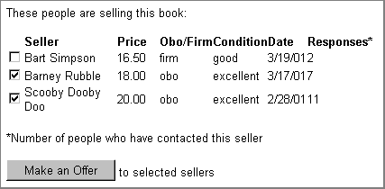
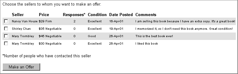
Response column
This column shows a running total of all the people who have contacted
a seller about a book. If the number is high, the chances are better that
the book has already been sold. We have had recurring problems getting
people to notice this column and respond to sellers accordingly. Some
observers have noted that perhaps BookMarket users simply don't need this
functionality; this may be true. However, in our needs assessment we discovered
that when speaking about the value of an online book exchange, students
mentioned that it was important not to waste time contacting sellers of
books that have already been sold. As a result, we feel the response column
is important.The column has gone through several iterations, and our last
iteration needs user testing before we will know if it works.
1st Prototype
3rd Prototype
Confirmation pages
After a user posts a book for sale or contacts a seller about a book,
s/he is presented with a brief page confirming the transaction. Our paper
prototype testers were very confused by the confirmation page; it did
nothing to explain what was going to happen next. Our subsequent iterations
have helped to solve this problem. We added better text explaining the
system and the buy/sell processes, and we added text repeating the user's
transaction information, i.e. the book up for sale, the price requested,
and the seller's information.
Auto-remember
We had intended from the very beginning for BookMarket to have some
sort of login feature in order to let users keep track of transactions,
edit postings, and have forms automatically filled in for them. We got
mixed reactions from paper prototype testers about the login feature.
Some of them expected to have to login; some did not want to at all. When
we built our first interactive prototype, we didn't incorporate the login
feature due to technical and time constraints. The same held true for
our second prototype. However, our test subjects did not like filling
in forms several times to sell and buy a few books. They expressed frustration
and dissatisfaction at the repetition. As a result, we decided to implement
an auto-remember feature that automatically fills in basic information
after the user has entered it once. This feature lasts throughout the
browser session. It solves the user's problem of repetitiously typing
in information, but it does not require a login or password. We have not
yet been able to test our implementation of this feature on test subjects,
and we are anxious to see if people like it.
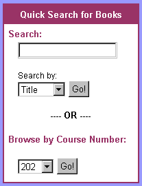
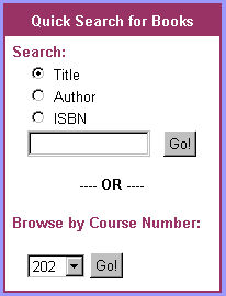
Quick Search: Appearance and Placement
BookMarket has a Quick Search box on the lefthand sidebar. We implemented
this feature in our paper prototype because we were all familiar with
the type of user who always wishes to find information through searching.
The search box has since been through redesigns to improve its look, feel,
and usability. Our heuristic evaluators were especially helpful in suggesting
a better way to have users choose a search type, using radio buttons instead
of a drop-down box. We also took measures to insure that Quick Search
does not impede users in their tasks. While it is a very useful tool for
buyers or browsers, it tends to throw people off track who are trying
to sell or edit postings. After witnessing this behavior in our user test,
we removed the Quick Search box from all screens except those directly
related to buying.
 |
 |
|
|
1st Prototype |
3rd Prototype |
Navigation
Our initial design and paper prototype did not have navigational tabs
to help users switch beween tasks. Instead, we thought users would enter
one task sequence, complete it, and return to Home to begin another task
sequence. After witnessing users struggle with this structure during paper
prototype tests, we decided to implement a basic tabbed navigational structure
that quickly moved users between Buy Books, Sell Books, and Edit Postings.
Our navigational structure proved successful in our last round of usability
testing; none of our users had trouble telling where they were or how
to get to another section. We also improved our Home Page to more effectively
help guide users who were approaching BookMarket for the first time. The
old home page lacks
good visual cues and good tabs, while the new
home page has both.
Most Valuable Evaluation Technique
We believe that the paper prototype was the most valuable to our project. The straight-forwardness of our design meant that we did not need to refine the structure and flow of the pages as much as we needed to improve the flow within pages and between tasks. Our most valuable lesson from this test was that we needed to think more critically about what our system does and how to match it to the existing mental models of users. Most testers were confused about what BESS (later, BookMarket) did and how it did it. The low-fi prototype highlighted this weakness without our having to invest time in coding, graphic design, or the backend.
We realize that, had our project had a higher level of complexity, the paper prototype would have been less valuable. However, given the scope of our project, the method met our needs perfectly.
Describe which of the three evaluation technique (low-fi prototype run-through, heuristic evaluation, pilot usability test) was most valuable to your prototypes usability and why.
Conclusion
Our BookMarket project was the most challenging endeavor we have pursued at SIMS thus far. The simplicity of our interface hides many hours of testing, experimentation, and hard work. We found the UI design process very rewarding.
We hope that someday, SIMS students will actually use BookMarket, but even if it doesn't get used, it has provided us with an invaluable experience in human computer interaction.
Copyright © 2001 Chan, Eklund, and Trombley. All rights reserved.