
Problem Statement, Solution Overview
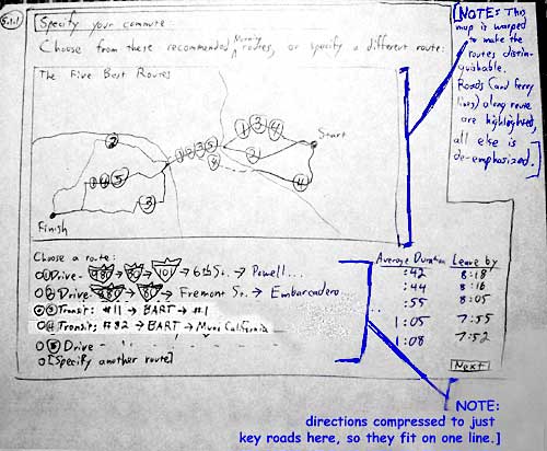
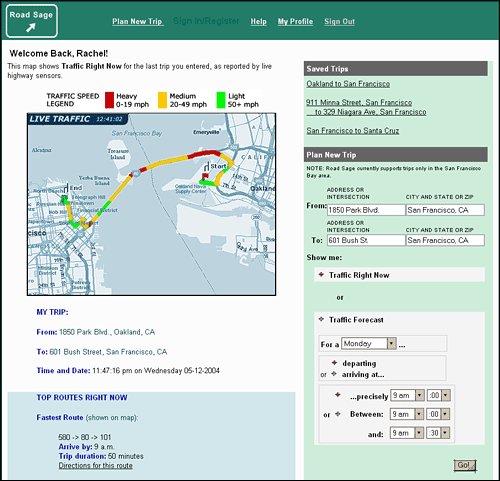
Description: Final Interface Design
Design Evolution
Design Evolution
Our design evolved iteratively from a vague idea, to a more precisely-defined
idea informed by initial research and user interviews, to a series of
evolving paper sketches, to a series of evolving interactive prototypes.
With each evolution we presented the current design to users, observed
and recorded user reactions, then improved the design based on this data.
Also, between user tests we subjected our design to a heuristic evaluation,
meaning that another team of user interface specialists examined our design
and critiqued it using a set of formal usability criteria; after the heuristic
evaluation we made yet more improvements to the design based on this feedback.
Before the sketches
We defined and extracted the essence of our first vague ideas by defining
a set of personas and goals around which
we would build the site. (Personas are fictional, prototypical users designed
to represent key targeted user groups during design discussions, and by
"goals" here we mean core goals that these prototypical users
pursue in life, some of which our tool might help them accomplish). We
built these personas and goals around information we gathered from potential
users during preliminary interviews.
Next we developed a ranking of the most important, top-priority features
and task flows to focus on by hashing out a task
table for each persona and summarizing the findings in a summary
task table.
Initial sketches
First sketches illustrated potential implementations of the core concepts behind the project: providing a system that would show current and predictive traffic information. They focused on the needs of the personas drawn up previously. From the beginning we thought that its look and interaction style should somewhat resemble current direction-finding services such as MapQuest and MapBlast which users are already comfortable using, but at the same time it should differentiate itself by providing traffic information and reduce the amount of step-by-step-directions detail in the main parts of the flow.
Low-fi (paper) prototypes
We were ready to create the first manifestation of our design that we could place in front of users and test. We refined the sketched designs into more focused and consistent but still very minimalized, "low-fi" prototype pages that consisted of a series of sketches, post-it-notes, and taped-in bits from printouts and photocopied diagrams. The goal in using such a rough prototype was (1) to encourage users not to hold back any criticism of the system, which is bound to happen when they confront fancy and intimidating final-looking Web pages, and (2) to enable us to very quickly and easily change the prototype on the fly based on user feedback.
For these reasons, the low-fi prototype emphasized the site's basic task flow, information organization and (to a lesser extent) textual labeling. This prototype was intentionally "down and dirty:" graphic design took a back seat to allow constant evolutionary change for the benefit of functionality.
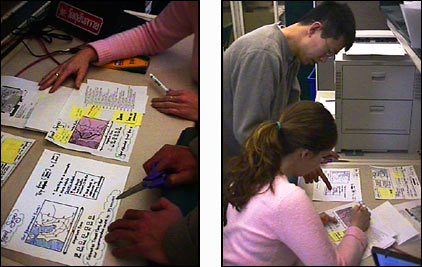
Figure 2: Team members change the prototype based on user test results.
More photographs of our initial low-fi prototypes are available here.
We tested these prototypes by placing them in front of users and asking the users to "use" the tool to carry out a set of particular tasks. The users told us what they would do next (i.e., fill out a form with particular information, click "Go," etc.) After each user choice we mimicked a system response by placing before the user a new "screen." We also often made changes on the fly -- if a user said "I would expect to find a 'directions' button here," for instance, we would sketch in a directions button on the fly. If a user tried to click on a word that we didn't intend to be clickable, we usually would make that word clickable, draw up a page that word would lead to, and then test those additions with other users.
This feedback proved very valuable. Among the improvements we made based on this were to remove maps from the front page, to remove the arrival/departure-time toggle from the interactive map, and to remind the user of what course is being plotted on the map pages by providing From: and To: fields. The low-fi tests pointed out our biggest problem and the biggest challenge in designing this interface: to make the distinctions between real-time and predicted traffic forecast maps very clear and understandable.
The low-fi prototyping technique definitely proved the most valuable of all the techniques we undertook. Not only did it quickly point out much bigger problems with the interface than the other techniques did, but it's rough appearance encouraged users to suggest changes that they might not think of bringing up while looking at an intimidating, completed-looking interactive prototype on a computer screen. Also, we were able to make changes on the fly, right in the middle of testing, which was not practical with the more formal later prototypes.
First Interactive Prototype
Based on the foundation we build via the low-fi prototypes, combined with the changes that we learned were necessary, we moved on to build out the first interactive prototype. This moved us a step closer to a final piece of software; the pages were rendered on a computer screen rather than by hand.
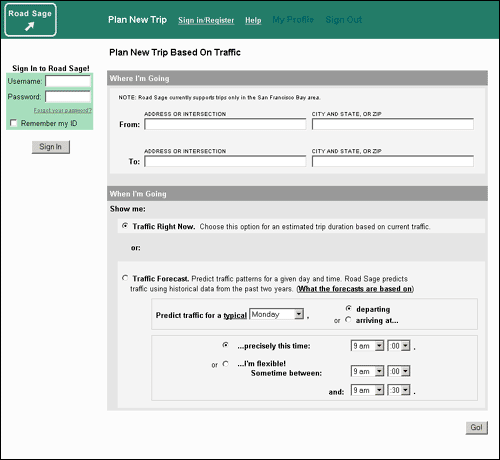
Figure 2: A screen shot from the first interactive prototype (the default front page)
But these were still "flat" pages designed merely to mock up the experience of using Road Sage. The maps, for instance, were static dummy gifs rather than "live" images rendered on the fly. So regardless of what address and time of day a a user entered into the prototype, for instance, they would get the same map pages illustrating a different route at a different time. But we explained this to users before the tests to minimize confusion. The objective here is to discover substantial points of confusion and breakage in the interaction flow, and these flat pages did the trick while simultaneously allowing us to make very quick changes on the fly based on user feedback, something that is nearly as practical with "live" systems connected to data on the back end. (More details about the first interactive prototype are available, as is a link to the actual prototype).
Heuristic Evaluation
It was time for a set of fresh expert eyes. Another team of interface designers looked over our interactive prototype and critiqued, formally conveying their opinions using a set of formalized usability criteria called heuristics.
Based on this advice, as well as on user test results, we made plenty
of further improvements to the site including making top-level navigation
clearer, providing users the ability to use the system without logging
in or registering, clarifying the geographic scope of Road Sage data,
streamlining the route-specification process, and further distinguishing
live views from predicted traffic views. More details about these improvements
are available here.
Later Prototypes and Pilot Tests
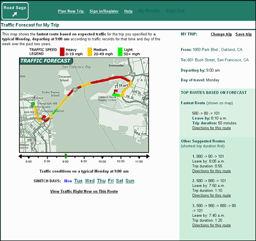
The second interactive prototype was a substantial improvement over the previous designs. This prototype is still online, instructions for using it as well as a link to the prototype are available.
We rolled out this version to new sample users during our pilot usability studies. These users pointed out some complaints and issues, but it was clear that the interface was substantially improved by now. In previous tests users exhibited serious confusion about what they were doing and how they might complete central tasks; by now the issues were much smaller and more subtle ones, usually dealing with secondary issues. For instance, a user complained that he had to scroll too much, and another user said that she would like to see traffic on alternate routes visualized on the maps in addition to her primary route. We used what we learned during these tests to improve the interface further. You may view the resulting prototype here.
No interface is ever perfect and one can always find new ways to improve
any form of human-computer interaction. If we were building this product
in the world of business we would push for perhaps another month to carry
out more testing of the final prototype, and then push for more testing
of the first "live" version of the system before releasing it
to the public, then more testing and iterative improvement from now on.
Given the brief amount of time we had to work on this, we feel confident
that we identified and removed the biggest usability problems in the system
and began moving down the most rewarding path.