
Introduction,
Task Flow,
Work Distribution
Prototype
For our first usability tests we built a very minimalized, "low-fi" prototype that consisted of a series of sketches, post-it-notes, and taped-in bits from printouts and photocopied diagrams. The goal in using such a rough prototype is (1) to encourage users not to hold back any criticism of the system, which is bound to happen when they confront fancy and intimidating final-looking Web pages, and (2) to enable us to very quickly and easily change the prototype on the fly based on user feedback.
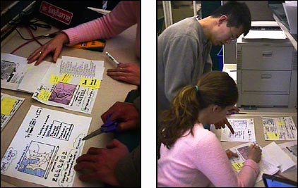
Photo: John and Lauren change the prototype based on user
test results.
For these reasons, the low-fi prototype emphasizes the site's basic task flow, information organization and (to a lesser extent) textual labeling. Although the final product will look much handsomer and will include elegant graphics, it's actually prefereable in early prototypes to completely de-emphasize visual design, logos and the like. Here, the prototype is "down and dirty:" graphic design takes a backseat to allow constant evolutionary change for the benefit of functionality; visual design elegance will come into play later once the basic interaction is nailed down.
Here are photographs of the evolving low-fi prototype:
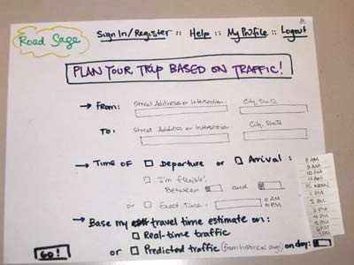
Front page
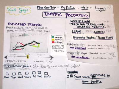
Predicted traffic page (with map, estimated travel times)

Real-time traffic page

Directions popup window

Login screen
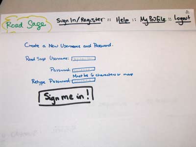
Registration screen

Personalized front page
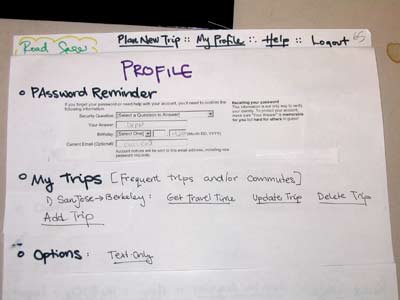
Profile screen

First iteration of traffic predictor