|
|
|
SIMS 213 Final Write Up - Communications
Spectrum
May 13, 2003
|
|
|
| |
| 1.
Problem Statement |
| |
Currently
significant inequalities and inefficiencies exist within the
United States broadcast spectrum allocation process. These
problems are a direct result of an archaic understanding of
the communications spectrum and are compounded by the entrenched
interests of current spectrum licensees. The lack of public
understanding of and engagement in the management of the communications
spectrum results in exclusive licensing and encourages the
use of inefficient technologies and capital intensive business
models.
Although
the communications spectrum allocation process has been significantly
revised in recent years, the prevalent metaphor of scarce
real estate has not been questioned. The current
allocation chart (pdf) is very hard
for the uninitiated to understand. It shows too much information
without enough explanation. What is missing from the allocation
debate are tools that allow interested parties to understand
how the spectrum is actually allocated and utilized. An interactive
communications spectrum analysis tool would allow users to
view individual sections of the spectrum along with regional
usage information. It could also provide meaningful explanations
of the chart data. |
| |
|
2. Solution Overview |
| |
| The
US Radio Spectrum Information and
Awareness Site (3rd Interactive Prototype)
offers users, who have little or no knowledge of the communications
spectrum, to learn more about the spectrum and to browse information
about spectrum allocation and uses. The spectrum site contains
all of the information that exists within the current spectrum
allocation chart, but it displays the information in such a
way that users can more easily determine the breakup of the
spectrum throughout different industries. Further, this site
provides users with spectrum allocation information in the context
of how it is used in different regions. |
| |
| 3.
Personas And Scenarios |
| |
| Susan
Evans, Legislative Assistant |
 |
| Age:
29 |
| Education:
BA Sociology |
| Martial
Status: Unmarried |
Susan
lives a hectic life, but enjoys it immensely. She spends
90% of her time working out of her congresswomans local offices
in Oakland and the rest of her time in Washington. She
has been working at this job for a year and half and is considering
working on a campaign in the next election cycle. Susan
rents an apartment off of College Avenue in the Rockridge
area of Berkeley. Susan tries to commute by bus, but
often has to drive to work as she is frequently asked to go
to regional events and constituent meetings. She has
an active social life that revolves around her friends from
growing up and school, and increasingly her work mates.
Susan enjoys music and theater performances, usually going
to an event at least once a month. She is active in
Habitat for Humanity in Oakland. Though she is not religious,
she enjoys the community spirit. She has been known
to pick up a hammer, but primarily contributes her organizational
talents.
Susans
job consists of two main functions; community outreach and
legislative research. By meeting with local constituents
and representing her congresswoman locally, she provides key
information about local issues. She is required to be
on top of district level social and economic issues and to
understand how pending federal legislations is going to effect
the district. Though she is diligent and resourceful,
she does not have much time to do direct research on legislative
issues. Instead she relies on secondary sources including
the Congressional Research Services, local and national newspapers
and research published by interest groups and foundations.
Over the past year Susan has developed a good relationship
with several industry lobbing groups and foundation staffers.
Though she recognizes that these individuals have agendas,
she has come to trust their opinions and rely on them for
insights into some federal legislative issues.
Since
Californias ninth district contains a substantial amount
of technology companies, Susan is very aware of the economic
impact of technology in her district. Though she is
not a tech geek she does consider herself an experienced computer
user, but not an expert. Susan primarily uses office
applications and has been learning how to use Microsoft Access.
She was an early convert to the PDA and now relies on it exclusively
for her contacts. Six months ago she upgraded her home
computer getting a new Dell Dimension and DSL.
At a Chamber
of Commerce meeting recently, Susan met a representative of
a local company that makes chips for wireless radios.
From him she learned that there are dozens of companies in
the 9th district that make hardware and software
for the wireless industry. Though her congresswoman
is not a member of the Energy and Commerce Committee that
oversees wireless communications, Susan recognizes that federal
regulation of the wireless industry will affect the local
constituencies and thinks that it could be good issue for
local fundraising and campaigning. |
Goals |
- Contribute
to the success of her congresswoman
- Identify
issues that are important to her district and that could
be useful for future campaigns
- Build
a network of political contacts that will further her professional
career
- Create
areas of expertise that will make her a more valuable staff
member
|
| |
| Katie
Coogan, Journalist |
 |
| Age:
31 |
| Education:
BA Political Science, MA: Journalism |
| Martial
Status: Unmarried |
Katie
Coogan is a staff writer for the Technology division of the
San Francisco Chronicle.She has been working at the
Chronicle for a little over a year.Before coming to the Chronicle,
Katie worked as a legal reporter specializing in Internet
and technology issues for American Lawyer Media.On
the side, she also worked as a freelance writer for The
Industry Standard.
Katie
was recently promoted by the Chronicle from her position as
a weekly column writer covering technology-related legal issues,
to a staff reporter position. Two topics that Katie has covered
in depth are the Microsoft anti-trust trial and the copyright
controversy created by Napster. In her new role, Katie will
be focusing on technology-related issues which are of concern
to California voters. She is especially enthusiastic about
her new role at the paper. Katie feels that with more and
more technology issues going to the polls in California, it
is important for journalists to educate voters on such topics.
Katie
has always been a driven individual who continuously strives
to improve her work and position in life. She grew up in Peshtigo,
Wisconsin. She always had a knack for technology. In high
school she made a hobby of tinkering with the familys Dairy
Master Swift Flow milking system, but her real passion became
politics after she joined her high school debate team. Upon
receiving a full tuition scholarship to The University of
Wisconsin, Katie entered and studied Political Science with
a minor in Industrial Engineering. Nearing graduation, Katie
discovered that she was torn between politics and technology.
She decided to enroll in Northwesterns Journalism School
where she could pursue both areas through her writing.
As a journalist,
Katie dreams of one day becoming the Associate Editor of a
large newspaper. She is excited about her new promotion and
is determined to impress her new boss. Katie devotes most
of her time at work to research and tries to focus on topics
that are of interest to Californians. She uses the web to
browse through technology forums like slashdot.com and mailing
lists hoping to find references and links to experts in the
field. She also spends time looking at websites that advocate
the different positions of the topic at hand. Katie is frustrated
by websites that contain stale information or confusing visualizations.
She often downloads charts and visuals which she can later
use to help her write her articles.
With Katies
constantly increasing workload, she has little time for a
social life. She currently lives in a condo in Potrero Hill
with her cat, Milky. |
| Goals |
- Become
the first female associate editor of The San Francisco
Chronicle
- Stay
informed about the latest technology and technology issues
that concern California voters
- Continue
to write informative articles that help educate the average
Chronicle reader about technology-related issues
- Summarize
topic issues in how they effect the Bay Area
|
|
| |
|
4. Final Interface Design - Third
Interactive Prototype |
| |
| 4a.
Functionality |
The
final interface for the Communications Spectrum project is
geared toward a subject matter novice who is looking for information
about how the communications spectrum is allocated. The site
offers two main functionalities; an overview of the topic
in the Tour and a comparative analysis tool in the Analyze
Spectrum Usage section. The site also provides a Related sites
page that directs users to other sites that provide information
about spectrum allocation issues.
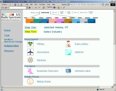
Information
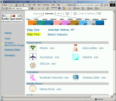
in the Tour is organized according to industry, e.g. Broadcast
Television and Radio. The Tour provides data about how each
industry uses the communications spectrum and shows graphically
the parts of the spectrum allocated to each industry. Users
have the option to navigate through the Tour sequentially
using the Next and Back links on each page. Or they can jump
to specific industry pages using the other links found at
the top of each Tour page.
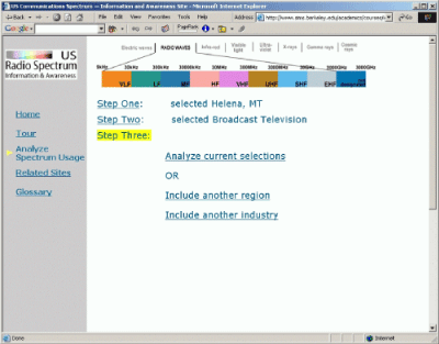
The comparative
analysis tool first guides novice users through a step by
step process of choosing relevant and allowable data parameters
to compare spectrum use in different industries and different
regions. Users have to the option to compare spectrum usage
in one region for one industry, in two regions for one industry,
or for two industries in one region. New functionality in
the Third Interactive Prototype streamlines the initial selection
process, making it so clicking a choice immediately proceeds
to the next step rather than requiring the user to click to
select and click again to proceed. Additionally the Third
Interactive Prototype supports better content integration
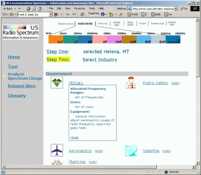
with the addition of info links that display brief industry
information for each possible choice on the industry selection
pages.
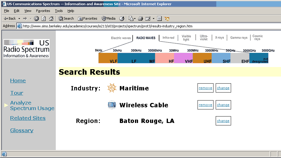
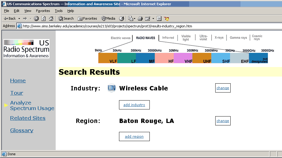
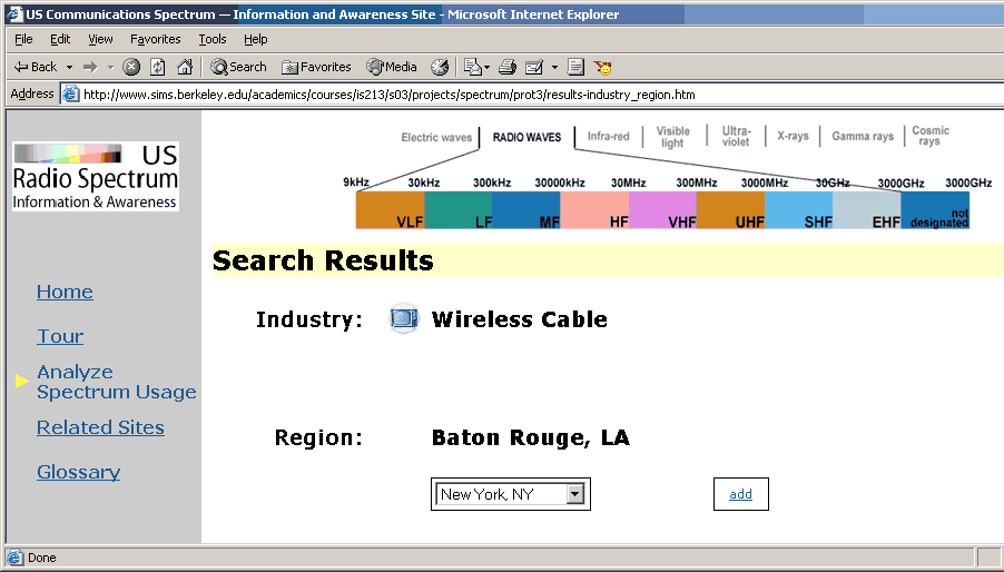
Most importantly
the Third Interactive Prototype offers shortcuts for changing
parameters directly on the results pages. These shortcuts
let users change their comparison parameters (regions and
industries) on the results page, without having to step through
the selection process again. This shortcut selection process
continues to seamlessly enforce the supported combinations
of parameters. For example if a results page is displaying
a comparison of spectrum usage in one region for two industries,
then the user is only presented with the option to change
the one region, change either of the two industries, or remove
one of the two industries. If the user chooses to remove an
industry , leaving only one region and one industry selected,
then choices appear for her to change either of those selections
or add another industry or another region. If she chooses
to add another industry, then the option to add another region
disappears and so on. For visual depiction of this functionality,
please see the Analyze Spectrum
Usage section of the Third Interactive Prototype or the
screenshots below at the end of the Design
Evolution section |
| |
| 4b.
Interaction Flow |
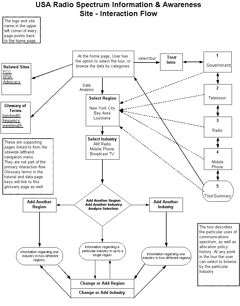 |
| 4c.
Unimplemented Parts |
While
we have focused on designing interactions that prevent most
errors, there are a few exceptions we have not handled in
the Third Interactive Prototype. For example, it is still
possible for users to choose the same industry or the same
region twice in the Analyze Spectrum Usage section.
We also
realized by the Second Interactive Prototype phase that it
didn't make sense to spend a great deal of time writing domain-specific
content for the Tour and the rest of the site. We struggled
mightily to learn enough about the vast array of spectrum
allocation data to make somewhat educated decisions about
which data to display on the results pages. After that experience,
it became clear that we should focus our energy on streamlining
the interaction and providing an effective framework for exploring
the information, rather than trying to produce the content
itself.
Along
these same lines, users can select different regions and industries
for comparison. The labels on the data change, but the actual
values do not. All versions of the results pages show the
data we aggregated for the regions Helena, MT and New York,
NY, and the Broadcast Television and AM/FM Radio industries.
The graphics showing bands of allocated spectrum for each
industry (on Tour pages and results pages) are accurate and
based on actual data though.
We also
did not implement the content integration between the technical
terms used on the results pages and the tour pages and their
definitions in the glossary. The glossary page is mocked up
as a simple alphabetical listing with anchor links. We envision
that the contextual glossary definitions incorporated on other
pages of the site would look and function in a manner similar
to the way the info links on the industry selection pages
of the Analyze Spectrum usage section. That is to say when
the user clicks a term a definition would display in an expandable
and collapsable inner HTML 'box' just like the industry info
does in the above mentioned pages of the Third Interactive
Prototype.
With regard
to the new functionality on the results pages of the Third
Interactive Prototype, we have implemented the shortcut interface
that allows users to change comparison parameters, region
and industry, but we have not implemented the functionality
that would change the data or the data labels on the rest
of the page.
|
| |
| 4d.
Tools |
We used
several different tools to produce our prototypes. Using Dreamweaver
or TextPad, we wrote HTML, DHTML and Javascript. DHTML and
Javascript support the dynamic presentation of the user's
choices (region and industry) on the selection and results
pages of the Analyze Spectrum Usage section. We used Adobe
Photoshop, Adope Illustrator, and Excel to develop the icons
and data visualizations displayed throughout the site . |
| |
| 5.
Design Evolution |
Any
discussion of the Communications Spectrum team's design evolution
must begin before any actual design was put forward. The most
difficult decision we had to make as a team regarded which
aspect of the vast and complex communications spectrum information
problem we would tackle. Going back to our first assignment’s
problem statement, we stated that “What is missing from
the allocation debate are tools that allow interested parties
to understand how the spectrum is actually allocated and utilized.
The current allocation chart is not very useful for the uninitiated,
showing too much information without enough explanation.”
In fact, it wasn't until after the Low Fi Prototype evaluation
process, that we finally determined exactly which problem
related to the display of spectrum related information we
would try and solve.
Building
and testing our Low-Fi
prototype made us realize that we had to pare down our expectations
and focus on a single interaction and visualization problem,
i.e. how do you display comparative information about spectrum
usage by industry and region? The Low-Fi prototype evolved
from a series of sketches and conversations, now unfortunately
mostly lost to history. In the process of constructing it
we worked through a number of different possibilities for
the data interface, navigation and labelling.
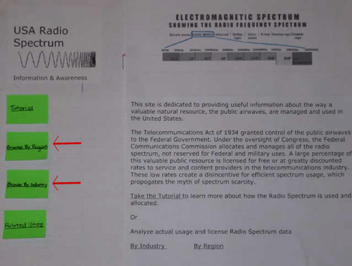
Low-Fi
prototype exposed us to our first major interaction problem.
To address our problem statement we chose to offer two distinct
paths into the data analysis section (see the
left hand screenshot below.) The user could choose
to "Browse by Industry" or "Browse by region"
. Before we tested the prototype with first time users, we
had trouble even among ourselves differentiating between the
two entry points. In testing this interaction all of our testers
failed to understand the distinction between the two paths.
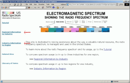
In our First Interactive Prototype
we thought we could solve this problem by making the language
clearer (see the righthand screenshot below.)
However, this was no help, and our heuristic evaluators again
questioned the distinction between the two possible comparison
dimensions. |
| |
| |
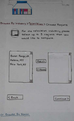
| As the
site evolved from the Low-Fi Prototype to the First Interactive
Prototype we also made other changes in the data selection methods
(screenshots below.) In the Low-Fi prototype
we offered users shuttle boxes in sequential steps to choose
which data elements to display. In the First Interactive Prototype
we changed this to pull down menus and provided a single screen
for choosing all data items. In addition the overall layout
of our selection screens changed significantly, with a US map
depicting regional choices and icons, and descriptive text accompanying
industry choices. |
|
| |
| The Heuristic
Evaluation was a great help to our team. Their comments
reiterated out testers' dissatisfaction with the two paths into
the data. They also pointed out that the interface lacked navigational
elements to orient users within the site. As for consistency,
our heuristic evaluators pointed out that our varied use of
color and terms throughout the site was more confusing than
it was illuminating. We addressed these issues, as well as others,
in the Second Interactive Prototype.
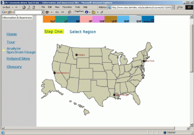
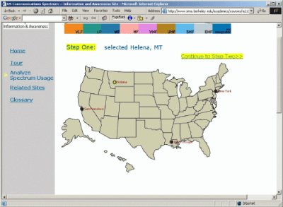
In
the Second Interactive Prototype we changed the main data
analysis interaction from having two entry points to having
only one, the "Analyze Spectrum Usage" link in the
lefthand navigation bar of every page (screenshots
below.) Implementing this change required significant
changes to the entire data selection process. We created a
sequential process where the user first chooses a region,
then chooses an industry, then has the option to either analyze
the one chosen region and industry (this was new functionality)
or choose another industry or choose another region for comparison.
We feel that this design makes the the data selection interaction
vastly more usable. The onus is no longer on the user to understand
the possible comparison parameters in advance. It also continues
to enforce the comparison restraints on possible choices without
the user needing to know about them in advance. |
|
|
|
| |
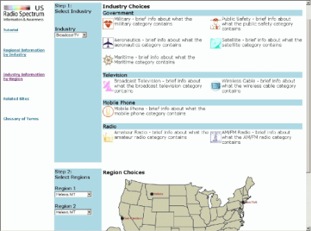
| As
mentioned above in the Functionality section
of this report, one of our objectives for the Third Interactive
Prototype was to provide better integration between the content
in the analysis section and the content in the tour. Initially
we envisioned directly linking to the specific content in the
tour from the industry selection pages, but realized that this
might end up disorienting users. We chose instead to provide
a (more) link next to each industry that allows users to expand
the existing page to show more industry information (screenshots
below.) |
|
|
| |
As also
mentioned above we streamlined the data selection process
in this iteration, making it so users need to only click on
a region to proceed to the industry selection page, and click
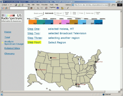
on an industry to proceed to Step Three.
The most
significant change in The Third Interactive Prototype addresses
the need for a more expedient expert interface for data comparison.
The Second Prototype's data selection process is good for
explaining the possible comparison the first time through.
But it quickly becomes cumbersome for repeated selections.
As explained above in the Functionality section, we now allow
the user to add and/or change their comparison parameters
directly on the results page (see screenshots
below.) We considered creating a separate expert interface,
but felt that once the user had seen the data results they
would want to change their choices without further navigation. |
| |
| After
initial selection of two Industries in one Region: |
 |
| After
removal of one of the Industries: |
 |
| In
the process of adding another Region |
 |
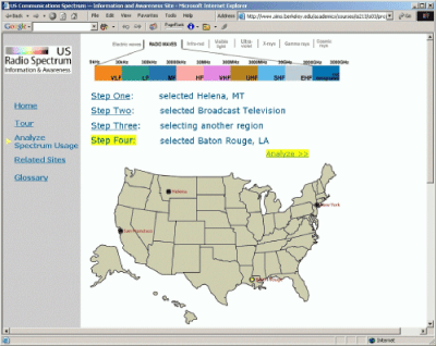
| After
adding a second Region: |
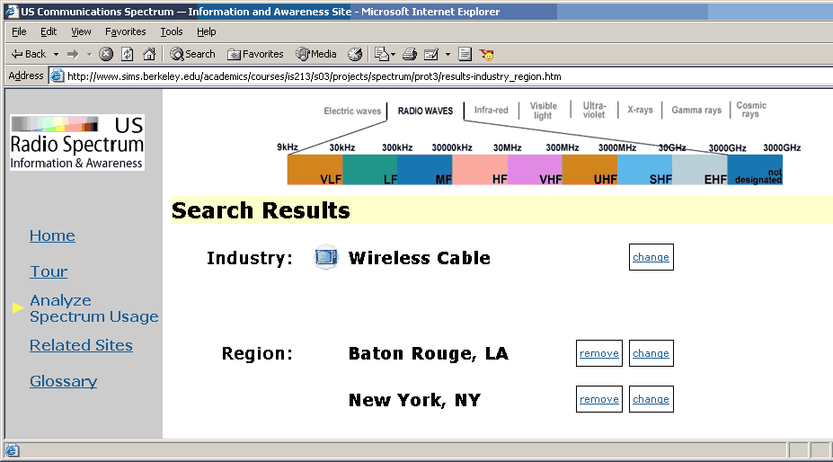 |
|
| |
| 6.
Most Useful Design Process Step |
| |
In the
context of this project specifically, both the usability testing
of the Low-Fi Prototype and the Heuristic Evaluation gave
us invaluable insight and direction for how to focus our efforts
and move forward productively. Early discovery of the problem
with the two path entry into the data analysis section insured
that we would keep working on that problem with determination
in each iteration.
The heuristic
evaluation was the most thorough evaluation technique and
offered a great deal of specific feedback about how and where
the site could be improved. Using the other evaluation techniques,
we were able to discover problematic aspects of our site,
however, these evaluations did not provide us with as many
alternative design suggestions as the heuristic evaluation.
Additionally, our heuristic evaluators estimated the severity
of each usability problem, thus helping us to prioritize our
development efforts. |
|
|