SIMS
213 |
| Home |
| Assignment 1: |
| Project Proposal |
| Assignment 2: |
Personas & Task Analysis |
| Assignment 3: |
Scenarios & Initial Design |
| Assignment 4: |
Low-fi Prototype & Test |
| Assignment 5: |
| Assignment 6: |
Heuristic Evaluation |
| Assignment 7: |
| Assignment 8: |
Pilot Usability Study |
| Final Presentation |
| Assignment 9: |
| Work Distribution |
SIMS 213 Assignment 7 � Communications
Spectrum
Second
Interactive Prototype
April 17, 2003
| Contents |
Based on the
feedback that we received in our heuristic evaluation, we made several
changes and improvements to our prototype. The following section contains
the heuristic violations of our first interactive prototype, the change(s)
that we made to fix the violation, and screen shots demonstrating the
changes.
The changes
to our prototype include fixes to all of the heuristic violations presented
to us as well as fixes based on feedback from Professor Hearst, Kaichi,
and Maggie.
# |
Page Area | Violation | Severity | Description | Change Made |
1 |
Front
Page |
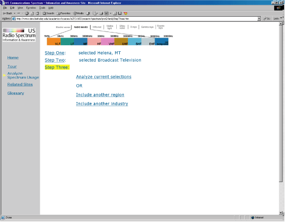
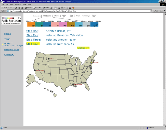
H7 | 3 | Front page doesn't include search criteria boxes to shorten the search process for frequent users. | The entire search process was redesigned to address this and other concerns. |
2 |
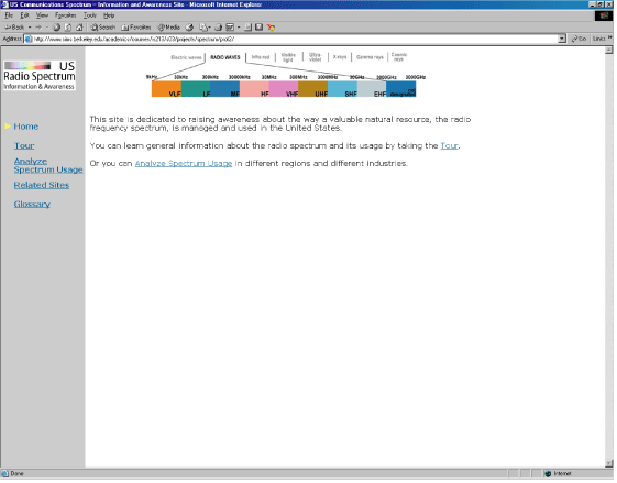
H10 | 3 | Doesn't include enough information in the introductory text. | The content from the tutorial home page was transferred to the front page. | |
3 |
H4 | 1 | Grammatical error in introductory text | Sentence was rewritten. | |
4 |
Tutorial (now called Tour)
(Screen Shots) |
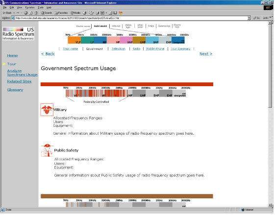
H2 | 3 | The name 'Tutorial' does not correctly describe what has been designed. This section should be renamed. | Name of the section changed from 'tutorial' to 'tour'. |
5 |
H4 | 2 | Site includes links that go to the tutorial home but which are labelled differently | Links changed so that they are consistently worded throughout the site. | |
6 |
H4 | 2 | Spectrum graphic does not appear on the top of every tutorial page. | Added the spectrum graphic to the top of pages where it didn't appear. | |
7 |
H4 | 2 | Some links to outside sites open in a new browser window and some do not. | All links to outside sites open in a new browser window. | |
8 |
H7 | 2 | Long tutorial pages don't include anchors to all the technologies included in the page | Not changed because this only applied to one tour page and we thought it would be inconsistent to include anchors on only one page. | |
9 |
H1 | 2 | 'Next' and 'Back' tutorial buttons only appear at the bottom when they should appear above the fold as well. | 'Next' and 'Back' buttons included towards the top of every tour page. | |
10 |
H1 | 2 | There are two visible links to 'Start Tutorial' on the front page. | One link was eliminated so that only one currently exists. | |
11 |
H2 | 2 | Navigation links should say 'Next' and 'Back' rather than the names of the previous and next pages. | Link wording changed to 'Next' and 'Back' throughout the tour. | |
12 |
H4 | 1 | The text in the navigation links at the top wraps making it look messy. | Fixed the wrapping so that it no longer wraps. | |
13 |
Search Criteria Page (Screen Shots) |
H4 | 3 | Submit button appears in a different column than all other user selection areas on the page. | Search criteria pages were changed, but the continue buttons are inline with user selected data. |
14 |
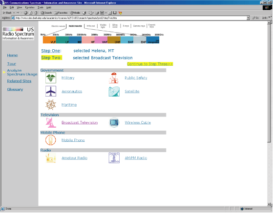
H9 | 2 | Drop down menus should eliminate options that have been chosen in other drop down menus. | Throughout the data selection process, already chosen options do not appear as available options. | |
15 |
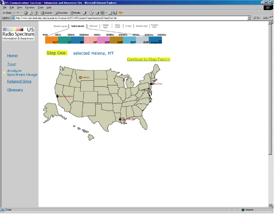
H | 2 | The maps on these pages are very large and appear as if you can click on them. | In the new search criteria pages, maps are the same size, but users can click on them to select a region. | |
16 |
H6 | 1 | There is no way to clear all search criteria fields on this page. | The new search criteria process does not include all search criteria in one page, so this problem is no longer relevant. | |
17 |
Search Results Page (Screen Shots) |
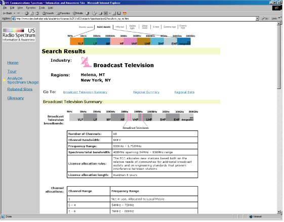
H4 | 3 | Technologies are referred to as 'industries' on this page, rather than 'technologies'. | Wording changed so that the term 'technology' is used consistently throughout the site. |
18 |
H1 | 3 | The order of the data on this page is confusing. The user would probably expect to see a data comparison at the top of the page. | A lot of data on the results page was eliminated. For remaining data, we put appropriate anchor links which demonstrate a rational order to the information. | |
19 |
H1 | 3 | The justification for making these comparisons is unclear. Further, the page needs more visualizations of comparisons. | The justifications for making comparison have been put into the search criteria pages to help users decide which type of comparison to make. | |
20 |
H2 | 3 | Anchor links on this page do not have meaningful labels. | Anchor links reworded so that they are more informative. | |
21 |
H2 | 3 | The text at the top of the results page does not stand out very well. It would help to have more description. | The font indicating which region and industry data the page contains was increased and put into a gray box. | |
22 |
H3 | 2 | Page includes a link at the bottom that says 'back'. Rather, it should say something more informative like, 'Search Again'. | Link changed so that it now says, "New Search" | |
23 |
H2 | 2 | The purpose of the tower locations on maps are not clear. Further, these towers need more location information (such as addresses.) | Tower maps eliminated from the results pages. | |
24 |
H4 | 2 | Labels associated with similar graphics are not consistent from page to page. | Labels reworded so that they are now consistent. | |
25 |
H5 | 2 | The first anchor at the top of the page doesn't serve any functionality. | First anchor now works. | |
26 |
H6 | 1 | Links to the top of the page are not visible enough. | Font size of links was increased and fonts were moved to the right hand side of the page so that they are no longer inline with page data. | |
27 |
H1 | 1 | Fonts associated with the graphics on the bottom of the page are small and unreadable. | The graphics at the bottom of the page were eliminated. | |
28 |
H2 | 1 | The populations of regions are written in thousands which is confusing and unnatural. | Exact populations are shown (not in thousands.) | |
29 |
Entire Site |
H | 4 | There is no clear relationship between the colors in the spectrum and the colors of each industry. | The spectrum graphics were changed so that they are now gray with the technology's usage bands filled in with the technology's color. |
30 |
Navigation | H3 | 3 | There is currently no way for user to find out their current location on the site. | Triangle images placed on the left hand menu to indicate the user's current location within the site. |
31 |
H1 | 3 | The user is required to already know which type of search they would like to perform. It would be easier to include the search options in one page rather than two separate processes. | The process to enter search criteria has been changed so that the user need only enter at one place. |