|
Problem
statement
Traditional
travel publishers have long-standing problems by virtue of
the content areas they cover. Travel information changes even
as an author puts pen to paper - hotels and restaurants open
and close, prices go up, and governments change. This fact,
combined with publishing delays of at least a year, mean travel
guides are out of date the moment they are published. In addition,
the costs of publication result in guides pitched at the masses,
offering only certain geographical areas and middle-of-the
road content. There is no time for - or profit in - creating
guides which truly meet an individual's needs.
Frequent
travel guide users are well aware of the very real weight
of information provided in book form. Veteran travelers strive
to pack only the barest of necessities when they travel. When
embarking on long journeys or traveling frequently every ounce
matters. For example, an individual traveling to Vietnam,
Laos and Cambodia for a month would have to purchase a guide
to each of these countries. Travelers don't want to carry
these 800 page, 2-pound guidebooks -- especially if they only
need a fraction of the information they contain.
Solution
Overview
TraveLite's
solution is to design and prototype an interface to produce
customized digital travel information for handheld devices.
The system would pull content from a database of stored digital
travel information. The TraveLite interface allows travelers
to sort through this database of travel content and choose
only what they decide they need or want. Through a series
of tasks, users create a customized guide, which they can
later download to a PDA. In creating guides based on their
interests and needs, travelers will have the opportunity to
purchase their guide, rather than a static, bland product
designed for a generalized perception of what a generic traveler
in a region may need. The system will also allow users to
store personalized guides in an account on TraveLite for further
modification and purchase.
Personas
and Scenarios
In
looking at the range of potential users, we realized that
we needed to have web savvy individuals with some reason to
travel, but that there would be a range of travel purposes
from business to personal. We arrived at three personas: the
leisure traveler, business traveler, and adventure traveler.
For each of these travelers, a primary goal is to have just
the information they need and nothing more. Each, however,
has a different tolerance for the amount of time and effort
they are willing to invest in filtering this information.
Design
Personas
Leisure
Traveler or Tourist: Savanah Bao
Our primary persona is the leisure traveler or tourist.
As the person with the least experience traveling but a
high need for information, she falls in between these two
types. She needs both basic travel information and extensive
listings of restaurants, excursions and where to find out
more information on current events. She will need more guidance
on what to do but will create a fairly well developed schedule
pre-departure. She prefers to avoid the unexpected but wants
to have enough information on hand to deal with any surprises
along the way. While she is willing to spend a fair amount
of time in researching her destination, she is not as willing
to invest as much effort as the adventure traveler. The
tourist is most likely to need both a breadth and depth
of information and to use a guide more intensely than a
business or adventure traveler. [Full
persona description]
Frequent
Business Traveler: Evan Turner
We chose the business traveler as the person with the
most frequent need to travel but the lowest need for information
and the lowest interest in their destination. The business
traveler may use the service frequently but in many cases
would not find a lot of value returned for time spent customizing
the guide. In fact, he would probably prefer a prepackaged
product to meet his need without any significant time investment.
This is an edge case for TraveLite. [Full
persona description]
Adventure
Traveler: Charley Miller
The adventure traveler is also an edge case, but at
the other end of the spectrum. She has the greatest need
and desire to research a destination in preparation. As
someone who travels frequently, this person has learned
the value of traveling light and also knows what type of
information she needs to bring along. This is the type of
person who would read through as many resources as possible
pre-departure and attempt to winnow this down to the bare
essentials she'll need on the road. However most of her
needs and goals are also met by requirements for the tourist
persona. [Full persona description]
We
created three scenarios, one for each persona. Taken together,
these scenarios are designed to cover the range of tasks users
will need to complete with the TraveLite web application.
While any of the three personas might have occasion to use
the site according to any one of these scenarios at some point,
we attempted to frame the scenarios around typical task paths
for each of the personas.
Design
Scenarios
Evan:
needs to quickly download a guide for an emergency business
trip to LA. He logs in to his account, quickly chooses the
information he needs, purchases and downloads the guide
and heads for the airport. [Full
description of scenario with task flow]
Savannah:
is planning a trip to San Francisco on a slow afternoon
at work. She creates an account, begins building a guide
and saves it when she is called away by a colleague. [Full
description of scenario with task flow]
Charley:
is planning a Spring Break trip to the Bay Area between
classes. She logs in, opens a guide she has already started
creating, modifies it and saves it again before her next
class. [Full
description of scenario with task flow]
Final
Interface Design
Interaction
Flow & Functionality
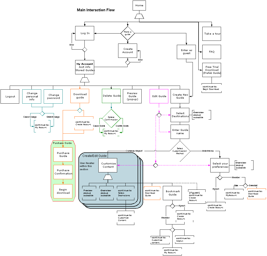
As
described above, this system allows the user to create a personalized
travel guide, including information specific to his/her needs,
and excluding information that is not needed. The user can
start a guide as a guest, without creating an account. They
choose their destination(s), mixing and matching among destinations
and regions within each destination. They have an opportunity
to name the guide to further personalize it and then choose
a method to edit the guide. The two editing choices are to
have TraveLite build it a guide for them, or to edit the guide
themselves.
On
the "Build it for me" path, the user fills out a
brief questionnaire designed to make a rough cut at the content
based on their interests, budget, length of travel, and purpose
for traveling. From here the user previews the content provided
and has the option to return to the questionnaire, switch
paths and edit the guide in detail, or save it to download.
On
the "Edit your own guide" path, the user moves to
a detailed edit page. From here they can exclude categories
from their guide or edit each category based on their preferences.
Each category provides metadata that users can use to winnow
their content. From here, the user then saves the guide and
again has the option to save and edit it later or download
it.
On
the download page (for both paths), the user has the option
to purchase the guide immediately or else download it for
a 48 hour trial. If the user decides to download the trial
guide, they may return to the site to purchase it. To purchase,
they submit their payment information and then receive a numeric
code that will permanently unlock the guide they have on their
PDA.
|
Interaction Flow Diagram
|
 |
We
have also provided a detailed storyboard
using screenshots from the final prototype.
Future
Implementation
The following is additional functionality
that we did not have an opportunity to implement, given the
limited timeframe for the project.
Accelerators
Check
all/Uncheck all in detailed editing
We would like to implement
the check all/uncheck all feature on each section of the
Edit page. This allows the user to quickly add or remove
content from the section. We envision this being useful
if someone wants to undo all the editing they've performed
on a section or know that they only want some certain content
in the section.
Add
third edit path, allowing users to make a detailed edit
across the entire guide
This is intended as middle path
and would function in much the same way as the "Edit
your own guide" path. However, instead of editing each
region individually, the user would edit each content category
and apply their selections across the entire guide.
User
Control & Freedom
Support
a finer level of editing
From the edit
page, a few users indicated a desire to click through on
each item for more detail and the opportunity to include/exclude
each item. This would require a substantial redesign of
the back-end system architecture. We would implement this
feature if more user testing indicated that it was an important
one.
Allow
Save as
to clone a guide
Our heuristic evaluators expressed an interest in being
able to clone or do a 'save as...' on a guide as a shortcut
method to creating a new guide. If a user has a current
guide that they find useful but wish to make some alterations
in order to better suit their current trip, they can save
some work by copying the guide as a new guide. They can
then edit it to better suit their current trip and then
save or download it.
Other
Additional Functionality...
Integrate
an update your guide feature
Part of the intended functionality of our system is to allow
users to return to TraveLite and refresh the content contained
in their guide. They would return to their account, choose
the guide they wish to update, and download it on to their
PDA for a minimal charge (currently $5 in the prototype).
Before they choose to download, users will have the opportunity
to preview the guide (all updated content will appear in
red) to determine if they do indeed wish to update the guide.
In this way, they will be able to judge the amount of updated
content compared to the overall content.
Create
the downloadable product for PDAs
We would, of course, like to follow through with this project
and create the actual downloadable product. At this time,
we do not have the time or skills to complete this part
of the overall product.
Tools
used to develop the system
In developing this prototype we used Dreamweaver, Cold Fusion,
and Programmer's File Editor (basic text editor with some
code awareness), with Access supporting the back end.
We
are relatively pleased with Cold Fusion as a prototyping tool,
being both easy to learn and easy to use. It enabled us to
produce a dynamic prototype in a relatively short period of
time. Dreamweaver cooperates with Cold Fusion, allowing you
to edit some Cold Fusion tags within the Dreamweaver WYSIWYG
interface. We used Dreamweaver only for formatting tables
and editing text on the page, however, since Dreamweaver's
built-in source editor is inadequate, presenting the code
in a way that is difficult to scan with the eye. We used Programmer's
File Editor as the primary editor for creating the pages since
they are primary composed of Cold Fusion code. BBEdit would
have been preferable as it uses color coding and indentation
effectively, allowing the programmer to quickly scan the page,
but it is not available on the machines in the SIMS computer
lab. It also would have been nice to edit the Cold Fusion
code with a tool like Cold Fusion Studio, but editing the
tags by hand will probably cement the syntax in our minds!
Dreamweaver's
use of templates makes it easy to quickly generate and update
multiple screens at once, but the unreliable behavior of the
templates in the presence of Cold Fusion markup resulted in
complications. Specifically, the presence of templates sometimes
causes Dreamweaver to delete Cold Fusion code. In the end,
many of the truly interactive pages had to be detached from
templates in order to preserve their code, making global changes
to the design more difficult and time-consuming. To reduce
these difficulties, we use server-side includes whenever possible,
to avoid duplicating interface elements unnecessarily. Hopefully,
Macromedia's acquisition of Allaire bodes well for the cooperation
of these two tools.
The
back-end of the system was managed with an Access database.
Access is easy to work with for those with average technical
skills and allowed us to easily and quickly make changes to
the database structure when needed. It also allowed us to
develop a user-friendly interface using forms for data entry.
Design
Evolution
Initial
Design
We
initially came up with an interaction flow that was focused
on a sequential, step-by-step flow through the decision process
of customizing a guide. The flow could be truncated, stepping
the user only through those categories she has specified,
but the selection process within each category was relatively
detailed. While this approach has its merits, it was less
than ideal for our business traveler, who is concerned with
the length of time customizing a guide will take. To minimize
the number of steps, we developed an alternative interaction
flow, in which the TraveLite system would make a "first cut"
of the content based on the specified preferences of the user.
[For more information, go to full write-up]
This
initial design consisted of 9 screens:
Home;
Sign In and Create Account;
My Guides and Profile;
Orientation and Destination;
Travel Preferences;
Table of Contents and Refine Choices;
View/Edit and Detailed Information;
Checkout; and
Download.
Paper
Prototype
In addition to "dynamic" travel-related content, the final
low-fi prototype consisted of 16 screens:
Home;
About TraveLite;
Frequently Asked Questions (FAQ);
Free trial download, including two download dialogue boxes;
Sign In;
Create Account;
Forget Password;
My Guides (personal account page);
Choose a Destination;
Choose Content (filter content categories);
Create/Edit a profile;
Guide Table of Contents;
View/Edit a Section;
Detailed information on a particular content item;
Checkout pages: enter/edit personal information and specify
download format, enter credit card information, confirmation
& download; and
Logout.
The
results of testing this prototype on 3 users highlighted four
main difficulties in the interface [for full details, see
our write-up]:
Difficulties
with Business Model: what
exactly (in terms of a product) TraveLite seeks to offer
its customers and how and what exactly it plans to charge
for that product.
We decided to revisit our user research and recalled that
users' current experience with customizing guides is buying
guide content at bookstores (and collecting it from other
sources) and customizing with scissors and glue. We decided
to mimic this path and changed the purchasing path to use
a subscription based model where users "subscribe" to content
for a year. They can manipulate and recycle that content
into as many guides as they like during that period.
Content
Context problems: Confusion between
all the content that is available for a particular destination
and the part of that content that is included in a particular
guide.
To
address this issue, the redesign of TraveLite will have
a simpler filtering mechanism that shows all content available
and specific guide content in close proximity to one another.
We decided that each filtering task would take place in
a suite of dynamic panes. All content appears by default
and is removed as the user deselects check boxes. Since
the content updates dynamically, we think it will be clear
to users what represents available content and what represents
content in their guide.
Process
Flow and Context:
Uncertainty of location within the process of creating a
guide. We want to allow users the flexibility to move between
the steps of this process, however, it is still possible
to leave that path and possibly get confused.
We address this problem by providing more of a path through
the guide building process in this iteration. We also hope
that in improving our business model, the purchase path
(an major area of confusion) will also become more clear
to the users.
Too
much Detail and Functionality: All
three users felt somewhat overwhelmed by the choices they
were making and the level of detail to which they could
go to customize their guides. Most of the test participants
appreciated the ability to tailor content but found the
interaction structure confusing.
We
addressed this by limiting functionality, primarily cutting
the "Profiles" functionality entirely, however we also limit
the users ability to perform complex queries and searches
over the information.
1st
Interactive Prototype/Heuristic Evaluation
This prototype focused on the main task path of the TraveLite
interface, that of building a guide. While some of these pages
are fully functional, some are simply flat html. For a full
description, see write-up].
The main screens are:
- TraveLite
Home
- Login
/ Create an account
- My
Account (account home page)
- Customize
a guide, including
- Choose
format and target size
- Select
destinations / subregions
- Refine
within a region
- Purchase
access to content
- Select
destinations for purchase
- Enter
purchase information
- Purchase
Confirmation
- Preview
Guide
A
fellow group of students evaluated this prototype against
a set of heuristics. Based on their feedback we made the following
changes [See the full write-up]:
Providing
Feedback:
Throughout the site, we now provide more feedback to the
user about the process, and their current location within
the process. For example, we now provide a process bar giving
the user feedback on their current location in the edit
process, how many steps they have already traversed and
how many steps remain incomplete. We are also clearly labeling
all the pages, and, on the Home page, explain the steps
involved in guide building and give the user an idea of
what to expect.
Business
Model: The heuristic evaluators
found the 'purchase content' and 'guides created' distinction
confusing. As mentioned above, we based our payment method
on a subscription model, allowing users full access to a
set of content for set time period. However, we discovered
through this evaluation that this model is still potentially
confusing. To further alleviate confusion and streamline
the flow of the interaction, we decided to simply redirect
the users to the "purchase" section when they
need to purchase a subscription to content. Thus, if they
choose a destination to which they are not subscribed, they
are redirected to the purchase page. By asking users to
subscribe to content only when necessary, we expected that
this new design would require less cognitive load and flow
more smoothly.
Edit
Guide: On this pass of
the prototype, much of the functionality on this page was
not yet implemented, we suspect that some of evaluators'
difficulties with this page stemmed from not being able
to actually interact with the system. This functionality
included:
- First,
the state of a tab would indicate whether the content
in that tab was included in the guide. If the tab was
greyed out, this would have indicated that this section
of content was not included. If the tab was active, the
content of the tab was included. Tab state was implemented
in the next iteration.
- We
have also clearly labeled the check box with 'include'
so that the user understands the action resulting from
clicking the tab. The tab will also be activated (clickable)
when the check box is marked.
- We
still wanted to provide the user the option to add or
subtract all the content within a section with little
effort, therefore we maintained the 'Check all | Uncheck
all' on each tab. (This allows the user to quickly check
only a few items in the tab - a different action than
excluding the entire section from the guide.)
- We
have also made the tabs more closely resemble the look
and behavior of standard online tabs.
'Finished'
button: On the Edit Guide page, we had
changed the 'Finished' button in the previous prototype
to read 'Bookmark: Edit Later', to indicate to the user
that they are capturing the content but can still return
to the guide to alter it whenever they wish. The evaluators
had difficulty with the use of this term and suggested 'Save'.
We had used 'Save' in the paper prototype and were told
that this connoted a sense of finality that made the user
feel uncomfortable about choosing it. The assumption was
that this implied to the user that they had finished the
entire task, not that they were simply storing the current
state for either download or editing at a later time. We
decided to keep 'Bookmark' and see what the results of user
testing would be.
Process
Flow: In the editing process,
we have now streamlined the flow so that the user picks
a country, picks their regions (or accepts the default "all
regions") and then chooses their desired guide size
and editing/customizing method (1. pre-formatted, 2. edit
by country, or 3. edit each region). If the user chooses
either the 2. edit by country or 3. edit each region, they
proceed to the edit page. For option 3. edit by region,
the user can edit content for each region, one content section
at a time. Alternatively, with option 2. edit by country,
the user performs the customization at the country-level,
and is not required to edit region by region. Previously
we had the user choose a country, pick their guide size
and then pick regions and edit the content; we realized
from the evaluators' feedback that the region selection
also impacts the potential guide size and so should come
before this step.
2nd
Interactive Prototype
For this stage
of the design process, we had an almost fully functional prototype.
We tested this system on four users using an informal usability
testing method and 'talk aloud' protocol. [See write-up
for full discussion of the test.] This stage of testing pointed
out major problems with the interface:
Business
Model: Our ambivalence regarding
our business model was showing, and cascaded into problems
with our process flow. Most individuals we tested did not
immediately understand the subscription model, and were
resistant once it became clear. As a result, we
also decided to emphasize and focus on enabling this process
for PDAs, as
opposed to supporting a variety of download formats (HTML,
PDF, PDA, etc.). Our
users found PDA guides the most interesting and compelling
element of the system. This
has the additional advantage of allowing us to more closely
target the motivations and goals of the PDA user, as opposed
to attempting (unsuccessfully) to support a variety of goals.
Also, we now allow for people to experience TraveLite and
create a guide as a 'guest', rather than requiring users
to create an account before providing access to much of
the functionality of the interface. This gives new users
the opportunity to experiment with the guide-building process
prior to making any commitment.
Process
Flow:
As a result of the changes to our business model, we were
also able to streamline our interaction flow, primarily
achieved by moving the 'create account' and 'purchase' stages
to later in the process. We were also able to simplify many
of the pages and eliminate unnecessary functionality. The
guild-building process was reduced from six steps to four:
Select a Destination, Choose a method to Build a Guide,
Edit the guide, and Download the guide. We also collapsed
the Destinations and Choose Regions pages into one page,
making the destination-selection process smoother and more
intuitive.
Visual
design: Across the site, we also
looked at ways to improve the visual design, eliminating
extraneous text, punching up the copy, incorporating more
graphics and improving navigation aids.
Providing
Feedback: Along with changes to
the visual design, we also looked at each of the pages and
improved the textual feedback, giving the user more information
up front regarding the system and its functionality, providing
a better sense of their location throughout the process,
and eliminating excess visual clutter where possible.
Final
(Third) Interactive Prototype
Because we encountered so many major problems with the 2nd
interactive prototype, we decided to make these changes and
run another small test using an additional 3 users. Following
this pass, users expressed a great deal more satisfaction
with the system and had fewer fatal errors. Additionally,
average task time was cut in half. For the final version of
the prototype, we have also improved the look and feel of
the final interface, incorporated some additional exception
handling and improved the readability and usability of instructions
and textual feedback throughout the site.
Reflections
on Evaluation Techniques
Of
the three evaluation techniques used in the course (low-fi
paper prototype testing, heuristic evaluation, and usability
testing on an interactive prototype), we found testing the
interactive prototype to be the most useful method for our
interface. It was incredibly educational to have actual users
try to interact with our system and actually see the problems
they had and where they breezed through the functionality.
It was also useful to be able to walk them back through the
screens and follow up on areas that had tripped them up or
where they seemed to not notice some part of the interface.
Paper
prototyping was also useful in having actual users walk through
the interface, however it was difficult to actually convey
much of the functionality of the interface through paper screens.
Our system is extremely content-driven and designed partly
for entertainment rather than strictly a goal-oriented system.
It was very difficult to judge the enjoyment factor of the
potential interface through the paper prototype. Although
we did receive valuable feedback at this stage, we think that
wireframing screens using Dreamweaver or some other tool would
have been more efficient. A more "hi-fi" low fidelity
prototype may have gone further in communicating functionality
to users. We are also more aware now that analyzing the results
of a paper protype are very important. Distinguishing between
limitations of the method and true problems with the system
is very difficult at this stage. Now that we have experience
with paper prototyping and the rest of the design process,
we feel that we are better able to analyze the results more
appropriately that we did with this project.
The
Heuristic evaluation was also very helpful but was hampered
by the lack of functionality in our system at the time. If
we had implemented more of the features, we think that this
would have assisted our evaluators in understanding the application
and thus they would have had fewer difficulties in some areas.
With both the paper prototype and the heuristic evaluation,
the inability to experience the true functionality of the
interface raised issues that may have masked the underlying
problems with the interface - the business model and task
flow. Again, our experience on this project with these techniques
and analysis of the results they produce will hopefully allow
us to look beyond these limitations when we use these tools
in the future to see the true problems with the interaction.
|